On Nov 26, 2018, I’ve attended the data visualization workshop organized by GC ITP Skills Lab in the GC main library. The instructor’s first name was Hannah and she said her specialization is commuter science. (She didn’t inform more about herself, so apologies for missing more detailed information about her affiliations, research interest, and so on. )
The workshop was largely focused on how to visualize datasets with Pivot Chart in Excel.
- Hannah provided us the graduation.csv that collected data of the number of high school (?) students that arrays the data as follows: Demographic,Borough,Cohort,Total Cohort,Total Grads,Total Regents,Advanced Regents,Regents w/o Advanced ,Local,Still Enrolled,Dropped Out. Because I’m not familiar with the borough divisions as well as the culture where students frequently drop out, the dataset itself felt somewhat distant to me. (But we will see what I learned to overcome geographic and cultural unfamiliarity in dealing with data through geo-visualization techniques merged with data visualization. )
- Then, Hannah asked us to import that dataset to Excel. Simply we had to click “insert” and then find “Pivotchart” and then we imported the dataset by browsing the file saved in our drive previously. We had to adjust the format of the dataset a bit at this stage. Although we were not sure what to do with it exactly, the data started displaying as a chart on-screen.
- We learned the merit of using Pivotchart in data-visualization is that we can adjust categories and select/deselect “the fields” we wanted to see distinctively on the chart. The figure below is one of the examples we’ve got in trying out various charts.
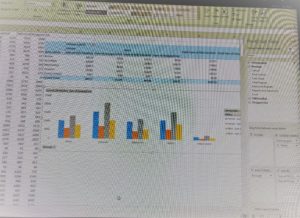
figure 1
4. we’ve tried different graph styles as well depending on what we want to see and which graphs would be more effective for chosen field characteristics.
5. After that, Hannah taught us how to merge Google Earth’s geographic information with the data visualization and visualize them together by variating the colors (and the color degrees) of the fields. We’ve tried a few different datasets to do this and it was interesting to discover that we can use GIS platforms (eg. Google Earth/Map) and the statistic data graphs at the same time, which helps those who are unfamiliar with site-specific geography and its relevance to data in a given data visualization & analysis project.
Overall, this workshop was helpful in a way that taught us to use a familiar software like Excel in a data visualization project for our specific needs of seeing the selected data fields which can be also aligned with geo-visualization by utilizing GIS technology.

This entry is licensed under a Creative Commons Attribution-NonCommercial-ShareAlike 4.0 International license.