Monthly Archives: September 2018

Peer review + power dynamics in Planned Obsolescence

Keeping in the spirit of Sandy’s post on collaboration vs. “ownership,” I wanted to mention Fitzpatrick’s idea of peer review, share my hesitancy about her diagnosis of the problem and solution, and hopefully hear what everyone else thought about it.

In Planned Obsolescence, Fitzpatrick considers From Book Censorship to Academic Peer Review by Mario Biagioli (full text at http://innovation.ucdavis.edu/people/publications/Biagioli%202008%20Censorship_review.pdf) to describe how “peer review functions as a self-perpetuating disciplinary system, inculcating the objects of discipline into becoming its subjects” (Fitzpatrick 22). As Biagioli puts it, “subjects take turns at disciplining each other into disciplines” in academia (12). This concept makes sense across types of peer review; Biagioli focuses on the royal academies and the associated “republic of letters” as a way to conceptualize peer review beyond a singular project, and I am also thinking of contemporary practices that are designed to evaluate and recalibrate a power dynamic (like the time I realized that the department head in the back of a classroom was actually there to evaluate the instructor).

This entire process of peer review, but particularly familiar version that Fitzpatrick considers in her first and third chapters in detail, is wrapped up in notions of who counts as a peer. We have discussed the idea of collaboration throughout the semester, starting with the notion that DH projects often accommodate, even require, a variety of skills and contributions; Sandy’s post speaks to this point and flags the critical “decision point about whose contributions to include” in the first place as a good place to start for identifying a project’s collaborators and expanding our notion of a peer. All of this points to a more inclusive notion of the peer which, in turn, aligns with a field like DH that strives to be participatory and democratic in multiple senses of the words.

The peer review process that Fitzpatrick outlines in Chapter 3 seems like a good place to start putting this expanded idea of the peer into practice. She compares how digital commenting functions as one level of peer review for projects such as “Holy of Holies,” Iraq Study Group Report, her own article “CommentPress: New (Social) Structures for New (Networked) Texts,” Expressive Publishing, and a digital release of The Golden Notebook (112-117), describing a spectrum of options from an entirely open commenting feature where any reader could leave a comment to relatively closed off systems where only select readers could provide feedback. As I made my way through this chapter, the phrase “the wisdom of the crowd” (which we first encountered in the context of The Digital Humanities Manifesto 2.0 as described in “This Is Why We Fight” by Lisa Spiro) kept coming to mind. From my perspective, this notion underlies Fitzpatrick’s model for online peer review, which strives to be a social, open process while “managing the potential for chaos” (117). (Granted, this chaotic or more generally negative mob/mass/crowd was much more familiar to me from French history, Romantic literature, early urban sociology, and general concern about trolling, but I have come around to the idea that the crowd can be a force for good in so many DH contexts.)

However, Fitzpatrick also notes that the author of  Expressive Processing experienced that “the preexistence of the community was an absolute necessity” (116) to make its comment structure useful. This experience logically translates to other projects: peer review that turns to the “wisdom of the crowd” can only be as helpful as its crowd. I see how the crowd might offer more variety of feedback and how a more expansive notion of peer review in general could magnify the voices of individuals who may not have gotten the chance to participate in the process otherwise, whether because they fall slightly outside of academic circles, have not yet acquired the prestige to “do peer review” for a publisher, or any other reason. But to become a member of that peer review community or crowd — one of the seven women with commenting privileges on The Golden Notebook, for example — in the first place, I see the same social and technical barriers to access that we have talked about in class. As a result, I am struggling to see how a more democratic comment structure in digital spaces changes the disciplinary power dynamic of peer review. In your reading, does Fitzpatrick’s proposed version of peer review (in certain contexts) adequately address this power dynamic?

Blog Post: Continuing the Conversation About Collaboration vs. “Ownership”

So, we’re one introduction class and two (official) classes into the semester, and we’ve pretty much established that collaboration is highly encouraged in DH. Not sure if “ownership” is the right word for me to input in the title, but I’ll just go along with it. Feel free to help me find a better term as you read through this post and interpret what I’m trying to get at.

In this week’s class, we discussed what exactly it means to “collaborate” for DH. I brought up my experience at the NYC Media Lab’s 2018 Summit that Anca and I attended, where my group at a particular workshop spent more time educating each other about the intricacies of artificial intelligence (AI) since not many of us were too familiar with AI. Now, thinking about my example in retrospect, that’s great and all from the context of just sharing ideas and helping one another understand different perspectives, but how do we bring that to the context of an actual project?

I thought about this some more after class and realized that collaboration is actually embedded in many fields that involve the use of writing and/or digital media, but the difference here is it’s less recognized as collaboration. Naturally, as a journalist and emerging digital campaigner, the following examples I’ll provide are in those contexts.

A news organization that actually has a newsroom of some sort will likely have a lengthy editorial process for each article prior to publication. The Excelsior, one of Brooklyn College’s student newspapers, looks something like this:

  1. A writer submits his/her article to a section editor.
  2. The section editor edits the article and forwards the article with new edits to a copy editor.
  3. The copy editor edits the article and forwards the article with new edits to the editor-in-chief or managing editor.
  4. The managing editor makes the final edits.

I’m sure even larger organizations like the New York Times would have an even more complex editorial process, but you can see that this — journalism — somewhat involves collaboration. I italicized “somewhat” because if we’re looking at the process from the standpoint of sharing ideas and new perspectives (like in my example from NYC Media Lab ’18), that part is missing unless the writer actually sees each step of the process and is able to learn from the edits made at each step. And, as I hinted at earlier, in the big picture, this isn’t really recognized as collaboration. The writer will get the byline that goes with the article that has all the final edits, and there will be no mention of all the editors involved — aside from their names being listed on the masthead of the publication. Still, I do view journalism as a collaborative field, and l’d argue journalists can’t become better journalists without all of this collaboration.

In terms of digital campaigning, it’s very similar. I intern on the digital team at Everytown for Gun Safety — “Everytown” for short — and occasionally help draft email campaigns. Obviously, as an extremely beginner digital campaigner, I can’t just write something and have it sent out to the masses. There’s a very long approvals process that begins with the campaigner I wrote the draft for, reviewing my work and explaining to me why he/she made the changes he/she did.

I’m often told that this kind of work I do at Everytown will help build my portfolio of email campaigns I’ve written, but sometimes I stop and think: Did I really “write” this? It’s not that the email I draft looks so drastically different after a full-time digital campaigner makes changes, but there are some intricacies and details I may not be familiar with for a particular state or campaign since I’ve only been at Everytown for a few months. My missing familiarity often leads to very specific changes in the copy of the email campaign, and sometimes I think presenting the final email campaign that’s sent out as my own is somewhat misrepresenting what is actually my work. And, as someone in class brought up, it’s not such a simple process of pointing to which paragraphs in the final product were what I wrote… because that’s just not what the collaborative process entailed.

Maybe “ownership” is the right word then, because I’m trying to figure out what exactly I can call as my own.

I Attended a TLC Workshop — Notes + Visuals

I attended an informally styled, very informative workshop on Wed. Sept. 26 on “Expanding Your Pedagogical Toolkit”. The facilitator was GREAT, Asilia Franklin-Phipps, and I can’t wait to get to know her even more. The TLC Staff workshop team was GREAT also.

We were seated in groups of 4-5 at round tables in the Skylight room on the 9th floor with a  totally open view straight up to yesterday’s blue sky and moving white clouds above us (beautiful setting) and I think this contributed to the open process we were engaged in.

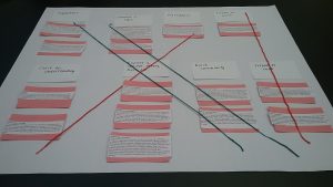
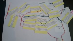
We did a hands-on project together which consisted of us reading pedagogical class ideas/suggestions “expand our teaching toolkit” aloud to hopefully inspire us. It was primarliy a matching game, though, to match the ideas with categories such as “Introduce a Topic”, “Explore a Concept, Theory or Topic”, “Engagement”, “Check for Understanding” and even “Attendance”.  We then connected/cross-referenced the categorized ideas with string.

As the saying goes, “a picture says a thousand words” so here are two photos:

1) above: photo of the table where I sat

2) above: photo of the table to my right

Wow — guess who the “linear thinkers” were…?! I think these photos not only describe the workshop but also the processes of learning how to teach, teaching and learning. Dare I use the word from our Sept. 25 class readings, “mangle” (but here with a small m) to describe the bottom photo and these collaborative processes…?

We received a wonderful worksheet handout pdf today via email from Asilia of the pedagogical ideas we read aloud and categorized, which I’m happy to share here. It’s a great document and could come in handy in case anyone hits a dry spell in their classes during the semester.

Pedagogical_Toolkits_handout

The Mangle


(DHUM 70000 – Introduction to Digital Humanities) The Mangle

Text-Mining the MTA Annual Report

After some failed attempts at text-mining other sources [1], I settled on examining the New York Metropolitan Transportation Authority’s annual reports. The MTA offers online access to its annual reports going back to the year 2000 [2]. As a daily rider and occasional critic of the MTA, I thought this might provide insight to its sometimes murky motivations.

I decided to compare the 2017, 2009, and 2001 annual reports. I chose these because 2017 was the most current, 2009 was the first annual report after the Great Recession became a steady factor in New York life, and 2001 was the annual report after the 9/11 attacks on the World Trade Center. I thought there might be interesting differences between the most recent annual report and the annual reports written during periods of intense social and financial stress.

Because the formats of the annual reports vary from year to year, I was worried that some differences emerging from text-mining might be due to those formatting changes rather than operational changes. So at first I tried to minimize this by finding sections of the annual reports that seemed analogous in all three years. After a few tries, though, I finally realized that dissecting the annual reports in this manner had too much risk of leaving out important information. It would therefore be better to simply use the entirety of the text in each annual report for comparison, since any formatting changes to particular sections would probably not change the overall tone of the annual report (and the MTA in general).

I downloaded the PDFs of the annual reports [3], copied the full text within, and ran that text through Voyant’s online text-mining tool (https://voyant-tools.org/).

The 20 most frequent words for each annual report are listed below. It is important to note that these lists track specific spellings of words, but it is sometimes more important to track all related words (words with the same root, like “complete” and “completion”). Voyant allows users to search for roots instead of specific spellings, but the user needs to already know which root to search for.

2001 Top 20:
mta (313); new (216); capital (176); service (154); financial (146); transit (144); year (138); operating (135); december (127); tbta (125); percent (121); authority (120); york (120); bonds (112); statements (110); total (105); million (104); long (103); nycta (93); revenue (93)

2009 Top 20:
new (73); bus (61); station (50); mta (49); island (42); street (41); service (39); transit (35); annual (31); long (31); report (31); completed (30); target (30); page (29); avenue (27); york (24); line (23); performance (23); bridge (22); city (22)

2017 Top 20:
mta (421); new (277); million (198); project (147); bus (146); program (140); report (136); station (125); annual (121); service (110); total (109); safety (105); pal (100); 2800 (98); page (97); capital (94); completed (89); metro (85); north (82); work (80)

One of the most striking differences to me was the use of the word “safety” and other words sharing the root “safe.” Before text-mining, I would have thought that “safe” words would be most common in the 2001 annual report, reflecting a desire to soothe public fears of terrorist attacks after 9/11. Yet the most frequent use by far of “safe” words was in 2017. This was not simply a matter of raw volume, but also the frequency rate. “Safe” words were mentioned almost four times as often in 2017 (frequency rate: 0.0038) than in 2001 (0.001). “Secure” words might at first seem more equitable in 2001 (0.0017) and 2017 (0.0022). However, these results are skewed, because in 2001, many of the references to “secure” words were in their financial meaning, not their public-safety meaning. (e.g. “Authority’s investment policy states that securities underlying repurchase agreements must have a market value…”)

This much higher recent focus on safety might be due to the 9/11 attacks not being the fault of the MTA, so any disruptions in safety could have been generally seen as understandable. The 2001 annual report mentioned that the agency was mostly continuing to follow the “MTA all-agency safety initiative, launched in 1996.” However, by 2017, a series of train and bus crashes (one of which happened just one day ago), and heavy media coverage of the MTA’s financial corruption and faulty equipment, were possibly shifting blame for safety issues to the MTA’s own internal problems. Therefore, the MTA might now be feeling a greater need to emphasize its commitment to safety, whereas it was more assumed before.

In a similar vein, “replace” words were five times more frequent in 2017 (0.0022) than in 2001 (0.0004). “Repair” words were also much more frequent in 2017 (0.0014) than 2001 (0.00033). In 2001, the few mentions of “repair” were often in terms of maintaining “a state of good repair,” which might indicate that the MTA thought the system was already working pretty well. By 2017, public awareness of the system’s dilapidation might have changed that. Many mentions of repair and replacement in the 2017 annual report are also in reference to damage done by Hurricane Sandy (which happened in 2012).

In contrast to 2017’s focus on safety and repair, the 2001 annual report is more concerned with financial information than later years. Many of the top twenty words are related to economics, such as “capital,” “revenue,” and “bonds.” In fact, as mentioned above, the 2001 annual report often uses the word “security” with its financial meaning.

The 2009 annual report was extremely shorter (6,272 words) than in 2001 (36,126 words) and 2017 (29,706 words). Perhaps the Great Recession put such a freeze on projects that there simply wasn’t as much to discuss. However, even after considering the prevalence of “New York,” 2009 still had a much higher frequency rate of the word “new.” (The prevalence of “new” every year at first made me think that the MTA was obsessed with promoting new projects, but the Links tool in Voyant reminded me that this was largely because of “New York.”) Maybe even though there weren’t many new projects to trumpet, the report tried particularly hard to highlight what there was.

The recession might also be why “rehabilitate” and its relative words were used almost zero times in 2001 and 2017, but were used heavily in 2009 (0.0043). Rehabilitating current infrastructure might be less costly than completely new projects, yet still allow for the word “new” to be used. “Rehabilitate” words were used even more frequently in 2009 than the word “York.”

One significant flaw in Voyant is that it doesn’t seem to provide the frequency rate of a word for the entire document. Instead, it only provides the frequency rate for each segment of the document. The lowest possible number of segments that a user can search is two. This means that users have to calculate the document-length frequency rate themselves by dividing the number of instances by the number of words in the document. If the document-length frequency rate is available somewhere in the Voyant results, it doesn’t seem intuitive and it isn’t explained in the Voyant instructions.

Although I generally found Voyant to be an interesting and useful tool, it always needs to be combined with traditional analysis of the text. Without keeping an eye on the context of the results, it would be easy to make false assumptions about why particular words are being used. Helpfully, Voyant has “Contexts” and “Reader” windows that allow for users to quickly personally analyze how a word is being used in the text.

[1] I first ran Charles Darwin’s “Origin of Species” and “Descent of Man” through Voyant, but the results were not particularly surprising. The most common words were ones like “male,” “female,” “species,” “bird,” etc.

In a crassly narcissistic decision, I then pasted one of my own unpublished novels into Voyant. This revealed a few surprises about my writing style (the fifth most common word was “like,” which either means I love similes or being raised in Southern California during the 1980s left a stronger mark than I thought). I also apparently swear a lot. However, this didn’t seem socially relevant enough to center an entire report around.

Then I thought it might be very relevant to text-mine the recent Supreme Court confirmation hearings of Brett Kavanaugh and compare them to his confirmation hearings when he was nominated to the D.C. Circuit Court of Appeals. Unfortunately, there are no full transcripts available yet of the Supreme Court hearings. The closest approximation that I found was the C-Span website, which has limited closed-caption transcripts, but their user interface doesn’t allow for copying the full text of the hearing. The transcripts for Kavanaugh’s 2003 and 2006 Circuit Court hearings were available from the U.S. Congress’s website, but the website warned that transcripts of hearings can take years to be made available. Since the deadline for this assignment is October 9, I decided that was too much of a gamble. I then tried running Kavanaugh’s opening statements through Voyant, but that seemed like too small of a sample to draw any significant conclusions. (Although it’s interesting that he used the word “love” a lot more in 2018 than he did back in 2003.)

[2] 2017: http://web.mta.info/mta/compliance/pdf/2017_annual/SectionA-2017-Annual-Report.pdf
2009: http://web.mta.info/mta/compliance/pdf/2009%20Annual%20Report%20Narrative.pdf
2001: http://web.mta.info/mta/investor/pdf/annualreport2001.pdf

[3] It’s important to download the PDFs before copying text. Copying directly from websites can result in text that has a lot of formatting errors, which then requires data-cleaning and can lead to misleading results.

The Lexicon of Digital Humanities Workshop: 9/18/2018

I ended up attending The Lexicon of Digital Humanities workshop on Tuesday 9/18/2018 since we didn’t have class.  Also, I still need to meet my workshop requires for the course and this was a good way to do so. Particularly, I wasn’t quite sure what would be covered within this workshop, but I figured it would be especially helpful as we move forward. 

We started out with going over some general information about Digital Humanities, which I thought was helpful and particularly related to our most recent class discussions on what digital humanities is. This session defined digital humanities as “digital methods of research that engage humanities topics in their materials and/or interpret the results of digital tools from a humanities lens.” I liked this definition a lot so far. It seemed to align closely with what we’ve been talking about in class. 

Next, they had us download Zotero, which was honestly really good because I needed to do this anyway. They went through how to download it, add it to your browser and sync it to all your devices. Since I am fairly new with Zotero I was thankful for the step by step instructions. I feel like Zotoro will be such an awesome resource moving forward. 

Next, we went over many different types of data and places/ways to find it. They showed us a variety of resources which I feel will be useful in the future. At one point we split into partner groups and an individual at the table I was sitting at directed us to this resource for harvesting data from social media platforms: http://www.massmine.org/. It has documentation that explains how to do things (step by step) with minimal online command line (and apparently a lot of copy and pasting which doesn’t sound too intimidating for newcomers like myself to the field).

Overall throughout the session, there were several different tools and resources that were shared. I’ve included a link to the presentation below for more information. I highly suggest that those who were unable to attend this session take a look. A really cool project (that wasn’t included in the presentation) that we were shown can be viewed here: http://xpmethod.plaintext.in/torn-apart/volume/2/index .This project shows a data and visualization intervention looking at the culpability behind the humanitarian crisis of 2018. It’s a great example to show how digital humanities is so relevant to the world at this current moment and how its efforts can be productive in many ways. 

Here is a link to the presentation from the workshop.

After attending this workshop, one major thought that has been consuming my mind was the accessibility of the field of Digital Humanities. With many of the resources and tools being open-sourced and free, this allows those who may not have class privilege to still have equal access (keeping in mind that one still needs access to a computer and internet of course to utilize these tools/resources). This becomes an important conversation when we think about accessibility and who gets to be able to practice digital humanities. These resources and tools help provide a layer of accessibility that other fields do not always offer.

That being said, there is still a hierarchy within the field of those who have access to academia for in-class digital humanities courses and education (like ourselves), and those who do not have the privilege of being able to attend higher education courses. I do however feel that as I’ve started to become more familiar with the field, one of the main priorities has been to make as much of the content as free and accessible as possible. I hope this stays true as the field continues to develop within academia and that it does not fall into the “ivory tower” trend that has plagued some other humanities fields; (I come from a background in Women’s and Gender Studies which has been often critiqued for losing its roots in activism and accessibility by being too housed in academia). 

Designing for Difficulty

One thing that really struck me about the readings for this week is the general skepticism about ease of use. Ramsay and Rockman (“Developing Things“) argue that while a tool that doesn’t call attention to itself is useful, it’s less likely to be formally valued as scholarship. Tenen (“Blunt Instrumentation“)  is cautious about tools for several reasons, but his principal objection is that tools hide their inner workings in a way that can compromise the work done with them.  In order to do good, scholarly work using a tool, you need to understand exactly what it’s doing, and the best way to do that is to build it yourself.  Posner (“What’s Next“) takes this argument a step further, arguing that ease of use is often privileged above critical thinking.  The familiar is easy to use, but it doesn’t challenge the colonial point of view that the broader culture promotes.

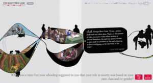
Posner uses the Knotted Line as an example of a project that presents history in a more challenging way than the traditional timeline.  I spent some time looking at this website. It’s a history of freedom in the United States, and brings together information about slavery, education, mass incarceration, segregation, immigration, etc on a timeline that, as the title suggests, is neither straightforward nor orderly.  To reveal the different events of the timeline, there is a window that the website user must pull and tease until the image becomes clear.

Image of the timeline from the Knotted Line

Part of the timeline of the Knotted Line. Paintings are revealed by pulling on the line. Image taken from http://evanbissell.com/the-knotted-line/

The Knotted Line is more physically strenuous than most websites, and it can also be frustrating – much like the struggle for freedom in American history. Obviously, these things are far from equivalent, but the fact that the reader has to work for this information helps to challenge narratives of progress and emphasize that the struggle is still ongoing.

This is a different kind of difficulty than that experienced by users of NLTK in Tenen’s chapter.  I haven’t used NLTK yet, but according to Tenen, it’s difficult because you have to understand exactly what it does. It doesn’t hide its inner workings behind fancy interfaces, but provides lots of careful documentation to facilitate well-informed (should I say expert?) use.

Ramsay and Rockwell discuss the “transparency” of tools, meaning the ability for tools to fade into the background as the user thinks about the task instead.  Both these projects are specifically against this kind of transparency. Instead, they offer transparency of a different kind, the kind that comes from letting the user look behind the scenes.

I’m a librarian, so I spend a lot of time hearing about how library users want ease of use, how complex interfaces drive people away and nobody cares about how the searches work, and how advanced searching is for librarians only because it requires searchers to understand how a record is put together.  I’m uncomfortable with most of those arguments, so I found Tenen and Posner really refreshing from that perspective, especially since Posner is a professor of library science!

Some of this is audience specific. Both NLTK and the Knotted Line are designed with a very specific audience in mind, and an audience with which the people who designed the tools were very familiar. And then, a lot of it is about designing carefully and intentionally.  It isn’t always bad for users to be confused and even frustrated, as long as it’s for the right reason.

Research for MALS Students

I too went to a workshop this week. Instead of learning about my digital identity (although I will say Sean’s post did prompt a google search of my own) I learned about research resources at the Graduate Center. The library had a Research for MALS Students workshop this past Tuesday. .

I studied new media prior to getting to the Graduate Center. Towards the end of undergrad, my work was focused more on practical skills than research, so I thought this would be a good place to start now that I’m in a more research based field of study. Also, I was luckily in a group that participated a lot so I got a few pro tips from my fellow students which is always a plus.

This workshop covered the whole of researching including finding a topic, methods for searching and evaluating source material, and ended with citations and paper formatting. The workshop was led by Steven Zweibel,  who is the reference librarian for the digital humanities program. Fun fact all the tracks at the graduate center have designated reference librarians. I’m sure this info will be super helpful in the not so distant future.  

We spent a little bit of time talking about the attitude towards research in undergrad versus graduate school. In undergrad you’re often told not to do research on the same topic while the whole point of doctoral and graduate research is to focus on a topic and build expertise in the area of your choosing. I knew that already, but the way it was framed in this context hit in a way I hadn’t realized before. 

Overall, I thought this workshop was a great intro the the resources available at the GC.  I’ll close by sharing a few tips I picked up in the workshop that I thought could be useful for others.

Tip 1: The following exercise is a good way to concisely think through your paper/project.

  • (Topic) I am studying _____ (Question) because I want to find out what/why/how ______ (Significance) in order to help my reader/user understand _____.

Tip 2: Save time figuring out which sources are right for you.

  • Once you have found an possible source, hit crtl F or cmd F and type in keywords at the bottom of your screen. An article can be worth the read or not depending on how many times those keywords pop up in it.

Tip 3: Theses in GC library

  • The Graduate Center Library is the only CUNY library with a section to research masters and doctoral theses. It can be a good resource especially if you find someone else has done research similar to your own.

Tip 4: Notecard for citations

  • Write page number, topic, synopsis of quote, quote itself, and what is useful about the quote as a note. This will help jog your memory later on about things you choose to cite.


Text mining of Native American Speeches with Voyant

Analysis of Short Well-known Speeches by Native Americans using Voyant

My students have to recite these speeches when I teach Voice and Diction, so I have copies on my desktop.[1] These are not long speeches. They vary in length from 75 to 100 seconds, or two or three paragraphs.[2] The speeches are all about how badly the White Man has treated them. Most are defiant speeches, calling for resistance. A few are speeches of peace or surrender, and one in particular, is a cry of pain (Standing Bear). I thought these would be interesting speeches to analyze.

At first, I decided to do a test run with three of them, so I copied and pasted three of the speeches into the text box.  This did not provide the results I wanted because Voyant treated them as one document, not as three short ones. This was my fault. I saw that Voyant let users upload individual files, but I didn’t do it.

Starting over, I uploaded all eleven speeches as word documents. That worked. It gave me an analysis of all the speeches, as well as information about the individual speeches. Overall, this corpus has 2,180 total words and 757 unique word forms. The longest speech was Sitting Bull’s, with 301 words. The shortest was Chikataubat’s at 153[3].  Interestingly, Chickataubat’s speech was the shortest, but it had the most words per sentence (30.6) and the highest vocabulary density (0.758)[4][5].

They did not calculate the overall vocabulary density of the corpus, but based on their formula, it’s 0.347. That seems low, but, at the same time, most of these speeches are calls to action, and the arguments presented in speeches like might to be more straightforward.

The most common words were “people” (15 times), “man” (12), “shall” (9), “white” (9), and “away” (8). Voyant also provided the most common words in the individual pieces. For instance, “tells” occurs four times in Osceola’s speech and “neighbors” occurs three times in Sitting Bull’s speech.

Considering that these are all speeches that arose out of conflict, the most common words are unsurprising: these words are used to call out to the community, and to tell them not to just to resist, but who to resist.  The frequency of “tells” in Osceola’s speech is not surprising. Osceola is calling on the Seminole to resist relocation to what is now Oklahoma. “Neighbors” in Sitting Bull’s speech refers to White Americans who are continually encroaching on Dakota territory.

I noticed that Voyant didn’t make links between related words: died and dead are treated as separate words, they aren’t really linked in any way in the analysis.

Sometimes, though, the link is more subtle: Sitting Bull’s “neighbors” clearly refers to white people, like “white”, but Voyant doesn’t link them either, which isn’t really a surprise.

Voyant has a function called “links”, which showed the three most common words in the corpus and the words “in close proximity” to them. It also has a “context” function, where you can click on a word, and it will show you all the sentences that word appears in. It also marks which speeches those sentences come from.

Next, I decided to split the works up into categories to see what, if anything, changed. I chose to focus on word count, most common words, and vocabulary density for this.

First, I divided the speeches into two groups: those that were given before the Civil War, and those given after. The pre-Civil War speeches were by Metacom, Chikatabaut, James Logan, Pushmataha, Wabashaw, and Osceola. The post-Civil War speeches were by Red Cloud, Spotted Tail, Sitting Bull, Chief Joseph, and Standing Bear.

The pre-Civil War speeches had a total of 1095 words, with 480 unique words. The most common words were “people” (10), “father” (7), “man” (7), “English” (6), “White” (6), “Logan” (6).

This makes sense: these speeches are all calls to resist, so they’d be making appeals and talking about their enemy. The interesting one is “Logan”. It is one of the most frequently encountered words in the entire corpus, yet it appears only in James Logan’s speech.

The longest speech here is James Logan’s at 202 words. The shortest is Chikataubat’s at 153.

The overall vocabulary density is 0.483. I’m not sure why. If, as I said above, calls to action tend to be less complicated than other kinds of speeches, the density should be lower, not higher. My initial hypothesis is either wrong or too simplistic.

As above, Chikataubat’s speech is the most dense, at 0.758, while the least dense speech is Osceola’s at 0.456. The longest speech is James Logan’s (202 words), and the shortest is Chickataubat’s (153). This is interesting because they both spend time describing individual situations in their speeches: the murder of Logan’s family at the hands of the Whites, and the desecration of the graves of Chickataubat’s family. The other speeches in this category are more generalized calls to resist.

The post-Civil War speeches (Red Cloud, Spotted Tail, Sitting Bull, Chief Joseph, and Standing Bear). These speeches are more of a mix. Chief Joseph is surrendering[6]; Standing Bear, asking for help[7], Spotted Tail saying resistance is futile, and Red Cloud and Sitting Bull calling for war.

The most frequently appearing words were “shall” (7 appearances), “children” (6), “died” (6), “men” (6), and “things” (6).

Standing Bear’s speech accounted for all the appearances of “died” and four of the appearances of “children”.  The most common word in Spotted Tail’s speech is “alas” (3).  Both of these make sense. Standing Bear is describing the state of his people: many died on the road to the new reservation, and more died once they got there. Spotted Tail has been defeated, and his speech reflects that. Meantime, the most common word in Red Cloud’s speech is “brought”, which appears three times. Again, context matters. Red Cloud is listing the things the White Man has done to his people, so the usage of “brought: makes sense.

The longest speech was Sitting Bull’s, and the shortest was Chief Joseph’s at 161 words. Chief Joseph’s speech, coming after weeks of flight and retreat, may be so short because he was exhausted and demoralized.

In terms of vocabulary density, the densest speech of this set is Spotted Tail’s at 0.655; Standing Bear’s is the least dense at 0.545. I don’t know why. I guess that linking vocabulary density to theme of speech doesn’t work, or at least doesn’t work with this corpus.

Finally, I decided to try to analyze these speeches by language family. This was difficult because the speakers’ languages came from five different language families. Only one language family, the Siouan, had more than two representatives. Since it had five: Ponca, Spotted Tail, Sitting Bull, Red Cloud, and Wabasha, I decided to try it to see if there were similarities.

Overall, this corpus contains 1,117 total words and 454 unique words, for a vocabulary density of 0.406.

Sitting Bull’s speech was the longest, at 301 words, while Wabashaw’s speech was the shortest at 193. Wabashaw’s speech had the highest vocabulary density, however, at 0.665 while Standing Bear’s had the lowest at 0.545. Again, the shortest speech is the densest (at least in terms of vocabulary).

The most common words overall were “died” (6), “man” (6), “shall” (6), “things” (6), and “children” (5). We can see Standing Bear’s influence here again, since, as mentioned above, all the occurrences of “died” and four of the occurrences of “children” were from his speech.

“Father” was the most common word in Pushmataha’s speech. Again, in context, this makes sense: Pushmataha was calling his people to war, extolling their bravery in the name of their father.

Overall, I thought this was interesting. I can see how almost all these tools can be useful. I’m not sure about vocabulary density, though: I can see that it has descriptive value. The argument can be made that a speech with higher vocabulary density might be more complex, but I don’t know that I saw that. I’d have to work with longer speeches to see if that bears out.


[1] These speeches are by Chief Joseph of the Nez Perce, Chikataubat of the Massachuset, James Logan of the Cayuga, Metacom (or King Philip) of the Wampanoag, Osceola of the Seminole, Pushmataha of the Choctaw, Red Cloud of the Oglala Dakota, Sitting Bull of the Hunkpapa Lakota, Spotted Tail of the Brulé Lakota, Standing Bear of the Ponca, and Wabashaw of the Dakota.

[2] Because I teach speaking skills, I think of length more as a function of time (how long it takes to recite) rather than word count.

[3] This makes me wonder if I shouldn’t replace this one with something a little longer.

[4] Voyant calculates vocabulary density like this: unique words/total number of words= vocabulary density.

[5] Chikataubat’s speech is essentially five run-on sentences. Maybe that’s why I’ve kept in it. It’s short, but it’s more difficult than the others.

[6] After being forcibly removed from their lands in Oregon to a reservation in Idaho, Chief Joseph and his people fled their lands, in an attempt to get to Canada while being pursued by the U.S. Cavalry. They had to surrender forty miles from the border. Look up his story. It’s worth a read.

[7] This is probably the saddest of the speeches.