It was difficult to decide on a topic to map for this assignment. With an assignment like this being very broad, it becomes hard to choose what to look at. Indecision is my worst enemy. I wanted to map content that I was passionate about so eventually I turned to women’s health care access in the United States. Recently, many right-wing politicians have been more aggressively fighting Planned Parenthood and specifically women’s access to abortion services. Inspired by the Safe Place project, I wanted to do an updated mapping of abortion centers in the United States. I was curious to see how many abortion centers were still available to women across the country, specifically one’s sponsored by Planned Parenthood.
I began to collect my data by using the Planned Parenthood Health Center finder feature (by state). Quickly, I realized that the amount of data clean up I would need to do for this project would require me to work beyond the assignment. I decided to narrow my scope a bit. This led me to wonder how many abortion centers were left in states that voted red during the Trump/Clinton election. These “red” states typically tend to advocate against women’s access to abortion resources, so it would be interesting to map these out to get a visual of the distance between centers.
For the sake of the assignment, I was only interested in mapping centers that actually had abortion services within their facilities. Abortion services range from providing the abortion pill to in-clinic abortions, to pre and post-abortion care. There were many centers that offered only abortion referrals, however, were not able to perform abortion procedures within their facility. It’s hard to tell by the website exactly how easy it is to obtain an abortion near you from a local doctor using an abortion referral. The user of the website is prompted to call in for more information from each center. Thus, I wanted to see the amount of specifically abortion service centers in “red” states.
First, I found all the red states from the 2016 election and combed through all of the Planned Parenthood-sponsored centers to determine the addresses to map. This was the most time-consuming part. One of my big takeaways from this project was the amount of time it took to organize and clean data. I had hoped that there was already an easily accessible list created all in one place, however, this was not the case. I needed to go through each state and then each center in each state individually to determine which centers specifically provided abortion services.
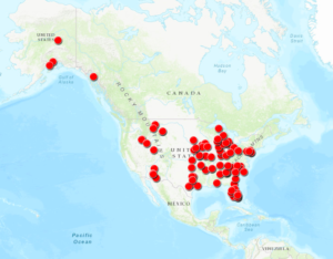
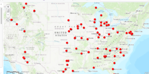
Next, I utilized ArcGIS Mapping software to plot the points across the United States. Here were my results:

Zoomed out map of the USA

There were several “red” states that had no abortion centers included sponsored via Planned Parenthood (some had abortion referrals but I chose to exclude them from the data). They were as follows:
- West Virginia
- North Dakota
- Kentucky
- Louisiana
- Mississippi
- Wyoming
I was not particularly shocked by the results, though it was quite discouraging to see how limited the options were for many of the “red” states. Most of the centers were only available in larger cities posing barriers of accessibility for those in rural America. One specific example of this is in Ohio, a state with a general population of almost 11.7 million. Within the state of Ohio, there were only three centers with Planned Parenthood-sponsored abortion services housed in the cities of Cincinnati, Cleveland, and Columbus. Many women have to travel several miles to get to one of these centers, especially those who reside in states with no Planned Parenthood abortion services (both Kentucky and West Virginia share borders with Ohio, however, both states have no Planned Parenthood abortion services). While Planned Parenthood isn’t the only resource for abortions in the United States, it’s arguably the most accessible and known resource. Centers that are not Planned Parenthood are a bit harder to find. I did my own Google searches for some of the states that did not have any options for obtaining abortions but struggled to find easily accessible options.
Since I’m originally from the small town of State College, Pennsylvania I wanted to see how accurate this provided data was by trying to schedule an online appointment for a nearby abortion. While there were a few options provided by Planned Parenthood for abortion services within less than 100 miles of State College on my map, when I went to schedule an actual appointment (specifically for obtaining an abortion) the closest option was actually in Pittsburgh, approximately 2.5 hours or 140 miles away. Thus, I worried that the data provided by Planned Parenthood was not always perfectly up-to-date or that all the centers were not actively or able to take a patient that needed an abortion immediately.
Similar to Quinn’s mapping project, I thought about the “All Models Are Wrong” article we read by Richard Jean So and asked myself what is missing from this data. What can be changed with this model for understanding abortion access in the United States?
Ultimately, the map doesn’t reflect all the myriad barriers that people experience in trying to obtain an abortion. Like my quick search in State College, the map does not always accurately represent centers that are actively accepting patients at the time of the search or still open. Similarly, it does not account for other restrictions placed by states on those who are seeking abortions including forced waiting periods and counseling requirements, and/or take into account how systems of oppression like capitalism or racism add additional barriers to access. At the end of the day, it’s simply a map that contains well-meaning information on abortion centers that tries to make them easy to find and access. While it’s not perfect, it’s at least a start. It’s a model that can and must change.
Besides adding in the “blue” state abortion services centers (which would be nice to see alongside the red states), it would be helpful to establish some programming that allows these locations to be automatically updated when a center is able to receive patients or goes out of service. Unfortunately, I do not have the necessary programming skills (or know if this is even possible), but this would be an interesting project to consider.
Overall, while there are some limitations with utilizing mapping software like ArcGIS it was still interesting and beneficial to use. I’ve just scratched the surface of its features, but hope to continue with this project to add in the blue states and other tools/programming in the future.

