For the mapping assignment, I used the first chapter of “Actual Innocence,” which documents the cases of wrongly convicted men exonerated through the work of the Innocence Project. The organization’s co-founders, Barry Scheck and Peter Neufeld, along with journalist Jim Dwyer, authored the book. The chapter tells the story of Marion Coakley, whose exoneration would lead to the founding of the Innocence Project.
Coakley, a resident of the South Bronx, was convicted of robbing a couple and raping the woman at a motel. He spent two years going through seven different state penitentiaries before the efforts of Scheck, Neufeld and two law students led to his exoneration.
I used Carto for the assignment after some much-needed tutorial-skimming and video-watching. Each dot on the map represents a location in Coakley’s story: where he lived, where the crime took place, the prisons he ended up in and the sites relevant to the legal side of the case and the involvement of Scheck and Neufeld.
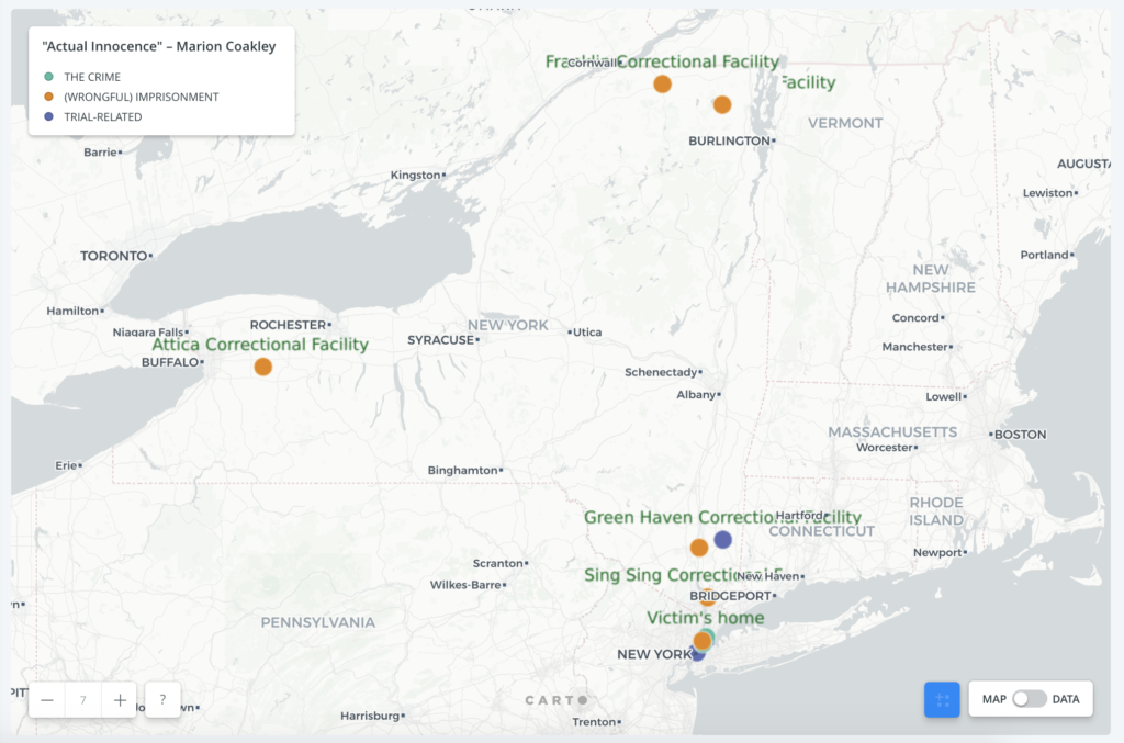
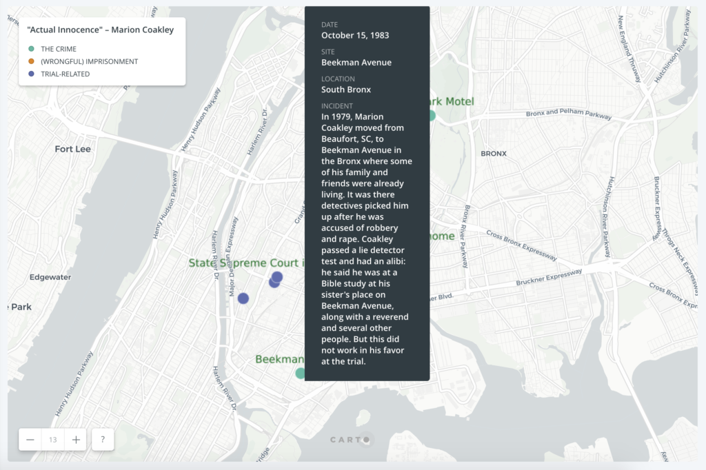
I started out with a spreadsheet in which each row listed a location, its latitude and longitude (found through Google Maps) and what would go on its tooltip: date, neighborhood/town, incident. I uploaded the csv file to Carto and after clicking the geocode feature, dots miraculously appeared that corresponded to each row.
Once I got past that initial thrill, I had trouble figuring out how to incorporate some kind of sequential aspect so that the chronological order of the events could be discerned. Otherwise, it’s just a bunch of dots to be hovered over at random. I’m not sure if there is in fact some way to achieve this on Carto but in the end I divided up the events into periods of Coakley’s story (the crime he did not commit, imprisonment, and trial-related matters) so that the dots could at least be color-coded and through a legend, have some distinctions.
 While the chronological order of the events surrounding his wrongful imprisonment remains unclear on the map, it at least gives a visual layout of the elements in the case and how far from home Coakley was as an innocent man going from prison to prison.
Another issue with mapping the story was that I could only pinpoint the sites that were specifically named in the text. A few critical parts of the story were left off the map such as the unspecified “police station” where the victims of the crime identified Coakley as the suspect through a photo (a photo that had stayed in the files despite that earlier case being dismissed). A NYC Open Data map put the motel where the crime occurred within the boundaries of the 48th police precinct but I didn’t include it on the map as I wasn’t completely sure that was the location of the station where the victims went. Another element that would require further research is whether any sites moved since the 1980s when these events took place. That was the case for the first prison Coakley was sent to, the Bronx House of Detention.
Additional ideas for the map that could be implemented in either Carto or other tools:
- The dots would have a sequential order so that the viewer would start off on one dot and click a button that would take them to the next dot based on the date in the data.
- An animated feature that would trace the chronological path in Coakley’s story by going from dot to dot, with a short description for each one.
- Use different picture icons instead of dots for each location, which would give more of an initial idea of what the spot represents without having to hover over it. (As some of the other mapping assignment posts do using ArcGIS.)
- Incorporate visuals (photos, legal documents, interview videos, etc.) either via a tooltip or a link that could add more of a human angle to the story.
What a great idea for a project. You really nailed the challenge of executing this the way you want to: sequence here is everything. Without it, as you say, it would be “just a bunch of dots to hover over at random.” I’m working on a blog post that will hopefully incorporate some of this thinking, so apologies in advance if you see these quotes again at some point, but they seem particularly relevant to the spirit of your praxis project. Lev Manovich talks about it one way:
“As a cultural form, the database represents the world as a list of items, and it refuses to order this list. In contrast, a narrative creates a cause-and-effect trajectory of seemingly unordered items (events). Therefore, database and narrative are natural enemies. Competing for the same territory of human culture, each claims an exclusive right to make meaning out of the world.”
Manovich quotes Mikhail Kaufman (in Man with a Movie Camera) as putting it similarly:
“An ordinary person finds himself in some sort of environment, gets lost amidst the zillions of phenomena, and observes these phenomena from a bad vantage point. He registers one phenomenon very well, registers a second and a third, but has no idea of where they may lead. But the man with a movie camera is infused with the particular thought that he is actually seeing the world for other people. do you understand? He joins these phenomena with others, from elsewhere, which may not even have been filmed by him. Like a kind of scholar he is able to gather empirical observations in one place and then in another. And that is actually the way in which the world has come to be understood.”
The bulleted list you have at the end (especially items 1 and 2) I think does an important job of gesturing toward the need for mapping tools that show the sequence, the chronology, the narrative and not just the location, the singular event, the database. I’m sure these things exist and that we could include them in your project here, but I’m glad to see “the mangle” of your practice and to see the problem before the solution, so to speak.
This is a really compelling story to map, Jennifer! Showing how far Coakley was sent from home accentuates the physicality of his isolation. I like how you color-coded when you couldn’t get Carto to represent time as well as space. This will be one of my concerns when I map a story, so thank you for adverting me to the problem of time in Carto.
I wonder if there’s a way to make the labels stay the same size when you zoom in? I haven’t used Carto yet and now that I see what you did I can hardly wait to build a map myself.
There is an animated option in Carto that includes the element of time but it’s visualized through a heatmap so for me at least it didn’t work for what I was trying to do:
https://carto.com/learn/guides/styling/displaying-temporal-data-with-heatmaps/
Don’t know if it would work for you but maybe for future projects?
(A great example of it being used to show geotagged tweets with the Ferguson hashtag from four years ago: http://srogers.carto.com/viz/4a5eb582-23ed-11e4-bd6b-0e230854a1cb/public_map)
This map made in ArcGIS uses numbers on the tooltip. It’s not how they used it in the map, but the numbers could be one form of communicating time and progression:
https://www.arcgis.com/apps/MapTour/index.html?appid=4c58d41064114a638a94f31a2f61d676
In terms of Carto, how to do that is my question…
With the “default” map I used, there weren’t too many formatting options in terms of label size – from what I could figure out at least – but maybe with some coding and the addition of other layers, it’s possible?