Author Archives: Jennifer Cheng

Final Project: A Bit More on “Nonprofit News Board”

Sandy’s post on our project proposal on a nonprofit news aggregation/curation site pretty much summed up everything but I wanted to add a few more thoughts, especially to clarify what I said during our presentation/Q&A.

One tentative feature we have in mind for presenting the stories (via headline and link, photo, brief excerpt) is a list of trending news topics. While the nonprofit sector is usually not in the business of covering news as it breaks, they do report on the news by providing context and giving explanations. I had mentioned during the Q&A portion of our presentation that this option (there would be multiple ways we hope to present the stories) would, for example, show the stories on mass shootings if/when one, god forbid, happens. But instead of covering the latest updates, such as the number of victims to the apprehension of the suspect and their name, the linked-to articles would instead tend to cover the shooting in the context of the bigger picture: How many mass shootings have there been so far this year? Might the latest incident prompt gun reform

These stories would focus on the consequences and in that sense, keep the issue at the forefront longer when the rest of the media has moved on. There are overlaps, of course, between outlets that are nonprofit and those who stay abreast of breaking news, such as the Associated Press and PBS, but for our site we plan to focus primarily on the typical small nonprofit startups.

To give an example, I searched for stories related to the government shutdown, produced by members of the Institute for Nonprofit News, and here are some of the headlines:

Going by this small sample, this potential feature would help demonstrate what sets nonprofit-generated news from much of the mainstream, often for-profit media.

Public History and the NYPL’s Public Projects

The concept of public history in the digital sphere as described in Cameron Blevins’ “Digital History’s Perpetual Future Tense” and Leslie Madsen-Brooks’ “‘I Nevertheless Am a Historian’” reminded me of the New York Public Library’s public projects. Anyone with internet access can help “interpret” historical materials in the library’s collections by pinpointing locations on maps, transcribing documents and polishing computer-generated results.

There’s the Building Inspector project – with the tagline “Kill time. Make History.” – that involves “training computers to recognize building shapes” on old maps, primarily from the 19th and early 20th centuries, and asking volunteers to verify the results. The intent is not only to document the buildings and neighborhoods of centuries past but also to observe how the city has changed over time and make this information “organized and searchable.” Other projects include:

  • Emigrant City: Transcribing information found on handwritten mortgage and bond ledgers from Emigrant Savings Bank records.
  • What’s on the Menu?: Transcribing old restaurant menus and tagging the geographic location of the restaurants.

This use of collaboration and making old images, maps and documents available for public input reflects the ideals of digital humanities and is a form of “expanding access to the past,” to borrow Blevins’ words in describing the emergence of public history.

He writes: “A commitment to public engagement and accessibility has democratized both the consumption and production of history.”

By getting the public involved, or at least those who can use the internet, the NYPL gives people “early” access – that is, access before the completion of the projects – to their historical collections to build the information that is and will be stored about that material. In turn, these efforts will allow visitors to not just search more easily for and within the texts and images but also analyze, say, the textual data.

(As a sidetone, this effort also demonstrates that when it comes to extracting text and shapes from historical documents and other material, human verification of computer-generated results is necessary – not to mention, human verification of the work of other humans as all the projects make sure to have multiple volunteers checking and double checking the transcriptions.)

At the same time, these tasks are able to be open to anyone who wants to volunteer their time perhaps because the work it is asking participants to do is clear-cut – verify or write out what it says in the documents. In this case “interpretation” is primarily inputting information. Interpretation in the sense of argumentation of the material on the part of the volunteers would be done on their own, separate from the project. This certainly avoids the potential pitfalls of “crowdsourcing history via the “‘wisdom of the crowds’” that Marshall Poe warns against, according to Madsen-Brooks.

A Network Analysis of Hashtags in Tweets Containing ‘Ted Cruz’

For the network analysis praxis assignment, I looked at what hashtags appear in tweets that contain “Ted Cruz” or “#tedcruz” during an 18-minute time frame. I used the Twitter Streaming Importer plugin in Gephi (video tutorial), which collects tweets according to set criteria and presents a network visualization of the results. Seeing as the Texas Senate race is one of the most visible in the midterm elections – and because the senator draws polarizing opinions – I was curious to see whether there would be a disparity in the kind of hashtags associated with Cruz tweets. I went with the short period of time so that the visualization would not get too crowded, and because the incoming data was becoming a bit much for my computer.

A few questions going into the assignment:

  1. Easiest one: Which hashtags appear the most?
  2. Will one side of the political spectrum tend to use certain hashtags (that don’t clearly indicate preference) over the other side?
  3. Will there be more hashtags from presumed Democrats or Republicans? That is, based on hashtags that clearly show political preference.
  4. Are any [hashtagged] figures frequently mentioned in “Ted Cruz tweets,” such as Trump or opponent Beto O’Rourke?

Hashtags resulting from an 18-minute search of tweets containing “Ted Cruz” or “#tedcruz.” The darker-colored nodes contain the hashtags that appeared the most frequently, and are connected to the nodes with hashtags that also appeared in the same tweets.

It took a very long time to figure out how to establish this kind of visual hierarchy through color and size but I was amazed at how Gephi could map out what looked like a mishmash of hashtags, collected through the plugin, into something observable.

I highlighted in blue and red (not through Gephi) what appeared to be hashtags coming from Democrats and Republicans, with the rest possibly going either way.


Some casual observations:

  • The most prominent hashtag “on the right” is #maga, which is tweeted alongside references to Trump (#trump, #trumprally), nationalism (#trueamerican, #cruzcaresaboutamerica) and the caravan (#stopthecaravan, #stoptheinvasion).
  • Meanwhile, uses of “vote” (#voteblue, #votedemocrat, #voteforamerica) dominate “on the left” side with numerous mentions of O’Rourke.
  • Trump hashtags appear less than I thought they would on the left side.
  • While Texas is certainly mentioned numerous times, the country as a whole is well represented on both sides, perhaps more so than usual given the current political atmosphere.
  • It seems there are a bit more Democratic-leaning hashtags in this pool, though it is certainly not an indication of how many tweets the two candidates in this particular race are generating – only of tweets that include Cruz’s full name.

Limitations, questions and possibilities
In addition to the brief period of time from which the tweets were drawn, the sample of “Ted Cruz” tweets is also limited in terms of the sample of Twitter users – specifically, those who use hashtags, and of course those who mentioned Cruz. And there’s always the question of who or what is generating the tweets, and how this can determine the usefulness of the data.

I applied the timeline feature, which Micki showed in her presentation, to see the growth of the number of nodes (though it was slightly more satisfying to actually see the feature itself working). With more tweets and a longer time frame, it would be interesting to see if there are any patterns based on time of day, clumps of hashtags appearing at once (i.e. ample use in a single tweet), the increased variety of hashtags, etc.

The plugin also has the option of pulling only usernames or emojis which for this “experiement” seemed more difficult to discern patterns, or pulling everything (hashtags, handles, tweets) which when laid out on the visualization was a bit of a mess and seemed to require beyond-beginner skills to clean up. For my attempt at using Gephi, going the hashtag route seemed the easiest to manage while still producing something that could be examined.

From what I could see, using the hashtag option only returned hashtags and timestamps. Through the latter you can tell which hashtags likely appeared in the same tweet and I believe it’s visualized through the ones that appear to be grouped together. The other options in the plugin for pulling information produced more data – that helped in tracing back to the original tweets – so would provide other kinds of opportunities for analysis, as would the statistical algorithms included in Gephi.

Workshop: “Writing with Markdown”

The Digital Fellows’ “Format Your Dissertation Like a Pro: Writing with Markdown” workshop taught by Rafael Davis Portela introduced Markdown, a markup language (a way to annotate and present text in a document using tags, with HTML being one example) meant for writing dissertations, web content, notes, or really any form of text, that uses relatively limited formatting options so that the focus remains on the actual writing itself.

Basically, you’re writing your document in a plain text editor with the ability to add minimal formatting to it using syntax. There are benefits such as being able to move paragraphs around without worrying about messing up the formatting, writing lists without being concerned about the specific order, and including notes to yourself that don’t appear in the final version. The file is a plain text file so you don’t have to worry about compatibility issues and you can easily convert it to other formats when you’re finished such as a doc, pdf or html file, or even into presentation slides.

Pre-Markdown

You will need to download some tools to convert the Markdown file when you’re done and if you prefer, you can create the Markdown file itself in Terminal, the info for which is all found on Rafael’s Github page for the class. Just to try using Markdown, you can use Visual Studio Code like we did in the workshop or another text editor, and save the file as a .md file. Or try Markdown in a browser without installing anything at dillinger.io.

Markdown syntax

You’re pretty much just writing your text in the text editor but when you want some basic ways of structuring or styling your text, such as for headlines, lists or links, here’s some of the syntax you can use. (I wasn’t sure of the best way to present the syntax and the result in WordPress so I used screenshots.)

Headings: For the equivalent of headings in Word or Google Docs, you use the pound sign (or hashtag). I’m not sure the best way to present the syntax

Paragraphs and line breaks

  • To start a new paragraph, leave a blank line after the previous paragraph
  • For a line break, add a “\” at the end of the line

Text formatting

Block quotes: Add a “>” in front of the text to make a block quote. (Correction: The result is missing the words “in Markdown.”)

Lists

  • Use *, + or – for unordered lists and add four spaces before the mark for second-level bullets.
  • Write “1.” or “1)” for ordered lists – you can use 1 or any number, and repeatedly, as Markdown will automatically convert it to an ordered list. (Correction: The “A.” in the syntax should be a “1.” or any number. Doesn’t matter as Markdown will order it for you.)

Comments: A comment doesn’t appear in the final version. It can be a reminder or note to yourself. Or it can be text you’re not sure you want to include in the document but in case you change your mind, you simply remove the syntax, which is:

<!– A comment surrounded on both sides by the syntax –>

Links: Use brackets for the text you’re linking and parentheses for the URL with no space in between.

The rest

  • Go to Rafael’s Github page for the workshop for more on inserting images, footnotes and converting Markdown files to pdf/doc/html files, eBooks, presentations, etc. And on automatic citation.
  • Additional syntax info here and here.
  • To get an idea of what Markdown could look like, here’s a screenshot of the post I wrote before putting it in WordPress:
  • Before the workshop, I would use the TextEdit application in plain text format to write since I could produce a clean text that can be formatted in other software. However, I did wish I could, for example, differentiate heading text from paragraphs or make links or tables. Markdown looks like a good solution for keeping the focus on the text without, say, being distracted by multiple fonts and colors or inconsistent line spacing, while still letting you do some basic formatting to distinguish different parts of the text. I still have to become comfortable with converting the Markdown document to other formats – and figure out if there was an efficient way to “convert” it to a WordPress post – but in the meantime it seems like an efficient way to write text without many of the concerns that come with word processing software.

Mapping the Wrongful Imprisonment of Marion Coakley

For the mapping assignment, I used the first chapter of “Actual Innocence,” which documents the cases of wrongly convicted men exonerated through the work of the Innocence Project. The organization’s co-founders, Barry Scheck and Peter Neufeld, along with journalist Jim Dwyer, authored the book. The chapter tells the story of Marion Coakley, whose exoneration would lead to the founding of the Innocence Project.

Coakley, a resident of the South Bronx, was convicted of robbing a couple and raping the woman at a motel. He spent two years going through seven different state penitentiaries before the efforts of Scheck, Neufeld and two law students led to his exoneration.

I used Carto for the assignment after some much-needed tutorial-skimming and video-watching. Each dot on the map represents a location in Coakley’s story: where he lived, where the crime took place, the prisons he ended up in and the sites relevant to the legal side of the case and the involvement of Scheck and Neufeld.

I started out with a spreadsheet in which each row listed a location, its latitude and longitude (found through Google Maps) and what would go on its tooltip: date, neighborhood/town, incident. I uploaded the csv file to Carto and after clicking the geocode feature, dots miraculously appeared that corresponded to each row.

Once I got past that initial thrill, I had trouble figuring out how to incorporate some kind of sequential aspect so that the chronological order of the events could be discerned. Otherwise, it’s just a bunch of dots to be hovered over at random. I’m not sure if there is in fact some way to achieve this on Carto but in the end I divided up the events into periods of Coakley’s story (the crime he did not commit, imprisonment, and trial-related matters) so that the dots could at least be color-coded and through a legend, have some distinctions.

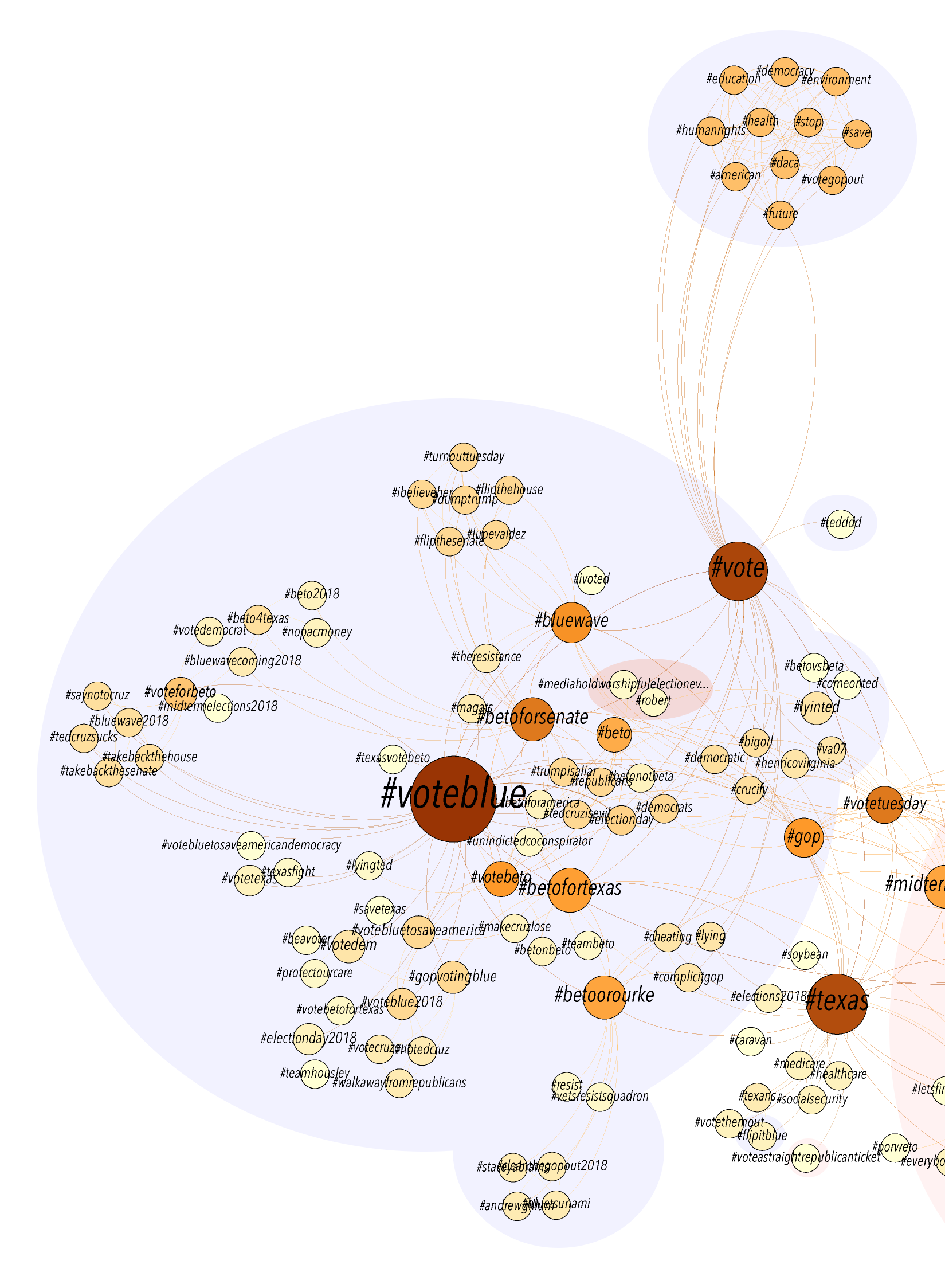
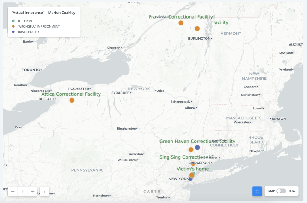
While the chronological order of the events surrounding his wrongful imprisonment remains unclear on the map, it at least gives a visual layout of the elements in the case and how far from home Coakley was as an innocent man going from prison to prison.
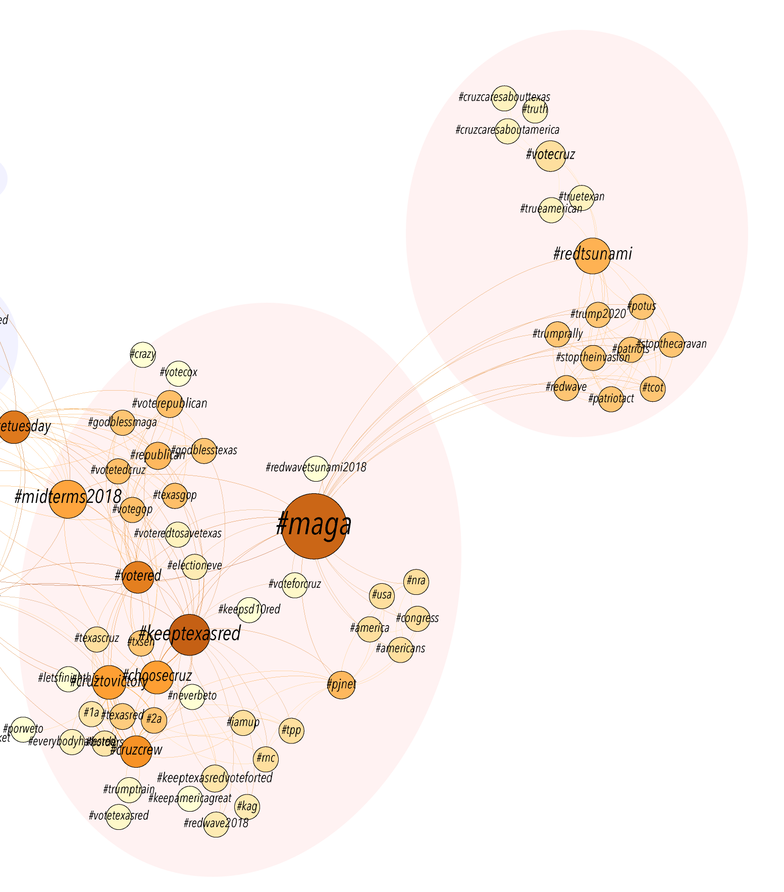
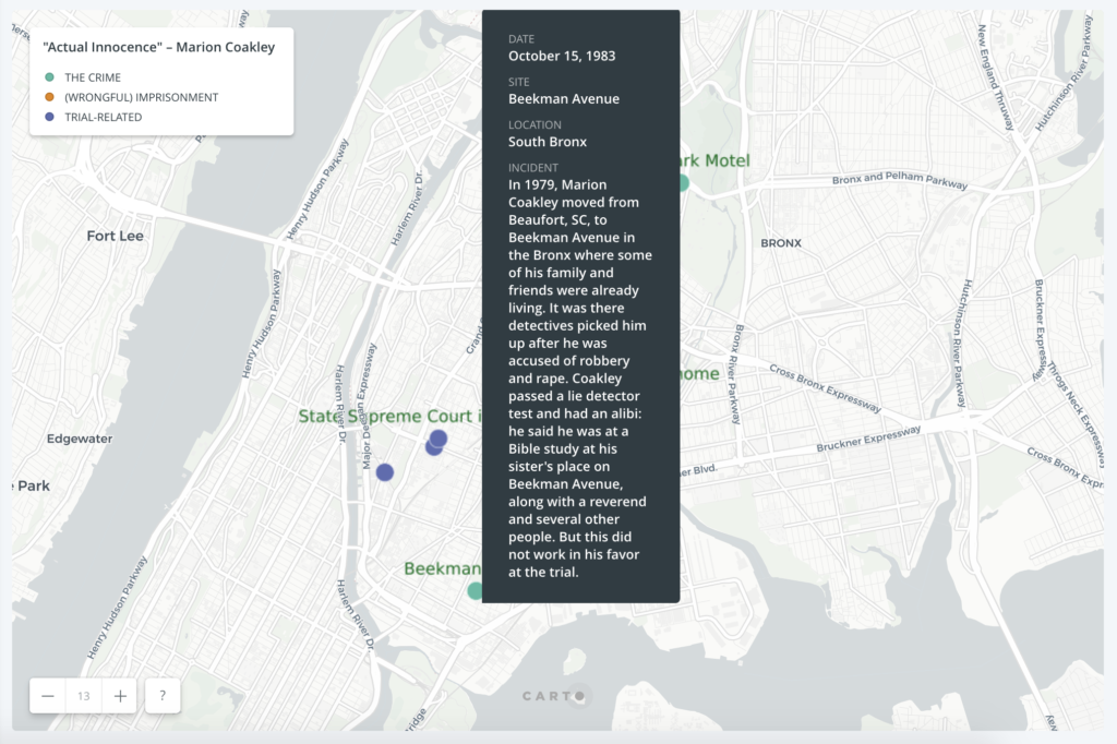
Another issue with mapping the story was that I could only pinpoint the sites that were specifically named in the text. A few critical parts of the story were left off the map such as the unspecified “police station” where the victims of the crime identified Coakley as the suspect through a photo (a photo that had stayed in the files despite that earlier case being dismissed). A NYC Open Data map put the motel where the crime occurred within the boundaries of the 48th police precinct but I didn’t include it on the map as I wasn’t completely sure that was the location of the station where the victims went. Another element that would require further research is whether any sites moved since the 1980s when these events took place. That was the case for the first prison Coakley was sent to, the Bronx House of Detention.

Additional ideas for the map that could be implemented in either Carto or other tools:

  • The dots would have a sequential order so that the viewer would start off on one dot and click a button that would take them to the next dot based on the date in the data.
  • An animated feature that would trace the chronological path in Coakley’s story by going from dot to dot, with a short description for each one.
  • Use different picture icons instead of dots for each location, which would give more of an initial idea of what the spot represents without having to hover over it. (As some of the other mapping assignment posts do using ArcGIS.)
  • Incorporate visuals (photos, legal documents, interview videos, etc.) either via a tooltip or a link that could add more of a human angle to the story.