This week’s class discussion really shed light on the different applications mapping can be used for, depending on the discipline. My group (“group four” for those of you who were in class) talked a lot about how maps can be used as a single entity that could represent a much larger amount of information (i.e. the text of a very long research paper). (However, please proceed with caution when considering using a map in this way.) Kriti also passed around a map she’s worked on that shows the stop and frisks of a particular neighborhood in New York City.
It was intriguing to look at maps in this way because as someone with a background in journalism, I’ve always thought of maps as entities that could enhance a story (as opposed to being designed to be looked at alone). I couldn’t think of any recent examples of maps used in journalism until I came across The New York Times‘ coverage of the explosive devices that have been sent to many of Trump’s critics.
Here are the two I’ve seen:
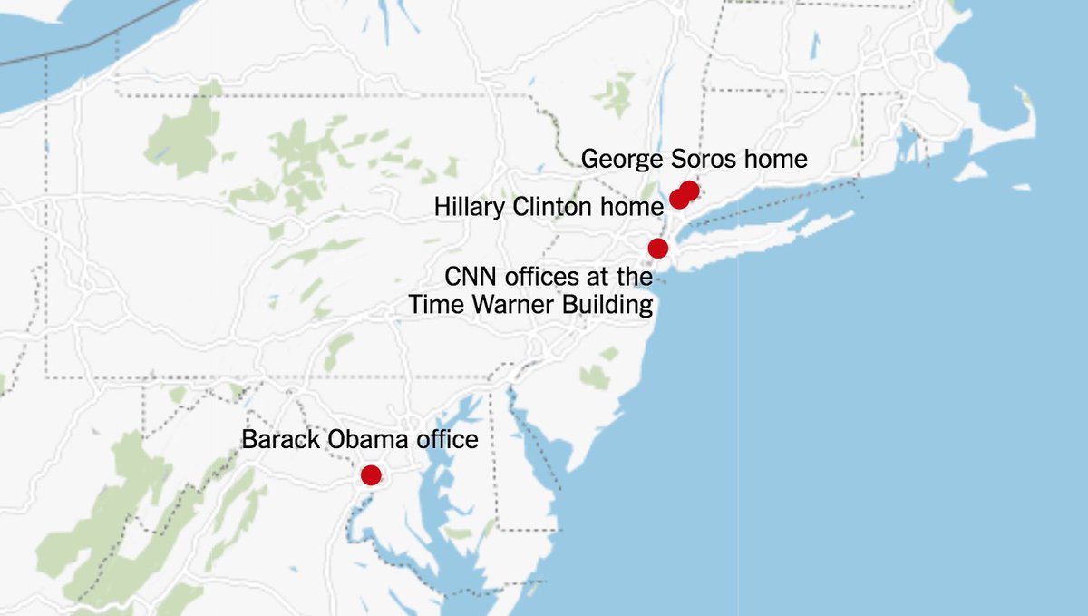

The first map was of course circulated very early into the news story, when suspicious packages were discovered only at George Soros’ home, Hillary Clinton’s home, Barack Obama’s office and CNN’s offices. It’s also clear that map was created on Google Maps, though I can’t point you to evidence in text because the article this map was originally in has since been updated with the second map. Here’s The New York Times’ article I’m referring to.
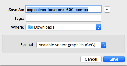
Before I continue, I also want to bring up the fact that the second map is from a screenshot I had to take because if I try inserting the image of the map from the image URL, it looks like this:

So, it seems like The New York Times overlayed the map itself and the text on the dots in a different way than I originally thought. Upon first glance, one might think the map — a combination of the outlined states, text and dots — was just a single image. When I tried to download the map as an image, I discovered it’ll actually save as a scalable vector graphics file:
Either way, I feel the maps used here were still for the purpose of enhancing the story. The reader gets to visualize where exactly these suspicious packages were found rather than reading “George Soros’ home, Hillary Clinton’s home, CNN’s offices, etc.” Because of the maps, we can easily see the distance between each of the places where these packages were found.
I’m doubtful when thinking that the maps here could represent the entire scope of the news story, however, and that’s quite alright too — that’s just not how I think maps can be used in journalism. I’m curious to hear about maps anyone else has encountered in news coverage though, and if anyone else has a different view of mapping in journalism based on their observations.
Mapping also seems to be a relatively new concept for journalists, so inevitably, news organizations with a lot more resources (such as The New York Times) appear to be part of the few that are actually incorporating maps into their pieces. Or, at least part of the select few that are using maps well. I don’t have any specific examples to point to, but when I was discussing this idea with my group, I brought up how journalists are trying to incorporate more infographics in general, and that often involves adding a chart or graph into an article. Sometimes these infographics are added without an actual purpose though; they’re essentially just there in articles for the sake of being there. I can see the same thing happening for maps.
Hi Sandy, I’m not sure if you’re only considering standard news coverage but interactive journalism pieces came to mind when I thought of effective ways in which journalists have used maps. Regular stories and breaking news stories are probably not going to use the interactive format since they take time to go through (and make of course) and are not always mobile-friendly, but with the stories that do, maps and other multimedia elements seem nearly as crucial to the presentation of the story as the text.
As newsrooms – at least those with resources, as you mentioned – adapt to ever-changing digital formats and new ways of storytelling emerge, in these cases, the definition of what constitutes an online news/feature story can start to evolve and perhaps so does the role of visuals.
A few examples that use and maybe even rely on maps:
– “Rio’s Killer Apps”: https://www.theglobeandmail.com/world/article-rios-killer-apps-how-brazilians-rely-on-crowdsourcing-to-stay-safe/
– “Harriet Tubman’s Path to Freedom”: https://www.nytimes.com/interactive/2017/02/24/travel/underground-railroad-slavery-harriet-tubman-byway-maryland.html
– “How the Army Corps’ Hesitation Nearly Destroyed a City”: https://projects.propublica.org/graphics/cairo-floodway
– “Navigating the invisible boundary and physical barriers that define the U.S.-Mexico border” (not exactly a news story but I thought it was a great use of the map): https://www.washingtonpost.com/graphics/2018/national/us-mexico-border-flyover
As for maps being used in regular news stories, one way to find them is to look at the Twitter accounts of a media outlet’s graphics department:
https://twitter.com/GuardianVisuals
https://twitter.com/LATimesGraphics
https://twitter.com/ECONdailycharts
The article itself remains of course the most important part of the story but perhaps as journalism adapts to the digital environment and technology develops, the capacity and role of maps and other visuals will change as well.