Author Archives: Sandy Mui

Final Project: “Nonprofit News Board”

Hi everyone,

You all already saw Jennifer and I present, but here are more details about our final project — in a blog post format. We also tentatively selected a name for our nonprofit news curation tool/website — “Nonprofit News Board.”

We are proposing the creation of the tentatively-named “Nonprofit News Board,” a website that will aggregate and curate the news produced by nonprofit media outlets. By gathering the links to their work in one location, and offering different ways of presenting the stories — including through the use of visualizations — we seek to facilitate access to and awareness of this sector, especially at a time when the news media in general face dire circumstances: financial insecurity, the proliferation of inaccurate information masquerading as news, newsrooms facing cutbacks and layoffs if not being shuttered altogether, and hostility from those in power. In the last 10-15 years, numerous nonprofit news startups emerged, in many cases to fill in the gaps left by the closing of many local newsrooms and produce in-depth, critical and nonpartisan coverage of government, education, health and other issues that serve the public interest. These outlets, many of whom represent a particular region of the country or focus on specific topics, aim to inform and educate readers.

Through building a structure that presents these kind of stories, we strive to spotlight and promote work that has undergone extensive research and verification. The site would serve as a remedy for the spread of misinformation and give visitors an innovative one-stop alternative to news that is produced by organizations driven by the need to turn a profit and to be the first on a story. Visitors will find in one location the not-so-breaking news; stories about the aftermath of so-called breaking news; and the investigations months and years in the making.

By driving traffic to nonprofit sites and ideally helping to establish a following for them, a greater number of people will, story by story, be better informed about the news they consume. We will examine sites that aggregate and curate the news and consider how to build on those examples to best produce a unique product in a time of heightened public awareness of the media industry.

While journalism and the humanities are considered two distinct fields, the principles of nonprofit journalism overlap with those of the humanities. At the core of both, practitioners engage in observing and documenting human societies and experiences through critical thought, research and communication. Through the study of arts and culture, the humanities inform students and scholars of the similarities of seemingly disparate people and communities, or at least encourage them to observe and understand societies and see the many sides of the human experience. In a similar fashion, the mission of most nonprofit media outlets includes giving a platform to the issues and voices often ignored by mainstream news entities. This can stir up empathy in readers and help them realize the experiences shared between different populations. In this regard, highlighting the nonprofit media sector effectively also promotes the principles of the humanities and establish connections between the two disciplines.
Mapping — from the context of journalism (and coverage of the pipe bomb packages)

This week’s class discussion really shed light on the different applications mapping can be used for, depending on the discipline. My group (“group four” for those of you who were in class) talked a lot about how maps can be used as a single entity that could represent a much larger amount of information (i.e. the text of a very long research paper). (However, please proceed with caution when considering using a map in this way.) Kriti also passed around a map she’s worked on that shows the stop and frisks of a particular neighborhood in New York City.

It was intriguing to look at maps in this way because as someone with a background in journalism, I’ve always thought of maps as entities that could enhance a story (as opposed to being designed to be looked at alone). I couldn’t think of any recent examples of maps used in journalism until I came across The New York Times‘ coverage of the explosive devices that have been sent to many of Trump’s critics.

Here are the two I’ve seen:

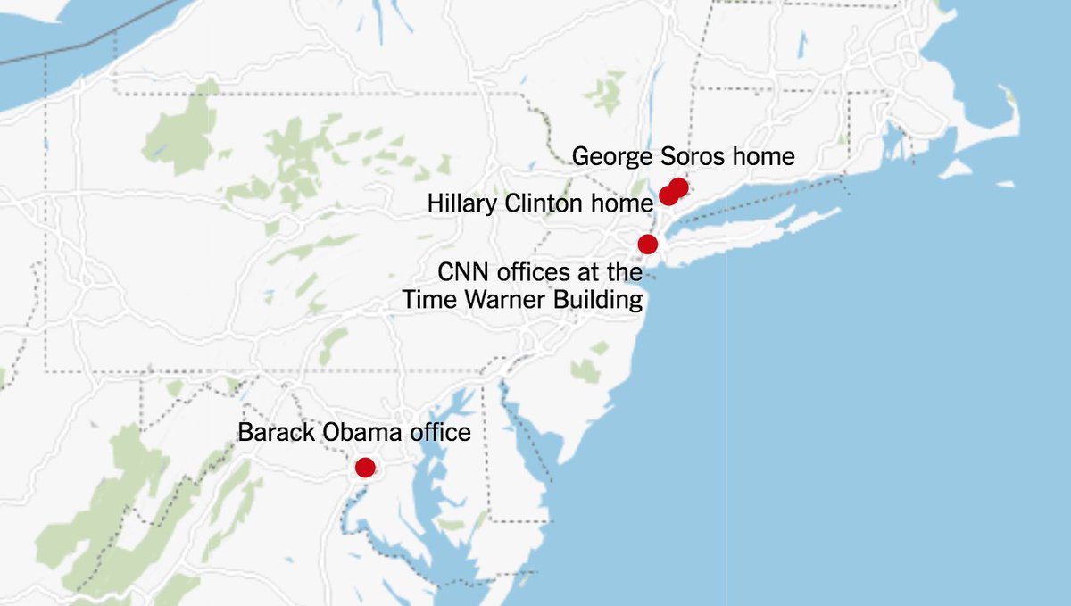
The first map was of course circulated very early into the news story, when suspicious packages were discovered only at George Soros’ home, Hillary Clinton’s home, Barack Obama’s office and CNN’s offices. It’s also clear that map was created on Google Maps, though I can’t point you to evidence in text because the article this map was originally in has since been updated with the second map. Here’s The New York Times’ article I’m referring to.

Before I continue, I also want to bring up the fact that the second map is from a screenshot I had to take because if I try inserting the image of the map from the image URL, it looks like this:

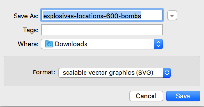
So, it seems like The New York Times overlayed the map itself and the text on the dots in a different way than I originally thought. Upon first glance, one might think the map — a combination of the outlined states, text and dots — was just a single image. When I tried to download the map as an image, I discovered it’ll actually save as a scalable vector graphics file:

Either way, I feel the maps used here were still for the purpose of enhancing the story. The reader gets to visualize where exactly these suspicious packages were found rather than reading “George Soros’ home, Hillary Clinton’s home, CNN’s offices, etc.” Because of the maps, we can easily see the distance between each of the places where these packages were found.

I’m doubtful when thinking that the maps here could represent the entire scope of the news story, however, and that’s quite alright too — that’s just not how I think maps can be used in journalism. I’m curious to hear about maps anyone else has encountered in news coverage though, and if anyone else has a different view of mapping in journalism based on their observations.

Mapping also seems to be a relatively new concept for journalists, so inevitably, news organizations with a lot more resources (such as The New York Times) appear to be part of the few that are actually incorporating maps into their pieces. Or, at least part of the select few that are using maps well. I don’t have any specific examples to point to, but when I was discussing this idea with my group, I brought up how journalists are trying to incorporate more infographics in general, and that often involves adding a chart or graph into an article. Sometimes these infographics are added without an actual purpose though; they’re essentially just there in articles for the sake of being there. I can see the same thing happening for maps.

Mapping Shawn Mendes’ tour locations

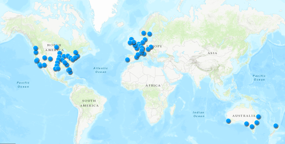
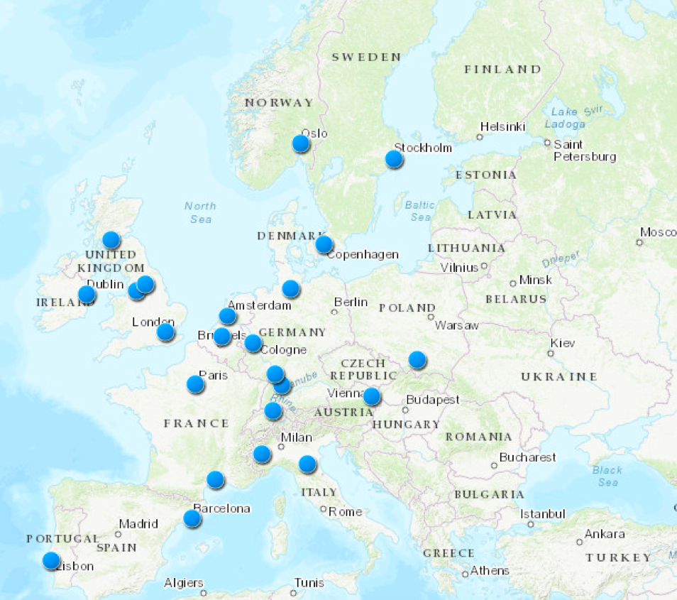
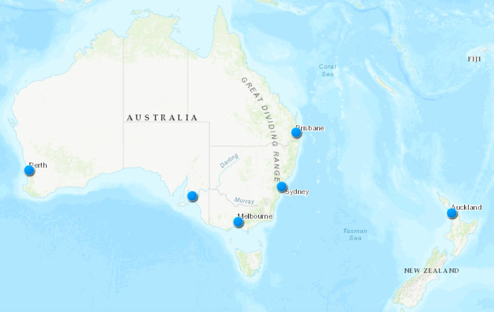
For my mapping assignment, I chose to map Shawn Mendes’ tour locations because I love Shawn Mendes and was curious about what all his tour locations would look like on a world map. There are a few things I want to comment on regarding my experience mapping these locations on ArcGIS. I attached screenshots above, but you can view the interactive map on ArcGIS here.

Breadth of data inputted on ArcGIS

I expected it to be relatively simple to map all of these locations since Mendes has all his tour locations, with each location’s respective venue, on a single webpage. However, as I was doing the assignment, I realized this came with the assumption that ArcGIS would be similar to Google Maps and just be able to match a venue’s name with its respective location on the map.

For the most part, I tried to construct the map using the names of the venues because that was more convenient, given the webpage already had each venue’s name next to the tour dates, so I wouldn’t need to open too many new webpages. I didn’t run into too many problems while doing this for the venues in the United States — aside from the fact that multiple venues across the United States have the same name, which was easily solved by lining up the venue name with the correct city/state. International tour locations were much trickier… I guess ArcGIS might have less data for locations outside of the United States? It was also somewhat confusing for some venues that had multiple addresses on ArcGIS; I believe this was occasionally the case because all of these venues are rather large, and the differences in these addresses may have represented different parts of the roads or intersections that these venues occupy.

Using venue names as opposed to “more precise” addresses

When ArcGIS was unable to recognize a venue name (as I pointed out, this was mainly the case for international locations), I decided to take an extra step to get these locations on the map. This just involved going on the RSVP page of the respective event or using Google to find the specific address of the venue. That made me wonder whether I was actually messing up the preciseness of my map by mostly using the venue names, as opposed to addresses, to pinpoint locations on ArcGIS. Of course, I began regretting not opting for route of using the “more precise” addresses once I ran into the problem of a venue having numerous addresses on ArcGIS.

Are the locations that are attached to these venue names, the same as the venues’ actual addresses? That depends on the inner mechanics of ArcGIS, so I don’t have a concrete answer to that question.

Layers on ArcGIS

I’m not entirely sure why this happened, but my map is composed of two layers, “Map Notes” and “Map Notes 1.” That was not what I intended to happen; I didn’t want any layers at all, and I didn’t try to build the map around layers. I do believe that this somehow happened because I didn’t make the map all at once; I saved the map to save my progress at some point and then continued my progress a little while later. (When I tried to save the map again after resuming and finishing my work, I actually had to rename the map because it couldn’t save my new progress to the map that was made from the initial “save.”) It’s more of an inconvenience if anything, since I don’t want anyone looking at my map to go to the “Contents” tab and think the two different layers actually mean anything.

Moving further with more time and more familiarity with ArcGIS

Though I ran into this “layer” problem, I do see some ways it could be helpful to use layers. For example, I could’ve used different layers to map out Mendes’ tour locations in a specific month (i.e. one layer for April, one for May, and so on).

I also thought it would’ve added an even greater visual element to draw arrows to map out Mendes’ tour from location to location. The map I created is just a bunch of dots on a map with no context, and the context could’ve been improved if there were arrows drawn from location to location and/or layers to separate out tour locations by month.

NYC Media Lab’s Demo at Exploring Future Reality

Hi friends,

Here’s another opportunity at NYC Media Lab. You can apply to demo or register to attend.

NYC Media Lab will partner with university labs, media and technology executives, and startups from the CIty’s innovation ecosystem to bring 30 demos to Exploring Future Reality. Demo participants will receive complimentary admission to the event, which will host relevant discussions and ample networking opportunities.

DEADLINE: ROLLING UNTIL FRIDAY, NOVEMBER 9. APPLYING IN EARLY INCREASES YOUR CHANCES.

Computers (and algorithms) as… objective entities?

The title of this post was originally going to be “Computers as… objective machines?” but since Stephen Ramsay’s Reading Machines: Toward an Algorithmic Criticism focuses on algorithms, I had to change up the noun just a bit. I wouldn’t consider algorithms to be machines, but after typing out the title of the reading, that’s another interesting thought.

Ramsay opens up the text, specifically in his “Preconditions,” by setting the scene with the idea of computers as objective machines:

“Against this view stand those who regard computers in the humanities as providing a welcome relief from the radical skepticism of contemporary humanistic thought. Here, after all, is a machine that not only gives answers but demands them—a device that is wholly intolerant toward equivocation and uncertainty. In this view, the computer represents an emancipation from the ironic imprisonments of postmodern excess. Even without supposing that computation leads toward (or even begins with) objectivity, some see it as a way to get beyond the beached solipsism that characterizes modern discours and toward its right and proper end in raison.” (page ix)

What interested me about this excerpt was not that the idea was new to me, but I realized I had not really given much thought to how some people and institutions have come to the belief that algorithms could also be objective entities. It all began with computers themselves, though that’s another intriguing idea in itself. What exactly does it mean for computers to be objective machines? Does that include computers’ pre-installed applications and the intricacies of the applications themselves? I actually can’t remember the last time I used a computer solely for its pre-installed applications because as far as I can remember, a computer and the Internet have come hand-in-hand — even if the Internet connection was as slow as a snail. What I’m trying to get at is I just can’t place my finger on what exactly encompasses computers when it comes to this idea that computers are objective machines.  

Next, while Ramsay discusses algorithms in the context of text analysis, I want to bring up damage that algorithms have been responsible for in other contexts — especially in education systems. I suppose this is my “algorithmic criticism” of education systems (thanks Ramsay!). Weapons of Math Destruction by Cathy O’Neil is a very good book I read last semester that discusses the shortcomings of algorithms in many different contexts. In one chapter, O’Neil writes about how many college admissions offices use algorithms to rank students and predict their behavior, which isn’t an idea that should be new to anyone. You can read the relevant excerpts from Weapons of Math Destruction in this article, but some of the quotes are below:

“Enter the age of big data. Recently, college admissions offices have begun to use algorithms that work on an individual-student basis to profile and predict their behavior. They use social media data, as well as the data supplied by the applications, to compute the likelihood a given student will enroll if accepted, the extent of financial aid needed by the student—or needed to seduce a relatively well-off student—and the chances that student will graduate. It’s the big data version of the exact same game, with the exact same goal: to increase the college’s ranking.”

“What about poor kids? There’s an algorithm for that. The College Board website has a matching algorithm to pair high school students with suitable colleges, and it’s free. This could be a useful tool for many. But the college readiness advisors I interviewed said their inner-city students are almost entirely paired with expensive for-profit universities, the diplomas of which have been shown to be no more useful in landing jobs than high-school diplomas.”

“The college admissions process has become a minefield, and the current algorithms are the mines. If we are to regain control over our education system, we need to do better, and that means a better definition of quality education, with an eye on containing costs. We can start by demanding college rankings, for example, that are tailored to our needs and that take into account cost and future debt loads. The U.S. Department of Education’s College Scorecard is a great start. Big data can help but only if we scrutinize the algorithms instead of unquestionably following them.”

I want to end with a quote from Ramsay’s Reading Machines, since I feel it encompasses all the shortcomings of algorithms regardless of context:

“If algorithmic criticism is to have a central hermeneutical tenet, it is this: that the narrowing constraints of computational logic—the irreducible tendency of the computer toward enumeration, measurement, and verification—is fully compatible with the goals of criticism set forth above.” (page 16)

Similarly, as we saw last week when reflecting on our text mining praxis assignments, many of us ended up doing more of a close reading — when the goal/expectation was distant reading — because it was nearly (if not completely) impossible to determine the context of the words without inserting ourselves into the text mining process. The human factor inevitably cannot (and should not) be completely eliminated.

NYC Media Lab Prototyping Challenge

Hi everyone,

Thought some of you might be interested in this new prototyping challenge NYC Media Lab launched.

Havas: The Future of NYC Transportation

Application Deadline: Friday, November 16th

Havas is a company devoted to building meaningful brands and meaningful experiences. While big brand campaigns are needed, we also strive to make a positive impact on real people’s lives and better our communities through building experiences. Impact comes in many forms. It could be utility, inspiration, or support. And a little can go a long way. Key is to be alert to shifting needs and proactively offer solutions and support when they are needed most.

This year, we’ve chosen to focus on a topic that impacts all of us New Yorkers—the Future of Transportation and the role technology can play to support upcoming needs. Havas will partner with NYC Media Lab to launch an open call for NYC universities to imagine the future of transportation in cities:

Guiding Questions:

  • How will technologies like artificial intelligence, machine learning and computer vision shape the future of transportation in cities?
  • How will data and technology transform how we experience, access and move within cities?

Challenge Areas:

  • Challenge Area 1: Supporting Growing Commuter Needs
  • Challenge Area 2: Improving City Transit Efficiencies
  • Challenge Area 3: Helping Businesses Embrace Change and Prepare for Future Demands

More details here:

https://nycmedialab.org/projects/2018/9/27/havas-the-future-of-transportation-in-cities

Text Mining: Three Articles About Facebook

For the text mining praxis assignment, I decided to text mine three articles about Facebook. I had found these articles for an assignment in another class, “Media Literacy,” in which I had to select three clips to see how Facebook is portrayed in the news. These are the three articles I picked:

That same week, Facebook had a huge security breach that affected 50 million years, so needless to say… the coverage wasn’t exactly good. (Then again, when was the last time Facebook’s portrayal in the news been good?) And, all three articles I picked came in light of Facebook’s security breach, so it was likely referenced in some way.

My conclusions from this little “scavenger hunt” for Media Literacy were essentially how Facebook has a very negative light cast on it based on its coverage, and the abundance of negative coverage of Facebook makes it difficult for readers to know at a specific moment in time what exactly is going on with Facebook. With this text mining exercise, however, I wanted to see if there were any commonalities between the three articles I had chosen, as well as what may have been distinct about the topics each article covered.

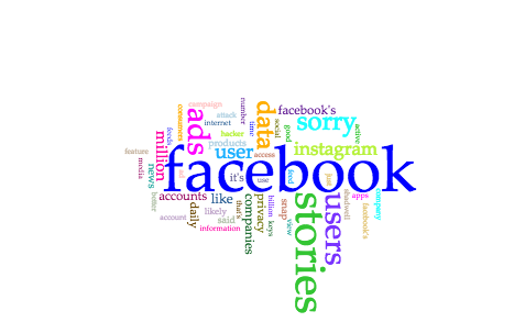
Obviously, “Facebook” was the most common term in all of the articles…

Many of the other common terms, however, were very distinct to a particular article. For instance, you can see the term “stories” is rather big in this Cirrus view — that term only appeared in the article “Facebook Is Cannibalizing Itself.” Upon further investigation (in other words, simply looking back at that article), the piece focuses on Facebook Stories and how they compare to similar features on other social media platforms, so it’d make sense the term “stories” appears specifically for that article. “Sorry,” another big term on the Cirrus view, obviously applies to the article “Sorry, not sorry.”

In terms of what all articles had in common… not much. The terms “data” and “users” appear in all articles, but there were a few different contexts in which these terms were used. (Note: “user” in singular form is also a term on the Cirrus view, but it appears in only two of the three articles.) “Data” was only referenced once in the article “How Facebook Was Hacked And Why It’s A Disaster For Internet Security,” and it seemed to only be used as an afterthought. It came in the last sentence:

“They almost certainly DO do a better job securing sensitive data than a zillion small sites wouldBut when they get breachedit’s a catatrasophe of ecological proportion.”

It surprised me that the term “data” would only be used once in this article since in my mind, the terms “data” and “security” come hand in hand. On another note, you see the term “privacy” in the Cirrus view as well, right? That term was distinct for the article “Sorry, not sorry,” another surprise to me.

I’ll end with some context about how the term “users” was used in each article. The obvious might be using the term when referencing the amount of users on the site, which was certainly the case.

Next came the Cambridge Analytica news — a massive data privacy scandal that affected 87 million Facebook users.” (“Sorry, not sorry”)

“Facebook (NASDAQ:FBnow has 300 million daily active users (DAUson Messenger Stories and Facebook Stories.” (“Facebook Is Cannibalizing Itself”)

Facebook dropped a bombshell on Friday when it revealed an unknown hacker had breached the sitecompromising the accounts of 50 million users.” (“How Facebook Was Hacked And Why It’s A Disaster For Internet Security”)

The rest of the context of the term “users” in these articles pertained to these users taking specific actions on the platform. For example, from “Sorry, not sorry”:

“Gizmodo reported this week that Facebook allows its advertising partners to target a Facebook user by their phone number  — where users gave Facebook that phone number for the implicit purpose of enabling 2FA account security.”

There wasn’t much that was similar between all three articles’ use of the term “users,” which is a reminder of how important context is when text mining. This might’ve been a text mining of rather uninteresting results, but I was excited to get my feet wet with Voyant and have realized that there’s much more work to be done than just recognizing common words that were used in all sets of texts.

Blog Post: Continuing the Conversation About Collaboration vs. “Ownership”

So, we’re one introduction class and two (official) classes into the semester, and we’ve pretty much established that collaboration is highly encouraged in DH. Not sure if “ownership” is the right word for me to input in the title, but I’ll just go along with it. Feel free to help me find a better term as you read through this post and interpret what I’m trying to get at.

In this week’s class, we discussed what exactly it means to “collaborate” for DH. I brought up my experience at the NYC Media Lab’s 2018 Summit that Anca and I attended, where my group at a particular workshop spent more time educating each other about the intricacies of artificial intelligence (AI) since not many of us were too familiar with AI. Now, thinking about my example in retrospect, that’s great and all from the context of just sharing ideas and helping one another understand different perspectives, but how do we bring that to the context of an actual project?

I thought about this some more after class and realized that collaboration is actually embedded in many fields that involve the use of writing and/or digital media, but the difference here is it’s less recognized as collaboration. Naturally, as a journalist and emerging digital campaigner, the following examples I’ll provide are in those contexts.

A news organization that actually has a newsroom of some sort will likely have a lengthy editorial process for each article prior to publication. The Excelsior, one of Brooklyn College’s student newspapers, looks something like this:

  1. A writer submits his/her article to a section editor.
  2. The section editor edits the article and forwards the article with new edits to a copy editor.
  3. The copy editor edits the article and forwards the article with new edits to the editor-in-chief or managing editor.
  4. The managing editor makes the final edits.

I’m sure even larger organizations like the New York Times would have an even more complex editorial process, but you can see that this — journalism — somewhat involves collaboration. I italicized “somewhat” because if we’re looking at the process from the standpoint of sharing ideas and new perspectives (like in my example from NYC Media Lab ’18), that part is missing unless the writer actually sees each step of the process and is able to learn from the edits made at each step. And, as I hinted at earlier, in the big picture, this isn’t really recognized as collaboration. The writer will get the byline that goes with the article that has all the final edits, and there will be no mention of all the editors involved — aside from their names being listed on the masthead of the publication. Still, I do view journalism as a collaborative field, and l’d argue journalists can’t become better journalists without all of this collaboration.

In terms of digital campaigning, it’s very similar. I intern on the digital team at Everytown for Gun Safety — “Everytown” for short — and occasionally help draft email campaigns. Obviously, as an extremely beginner digital campaigner, I can’t just write something and have it sent out to the masses. There’s a very long approvals process that begins with the campaigner I wrote the draft for, reviewing my work and explaining to me why he/she made the changes he/she did.

I’m often told that this kind of work I do at Everytown will help build my portfolio of email campaigns I’ve written, but sometimes I stop and think: Did I really “write” this? It’s not that the email I draft looks so drastically different after a full-time digital campaigner makes changes, but there are some intricacies and details I may not be familiar with for a particular state or campaign since I’ve only been at Everytown for a few months. My missing familiarity often leads to very specific changes in the copy of the email campaign, and sometimes I think presenting the final email campaign that’s sent out as my own is somewhat misrepresenting what is actually my work. And, as someone in class brought up, it’s not such a simple process of pointing to which paragraphs in the final product were what I wrote… because that’s just not what the collaborative process entailed.

Maybe “ownership” is the right word then, because I’m trying to figure out what exactly I can call as my own.