So for my praxis assignment (after spending an extensive evening trying to understand and figure out Gephi) I decided to go with Palladio, the engine developed by Stanford University. After playing with the provided sample dataset provided n Palladio, I encountered the frustrating issue of finding a dataset that I wanted to work with and worked in Palladio. The initial set I wanted to use was not available in the form of a comma separated value file (.csv), so I had to keep looking. This is when I found www.data.gov, which provided over 18,000 datasets from our area alone. Now that I was in a dataset wonderland, I had found more than several interesting data topics I wanted to work with from disability to car accident statistics. However, this is when I ran into the final pothole in the road to success with this praxis assignment. The sheer size of the dataset played heavily in my ability to use. Plugging in a dataset with well over 4,000 brackets of data tended to cause Palladio to crash entirely. Given Palladio is an open-source digital tool, I’m sure its power to remold datasets only goes so far. Finally, I found a dataset that came in the proper format and was a reasonable size to plug into Palladio.
I decided to work with a dataset titled Hate Crimes by County and Bias Type: Beginning 2010, based on New York State counties. Being someone who fits into several different marginalized communities, this was something I was especially interested in. I was born and raised about a couple hours north of the city in Ulster & Dutchess counties. However, growing up I also spent a lot of my time with family down here in the city, so knowing about these two different cultures and lifestyles I was curious to know the difference in terms of violence against these people labeled as “other.”
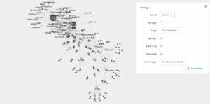
I mainly utilized the graphing feature on Palladio. This feature divides the source subject into nodes, and then they connect them to the target nodes in order to represent connections in the dataset. Before diving into specific the counties, I started by showing the correlation between hate crimes against properties versus hate crimes against individual people/groups of people:
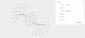
Crimes Against People Vs. Property Crimes
This was where I first learned something thanks to the visualization of the data. Notice how the connection between the nodes create a bowtie-like image, it shows that there is a great amount of overlap between these property crimes and crimes against people themselves. This is not something I imagine many people would take the time to scour through the dataset and mark down these similarities, so having this software where you can plug the data in and have it spit out a visualization like this is incredibly useful.
So another common issue I decided to look into before tackling individual counties was crimes against religious practice. We live in a post-9/11 society, and as a result, there is an unfortunately extreme level of prejudice against those within Muslim communities. So first I went ahead and searched the total incidents of hate crimes against religious practice as a whole, followed by specifying hate incidents towards Muslim practice:
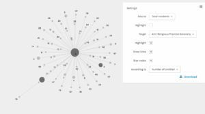
Total Incidents of Anti-Religious Crimes
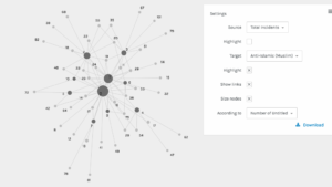
Total Incidents of Anti-Muslim Crimes
In comparing the numbers as well as the intensity of the nodes, we can see that there are many general hate crimes against religious practice as a whole, but if you look at the following graph that focuses primarily on anti-Muslim hate crimes you will see that a truly astounding percent of the religious hate crimes are against Muslim religious practice. This obviously reflects off of what I previously mentioned about the existing prejudice, and it validates that statement.
Alright, now for the New York State counties. For starters, I decided to look into the total number of hate crime offenders versus the number of hate crime victims:
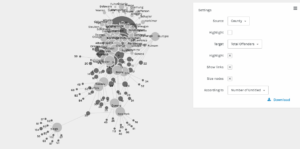
Total Number of Offenders by County
Total Number of Victims by County
Interestingly enough, you can see by the large cluster of engorged nodes in the offenders graph that there are a significantly higher number of offenders than victims. This is because a hate crime does not always mean physically damaging a person or group. So we can see that this significant gap between offenders and victims signifies that hate crime offenders are practicing in much more subtle ways such as only serving/hiring people within a specific demographic, intentionally excluding others.
One issue I did run into while going through this process, was a strange inconsistency in the statistical graphs for anti-gay hate crimes that took place. Below I provided the total number of incidents involving hate crimes against the gay community, and the counties where these hate crimes took place:
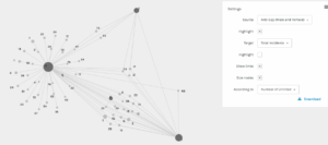
Total Number of Anti-Gay Hate Crimes
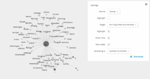
Counties Where Anti-Gay Hate Crimes Took Place
According to the first graph, there were a staggering number of incidents in terms of anti-gay hate crimes between 2010 and early 2018. However, in looking at the specific counties, it is showing it only took place in a few different NYS counties. There could be a misconnection with the data somewhere, but I am incredibly novice at this so I am not sure where. That or a disturbing amount of hate crimes took place in only several counties.
The last example I’ll provide shows anti-black hate crimes across New York, and I think it gives up some perspective on historical events:
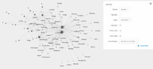
The Number of Anti-Black Hate Crimes
Thanks to this visual, we can see that a lot of the anti-black hate crimes take place on the southern end of New York State. Historically, there are tensions between inner-city communities and those of suburban communities such as Westchester County and Yonkers. Upon ideas such as public housing entering these suburban communities, their development was met with a lot of backlash provided by Italian and Irish citizens. This was primarily an issue when the country was still slowly desegregating, but these issues still run rampant today (as you can see by the visualization) and can be seen between New York City burrows and suburbia.
In the end, I thought this was a pretty neat little experiment to get a feel for these visualization tools. One day I will conquer Gephi, but today I am satisfied with my accomplishments regarding my analysis of this dataset using Palladio.
Which were the counties that Palladio claimed were the locations for almost all the anti-gay violence?
Dax,
Palladio pointed the anti-gay crimes to Suffolk (the largest number), Cortland, Nassau, Albany, New York County, and Queens (from what I can tell).
I couldn’t make heads or tails of Gephi until I looked for tutorials on YouTube. I found this one to be enormously helpful: https://www.youtube.com/watch?v=HJ4Hcq3YX4k
Very cool idea, Anthony! I’d love to hear more findings!
To build on Nancy’s point, I watched a quick tutorial that she posted and then started reading through the add ons list. Just reading the add ons descriptions was an education in the Gephi’s uses and limitations. Definitely a complex set of functionalities — and not a lot of time to learn them. I think the Goldstone piece brings this up: focusing on technical skills can take up all your time. It would be nice to have a data set — via Goldstone, with data already curated to show impactful results –all ready to go for one of these praxis assignments. I did spend most of my time again on the technical side.