Author Archives: Kiana Carrington

Final Project: A Call to imagine

How do we transcend cynicism to embrace hope and love in our politics during these tough times? How do we help this generation of organizers consider not only what they are fighting against but what they are fighting for?  These are the guiding questions of my digital humanities project proposal. For the final project, I proposed a website that is open for people to imagine the world of their wildest dreams, where they are truly free, consider the steps it would take to reach that world, and find local resources to aid in the journey toward that freedom dream. Freedom dreaming as I have defined it is the act of first envisioning the future you want to see and second contemplating the steps it will take to get to that vision. I hope for this website to be a community space where people can share ideas and resources to help get us all to a better tomorrow.

The website will be made with undergrad and high school students in mind and have three main components. The first would be selected texts from POC radical thinkers of the past. Themes will be pulled out through text analysis to serve as inspiration for visitors to the site. Second, is the social media aspect. Visitors to the site will be invited to share their freedom dreams on Twitter. Given a longer period of time I would look into using instagram to include visual and sound art, but given time constraints of a semester I think it will be best to stick with text. The third component will be a section with online resources and local organizations that can help people realize their freedom dreams.

Guiding principles that  I will keep in mind as I create this website are as follows:

  • Freedom Dreaming means actively uplifting the intricately connected and complex lives and stories of Black, Brown, Indigenous, Asian/Pacific Islander, Latin/os/as/x, Arab, Middle Eastern and Multi-ethnic people
  • Freedom Dreaming is about affirming and respecting all levels of ability, gender identity, sexuality, age, stages of healing, and socio-economic class
  • Freedom Dreaming is about connecting people and communities to create shared visions with one another
  • Freedom Dreaming means acknowledging and harnessing your own intrinsic power and expertise
  • Freedom Dreaming is about listening deeply while unlearning harmful ideologies and ideas

I think working on this project will prove both interesting and challenging. Thankfully there are resources on how to create accessible website that any user can use regardless of how they access the internet. I also had the idea while writing the proposal that something that might be interesting once the Twitter feed gets populated is text mining those posts using the Twitter API to see if any themes come out of it. I have no idea what it will show but I think it could be an interesting way of looking at what people feel are important topics that need to be discussed and things that are broken in our society that need to be fixed. It might also be good to compare and contrast our freedom dreams today with those of previous generations.

Network Analysis Praxis: An Attempt at Happiness

I had a bit of a hard time choosing a data set. I started looking at datasets for topics that are related to current events and politics, which just made me sad. Stumbling across this dataset on happiness and alcohol consumption was a nice relief. I started off  thinking of it as people partying and having a good time over the idea that alcohol consumption can also be a symptom of darker circumstances.

I found this website called Kaggle. It is a website that runs many data science competitions. It’s free and includes many datasets that have been put together by its users. Some of the data sets are managed by Kaggle and some are updated periodically by the people who upload them. You can search data sets by topic, popularity, date it was uploaded, and many other criteria. You do have to create an account with them to access the data sets. I just logged in with my Google account, and agree to not cheat in their data science competitions.

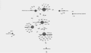
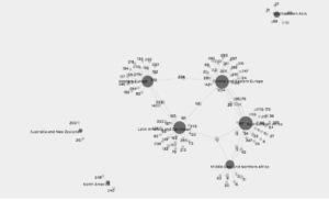
While looking through their data sets I found one on happiness and thought it would be a great topic to look at. The dataset included the human development  index, alcohol consumption per capita by type of alcohol, GDP and Happiness Score (from the UN report) of 122 countries. The question I was interested in answering was is there a relationship between alcohol consumption and happiness. I decided to look at this by region because it would be easier to study than to look at a graph with each individual country. It was when I looked at my first graph that I realized big my mistake. Naturally some regions have way more countries than others. This skews the data because regions with more countries will seem happier than smaller ones. It made me think back to our class discussion about quantitative methods. Maybe I might have thought about this sooner had I known how to decide what data I use and how I use it. I can’t say I’d sign up for that class, but an introductory unit could be useful. I decided to try my search by country. This approach resulted in one big circle of data. It did help me understand how the source and target work as well as give a more accurate depiction of the answer to my question.

The images I’ve added to this post show the relationships between type of alcohol consumption per capita and region. Wine drinking has the most connections between regions. That being said the relationships are around how little people drink wine. 

Venezuela has one of the highest beer consumption per capita at 333. It made me wonder about the factors contributing to that number including political turmoil, violence etc.  Also why beer? Is it because of price point? More readily available?

Spirit consumption connections were at higher numbers than beer and wine. I think it’s because certain spirits can be made using local ingredients like rice for example. It would require closer analysis but the idea seems plausible. 

All in all, my network analysis was not the best, but it raised questions which is part of the point of the exercise in the first place.  It shows correlations we expect and those we don’t prompting questions for further exploration. I get very far on my quest for happiness, but I think the journey created much for meaningful questions to explore.


Praxis Assignment: Mapping My Recently Played List

I like to think I listen to music from a range of artists around the world, so I thought I’d test the theory. I used my recently played list on iTunes to see how true this is. I started with a month of music but it was way too large so I limited the list to the last two weeks. It included 59 songs. I listened to two full albums, so the number of artist on the map is way less than. If I listened to multiple songs from the same artist I put my the one I like most that was on the recently played list.

Picking criteria was a bit difficult. Questions I had to consider included deciding whether to use where someone is working now or where a person was born? How am I showing difference between music genres? Can I get sound in here somehow?

In the end I decided to go with the birthplace/hometown. My data comes from wikipedia. For some artists I couldn’t find a city. This happen for a couple African artists and newer American artists. For those I dropped the pin in the state they are from. My little exercise  yielded a few surprises.  For example, Yaeji is a musician that makes electronic music that uses a mix of Korean and English. I thought she was making music in Korea but it turns out she is based in Brooklyn. I did this project using a larger dataset to start (then got super tired and narrowed my list) and some of my favorite Afrobeat and Soca artists were actually from the U.S. and England. This trend got me thinking about heritage, culture, and what things (food, music, ideologies) we adopt from our parents. I wanted the map to be somewhat interactive, so I added the links to the songs in case anyone wants to take a listen. The pushpins have youtube links to the songs.

Overall I think my experiment went pretty well. The only continent I missed was South America. I invite people to take a look and a listen sometime.

Legend: Purple pushpins: R&b, Blue pushpins: Mellow/sleepy time, Green pushpins: Hip hop, White pushpin: Afrobeats, Light Blue pushpin: Electronic, Red pushpin: Rock, Pink pushpin: Pop;   Yellow stick: Songs I thought people should check out by upcoming artists

View Map


Uber, Kanye, and the Jamaican Slave Revolt of 1760

I think I need to start with a quick shout out to the Uber driver that inspired this blog post. It all began with a ride to work that quickly went south when my Uber driver went on a rant about blackness in America. The lecture spanned many different topics and ended with her explaining to me that Kanye was indeed correct, slavery was a choice and slaves in The United States chose to remain in bondage long after her ancestors fought for their freedom in Haiti. Now there are many reasons why slavery was different in these two regions that I could have mentioned, but this all occurred before my Friday morning dose of caffeine. I had neither the energy nor the desire to engage. It did, however, lead to an interesting conversation with coworkers on the topic. In that discussion one major reason I cited for success in Haiti was the difference in geography between many Caribbean islands and the American South. Although these maps were not created to argue for or against people’s opinions on slavery, I thought it was an interesting way of telling a story that is often overlooked.

After reading the Monmonier How to Lie with Maps piece I took a look at the Slave Revolt in Jamaica 1760-1761 and the Atlas of Historical Geography of the United States mapping projects. It was interesting to see how the two projects tried to correct the pitfalls that map makers can fall into. The atlas used computers to their advantage to fix map projection issues with their digital georectified maps. Both maps were able to add a lot of background information in the text section that is unavailable when looking at a map on paper.

I found the Jamaican Revolt of 1760 project to be more transparent about their process. This could just be because of content. The atlas is more a digital representation of empirical data, wheres as the revolt map is trying to recount a historical event. This could also just be an example of two different kinds of mapping projects. The atlas digitized and enhanced 700 pre existing maps whereas the Jamaican revolt map was created from other maps and first hand accounts of a historical event. The makers of the revolt map were very aware of uncertainties in their project. For example, the map can only represent space and time from the slaveholders’ point of view and accounts of the skirmishes often varied greatly. They also share reasoning behind the design of the map and why certain elements like the faded dot that moves to chart the possible path of rebel forces were chosen.

All in all this was a great exploration into what forms digital mapping can take, as well as adding to my memory bank for the next time my Uber driver goes on a rant.

Research for MALS Students

I too went to a workshop this week. Instead of learning about my digital identity (although I will say Sean’s post did prompt a google search of my own) I learned about research resources at the Graduate Center. The library had a Research for MALS Students workshop this past Tuesday. .

I studied new media prior to getting to the Graduate Center. Towards the end of undergrad, my work was focused more on practical skills than research, so I thought this would be a good place to start now that I’m in a more research based field of study. Also, I was luckily in a group that participated a lot so I got a few pro tips from my fellow students which is always a plus.

This workshop covered the whole of researching including finding a topic, methods for searching and evaluating source material, and ended with citations and paper formatting. The workshop was led by Steven Zweibel,  who is the reference librarian for the digital humanities program. Fun fact all the tracks at the graduate center have designated reference librarians. I’m sure this info will be super helpful in the not so distant future.  

We spent a little bit of time talking about the attitude towards research in undergrad versus graduate school. In undergrad you’re often told not to do research on the same topic while the whole point of doctoral and graduate research is to focus on a topic and build expertise in the area of your choosing. I knew that already, but the way it was framed in this context hit in a way I hadn’t realized before. 

Overall, I thought this workshop was a great intro the the resources available at the GC.  I’ll close by sharing a few tips I picked up in the workshop that I thought could be useful for others.

Tip 1: The following exercise is a good way to concisely think through your paper/project.

  • (Topic) I am studying _____ (Question) because I want to find out what/why/how ______ (Significance) in order to help my reader/user understand _____.

Tip 2: Save time figuring out which sources are right for you.

  • Once you have found an possible source, hit crtl F or cmd F and type in keywords at the bottom of your screen. An article can be worth the read or not depending on how many times those keywords pop up in it.

Tip 3: Theses in GC library

  • The Graduate Center Library is the only CUNY library with a section to research masters and doctoral theses. It can be a good resource especially if you find someone else has done research similar to your own.

Tip 4: Notecard for citations

  • Write page number, topic, synopsis of quote, quote itself, and what is useful about the quote as a note. This will help jog your memory later on about things you choose to cite.