I had a bit of a hard time choosing a data set. I started looking at datasets for topics that are related to current events and politics, which just made me sad. Stumbling across this dataset on happiness and alcohol consumption was a nice relief. I started off thinking of it as people partying and having a good time over the idea that alcohol consumption can also be a symptom of darker circumstances.
I found this website called Kaggle. It is a website that runs many data science competitions. It’s free and includes many datasets that have been put together by its users. Some of the data sets are managed by Kaggle and some are updated periodically by the people who upload them. You can search data sets by topic, popularity, date it was uploaded, and many other criteria. You do have to create an account with them to access the data sets. I just logged in with my Google account, and agree to not cheat in their data science competitions.
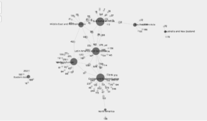
While looking through their data sets I found one on happiness and thought it would be a great topic to look at. The dataset included the human development index, alcohol consumption per capita by type of alcohol, GDP and Happiness Score (from the UN report) of 122 countries. The question I was interested in answering was is there a relationship between alcohol consumption and happiness. I decided to look at this by region because it would be easier to study than to look at a graph with each individual country. It was when I looked at my first graph that I realized big my mistake. Naturally some regions have way more countries than others. This skews the data because regions with more countries will seem happier than smaller ones. It made me think back to our class discussion about quantitative methods. Maybe I might have thought about this sooner had I known how to decide what data I use and how I use it. I can’t say I’d sign up for that class, but an introductory unit could be useful. I decided to try my search by country. This approach resulted in one big circle of data. It did help me understand how the source and target work as well as give a more accurate depiction of the answer to my question.
The images I’ve added to this post show the relationships between type of alcohol consumption per capita and region. Wine drinking has the most connections between regions. That being said the relationships are around how little people drink wine.

Venezuela has one of the highest beer consumption per capita at 333. It made me wonder about the factors contributing to that number including political turmoil, violence etc. Also why beer? Is it because of price point? More readily available?
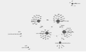
Spirit consumption connections were at higher numbers than beer and wine. I think it’s because certain spirits can be made using local ingredients like rice for example. It would require closer analysis but the idea seems plausible.
All in all, my network analysis was not the best, but it raised questions which is part of the point of the exercise in the first place. It shows correlations we expect and those we don’t prompting questions for further exploration. I get very far on my quest for happiness, but I think the journey created much for meaningful questions to explore.