Author Archives: Pamela Jean Stemberg

Happy New Year! Edge.org

Here’s a short and scary essay on Edge.org. and a longer piece that was on Vanity Fair. I thought this might interest some of you. I, like Hyemin, miss you all. Thanks for a great class!

Enjoy:

https://www.edge.org/conversation/george_dyson-childhoods-end

Final Project: One Instrument : Propaganda and the embargo of images following the bombing of Hiroshima and Nagasaki

One Instrument, the Virtual Reality (VR) documentary using historical footage from Hiroshima and Nagasaki, will attempt to connect the dots between the persistent false narrative that the US had to drop the bomb and the propaganda machine that created the story after the fact in 1945. To this day, when people are asked about the bombing of Hiroshima, they will get serious, look you in the eye, and shake their head saying, “Oh, yes. They had to drop the bomb; otherwise, Japan would have never surrendered,” Seventy-five years later! This is a false but tenacious story crafted by the US government through propaganda, censorship, and counter-narratives. The fact that it persists after 75 years is a testament to the effectiveness of this program.

The original idea for One Instrument comes from my short story “Nightfall” published in July of 2018 about two survivors of an apocalyptic event that neither of them understands. In the story, the woman returns to her home in the blast zone to find her badly burned husband lying on top of the rubble that had been their home. She lies to him about help coming as she sits by his side and waits for him to die.

The research for the story brought me to the New Yorker Magazine piece, “Hiroshima” by John Hersey which later became a book by the same title. I didn’t realize that the first significant piece written about Hiroshima was that piece a year later. After a little digging, I discovered that the Office of Censorship, and then, General Leslie Groves, were instrumental in keeping a lid on the images and stories broadcast from Japan in the immediate aftermath of the blast. The US occupied Japan until 1952, and the stories of the survivors didn’t come out until after the US left.

This project is a DH project for the general public. The NEH Digital Projects for the Public requires that it be for as large an audience as possible. So, I tried to make it as broad, excluding only the very young as possible audience members in the idea for its execution. It should also be ready for the 75th Anniversary of Hiroshima and Nagasaki which will be in 2020. The semester-long project will prototype a short immersive documentary that will lay down the techniques to be used for the longer ten -twelve-minute documentary (twelve minutes is the upper limit of attention inside of VR).

When thinking about how this project fits into the digital humanities, the Klein piece about James Hemings, “The Image of Absence: Archival Silence, Data Visualization, and James Hemings” comes to mind with its reference to Alan Liu’s call to action to reestablish “cultural criticism” (665) in the Digital Humanities. This documentary will squarely focus an eye on the critique of our culture both in the present and in the past. Also, Klein’s impetus to make Hemings’ “ghost” visible in the archives (668) is in the same vein as illuminating the use of propaganda through broadcast archival footage.

One instrument intends to look closely at the relationship between the narrative and the reality helping the viewer to understand how their opinion about the US bombing in Hiroshima might have been shaped by showing them embargoed images while the audio narrative plays the propaganda. Perhaps the public will begin to understand how their opinions are influenced as well as realizing how the US covered up the immediate aftermath of Hiroshima and Nagasaki.

Having worked as a broadcast news producer for a foreign agency during much of the Iraq War, I have seen the sanitized images that the US broadcast news agencies play. Even though there has been not Office of the Censor since 1945, we are still living under a kind of panopticon behavior modification that shows we believe that “they” will come knocking on the door at any minute if we show the “wrong” images.

Where have all the women gone?

Lisa Nakamura’s analyzes in “Indigenous Circuits: Navajo Women and the Racialization of Early Electronic Manufacture” the Fairchild Corporation’s use of Native American women to manufacture integrated circuit boards from the mid-60’s to the mid-’70s. She makes the point that women of color’s labor were essential to the founding of the physical, digital culture—circuits and chips—but that the patriarchal culture dominated their contribution and then erased it from the narrative. One way Nakamura supports her thesis is to examine a 1969 sales brochure depicting Fairchild’s “docile” Navajo women technology workers as culturally suited for the tedious and detailed task. The brochure visually draws together the digital and the native by using a rug pattern that women on the reservation would have produced and then showing that same pattern on the integrated circuit. These women are the central feature of the company’s account of the integrity of Fairchild’s manufacturing quality. She examines how Fairchild’s narrative is aimed at the US government who was not only heavily invested in using their circuits but also interested in ending services to the reservations (925). However, in the retellings of the history of Silicon Valley, the contributions of these women are all but expunged except for a “footnote” (921). Her article is an essential step in the direction of a fully inclusive narrative of the DNA of digital culture, and she gets closer to the heart of the problem of colonialism and patriarchy in the history but leaves out the most crucial part of the narrative: the native women’s voices. The problem is that when she is retelling the exploitation of these tribal women in Shiprock, New Mexico, we never hear from the women themselves.

I found it fascinating that though she directly quotes Charlie Sporck from Fairchild, she gives the native women no voice of their own except in an indirect mention of the general feelings of the Navajo tribe vis-a-vis the Fairchild plant’s closure (936). If there were no accounts from any of the women workers at the time.  Why doesn’t she acknowledge them? Is there an understanding that no one went back to talk to the women? Is it implicit? Leaving holes in the narrative is something we’ve spoken about this semester such as the ghost of Sally Hemings’ brother, James, who is all but left out of the archive. I have the same feeling about these women who are mentioned but not heard. It’s like talking about someone who you pretend isn’t in the room but is right in front of you. She accounts for the holes but does not do much to fill them with the actual participants. To tell this story without the voices of the women is to continue (albeit in a lesser way) what everyone else has done and objectify the erased people. I think she almost gets to giving agency to the oppressed and has written an essential piece in the history of digital culture, but this story needs to go further and be more inclusive even while continuing to analyze the narrative.

But how do we get away from objectifying the subjects of our inquiries? It might be messy to include the voices of these women, more time consuming and disturb the narrative that they were exploited without their participation. I don’t know, but we need to start to think about these things when we are writing about the marginalized. The last word on the Navajo women’s disposition was Charlie Sporck’s claim that the plant was a “failure.” He said, “the women made the money, and the men drank it up” (936). Why does he have the last word? When talking about the DNA of digital culture and how the exploitation of women of color figures into it, it is probably best to include those women’s voices and finally give the space to the exploited workers. I think that when we as academics need to look closely at the holes in the narrative spaces where the voices of the exploited should be, and make sure to give space to them.

David Bowie’s Reality Tour

For our first praxis assignment, I did a textual analysis of David Bowie’s top hit from each decade that he worked. While looking at his body of work, I became interested in his last tour, The Reality Tour, where he had a heart attack on stage and ended his public performing career. I wanted to look at his tour schedule because I thought there might be a clue as to what stresses he was enduring on stage. At first, I thought I’d do a map of the tour but never got to it.

Then came the network visualization praxis assignment and I was looking for some dataset to represent as a visualization, but in my search for datasets, I didn’t find anything that called to me. The things I wanted to look at such as the post-atomic bomb US and/or Japanese News was such a big undertaking that I decided to return to the Bowie data that I had from earlier.

Now I know there is a whole world of stuff, but I wanted to work with something I already had an intuitive sense of because it was easier to drill down into the dataset as it wasn’t large, but representative of the lifespan of an event. The fields being date, country, month, and arena were fairly simple and easy to corral into something approaching a tame dataset. So, I dug into Bowie’s final tour.

First, I tried to understand how to find in the data and represent what I intuitively thought would show up: that June was the most the stressful month of the tour (because it was connected to so many other dates on the tour) and caused him to have a heart attack on stage. But what were the important factors in the historical elements such as travel, dates, arenas, hours on stage, and days that he performed in each month of the tour? Which parts could I leave out?  And most of all how to show it?

It seemed that I was looking for a schematic of the plot of “Nashville,” Alman’s 1975 hit film, with all the intersecting lines converging in one concert. I thought I might find that kind of visualization in the data that I was using, but I wasn’t certain. Really, I wasn’t certain of what I was doing, at all.

I played with the data trying to understand what went into the weight of each node. First, I tried to weight each node so that it is accurately represented in the visualization all the dates and that looked like spaghetti with peas in a square dish. For the most part, everything I did in Gephi looked like a pasta dish. I finally took it to Palladio which was easier to use because it functioned on an axis with two data points: source and target. I cut and pasted the dataset from my spreadsheet into the data box and then smoothed out a few errors for special characters and loaded the data and choose graph. I choose the dates and the countries, and then I got little starfish all over a circular map, pretty, but not useful.

I needed to aggregate the dataset even more and I added the month to simplify it down to the nine months of the tour leaving out the dates. I then reentered the data and choose month and country. Voila! It showed up. Right in front of my eyes.

June was in the center of the visualization where I believed it belonged with all the stresses of the performances and travel that Bowie had to undertake for this tour. I think what I found most interesting is that the month had a equal connections to Europe and to the US. March also had those connections, but it seemed that June had more dates in the US and landed more squarely in the middle. So June visually represents the place in the middle where the connections to the different shows in the different countries fall on one side or the other.


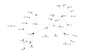
Visualization of David Bowie Reality Tour, 2003-2004

Palladio has issues with visualizing and one of them is that when you show the correct size of the nodes, you cannot see the labels. I choose text over image in this case because I thought the labels were more important for understanding the overall graph. I’d also like to see this in three dimensions as I believe it would give a fuller picture of the event.

For the future, there should be more data added to the weights of the nodes such as hours on stage, times of the shows, opening acts or none, set lists and how many encores. Hopefully, this configuration will hold up and June will continue to be in the center of it all.


I’m & love: an analysis of the lyrics of selected David Bowie albums

For this assignment, I selected the lyrics from five albums of David Bowie’s corpus. Since this was an unscientific review of his work, the simple parameters were to choose an album from each decade that he published. I started with Space Oddity, looked at 1983’s Let’s Dance, moved to Outsider, then Reality, and finally, Blackstar. All the lyrics were taken from the website AZLyrics.com. Co-authored lyrics were not excluded, but should be for future studies.

I start by exploring each album and looking at the highest frequency words from each. Space Oddity is the earliest album I examine and find the highest frequency word or phrase is “I’m” used 27 times. The next closest word is “want” at 19 times in the album.

Moving forward to the 1983 album, Let’s Dance’s, we see the word “long” used 44 times, mostly in the song, “Cat People.” The next album is from 1997, Outsider. This album seems to deviate from the others in that there are no stand out words with the highest frequency word being “it’s at 28 followed by “filthy“, “heart’s“, and “lesson” all tying at 24 words. Then we see in the 2003 album Reality, a return not only to stand out words but also to “I’m” as the leading phrase; it being used 64 times in this album. Finally, when we look at his last album, Blackstar, we see “I’m” used most frequently at 71 times.

After looking at the most frequently used words, I want to see what they are linked to and found that in Blackstar “I’m” is linked to the words “dying,” “man,” “blackstar,” and “trying.” As we know, Blackstar is Bowie’s last album and the one that he worked on after he was diagnosed with liver cancer.

Diagram of Blackstar.

Combining all the texts, I find that “I’m” is used 193 times which is almost 3 times more than the next phrase of “it’s” at 68 times or “love” at 66 times.  While love is not a consistent standout word, we can see by the trend line that it is used with some regularity.  I don’t use Stopwords, but would probably put “it’s” into the group, but that needs to be more closely examined.

And when we look at the final links diagram, we see that the three terms, “I’m,” “love,” and “it’s” are not related to each other at higher levels, but

Corpus links diagram level 3

even when we go several levels of word connections deep, it is hard to tie the terms together.

Corpus links diagram level 7

What could this mean that the terms are not correlated? Without thoroughly looking at the entire body of Bowie’s work (which is not the scope of the exercise), it’s difficult to draw conclusions. This could suggest that his lyrics embody different concepts and those concepts don’t overlap because they are embedded in each of his musical characters such as Major Tom, the Thin White Duke and his final, Blackstar.

Voyant is an easy to use tool.  Before I used Voyant,  I tried to use MALLET and have written something about that, too which I will publish at a later time. The biggest problem I’ve had is trying to get the images to show up. I’m not sure what I’m doing wrong, but I have to pay a visit to the fellows as I was about to lose my mind.