For our first praxis assignment, I did a textual analysis of David Bowie’s top hit from each decade that he worked. While looking at his body of work, I became interested in his last tour, The Reality Tour, where he had a heart attack on stage and ended his public performing career. I wanted to look at his tour schedule because I thought there might be a clue as to what stresses he was enduring on stage. At first, I thought I’d do a map of the tour but never got to it.
Then came the network visualization praxis assignment and I was looking for some dataset to represent as a visualization, but in my search for datasets, I didn’t find anything that called to me. The things I wanted to look at such as the post-atomic bomb US and/or Japanese News was such a big undertaking that I decided to return to the Bowie data that I had from earlier.
Now I know there is a whole world of stuff, but I wanted to work with something I already had an intuitive sense of because it was easier to drill down into the dataset as it wasn’t large, but representative of the lifespan of an event. The fields being date, country, month, and arena were fairly simple and easy to corral into something approaching a tame dataset. So, I dug into Bowie’s final tour.
First, I tried to understand how to find in the data and represent what I intuitively thought would show up: that June was the most the stressful month of the tour (because it was connected to so many other dates on the tour) and caused him to have a heart attack on stage. But what were the important factors in the historical elements such as travel, dates, arenas, hours on stage, and days that he performed in each month of the tour? Which parts could I leave out? And most of all how to show it?
It seemed that I was looking for a schematic of the plot of “Nashville,” Alman’s 1975 hit film, with all the intersecting lines converging in one concert. I thought I might find that kind of visualization in the data that I was using, but I wasn’t certain. Really, I wasn’t certain of what I was doing, at all.
I played with the data trying to understand what went into the weight of each node. First, I tried to weight each node so that it is accurately represented in the visualization all the dates and that looked like spaghetti with peas in a square dish. For the most part, everything I did in Gephi looked like a pasta dish. I finally took it to Palladio which was easier to use because it functioned on an axis with two data points: source and target. I cut and pasted the dataset from my spreadsheet into the data box and then smoothed out a few errors for special characters and loaded the data and choose graph. I choose the dates and the countries, and then I got little starfish all over a circular map, pretty, but not useful.
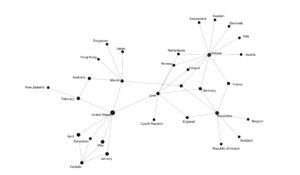
I needed to aggregate the dataset even more and I added the month to simplify it down to the nine months of the tour leaving out the dates. I then reentered the data and choose month and country. Voila! It showed up. Right in front of my eyes.
June was in the center of the visualization where I believed it belonged with all the stresses of the performances and travel that Bowie had to undertake for this tour. I think what I found most interesting is that the month had a equal connections to Europe and to the US. March also had those connections, but it seemed that June had more dates in the US and landed more squarely in the middle. So June visually represents the place in the middle where the connections to the different shows in the different countries fall on one side or the other.

Visualization of David Bowie Reality Tour, 2003-2004
Palladio has issues with visualizing and one of them is that when you show the correct size of the nodes, you cannot see the labels. I choose text over image in this case because I thought the labels were more important for understanding the overall graph. I’d also like to see this in three dimensions as I believe it would give a fuller picture of the event.
For the future, there should be more data added to the weights of the nodes such as hours on stage, times of the shows, opening acts or none, set lists and how many encores. Hopefully, this configuration will hold up and June will continue to be in the center of it all.

