One thing that really struck me about the readings for this week is the general skepticism about ease of use. Ramsay and Rockman (“Developing Things“) argue that while a tool that doesn’t call attention to itself is useful, it’s less likely to be formally valued as scholarship. Tenen (“Blunt Instrumentation“) is cautious about tools for several reasons, but his principal objection is that tools hide their inner workings in a way that can compromise the work done with them. In order to do good, scholarly work using a tool, you need to understand exactly what it’s doing, and the best way to do that is to build it yourself. Posner (“What’s Next“) takes this argument a step further, arguing that ease of use is often privileged above critical thinking. The familiar is easy to use, but it doesn’t challenge the colonial point of view that the broader culture promotes.
Posner uses the Knotted Line as an example of a project that presents history in a more challenging way than the traditional timeline. I spent some time looking at this website. It’s a history of freedom in the United States, and brings together information about slavery, education, mass incarceration, segregation, immigration, etc on a timeline that, as the title suggests, is neither straightforward nor orderly. To reveal the different events of the timeline, there is a window that the website user must pull and tease until the image becomes clear.
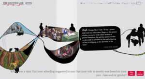
Part of the timeline of the Knotted Line. Paintings are revealed by pulling on the line. Image taken from http://evanbissell.com/the-knotted-line/
The Knotted Line is more physically strenuous than most websites, and it can also be frustrating – much like the struggle for freedom in American history. Obviously, these things are far from equivalent, but the fact that the reader has to work for this information helps to challenge narratives of progress and emphasize that the struggle is still ongoing.
This is a different kind of difficulty than that experienced by users of NLTK in Tenen’s chapter. I haven’t used NLTK yet, but according to Tenen, it’s difficult because you have to understand exactly what it does. It doesn’t hide its inner workings behind fancy interfaces, but provides lots of careful documentation to facilitate well-informed (should I say expert?) use.
Ramsay and Rockwell discuss the “transparency” of tools, meaning the ability for tools to fade into the background as the user thinks about the task instead. Both these projects are specifically against this kind of transparency. Instead, they offer transparency of a different kind, the kind that comes from letting the user look behind the scenes.
I’m a librarian, so I spend a lot of time hearing about how library users want ease of use, how complex interfaces drive people away and nobody cares about how the searches work, and how advanced searching is for librarians only because it requires searchers to understand how a record is put together. I’m uncomfortable with most of those arguments, so I found Tenen and Posner really refreshing from that perspective, especially since Posner is a professor of library science!
Some of this is audience specific. Both NLTK and the Knotted Line are designed with a very specific audience in mind, and an audience with which the people who designed the tools were very familiar. And then, a lot of it is about designing carefully and intentionally. It isn’t always bad for users to be confused and even frustrated, as long as it’s for the right reason.