
Following up on one of my concerns last week and “All Models Are Wrong“ from two weeks ago, I’m going to write more today on what information visualization does and does not tell us, inspired by Lev Manovich’s “What is Visualization”.
In the beginning of the reading, Manovich seems to support the argument from All Models are Wrong, in that models only tell a portion of the story.
“By employing graphical primitives (or, to use the language of contemporary digital media, vector graphics), infovis is able to reveal patterns and structures in the data objects that these primitives represent. However, the price being paid for this power is extreme schematization We throw away %99 of what is specific about each object to represent only %1- in the hope of revealing patterns across this %1 of objects’ characteristics.” Lev Manovich, What is Visualization?
In this excerpt, Manovich makes clear the advantage of traditional means of information visualization: revealing easily recognizable patterns from data that would otherwise take hours, days, or weeks to analyze. On the contrary, he admits that the downfall of simplifying the data is in the very act of simplifying it. This was troubling to me. I so desperately wanted there to be a way to visualize the data without loosing data, then along came “direct visualization”.
“Direct visualization” is a term coined my Manovich to explain a technique that employs visualization without reduction. He gave several examples that are no longer searchable, but two that had a strong impact on my understanding of “direct visualization”. These are Timeline (Jeremy Douglass and Lev Manovich, 2009) and Valence (Ben Fry, 2001). Both have a very “next generation” feel to them which is another aspect to “direct visualization”; technology giving us the ability to decipher massive amounts of data in a short time, and present it with the use of color, animation, and interactive elements.
This was a fascinating read and “direct visualization” is something I’m looking forward to applying to my own work where possible.
I really liked that piece too. Direct visualization was not something I was familiar with before. I like that it allows the viewer to ask a myriad of questions about what you’re looking at as well as offer possible explanations. In the Rate My Professor project linked in the syllabus there is a section that shows what students have marked as positive characteristics in their professors. Words associated with men included “brilliant and genius” and words associated with women were “compassionate and encouraging”. They’re being graded on two very different standards that reflect old ideas of the roles of men and women. To play around I typed in coding and it summed up my undergrad experience. The words “Ilustrator” “InDesign” and “suite” skewed towards women. In my experience women taught my intro classes in Adobe Suite and Maya. Once I got into classes with code all my teachers were men. That being said many words like “software”, “apps” ,and the word coding itself have no gender bias. I look at it and see progress because those words probably would have been blue just a decade ago.
Thank you for your thoughts Quinn. I’d just like to share a brief comment/observation. As I was reading Manovich article, Presner’s piece on thick mapping haunted me. I’m not sure if it’s an accurate way to put it but it seems that Manovich’s conception of ‘direct visualization’ does not attain the theoretical sophistication and practical implications of Presner’s thick mapping (which is fine). In that light, I’m thinking of ‘thick visualization’ as a method that could be more radical in form and practice than just “visualization without reduction”.
Quinn, I’ve also been uneasy about the reduction that takes place when creating graphs and charts. Research and art have often been torn by the opposing impulses to render as much as possible vs. abstract as much as possible. In data visualization, the ratio seems to have been tilted heavily toward abstraction for a long time, so it’s good to see new technologies creating more balance. So far, though, I’m not sure how much is being gained by direct visualization. Manovich’s Time magazine project is striking, but how much does it really communicate? It reminds me too much of those photo mosaics that use whole images as pixels to make a larger image:
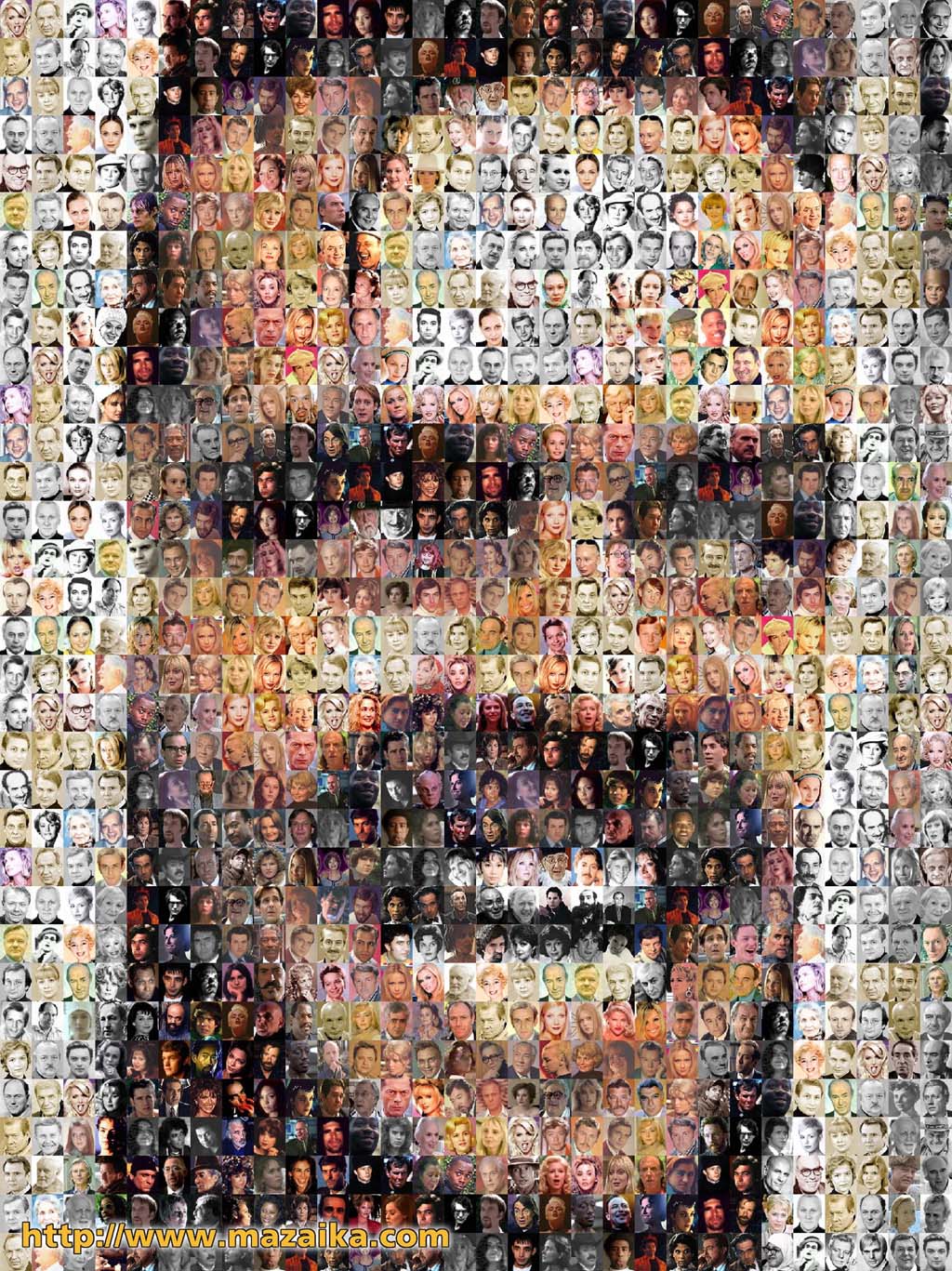
Ha! I just wanted a link to that image, not the WHOLE image. Now you all think I’m some kind of Stanley Kubrick fanatic…