Author Archives: Quinn Bolewicki

Project Proposal: Mapping a digital gallery and sharing to social media

Hi All,

First and foremost, congratulations to Patrick!

Second, I realize that my in-class presentation was a little short, so I want to clarify some things about my project proposal here. Below is an excerpt from my proposal that I hope will answer some questions. Anyone please feel free to ask more questions and let me know if you would like me to share the entire paper. Thank you all for an amazing semester and I’m looking forward to working with you in the future!

“I propose that we create two digital tools that can be used as an alternative to a typical digital management software such as Luna Imaging, which is often used by libraries and archives. The digital tools that I am proposing will improve the collection search process and increase social media presence. Ideally these tools will reach a broad audience and facilitate traffic to archives and cultural heritage institutions, whose community is normally limited to scholars and researchers. These tools will make searching collections fun, smooth, and easy in the form of a mobile application (known as an app), and a “Publish to Social Media” button on the upload page on the back end of Luna.  Throughout this proposal I will be using the terms “front end” and “back end”. Front end refers to the presentation layer of a software, website or app, and back end refers to the data access layer, usually where code is written [1].

I’m proposing these very different tools as one project because they are in fact intertwined. To reach the general population, who have a fairly untapped interest in history, we must make reaching out to them through social media, as well as their experience searching archive websites easier.

As it stands there are problems with searching archives’ digital collections. If the digital archivist uploading material is not proficient in web design, or if the archive’s collections are unorganized on the back end, the front end of the archive’s website can be tricky to navigate. I hope to tackle this problem with the app by creating less freedom on the back end, which will create a more concise and easy to understand digital gallery.

In addition to creating an app with a digital gallery, I would like to propose partnering with the New York City Municipal Archives (NYCMA) to create an interactive map of New York City.  This map will showcase images of every building with its associated address from the 1940’s, courtesy of the New York City Municipal Archives recently completed tax photo project. The map will also showcase any digitized images associated with an address or area in New York City, such as a crime scene photo from the year 1927 at 125 Mulberry St.

Creating the mobile app alone would tackle the learning curve needed to view different archives’ digital collections, which many researchers and scholars are already familiar with. It is important to reach out to the greater population, many of whom are unaware of the fascinating resources that with the app could be right at their fingertips.

Reaching this larger population could be done right from the source with a “Publish to Social Media” option on the upload page of Luna. This would make it easier for NYCMA to reach out to its potential patrons in such a way that keeps up with the fast-paced ways of the internet, and without the need to publish separately on multiple social media platforms.”
Thoughts on “Algorithms of Oppression, How search Engines Reinforce Racism”

There was a lot of information and many ideas covered in Safiya Umoja Noble’s Book, “Algorithms of Oppression, How search Engines Reinforce Racism”, so I’ll do my best to keep this post short while pointing out some parts that stuck out to me and my thoughts on them.

One of the first points I found worth mentioning was made my Noble stating “Not only do algorithms reinforce racism, sexism, and oppression overall, but they can spread false associations”. (I’m not sure if this is a direct quote, unfortunately I lost all my highlighted material to page 44.) This was made clear when she searches “black girls” on Google, and the first hit was a pornographic site. This quote also reminded me of a Fortune article titled “Lack of Women in Stem Could Lead to AI Sexism” where several virtual assistants are pointed out as having female names or voices, (i.e. Alexa) which “perpetuates the stereotypes about women as the chipper, helpful assistant.” It takes something as unobtrusive as a female AI voice, or as appalling as porn being the first search result for “black girls” to alter or reinforce our perception of a population.

Another point I wanted to address was in the section “Gaming the System: Optimizing and Co-optimizing Results in Search Engines” on page 47 where Noble describes “Hit and Run” activity as “activity that can deliberately co-opt terms and identities on the web for political, ideological, and satirical purposes.” This made me think of the 2016 presidential election where there was controversy raised over Facebook being many people’s primary news source and why that is problematic. These reasons were made clear in “Algorithms of Oppression” and Nick Seaver’s “Knowing Algorithms” in Part 2 where he describes Eli Pariser’s experience with algorithmic filtering on Facebook. Our knowledge of algorithms or lack thereof, can cause real damage to our understanding of all sides of a story.

Thankfully, as Noble mentions, some things have changed since her initial Google search. Pornography is not the first result to pop up, and what I found most exciting is that during my research, “Black Girls Code” is actually the first result. As the general public becomes more aware of algorithms and the impact they can have on our research, they hopefully become less likely to skew public perceptions, or at the very least, we’ll question the information we’re being fed.

Workshop: Understanding and Building on the Web with HTML/CSS

I recently attended a workshop on HTML/CSS that was incredibly fun and informative. Going into this workshop, my knowledge of HTML was limited to what I learned building MySpace pages over 10 years ago. The workshop was well organized to cater the students of various backgrounds that attended. Patrick Sweeney organized and led the workshop, and Stephen Morello kindly assisted those that ran into technical issues.

The objectives of the workshop were as follows:

 “By the end of this workshop, participants will:

– Familiarize themselves with the anatomy of a webpage and how the internet     works.

– Understand the basics of the HTML and CSS markdown languages.

– Use HTML, CSS, and a text editor to build a small website.”


My understanding of the difference between HTML and CSS was cleared up early, when HTML was described as the bones of website building, and CSS the style. Understanding the purpose of HTML/CSS as languages was a key component that I think many other programming classes fail to address. I tried to learn Python over the summer with an online course, for example, and didn’t know that it was commonly used as a glue language until I googled it just now.

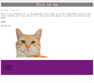
The workshop was broken down into HTML basics, and CSS basics. HTML basics included an introduction, and an opening activity where we viewed the code source of the New York Times website. We then created our own rudimentary website using a basic HTML template on a text editor like Sublime.From there, we covered tags and elements, paragraphs and headings, links, images, and conventions. CSS basics covered HTML/CSS integration, rule sets, filtering, classes and IDs, selectors, and troubleshooting. All in all, my poor website looked like this:

By the end of the two-hour workshop, the vibes of the room were overwhelmingly positive. Almost everyone had created their very own website that looked like it came straight out of the year 1998, and we were very proud of ourselves. We concluded the workshop with viewing some examples of websites created with HTML/CSS that looked very sleek, and really saw their potential as languages.

What is Visualization? – a deeper look into what data visualization can tell us

Following up on one of my concerns last week and “All Models Are Wrong from two weeks ago, I’m going to write more today on what information visualization does and does not tell us, inspired by Lev Manovich’s “What is Visualization”.

In the beginning of the reading, Manovich seems to support the argument from All Models are Wrong, in that models only tell a portion of the story.

“By employing graphical primitives (or, to use the language of contemporary digital media, vector graphics), infovis is able to reveal patterns and structures in the data objects that these primitives represent. However, the price being paid for this power is extreme schematization We throw away %99 of what is specific about each object to represent only %1- in the hope of revealing patterns across this %1 of objects’ characteristics.” Lev Manovich, What is Visualization?

In this excerpt, Manovich makes clear the advantage of traditional means of information visualization: revealing easily recognizable patterns from data that would otherwise take hours, days, or weeks to analyze. On the contrary, he admits that the downfall of simplifying the data is in the very act of simplifying it. This was troubling to me. I so desperately wanted there to be a way to visualize the data without loosing data, then along came “direct visualization”.

“Direct visualization” is a term coined my Manovich to explain a technique that employs visualization without reduction. He gave several examples that are no longer searchable, but two that had a strong impact on my understanding of “direct visualization”. These are Timeline (Jeremy Douglass and Lev Manovich, 2009) and Valence (Ben Fry, 2001). Both have a very “next generation” feel to them which is another aspect to “direct visualization”; technology giving us the ability to decipher massive amounts of data in a short time, and present it with the use of color, animation, and interactive elements.

This was a fascinating read and “direct visualization” is something I’m looking forward to applying to my own work where possible.

Mapping Assignment – 2016 Presidential Election

When trying to decide what to map I unsurprisingly thought of the 2016 presidential election. I wanted to discuss everything from demographics to voter suppression, through the use of maps. Due to time constraints, I decided on a foundation to base our discussion on and create two maps using Tableau showing the popular votes for Clinton (fig. 1) and Trump. (fig. 2)


One thing that comes to mind when I view these maps is Richard Jean So’s article “All Models Are Wrong”. There seems to never have been a truer statement when faced with these maps.

The first and most obvious piece of missing information is the electoral college vote, which neither of these maps represent and was one of the clear reasons Trump won the 2016 presidential election. If any alien visiting earth for the first time were reading these maps, they might say “Clinton won the popular vote, therefore she won the election.” But this is false and the maps fail to show that. There were many more elements affecting the outcome of the 2016 election that are not shown here; lobbying, number of visits to states by candidates, and Russian interference to name a few, all of which could be their own map.

Using Tableau to create these maps was a bit of a learning curve. I downloaded a database from the Federal Election Commission of the United States of America and cleaned the data myself for the first time. I chose Tableau because it gave me the freedom to choose my own large set of data without manually inputting, and frankly because I cannot seem to get access to Carto since the workshop a few weeks ago.

In conclusion, I’m interested in what these maps do not tell us, and also what they can. If we could create maps and accompanying diagrams to show us the popular vote,  voter suppression, Russian collusion, candidate visits, monetary donations, racism, sexism, and electoral votes, could we predict the next election? Could we find out how to change it?

Link

I started by selecting the transcripts from the Kavanaugh-Ford Senate Hearing. I focused on the opening statements of Brett Kavanaugh and Dr. Christine Blasey Ford since it was an uninterrupted summary of what each had to say. I wasn’t sure what to expect from this assignment, given this was my first time using Voyant and having chosen a highly charged subject matter, but I was not disappointed.

Fig. 1 Kavanaugh    

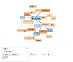
Fig. 2 Ford

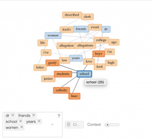
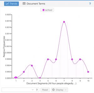
Figure one shows links between Brett Kavanaugh’s five most frequently used words (blue), and those associated with it (orange). I highlighted Kavanaugh’s second most frequently used word, “school”, to demonstrate the interactive aspect of Voyant. highlighting “school”, also narrowed down other charts to show detail for the selected term (fig. 3). 

Fig. 3 Kavanaugh

Fig. 4 Ford

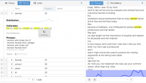
Additionally, I was struck by Kavanaugh’s frequent use of the word, “women”, and was quickly able to explore why with Voyant.

Fig. 5

In figure five, I was able to select “women” from the terms tab and view the context in several different ways.

I’ve avoided adding my interpretation to this blog post because I think Voyant is a powerful enough tool to speak for itself. I strongly suggest everyone interested in this topic take some time to compare themselves and share interesting finds that I may have missed. you can find the opening transcripts for Kavanaugh here and Ford here.