Tag Archives: data

Project T.R.I.K.E – Principles and Origin Myths

Hannah’s already provided some use cases that I hope help to illustrate why we think that Project T.R.I.K.E will be useful, and to whom.  I wanted to backtrack and give some context. Although, as Hannah’s post suggests, it’s quite difficult to suggest a specific starting point for our thought processes, which have developed iteratively until we’re not sure whether we’re trapped in a time loop or not.  However, I think I can trace through some of the things I think are important about it.

We really wanted to do something that would be useful for pedagogy. Again, if you want to know how it’s useful for pedagogy, please see Hannah’s post! But we were specifically interested in a resource that would teach methodology, because all of us were methodological beginners who really felt the need for more tools and resources that would help us to develop in that respect.  During our environmental scan, we were impressed by the efforts of the DH community to produce a number of useful guides to tools, methodologies, and processes (in particular, please see Alan Liu’s DH Toy Chest and devdh.org), although none of them were doing exactly what we want to do. There are plenty of dead resources out there, too, and we should take that as a warning.

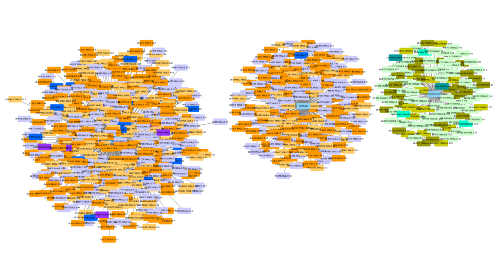
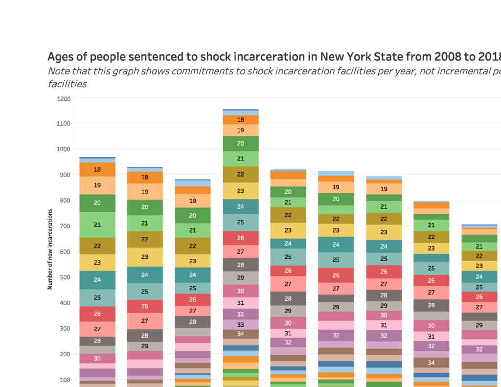
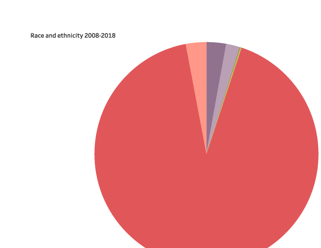
We really wanted to take a critical stance on data by creating something that would highlight its contingent, contextual, constructed nature, acknowledging that datasets are selected and prepared by human researchers, and that the questions one can ask are inextricably connected to the process through which the dataset is constituted. Our emphasis on a critical approach does not originate in this class; I believe all of us had been exposed to theories about constructedness before this. What’s curious about our process is that we went out seeking datasets and tutorials with this in mind, thinking about what we hoped to do, and this conversation ranged far from the class readings, focusing on our own work and also Rawson and Muñoz’s “Against Cleaning”   but eventually brought us back to Posner, Bode, and Drucker.  None of them, however, came away with exactly the solution we did; we decided that the constructed nature of data is best represented by making transparent the process of construction itself! Project T.R.I.K.E. will provide snapshots of the data at different stages in the process, highlighting the decisions made by researchers and interrogating how these decisions are embodied in the data.

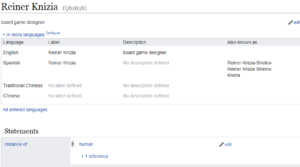
Finally, we really wanted to ensure that we could produce something that could be open to the community. Again, a lot of work in the DH community is openly available, but we also came across some datasets behind paywalls.  One repository aggregating these datasets not only made it difficult to access the databases but also had a series of stern lectures about copyright, occupying much the same space on their website that instruction in methodology would occupy on ours! While it is true that some humanities data may invoke copyright in a way that other kinds of data usually don’t, we’d much rather host datasets that we can make available to a wide variety of users with a wide variety of use cases. Limiting access to data limits research.

Think carefully, though. As part of the environmental scan, we came across an article that argues, on the basis of a report partially sponsored by Elsevier, that researchers seldom make their data available, even when they are required to do so. While I expect this is true, I am also suspicious of claims like this when they are made by major publishers, because their next step will probably be to offer a proprietary solution which will give them yet more control over the scholarly communication ecosystem.  In a context in which major publishers are buying up repositories, contacting faculty directly, and co-opting the language of open access as they do so, I’d argue that it’s more and more important for academics to build out their (our) own infrastructure. Project T.R.I.K.E. has slightly humbler ambitious, for time being, but it’s an opportunity for us to begin building some infrastructure of our own.

A Case for Turning on the Light in the Supply Chain Process

I really enjoyed Miriam Posner’s piece this week See No Evil because it brought up a common theme we’ve seen within the readings on digital humanities: how and why certain data/content is deliberately concealed or silenced and thus, what it means to utilize a variety of data software tools to draw attention to, address or even how data software tools contribute to the silencing or concealment of data/content. Personally, I am particularly interested in what we can uncover and learn from these concealings and silences to better address injustices and inequalities within society.

Prior to reading this article, my knowledge of the supply chain process was sparse and frankly, in the past, I have spent very little time considering the origins of where my goods came from. As an Amazon Prime member, I have the luxury of receiving my packages within 48 hours of ordering (2-day shipping) and as a person who has used the new Prime Now feature I have even received my goods the same day and within hours of ordering. I just want my items and I want them as soon as possible. Last minute birthday presents? No problem! Groceries delivered to my door? Delivered on the same day. The convenience is unreal.

However, what is at stake with my convenience? Should I know or care about the entire process for the supply chain of my goods? Why don’t I know more about the process? Am I part of the problem? Oh god, I am most definitely part of the problem.

Posner argues that the lack of knowledge of the supply chain process is deliberate, both to the company through the software they use and in turn the consumer; “By the time goods surface as commodities to be handled through the chain, purchasing at scale demands that information about their origin and manufacture be stripped away.” This is done deliberately by companies as a means to create an ignorance of the very specifics of how a product is created and transported, leaving companies turning a blind eye to horrifying work conditions and labor practices. This allows companies to avoid accountability for these work conditions and labor practices and pivot back to the consumer.

The consumers are in the dark, unaware of what their wants and needs for products mean for the working conditions and labor practices that impact those who are ensuring we receive our goods. Would consumers change their minds about a company if they truly knew what’s behind the scenes of receiving goods? I think most certainly.  As consumers should we demand to know the details of a company’s supply chain process? Perhaps we should be more active consumers and demand this knowledge by holding the companies that we purchase from to a higher standard. We, as consumers, could push companies to begin taking accountability for their supply chain process. Let’s do it!

However, we, as a society, rely on this darkness as a means to enable globalization and capitalism even when it means terrible labor practices and the suffering of those in the supply chain. We’ve exchanged scale, globalization, and capitalism for human rights. Globalization and capitalism are only possible through a lack of accountability companies and consumers are able to have regarding the goods they receive. Posner states “We’ve chosen scale, and the conceptual apparatus to manage it, at the expense of finer-grained knowledge that could make a more just and equitable arrangement possible.” Posner’s example of the supply chain process and software was the perfect example to highlight how deeply embedded capitalism and globalization is within society and the ways capitalism and globalization manifest themselves even in software programs.

So my question is where do we go from here?

By the end of the piece, Posner touches on the potential of visibility for supply chain software and programming, but ultimately the problem is more than just software. We must, as a society, agree to see, even if it is traumatic (as she references) for us to know the truth.

I believe that knowledge about things like the supply chain process may disrupt the structures of globalization and capitalism we’ve come to rely on, which may lead to more equitable working conditions and practices for all. We as consumers should do better at demanding to know the supply chain process and accept that it may mean that we see some things we don’t want to see and lose some convenience. Ultimately being in the light may help us be more understanding and empathetic to others lives and create better working conditions for all. Let’s turn on the light and be brave. Let’s do better. 

PS: (Slightly related but kind of a sidebar, Comedian Hasan Minaj just did an episode from his new Netflix show Patriot Act on Amazon discussing some different aspects on their growth and the impacts this has on their supply chain. Here is a link to a YouTube video of the episode.)

Network Praxis: Shock Incarceration in New York State 2008-18

I had a sneaky feeling that my dataset wasn’t going to work for network analysis, but I had found such a good dataset that I decided to try. This is an Excel spreadsheet compiled by the New York State Department of Corrections listing 602,665 people incarcerated in New York State over the last ten years, with information about admission type, county, gender, age, race/ethnicity, crime and facility. I knew six hundred thousand records were too many, but I figured I’d select just a few, and analyze the networks I would find in these.

The “few” records I selected were those of 771 men and women sentenced in 2018 to shock incarceration, a military-style boot camp initiative that was supposed to reform incarcerated people by subjecting them to strenuous physical and mental trials. According to the U.S. Department of Justice, shock incarceration involves “strict, military-style discipline, unquestioning obedience to orders, and highly structured days filled with drill and hard work.” The data I looked at shows that most people in these facilities were incarcerated for drug-related offenses such as criminal sale of a controlled substance (CSCS) or criminal possession of a controlled substance (CPCS). When marihuana is legalized the population in these facilities – and others – should, I hope, drastically decrease.

I fed the 771 records into Cytoscape and it was a total mess. I tried analyzing only the 106 women sentenced to shock incarceration in 2018 and that was still a mess. The main problem, I realized, was that I could see no clear relationships between the men and women listed in my data other than the relationship they have with the facility in which they are confined. I don’t know who hangs out with whom. I don’t know if people sentenced for different crimes are placed on different floors. It would be too much work to find out who transports the food to the facility and how many guards there are and so on. Frustrated with my project, I saw that trying to get data to bend to software is a lousy way to go about things. I started to think instead about what software would help me explore the data in a meaningful way and decided to see what I could do with Tableau. This was such a good choice that I’m having a hard time stopping myself from building more and more visualizations with what became a wealth of information when I stopped looking for networks that weren’t there.

I couldn’t embed Tableau Public in WordPress so I paste pictures here, but you can’t click and scroll and interact with my visualizations here, and some of the pictures are cut off so please visit my visualization on Tableau. By the way, I was happy to remember that students can get Tableau Desktop for free for a year. Here’s the link: https://www.tableau.com/academic/students

First, here is the mess I made with Cytoscape (I didn’t even try to figure out how to embed):

Isn’t that horrible?! Here’s a close-up:

And here are pictures of what I did with Tableau:

Phew, that’s all for now. See it on Tableau, there’s no comparison.

Make Space for Ghosts: Lauren Klein’s Graphic Visualizations of James Hemings in Thomas Jefferson’s Archive

In “The Image of Absence: Archival Silence, Data Visualization, and James Hemings,” Lauren Klein discusses a letter by Thomas Jefferson to a friend in Baltimore which she accessed through Papers of Thomas Jefferson Digital Edition , a digital archive which makes about 12,000 and “a significant portion” of 25,000 letters from and to Jefferson available to subscribers of the archive. In this letter, Jefferson asks his friend in Baltimore to give a message to his “former servant James” to illustrate how a simple word search would fail to identify that “James” as his former slave James Hemings, the brother of Sally Hemings, Jefferson’s slave and probably mother of five of his children.[1] Drawing our attention to how the “issue of archival silence – or gaps in the archival record – [which remain] difficult to address” in graphic visualization, Klein notes that the historians who built the Jefferson Papers archive added metadata to indicate that the James referred to in the above-mentioned letter was James Hemings [664]. I wonder what the metadata looks like; I wonder whether it provides sources or reflection, and what the extratextual conversation going on at the back end of the archive, if conversation it is, reveals.

While meta-annotation may appear to be a good way to fill the gaps of archival silence, Klein argues that adding scholarship as metadata creates too great a dependence on the choices the author of the archive made. The addition of metadata to the letter to the friend in Baltimore makes me wonder where in the archive metadata was added, where not, and why. Are all the gaps filled? Had metadata not been added to the letter Klein discusses, an analysis of the archive could conclude that Jefferson never makes any mention of James Hemings in the letter he wrote to his friend in Baltimore in 1801 to try to find Hemings, or in the ensuing correspondence between Hemings and Jefferson through Jefferson’s friend, in which Jefferson tries to hire Hemings and Hemings sets terms that were probably not met [667]. A word search in the archive, however, pulls up only inventories of property, documents of manumission, notes about procuring centers of pork and cooking oysters (Hemings was Jefferson’s chef) and finally a letter in which Jefferson asks whether it’s true that Hemings committed suicide [671]. How, asks Klein, do we fill in the gaps between the pieces of information we have? She concludes that we can’t. How do we show the silences then, she asks; how do we extract more meaning from the documents that exist – letters, inventories, ledgers and sales receipts – “without reinforcing the damaging notion that African American voices from before emancipation […] are silent, and irretrievably lost?” [665].

Klein calls for a shift from “identifying and recovering silences” to “animating the mysteries of the past” [665] but not by traditional methods. Instead, Klein says that the fields of computational linguistics and data visualization help make archival silences visible and by doing so “reinscribe cultural criticism at the center of digital humanities work” [665]. Through visualization Klein fills the historical record with “ghosts” and silences, rather than trying to explain away the gaps. The visualizations she creates are both mysterious and compelling, and bear evidence in a way that adding more words does not.

[1]Sarah Sally Hemings (c. 1773 – 1835) was an enslaved woman of mixed race owned by PresidentThomas Jefferson of the United States. There is a “growing historical consensus” among scholars that Jefferson had a long-term relationship with Hemings, and that he was the father of Hemings’ five children,[1] born after the death of his wife Martha Jefferson. Four of Hemings’ children survived to adulthood.[2] Hemings died in Charlottesville, Virginia, in 1835. [Wikipedia contributors, “Sarah ‘Sally’ Hemings”]

What is Visualization? – a deeper look into what data visualization can tell us

Following up on one of my concerns last week and “All Models Are Wrong from two weeks ago, I’m going to write more today on what information visualization does and does not tell us, inspired by Lev Manovich’s “What is Visualization”.

In the beginning of the reading, Manovich seems to support the argument from All Models are Wrong, in that models only tell a portion of the story.

“By employing graphical primitives (or, to use the language of contemporary digital media, vector graphics), infovis is able to reveal patterns and structures in the data objects that these primitives represent. However, the price being paid for this power is extreme schematization We throw away %99 of what is specific about each object to represent only %1- in the hope of revealing patterns across this %1 of objects’ characteristics.” Lev Manovich, What is Visualization?

In this excerpt, Manovich makes clear the advantage of traditional means of information visualization: revealing easily recognizable patterns from data that would otherwise take hours, days, or weeks to analyze. On the contrary, he admits that the downfall of simplifying the data is in the very act of simplifying it. This was troubling to me. I so desperately wanted there to be a way to visualize the data without loosing data, then along came “direct visualization”.

“Direct visualization” is a term coined my Manovich to explain a technique that employs visualization without reduction. He gave several examples that are no longer searchable, but two that had a strong impact on my understanding of “direct visualization”. These are Timeline (Jeremy Douglass and Lev Manovich, 2009) and Valence (Ben Fry, 2001). Both have a very “next generation” feel to them which is another aspect to “direct visualization”; technology giving us the ability to decipher massive amounts of data in a short time, and present it with the use of color, animation, and interactive elements.

This was a fascinating read and “direct visualization” is something I’m looking forward to applying to my own work where possible.

Data for Mapping workshop notes

This past Tuesday I attended a Digital Fellows workshop called Data for Mapping: Tips and Strategies. The workshop was presented by Digital Fellows Javier Otero Peña and Olivia Ildefonso. Highlights of this workshop were learning how to access US Census data and seeing a demo of mapping software called Carto.

Javier started the workshop encouraging us to interject with any questions we had at any time. The group maybe too enthusiastically took him up on this, and he had to walk it back in the interests of time after we spent 20+ minutes on a single slide. After that, the workshop moved along at a nice, steady clip.

There was a technical challenge, which I see as an unexpected boon. Carto changed their access permissions within the few days before the workshop, and nobody except the Digital Fellows could access it. The Digital Fellows had an existing account, so they were still able to demo for us how to use Carto. 

I think it’s for the best that we weren’t able to access Carto and set up accounts. Many workshops, including a Zotero one I went to a couple of weeks ago, bleed pretty much all their allotted time on getting software set up on each of the 10-20 attendees’ varied personal laptops. I find this incredibly painful to sit through. But in this workshop we established early on that we wouldn’t be able to individually install Carto, and so we were able to cover many more specifics on how to actually use Carto. Users who need installation help can always go to Digital Fellows office hours on their own.

Javier and Olivia shared their presentation deck with us. It is a thorough walkthrough of the steps needed to get Census data on the median age by state, and map that data in Carto. One note: in the upfront where it says the contents are for QGIS, replace that in your head with Carto. It is all about Carto. The QGIS references are accidentally in there from an older version.

I did some digging after the workshop on how to register to use Carto. Student access for Carto now requires a student developer GitHub account (which also includes free versions of other fun looking tools). GitHub says it can take from 1 hour – 5 days after applying on their site for your student developer account to be approved. I applied to have my regular GitHub account classified as a student developer account 5 hours ago using a photo of my GC ID card and haven’t heard anything yet, so I guess this really is going through some sort of vetting process. Maybe using a GC email address for verification would be faster.

This workshop was a good time, not least because Javier was extremely funny and Olivia was super helpful coming around to us to address individual questions. Five out of five stars. Would workshop again.