Tag Archives: data visualization

Network Praxis: Shock Incarceration in New York State 2008-18

I had a sneaky feeling that my dataset wasn’t going to work for network analysis, but I had found such a good dataset that I decided to try. This is an Excel spreadsheet compiled by the New York State Department of Corrections listing 602,665 people incarcerated in New York State over the last ten years, with information about admission type, county, gender, age, race/ethnicity, crime and facility. I knew six hundred thousand records were too many, but I figured I’d select just a few, and analyze the networks I would find in these.

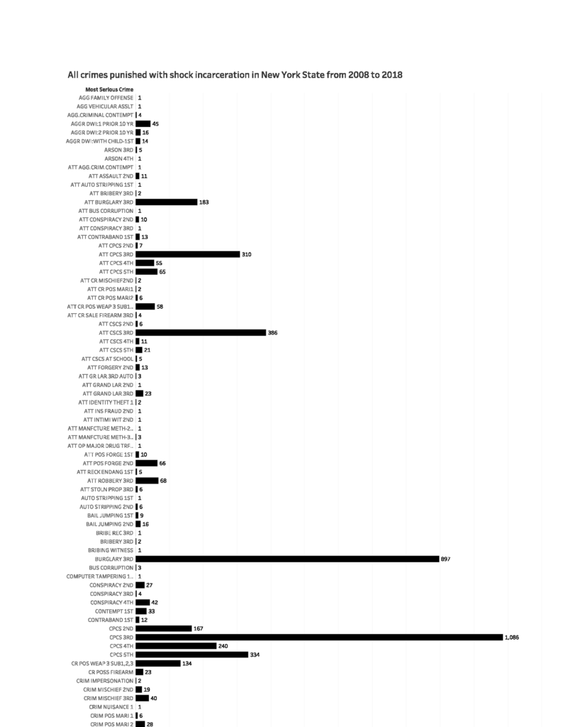
The “few” records I selected were those of 771 men and women sentenced in 2018 to shock incarceration, a military-style boot camp initiative that was supposed to reform incarcerated people by subjecting them to strenuous physical and mental trials. According to the U.S. Department of Justice, shock incarceration involves “strict, military-style discipline, unquestioning obedience to orders, and highly structured days filled with drill and hard work.” The data I looked at shows that most people in these facilities were incarcerated for drug-related offenses such as criminal sale of a controlled substance (CSCS) or criminal possession of a controlled substance (CPCS). When marihuana is legalized the population in these facilities – and others – should, I hope, drastically decrease.

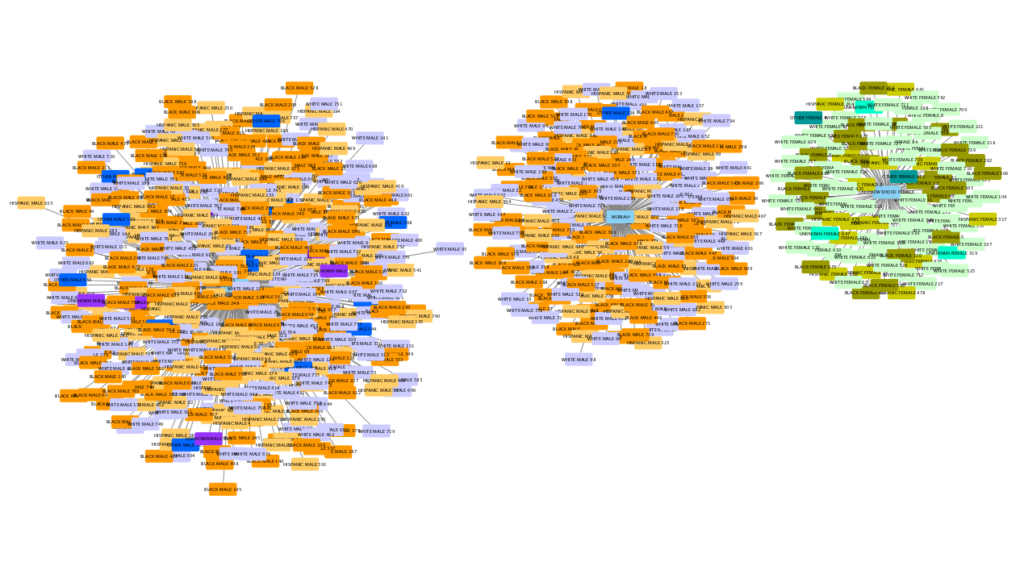
I fed the 771 records into Cytoscape and it was a total mess. I tried analyzing only the 106 women sentenced to shock incarceration in 2018 and that was still a mess. The main problem, I realized, was that I could see no clear relationships between the men and women listed in my data other than the relationship they have with the facility in which they are confined. I don’t know who hangs out with whom. I don’t know if people sentenced for different crimes are placed on different floors. It would be too much work to find out who transports the food to the facility and how many guards there are and so on. Frustrated with my project, I saw that trying to get data to bend to software is a lousy way to go about things. I started to think instead about what software would help me explore the data in a meaningful way and decided to see what I could do with Tableau. This was such a good choice that I’m having a hard time stopping myself from building more and more visualizations with what became a wealth of information when I stopped looking for networks that weren’t there.

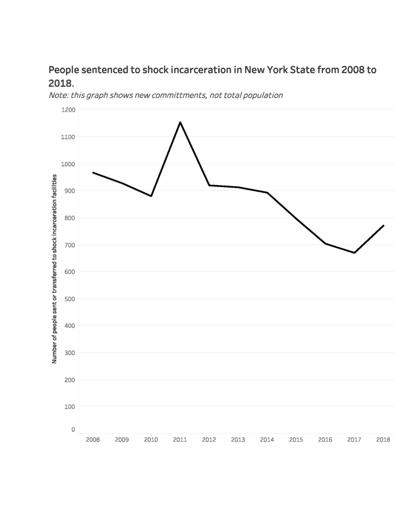
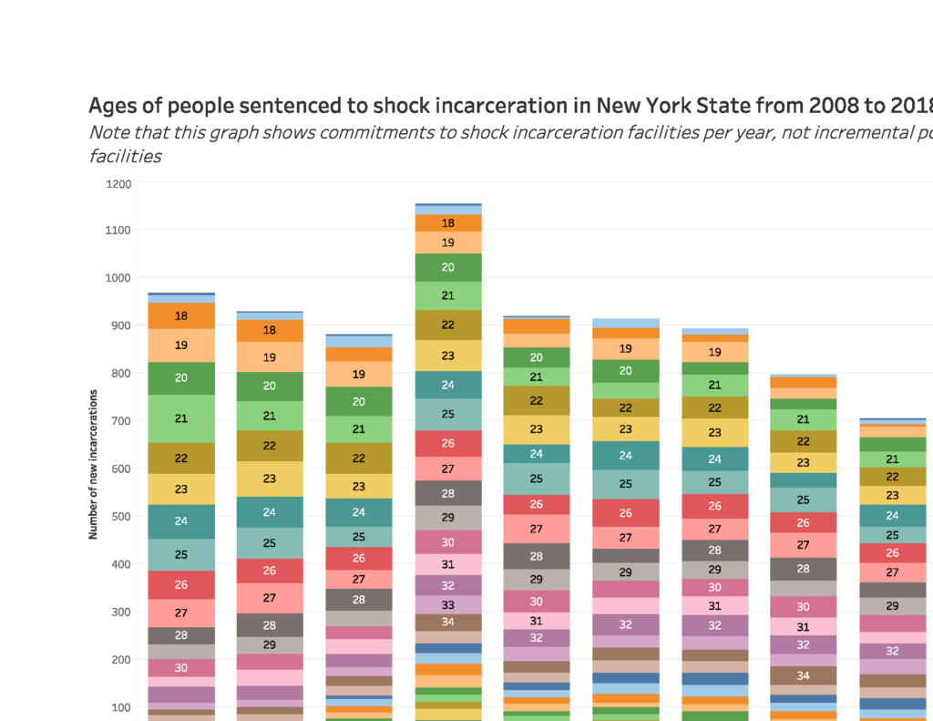
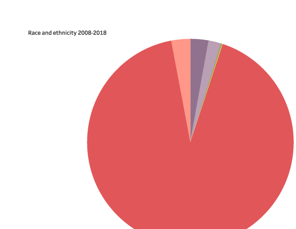
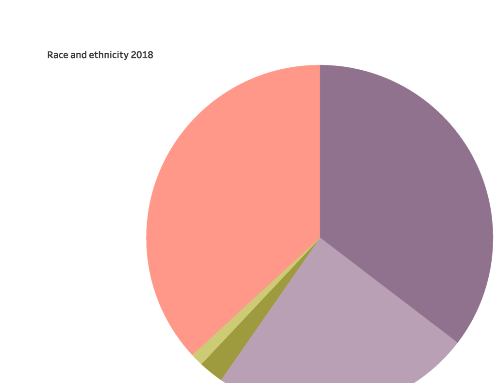
I couldn’t embed Tableau Public in WordPress so I paste pictures here, but you can’t click and scroll and interact with my visualizations here, and some of the pictures are cut off so please visit my visualization on Tableau. By the way, I was happy to remember that students can get Tableau Desktop for free for a year. Here’s the link: https://www.tableau.com/academic/students

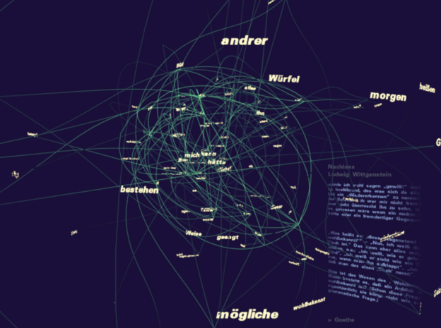
First, here is the mess I made with Cytoscape (I didn’t even try to figure out how to embed):

Isn’t that horrible?! Here’s a close-up:

And here are pictures of what I did with Tableau:

Phew, that’s all for now. See it on Tableau, there’s no comparison.

Network Analysis of Wes Anderson’s Stable of Actors

I had initially planned to have my network analysis praxis build on the work I had started in my mapping praxis, which involved visualizing the avant-garde poets and presses represented in Craig Dworkin’s Eclipse, the free on-line archive focusing on digital facsimiles of the most radical small-press writing from the last quarter century. Having already mapped the location of presses that had published work in Eclipse’s “Black Radical Tradition” list, I thought that I might try to expand my dataset to include the names and addresses for those presses that had published works captured in other lists in the archive (e.g., periodicals, L=A=N=G=U=A=G=E poets). My working suspicion was that I would find through these mapping and networking visualizations unexpected connections among the disparate poets in Eclipse and (possibly, later) those featured in other similar archives like UbuWeb or PennSound, which could potential yield new comparative and historical readings of these limited-run works by important poets.

The dataset I wanted and needed didn’t already exist, though, and the manual labor involved in my creating it–I would have to open the facsimile for each of multiple dozens of titles and read through its front and back matter hunting for press names and affiliated addresses–was more than I was able to offer this week. So I’ve tabled the Eclipse work only momentarily in favor of experimenting with a more or less already-ready dataset whose network analysis I could actually see through from beginning (collection) to end (interpretation).

Unapologetically twee, I built a quick dataset of all the credited actors and voice actors in each of Wes Anderson’s first nine feature-length films: Bottle Rocket (1996), Rushmore (1998), The Royal Tenenbaums (2001), The Life Aquatic with Steve Zissou (2004), The Darjeeling Limited (2007), Fantastic Mr. Fox (2009), Moonrise Kingdom (2012), The Grand Budapest Hotel (2014), and Isle of Dogs (2018). As anyone who has seen any of Anderson’s films knows, his aesthetic is markedly distinct and immediately recognizable by its right angles, symmetrical frames, unified color palettes, and object-work/tableaux. He also relies on the flat affective delivery of lines from a core stable of actors, many of whom return again and again to the worlds that Anderson creates. Because of the way these actors both confirm and surprise expectations–of course Adrian Brody would be an Anderson guy, but Bruce Willis?–I wanted to use this network analysis praxis to visualize the stable in relation to itself and to start to pick at interpreting the various patterns or anomalies therein.

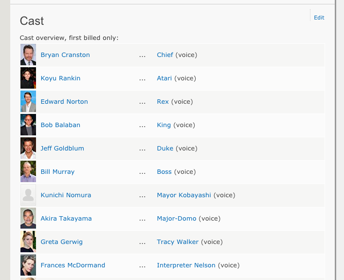
Fortunately IMDB automated a significant portion of the necessary prep work by providing the full cast list for each film and formatting each cast member’s first and last name in a long column–a useful tip I picked up while digging around Miriam Posner’s page of DH101 network analysis resources–so I was able to easily copy and paste all of my actor data into a Google Sheet and manually add the individual film data after. (I couldn’t copy and paste actor names from IMDB without grabbing character names as well, so I kept them, not knowing if they would end up being useful. For this brief experiment, they weren’t.)

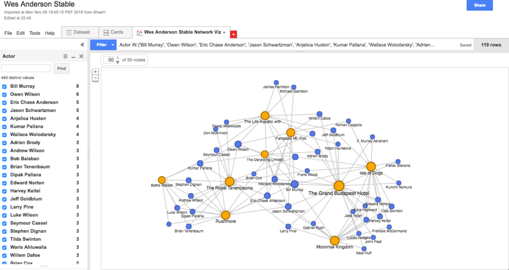
I used Google’s Fusion Tables and its accompanying instructions to build a Network Graph of the Anderson stable, the final result of which you can access here. As far as other tools went, Palladio timed out on my initial upload, buffering forever, and Gephi had an intimidating interface for what I intended to be a light-hearted jaunt. Fusion Tables was familiar enough and seemed to have sufficient default options for analyzing my relatively small dataset (500-ish rows in three columns), so I took the path of least resistance, for now.

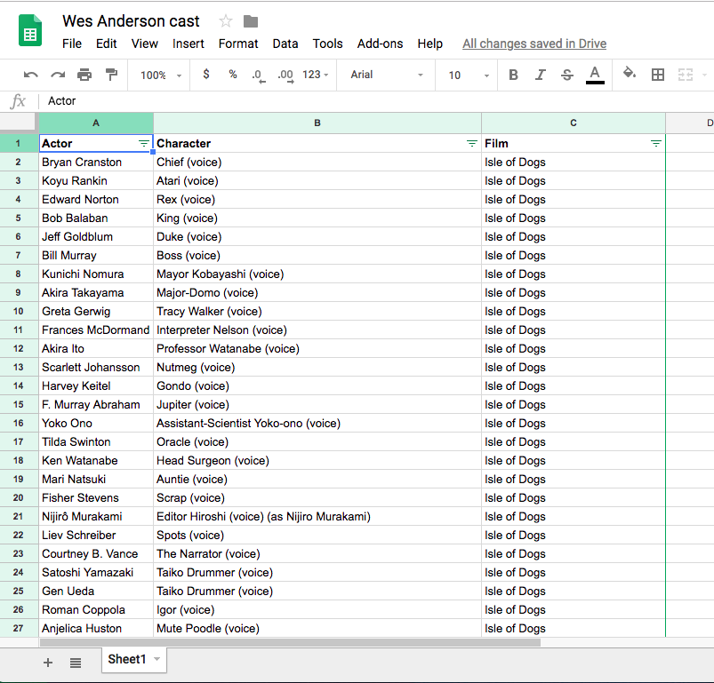
A quick upload of my Sheet and a + Add Chart later, my first (default) visualization looked taxonomical and useless, showing links between actor and character that, as you might expect, mapped pretty much one-to-one except in those instances where multiple actors played generic background roles with identical character names (e.g., Pirate, Villager).
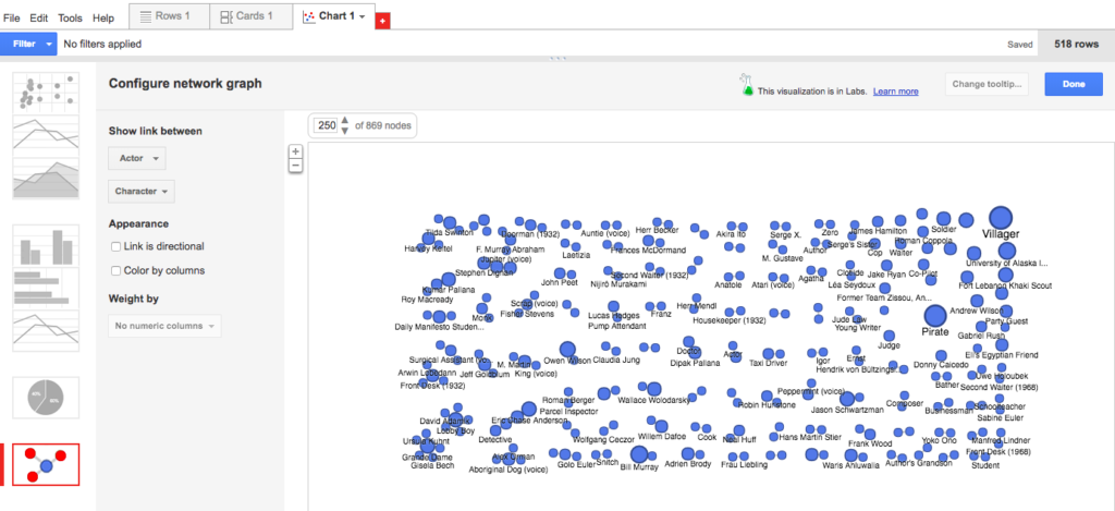
A poorly organized periodic table of characters

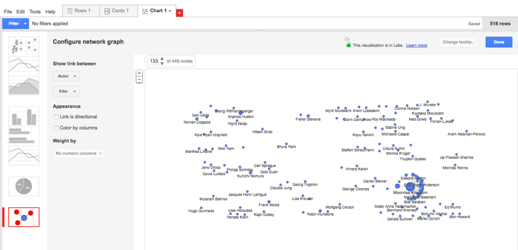
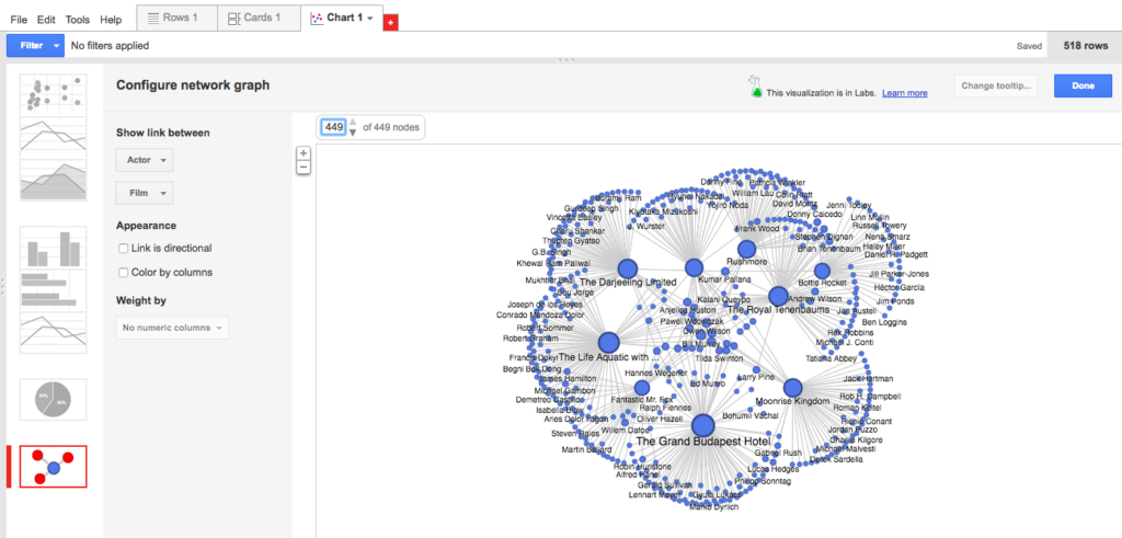
I changed the visualization to instead show a link between actor and film, and was surprised to find that this still didn’t show me anything expected (only one film?) or intriguing. Then I noticed that only 113 of the 449 nodes were showing, so I upped the number to show all 449 nodes. Suddenly, the visualization became not only more robust and legible, but also quite beautiful! Something like a flower bloom, or simultaneous and overlapping fireworks.

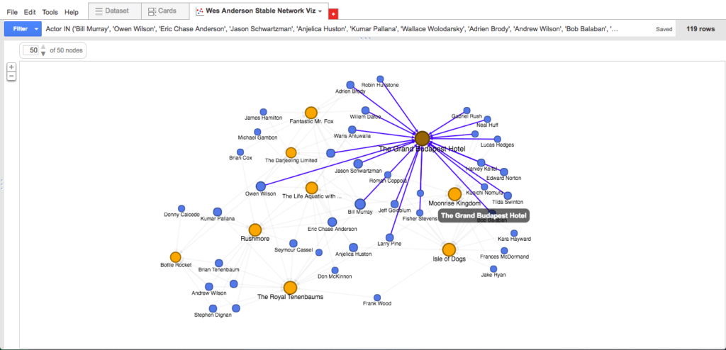
Beautiful as the fireworks were, I felt like the visualization was still telling me too much information, with each of the semi-circles consisting primarily of actors who had one-off relationships to these films. Because I wanted to know more about the stable of actors and not the one-offs, I filtered my actor column to include only those who had appeared in more than one of Anderson’s films (i.e., names that showed up on the list two or more times). I also clicked a helpful button that automatically color-coded columns so that the films appeared in orange and the actors in blue. This resulted in a visualization just complex enough to be worth my interrogating and/or playing with, yet fixed or structured enough to keep my queries contained.

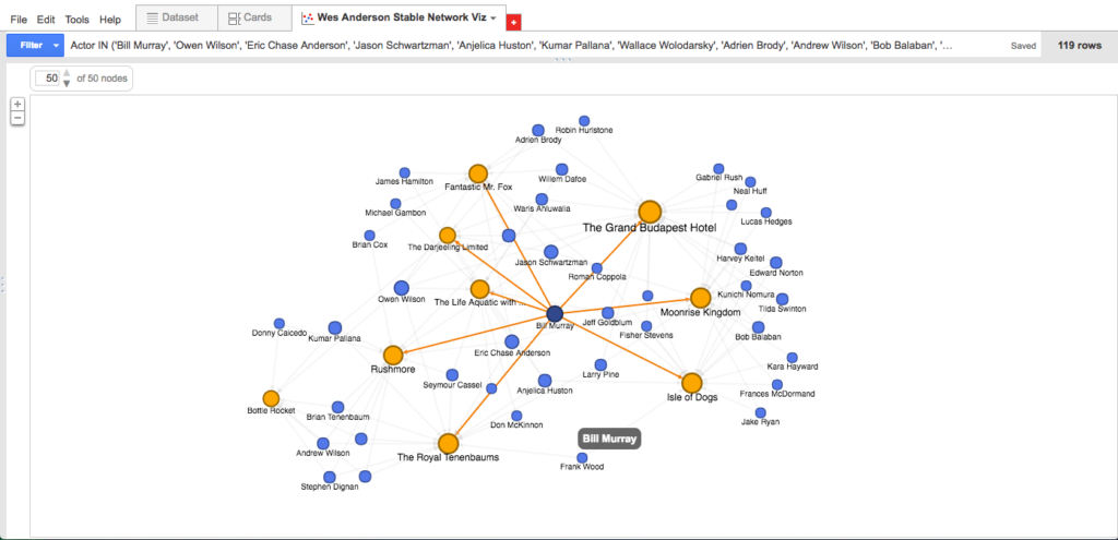
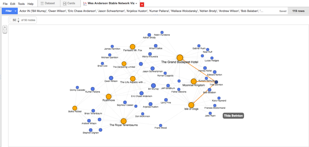
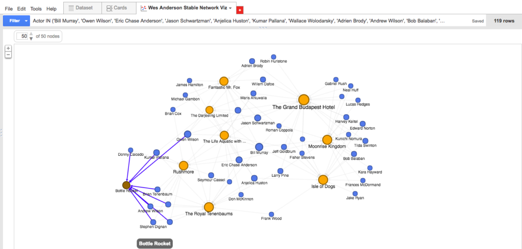
As far as reading these visualizations go, it’s something like this: Anderson’s first three films fall bottom-left; his next three films fall top-center; and his three most recent films fall bottom-right. Thus, the blue dots bottom-left are actors featured among the first three films only; blue dots bottom-center are actors who appear consistently throughout Anderson’s work; and blue dots bottom-right are actors included among his most recent films. As you can see by hovering over an individual actor node: the data suggests (e.g.) that Bill Murray is the most central (or at least, most frequently recurring) actor in the Anderson oeuvre, appearing in eight of the nine feature-length films; meanwhile, Tilda Swinton, along with fellow heavyweights Ed Norton and Harvey Keitel, appears to be a more recent Anderson favorite, surfacing in each of his last three films.

Also of interest: the name Eric Chase Anderson sits right next to Murray at the center of the network; Eric is the brother of Wes, the illustrator of much of what we associate with Wes Anderson’s aesthetic, and apparently also an actor in the vast majority of his brother’s films. (I’m not sure this find would have surfaced as quickly without the visualization.)

Elsewhere, the data suggests that Anderson’s first film Bottle Rocket was more of a boutique operation that consisted of a relatively small number of repeat actors (8), only two of which–Kumar Pallana and Owen Wilson–appeared in films beyond the first three. Anderson’s seventh film The Grand Budapest Hotel, released nearly twenty years later, expanded to include a considerable number of repeat actors (22: the highest total on the list), nine of whom were first “introduced” to the Anderson universe here and subsequently appeared in the next film or two.

I wonder what we would see if we visualized nodes according to some sort of sliding scale from “lead actor” to “ensemble actor” in each of these films, perhaps by implementing darker/more vibrant edges depending on screen time or number of lines? Would Bill Murray be more or less central than he is now? Would Eric Chase Anderson materialize at all?

And I wonder what opportunities there are to further visualize nodes based on actor prestige (say, award nominations and wins get you a bigger circle) or to create “famous actor” heat maps (maybe actors within X number of years of a major award nomination or win get hot reds and others cool blues) that might show us how Anderson’s casting choices change over time to include more big names. Conversely, what could these theoretical large but cool-temperature circles tell us about Anderson’s use of repeat “no-name” character actors to flesh out his wolds?

Further, I wonder if there are ways of using machine learning to analyze these networks and to predict the likelihood of certain actors’ being cast in Anderson’s next film based on previous appearances (i.e., the “once you’re in, you’re in” phenomenon) or recent success. Could we compare the Anderson stable versus, say, the Sofia Coppola or Martin Scorsese stables, to learn about casting preferences or actor “types”?
Make Space for Ghosts: Lauren Klein’s Graphic Visualizations of James Hemings in Thomas Jefferson’s Archive

In “The Image of Absence: Archival Silence, Data Visualization, and James Hemings,” Lauren Klein discusses a letter by Thomas Jefferson to a friend in Baltimore which she accessed through Papers of Thomas Jefferson Digital Edition , a digital archive which makes about 12,000 and “a significant portion” of 25,000 letters from and to Jefferson available to subscribers of the archive. In this letter, Jefferson asks his friend in Baltimore to give a message to his “former servant James” to illustrate how a simple word search would fail to identify that “James” as his former slave James Hemings, the brother of Sally Hemings, Jefferson’s slave and probably mother of five of his children.[1] Drawing our attention to how the “issue of archival silence – or gaps in the archival record – [which remain] difficult to address” in graphic visualization, Klein notes that the historians who built the Jefferson Papers archive added metadata to indicate that the James referred to in the above-mentioned letter was James Hemings [664]. I wonder what the metadata looks like; I wonder whether it provides sources or reflection, and what the extratextual conversation going on at the back end of the archive, if conversation it is, reveals.

While meta-annotation may appear to be a good way to fill the gaps of archival silence, Klein argues that adding scholarship as metadata creates too great a dependence on the choices the author of the archive made. The addition of metadata to the letter to the friend in Baltimore makes me wonder where in the archive metadata was added, where not, and why. Are all the gaps filled? Had metadata not been added to the letter Klein discusses, an analysis of the archive could conclude that Jefferson never makes any mention of James Hemings in the letter he wrote to his friend in Baltimore in 1801 to try to find Hemings, or in the ensuing correspondence between Hemings and Jefferson through Jefferson’s friend, in which Jefferson tries to hire Hemings and Hemings sets terms that were probably not met [667]. A word search in the archive, however, pulls up only inventories of property, documents of manumission, notes about procuring centers of pork and cooking oysters (Hemings was Jefferson’s chef) and finally a letter in which Jefferson asks whether it’s true that Hemings committed suicide [671]. How, asks Klein, do we fill in the gaps between the pieces of information we have? She concludes that we can’t. How do we show the silences then, she asks; how do we extract more meaning from the documents that exist – letters, inventories, ledgers and sales receipts – “without reinforcing the damaging notion that African American voices from before emancipation […] are silent, and irretrievably lost?” [665].

Klein calls for a shift from “identifying and recovering silences” to “animating the mysteries of the past” [665] but not by traditional methods. Instead, Klein says that the fields of computational linguistics and data visualization help make archival silences visible and by doing so “reinscribe cultural criticism at the center of digital humanities work” [665]. Through visualization Klein fills the historical record with “ghosts” and silences, rather than trying to explain away the gaps. The visualizations she creates are both mysterious and compelling, and bear evidence in a way that adding more words does not.

[1]Sarah Sally Hemings (c. 1773 – 1835) was an enslaved woman of mixed race owned by PresidentThomas Jefferson of the United States. There is a “growing historical consensus” among scholars that Jefferson had a long-term relationship with Hemings, and that he was the father of Hemings’ five children,[1] born after the death of his wife Martha Jefferson. Four of Hemings’ children survived to adulthood.[2] Hemings died in Charlottesville, Virginia, in 1835. [Wikipedia contributors, “Sarah ‘Sally’ Hemings”]

What is Visualization? – a deeper look into what data visualization can tell us

Following up on one of my concerns last week and “All Models Are Wrong from two weeks ago, I’m going to write more today on what information visualization does and does not tell us, inspired by Lev Manovich’s “What is Visualization”.

In the beginning of the reading, Manovich seems to support the argument from All Models are Wrong, in that models only tell a portion of the story.

“By employing graphical primitives (or, to use the language of contemporary digital media, vector graphics), infovis is able to reveal patterns and structures in the data objects that these primitives represent. However, the price being paid for this power is extreme schematization We throw away %99 of what is specific about each object to represent only %1- in the hope of revealing patterns across this %1 of objects’ characteristics.” Lev Manovich, What is Visualization?

In this excerpt, Manovich makes clear the advantage of traditional means of information visualization: revealing easily recognizable patterns from data that would otherwise take hours, days, or weeks to analyze. On the contrary, he admits that the downfall of simplifying the data is in the very act of simplifying it. This was troubling to me. I so desperately wanted there to be a way to visualize the data without loosing data, then along came “direct visualization”.

“Direct visualization” is a term coined my Manovich to explain a technique that employs visualization without reduction. He gave several examples that are no longer searchable, but two that had a strong impact on my understanding of “direct visualization”. These are Timeline (Jeremy Douglass and Lev Manovich, 2009) and Valence (Ben Fry, 2001). Both have a very “next generation” feel to them which is another aspect to “direct visualization”; technology giving us the ability to decipher massive amounts of data in a short time, and present it with the use of color, animation, and interactive elements.

This was a fascinating read and “direct visualization” is something I’m looking forward to applying to my own work where possible.

TEXT MINING — OBITS + SONGS + ODES

My process with the Praxis 1 Text Mining Assignment began with a seed that was planted during the self-Googling audits we did in the first weeks of class, because I found an obituary for a woman of my same name (sans middle name of initial).

From this, my thoughts went to the exquisite obituaries that were written by The New York Times after 9-11 which were published as a beautiful book titled Portraits. One of my dearest friends has a wonderful father who was engaged to a woman who perished that most fateful of New York Tuesdays. My first Voyant text mining text, therefore, was of his fiancee’s NYT obituary. And the last text I mined for this project was the obituary for the great soprano Monserrat Caballe, when I heard the news of her passing as I was drafting this post.

The word REVEAL that appears above the Voyant text box is an understatement. When the words appeared as visuals, I felt like I was learning something about her and them as a couple that I would never have been able to grasp by just reading her obituary. Indeed, I had read it many times prior. Was it the revelation of some extraordinary kind of subtext? Is this what “close reading” is or should be? The experience hit me in an unexpected way between the eyes as I looked at the screen and in the gut.

My process then shifted immediately to song lyrics because, as a singer myself who moonlights as a voice teacher and vocal coach, I’m always reviewing, teaching and learning lyrics. I saw the potential value of using Voyant in this way in high relief. I got really juiced by the prospect of all the subtexts and feeling tones that would be revealed to actors/singers via Voyant. When I started entering lyrics, this was confirmed a thousand fold on the screen. So, completely unexpectedly, I now have an awesome new tool in my music skill set. The most amazing thing about this is that I will be participating in “Performing Knowledge” an all-day theatrical offering at The Segal Center on Dec. 10 for which I submitted the following proposal that was accepted by the Theater Dept.:

“Muscle Memory: How the Body +  Voice Em”body” Songs, Poems, Arias, Odes, Monologues & Chants — Learning vocal/spoken word content, performing it, and recording it with audio technology is an intensely physical/psychological/organic process that taps into and connects with a performer’s individually unique “muscle memory”, leading to the creation of vocal/sound art with the body + voice as the vehicle of such audio content. This proposed idea seeks to analyze “songs” as “maps” in the Digital Humanities context. Participants are highly encouraged to bring a song, poem, monologue, etc. with lyric/text sheet to “map out”. The take-away will be a “working map” that employs muscle memory toward learning, memorizing, auditioning, recording and performing any  vocal/spoken word content. –Conceived, written and submitted by Carolyn A. McDonough, Monday, Sept. 17, 2018.” [I’m excited to add that during the first creative meeting toward this all-day production, I connected my proposed idea to readings of Donna Haraway and Kathering Hayles from ITP Core 1]

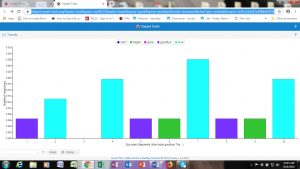
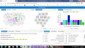
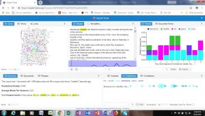
What better way to celebrate this, than to “voyant” song/lyric content and today’s “sad news day” obituary of a great operatic soprano. Rather than describe these Voyant Reveals through writing further, I was SO struck by the visuals generated on my screen that I wanted to show and share these as the findings of my research.

My first choice was “What I Did For Love” from A Chorus Line (on a sidenote, I’ve seen the actual legal pad that lyricist Edward Kleban wrote the score on at the NYPL Lincoln Center performing arts branch, and I thought I had a photo, but alas I do not as I really wanted to include it to show the evolution from handwritten word/text to Voyant text analysis.)

I was screaming as the results JUMPED out of the screen at me of the keyword “GONE” that is indeed the KEY to the emotional subtext an actor/singer needs to convey within this song in an audition or performance which I KNOW from having heard, studied, taught, and seen this song performed MANY times. And it’s only sung ONCE! How does Voyant achieve this super-wordle superpower?

I then chose “Nothing” also from A Chorus Line as both of these songs are sung by my favorite character, Diana Morales, aka Morales.

Can you hear the screams of discovery?!

Next was today’s obit for a great soprano which made me sad to hear on WQXR this morning because I once attended one of her rehearsals at Lincoln Center:

A complex REVEAL of a complex human being and vocal artist by profession.

AMAZING. Such visuals of texts, especially texts I know “by heart” are extremely powerful.

Lastly, over the long weekend, I’m going to “Voyant” this blog post itself, so that its layers of meaning can be revealed to me even further. –CAM