Author Archives: Michael Gossett

Final proposal: Born-Digital Graduate Conference in DH

Prototyping a born-digital graduate conference in digital humanities
PI: Michael Gossett (MA in Digital Humanities) | mgossett@gradcenter.cuny.edu

Overview
This proposal requests support for the planning and development of a born-digital, open-access graduate conference to be held in May 2019. The conference would be organized and jointly hosted online by the inaugural cohorts of the MA in Digital Humanities and MS in Data Analysis and Visualization programs at the CUNY Graduate Center.

The project would serve as a proof of concept for exploring the introduction of the conference’s online scholarly meeting functionality into the infrastructure or instructional documentation of open-access educational platforms such as the CUNY Academic Commons and Commons in a Box (CBOX).

There would be three phases to the larger project, of which this proposal figures as the first:

Phase 1 – Plan and prototype: Design and host in May 2019 a graduate conference in digital humanities (DH) that takes full advantage of the scholarly and social affordances of the web and makes accommodations for the particular personal and professional needs of graduate students. This phase would require the formation of a conference planning committee of MA and MS students; an advisory committee of GC Digital Fellows, librarians, and faculty; and a small stable of external consultants with experience in designing born-digital conferences and with developing infrastructure for field-building in the humanities. Phase 1 would conclude with two key deliverables:

  1. an innovative flagship DH conference for two new masters programs in their inaugural year at the GC; and
  2. a replicable (if developing) model for inclusive, accessible, cost-effective, and environmentally friendly online conferences capable of featuring critical and creative work from emerging and established scholars, educators, artists, and librarians working across interdisciplinary fields in the humanities in the United States and abroad.

Phase 2 – Develop, iterate, and share: Evaluate the scholarly, social, and technical successes and challenges of the conference for future building; consult with the GC Library and the Data and Digital Projects librarian to compose a data management and retention plan for the May 2019 conference and for the conference model going forward; and compose the white paper. This phase would require the project team to iterate on the initial conference model in preparation for additional conferences (at minimum: a May 2020 graduate conference in DH), and to possibly “fork” the model to accommodate developments required for other graduate-student-centered scholarly meetings or events in the humanities (e.g., the poetry reading, the paper workshop, the lecture series, the acting showcase, the studio art critique). Phase 2 would conclude with three key deliverables:

  1. a developing data management plan, created in consultation with the GC Library, for the online and archival preservation of the May 2019 conference and of any future born-digital conferences at the GC;
  2. a white paper on the conceptual and technical successes and challenges of the grant that would be distributed to DH graduate programs and centers in the United States and abroad; and
  3. one or more additional conferences or scholarly meetings in the planning or development stages for Fall 2019/Spring 2020.

Phase 3 – Refine and implement: Determine the sustainability and replicability of the initial conference model at the GC and elsewhere. During this phase, which would potentially arrive only after several cycles of phase 2, the project team would begin conversations with leadership for the CUNY Academic Commons and CBOX to explore integrating the scholarly meeting functionality developed through this project with the Commons and CBOX platforms and/or instructional documentation. These conversations would help to determine what further development and promotion would be required to make the model easily shared beyond across the GC and to institutions beyond it.

Enhancing the humanities through innovation
Note: This section seeks to adapt and apply to DH parts of Ken Hiltner’s (University of California at Santa Barbara) white paper on UCSB’s digital conference model. (See also: Environmental scan)

New technologies have opened up exciting possibilities for reimagining what humanities research looks like in the digital age. Keeping pace have been innovations in how scholars communicate this research through publishing and pedagogy, with monographs, journals, and classrooms each adopting a variety of new forms in the digital landscape. However, considerably less effort has been put into translating scholarly meetings—particularly the academic conference—into a comparable digital format, which leaves an important gap in coverage after the initial research stage and before the final publication stage in the new digital scholarship workflow. This gap disproportionately and negatively affects graduate students who, as emerging scholars, benefit most from the kinds of opportunities to share and refine works-in-progress that conferences are particularly adept at providing, and who, as students, have more limited funding options and travel time at their disposal than regular conference attendance typically calls for.

This project would look to fill the gap in coverage with a prototype for a born-digital graduate conference that would account for the particular personal and professional needs of graduate students (as hosts, as presenters, as attendees) by taking advantage of the scholarly and social capabilities of the networked web.

Though the particular format of the proposed conference would be determined by the conference planning committee in the early weeks of the project, generally speaking a born-digital conference would be conceived as one in which:

  1. speakers or lead participants pre-prepare their presentations (e.g., a video of them speaking via webcam or smartphone; a screen recording of a presentation via PowerPoint; some hybrid of the two, with speaker and presentation alternately or simultaneously onscreen; a string tweets or blog posts);
  2. talks or presentations are viewed on a dedicated conference website (e.g., WordPress) or social media platform (e.g., Twitter); and
  3. discussion and conversation is facilitated through online commenting forums that are kept open and active longer than the duration of a traditional conference Q&A.

Thus, a born-digital conference would have distinct advantages over a traditional conference format, several of which would be of particular import to graduate students:

More inclusive: Without a travel requirement, graduate students would be able to participate in the conference from nearly anywhere on the globe, allowing for increased attendance and a cross-pollination of ideas from national and international colleagues. Traditional graduate conferences, for a number of logistical reasons, tend to be highly local or, at best, regional, with the host institution grossly overrepresented among attendees. Because born-digital conferences can be built using largely or exclusively free, open-source software, it makes them inexpensive to host and free to attend. This allows a range of groups and institutions, particularly remote or under-resourced colleges and universities, to be able to do so.

More accessible: Born-digital conference content can be closed captioned for hard-of-hearing individuals, optimized for audio screen readers, and made available as audio podcasts. Additionally, conference talks have the potential to be captioned in more than one language, and can accommodate multiple translations through accompanying transcriptions. This means there is potential for presenters to present in their native languages with English (and other) translations, opening up the possibility of a true multilingual conference.

More citable and shareable: By existing online, a born-digital conference functions as both an event and a publication, giving nearly anyone anywhere on the globe, as long as Internet access is available, instant and lasting access to all the cutting-edge material introduced at the event. This is especially valuable to graduate students, whose developing scholarship and creative work is less likely to have a stable, citable, and shareable (i.e., published) form once the conference is over.

More available: Born-digital conferences offer graduate students the ability to create and consume conference content on their own time. This makes attending these events far more efficient, as it allows one to attend all of the presentations of interest–eliminating the unfortunate phenomenon of “competing panels”–and none of those that are not, all in the order, and at a time, of one’s own choosing. This is especially valuable to graduate students, whose classroom, teaching, work, and family responsibilities often limit their ability to devote uninterrupted time to days- or even day-long conferences.

Environmental scan
This project would look to maintain and build on several existing efforts to rethink the nature and structure of scholarly meetings, especially inasmuch as they appear in higher education via the traditional humanities conference. Three initiatives in particular serve as important touchstones for the future work of this project: the “nearly carbon-neutral” conference, the unconference, and the Twitter conference.

The “nearly-carbon neutral” conference: The University of California at Santa Barbara’s Environmental Humanities Initiative (EHI) introduced their “nearly-carbon neutral” (NCN) conference model in 2016 in an effort to eliminate the massive carbon footprint of traditional fly-in conferences. By the EHI’s estimates, an average traditional conference of 50 attendees from eight different countries would require over 300,000 miles in air travel, resulting in over 100,000 pounds of carbon dioxide in the process–the equivalent of the total annual carbon footprint of 50 people living in India or 165 people living in Kenya. To curb this, the NCN model takes a digital approach, wherein keynote addresses, plenary discussions, and panel presentations are pre-recorded as videos that are hosted on a publicly available and widely promoted conference website that remains open for viewing and commenting for approximately three weeks. In an NCN, Q&A sessions are regularly staged in a registered comments section adjacent to the presentations, with presenters and speakers committed to asynchronous engagement with commenters during the duration of the conference.

The NCN is the leading model for born-digital conferences, having been well-received by its presenters and attendees (87 percent of speakers have said “yes,” the conference was successful) and having been iterated on and refined in a total of three pilot projects at the UCSB EHI between 2016 and 2018 (here, here, and here). It is more than likely that much of what this project would attempt to do would be in large part indebted to the lessons learned and best practices established in conference organizer Ken Hiltner’s white paper and practical guide to hosting an NCN. However, even Hiltner acknowledges that this model is still very much in development, using the white paper to encourage others to “modify the NCN conference approach explored here,” “experiment,” and “let me know what worked (and what didn’t) so that future NCN conferences can be improved upon.” Since “the goal is to create a viable alternative to the traditional conference,” Hiltner says, “improvements to the approach are most welcome.”

This project would take seriously Hiltner’s call and would look for improvements to the model that would benefit the graduate student experience. The project would augment the innovations of the NCN by introducing to the eco-focused conference some additional innovations gleaned from two significant digital conference models developing in or around DH.

The unconference: The “unconference” model created by BarCAMP and popularized in DH over the past decade by THATCamp (“The Humanities and Technology Camp”) is an open, inexpensive, and highly informal type of meeting where humanists and technologists of varying skill levels gather in regional meet-ups to learn and build together in sessions proposed on the spot. Unconferences differ from traditional conferences in two significant ways: (1) the program for the unconference isn’t set beforehand by a program committee, but is mostly or entirely created by all the participants during the first session of the first day; and (2) there are no formal or prepared presentations, as sessions at the unconference are conducted less like lectures and more like seminars, where everyone participates and shapes the direction of the conversation.

The planning committee would be tasked with finding ways by which to integrate this organic and “bottom-up” unconference approach into a born-digital model that requires no physical travel accommodations and that can be easily preserved and shared online.

The Twitter conference: In the Twitter conference model used for the Public Archaeology Twitter Conference as well as for PressED, a conference on how WordPress is used in teaching and research, presenters are simply allocated approximately 15-minute time slots over the course of the day of the conference to post a 10-12- tweet-conference paper linked to other conference papers via an established hashtag.

Though likely to borrow less from this model than from the NCN or unconference models, the planning committee nonetheless would be tasked with finding ways to incorporate the flexibility, dynamism, concision, and minimal computing of the Twitter conference approach into a born-digital format that affords time and space for more sustained argumentation or creative exploration.

Work plan
The project activities for Phase 1 will be grouped into four stages:

Stage 1 (Jan-Feb 2019)

  • Establish planning committee, advisory board, and consultants
  • Choose project management tool (e.g., Airtable, Google Doc)
  • 1-day retreat to design the structure of the conference
  • As applicable, identify keynote/plenary speakers (target: 2-4)
  • As applicable, send targeted invitations to graduate students (target: 4-6)
  • As applicable, draft an open call for proposals and distribute to GC and elsewhere, both in the United States and abroad (target: 24-32)
  • Draft how-to and best practice guides on digital presentation
  • Create wireframes for conference website in CUNY Academic Commons
  • Create social/media presence (Facebook, Twitter, Instagram, YouTube, SoundCloud)
  • Apply for MA/MS Digital Project Startup Grant (application due January 25)
  • Apply for MA/MS Training Grant (application due January 25)
  • Apply for New Media Lab resources and workspace

Stage 2 (Mar 2019)

  • As applicable, finalize participants list and organize into clusters (target: 8 clusters of 3-4 presentations)
  • Develop a social media strategy for pre-conference and conference content
  • Begin to acquire presentations from participants

Stage 3 (Apr-May 2019)

  • Acquire remaining presentations from participantsUpdate conference website with presentations
  • Create transcripts and, as applicable, translations of presentations
  • Remediate presentations according to ADA standards
  • Post audio podcasts to conference SoundCloud page
  • Quality check pre-Go Live

Stage 4 (May 2019)

  • Conference Go Live
  • Roll out daily social media announcements highlighting conference content
  • Monitor comments sections and encourage panelist engagement

Stage 5 (May-Jun 2019)

  • Prepare for Phase 2
  • Draft preliminary white paper
November 20: A Case for Keeping Infrastructure and Materiality

I want to make a brief case for why we ought to keep the November 20 class focused on infrastructure and materiality, and I want to do it through the video game trope of mirror alignment puzzles. (Apologies in advance if this is a little too “did you know Shakespeare … [turns hat backwards] … was a rapper?!”)

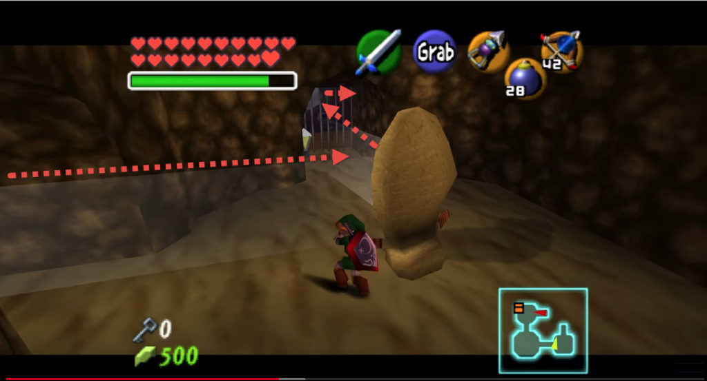
Mirror alignment puzzles start with a source of light that somehow needs to get from here (a crack in the roof) to there (a “sunlight keyhole”). Your job is to position a dozen or so abandoned cave mirrors into a mediating system that takes the light where it wants to go. It’s how you move forward, or access important tools.

The Legend of Zelda: Ocarina of Time

When Jonathan Rauch talks about how the creation of knowledge, he describes it as a “professionalized and structured affair,” a network of “norms and institutions [assembled into] a system of rules for identifying truth.” That there even is a system that checks, balances, reviews, replicates, cites, and confirms its hypotheses is what fundamentally separates the “shared facts” of scholarly knowledge from the irreverent disinformation of “troll epistemology.” (As my other recent post indicates: I’m a bit preoccupied with the blurry boundary between scholarship and conspiracy right now.)

Similarly, when Kathleen Fitzpatrick thinks about “the university of the future” in Planned Obsolescence, she does so by spending a great deal of time reimagining the scholarly author, the monograph, peer review, the university press, and the library not just as discrete mirrors but more importantly as a necessary network for the mission-driven creation and sharing of knowledge. 

And since, as Eli Lehrer reminds us, infrastructure is a public good, using a liberal version of the transitive property, we can easily make the case that if infrastructure helps us constitute knowledge and infrastructure is a public good, then it must be that the constitution of knowledge is a public good. Knowledge is good! This may sound like nothing new–it’s basically something we knew already–but it’s true (here) only if each of the initial premises is true. And if we had to work backward from our conclusion, what could we really say about these initial premises? How convincingly can we argue that infrastructure is (or can be) a public good, or that infrastructure helps us constitute knowledge? Could we get into the weeds on these issues with those who are skeptical? (After all, one of the largest partisan gaps in institutional confidence involves higher education.) Can we say anything about the infrastructure of and around DH? Can we speak to the material changes needed to solve the “Grand Challenges” of our time with the same dexterity as we can the ideological changes needed? Is the fact that we are open to substituting this material indicative of a potential blind spot? 

Or, to cannibalize a line of thinking from Renaissance scholar and editorial theorist Gary Taylor: how can you love knowledge if you don’t know it? How can you know it if you can’t get near it? How can you get near it without its underlying infrastructure?

Rather than looking in the mirror to analyze a little more carefully the DH knowledge and experiences we bring to it–what we’ve already read; projects we’ve already started working on–I think we ought to spend a little time looking at the mirrors of DH themselves: the way they are currently positioned; their various misalignments; where the light is and wants to go and how an improved infrastructure can facilitate that process.

And it’s not just the hardware or software either, the mirrors that stand apart from us. I think we ought to consider human infrastructure too: how student or adjunct labor fits in to DH; who or what the public (or their data) is; how our physical bodies are exposed or made vulnerable in DH work.

The materiality of digital infrastructure.

The materiality of human infrastructure.

We’ll need to think too about the ecological systems in which our digital infrastructure operates: the permanence or disposability of machines; energy usage for the creation and preservation of projects; the physical space DH centers and server warehouses and shared repositories require; the carbon footprint involved in our conference travel to present on the shiny new thing.

Shine your mirror shield here long enough…

…and you will receive access, but will irremediably destroy the face.

There’s a lot to talk about, and Matt and Steve bring a lot to the table in this regard through their CUNY and other affiliations. It’s worth spending two hours thinking about.

Ten Things: Deformance as Conspiracy and Cunning

1 // In the interest of showing the mangle of my practice, here is a miniature commonplace book of current entanglements with our recent readings on deformance and some additional ones on conspiracy and cunning.

Deformance as Interpretation

2 // Lisa Samuels and Jerome McGann (“Deformance and Interpretation”) tell us that works of imagination “encourage interpreters,” since imaginative work has a performance element to it that is  “organized as rhetoric and poiesis rather than as exposition and information-transmission.” They argue that, though scholarly criticism often thinks of itself as operating on the expository, informational end of things, in truth, by virtue of its interpretive practice, scholarly criticism is very much a kind of imaginative work, and as such, it inevitably “lies open to deformative moves.” Deformance, here, is both performing and deformed, scrambling what it enacts, reconstructing what it consumes–some version of “the Susie-dancing-Olga scene” in Suspiria (2018), if you’ve had a chance to see it.

3 // What Samuels and McGann are getting at is not unlike what Lev Manovich describes in The Language of New Media, if you think of, here, a text as a “database” and deformative or interpretive reading or criticism as a “narrative”:

As a cultural form, the database represents the world as a list of items, and it refuses to order this list. In contrast, a narrative creates a cause-and-effect trajectory of seemingly unordered items (events). Therefore, database and narrative are natural enemies. Competing for the same territory of human culture, each claims an exclusive right to make meaning out of the world.

Manovich also quotes Mikhail Kaufman (Man with a Movie Camera) in an illustration I find helpful:

An ordinary person finds himself in some sort of environment, gets lost amidst the zillions of phenomena, and observes these phenomena from a bad vantage point. He registers one phenomenon very well, registers a second and a third, but has no idea of where they may lead. But the man with a movie camera is infused with the particular thought that he is actually seeing the world for other people. Do you understand? He joins these phenomena with others, from elsewhere, which may not even have been filmed by him. Like a kind of scholar he is able to gather empirical observations in one place and then in another. And that is actually the way in which the world has come to be understood.

4 // Texts, Samuels and McGann say, “lose their vital force when they succumb to familiarization,” suggesting that it’s only through defamiliarizing them, through “disordering one’s senses of the work” by cutting through them via “strange diagonals”–that is to say, through making them something that they weren’t before–that we strengthen and propel texts forward. This all sounds like interesting, important, and necessary work.

And yet, deformance also “turns off the controls that organize the… system;” creates results that we “cannot predict;” puts us in a “highly idiosyncratic relation” to things; reorders, isolates, alters, and forcefully inserts; and ultimately changes the previously agreed upon terms for investigation. This, to me, even as one who “gets it”–appropriative conceptual poetry is a primary research interest of mine–is a dangerous rhetoric made all the more dangerous by our current cultural and political climate of trolling, gaslighting, indifference to truth, skepticism of institutions/-al knowledge, and rampant, blatant disinformation.

Deformance as Conspiracy

5 // There are two quotes from Stephen Ramsay’s Algorithmic Criticism that I highlighted during my first reading because of the way they position deformative interpretation as an intentional rejection of fact:

We read and interpret, and we urge others to accept our readings and interpretations. Were we to strike upon a reading or interpretation so unambiguous as to remove hermeneutical questions that arise, we would cease to refer to the activity of reading and interpretation. […] If text analysis is to participate in literary critical endeavor in some manner beyond fact-checking, it must endeavor to assist the critic in the unfolding of interpretive possibilities.


And:

It is in such results that the critic seeks not facts, but patterns. And from pattern the critic may move to the grander rhetorical formations that constitute critical reading.

Elsewhere, Ramsay notes that “pattern” (not fact) is the thing that “unites art, science, and criticism,” and says that literary criticism operates within a framework in which “the specifically scientific meaning of fact, metric, verification, and evidence simply do not apply.” Here, “‘evidence’ stands as a metaphor,” and readings are not the text itself, but new things where “data has been paraphrased, elaborated, selected, truncated, and transduced.”

Though I don’t believe this is what Ramsay himself is doing or suggesting at all–ditto Samuels and McGann above–there is a rhetoric and methodology here that focuses on non-facts and patterns, on the perceived slipperiness of fact and veracity, on building arbitrary patterns into grander formations, on urging others to accept one’s interpretations. The result is that, even when it is meant to liberate literary criticism, such thinking still inadvertently brings criticism squarely into the realm of conspiracy theory, a place that, at its worst, I think we are all very uncomfortable getting close to, given its current status as an alt-right, white nationalist breeding ground.

6 // Does the fact that one can create a brief reading list that links speculative literature and racist/nationalist “alternative beliefs” say anything about the inherent magnetic attraction between deformative criticism and conspiracy theory? (FWIW: Part 2 of this reading list is on the much more palatable topic of aliens.)

7 // In her (very short) essay “Some Preliminary Notes on Conspiracy as Theory” (PDF below) Astrid Lorange writes about “the way that [scholarly] research requires special attention to a set of often imperceptible connections that reveal themselves as increasingly relevant, as if they spoke to a larger whole mostly hidden, apparent only by effort.”

Astrid Lorange – Some Preliminary Notes on Conspiracy as Theory

Here’s one beefy section:

Let’s say we consider scholarship a close ally of conspiracy theory; the practice of research, we can claim, is akin to a mode of thought that perceives, through a strange collusion of paranoia, desire, and experimental detective work, a theory of connectivity that belies a large but difficult-to-see truth… If the aim of the scholar is to uncover hidden truths through the disciplined labor of focusing-in, the conspiracy theorist’s aim is to uncover hidden truths through the the disciplined labor of focusing-out.

Here’s another:

For conspiracy theories, the final reveal reveals that what we feared all along was, indeed, there all along, and the reward is the knowledge of what we knew but could not prove. For scholarship, the final reveal reveals that what we assumed we knew was in fact a falsehood, a red herring, and the reward is the knowledge of the limits of our knowledge.

Even though Lorange frames conspiracy theory and scholarship as moving in opposite directions, the fact that they are doing so on the same track suggests something important about the underlying assumptions that gives her (and me) pause.

Deformance as Cunning

8 // To further complicate matters, I’ve scanned a few pages from Paul Chan’s introduction to a new-ish translation of Plato’s controversial Hippias Minor (or, The Art of Cunning) with a link to the PDF, if you want to take a look:

Paul Chan – Introduction to Hippias Minor

Hippias Minor is so controversial, Chan writes, because in it Socrates argues that there is “no difference between a person who tells the truth and one who lies, that an intentional liar is better than an unintentional one, and that the good man is the one who willingly makes mistakes and does wrong and unjust things,” a position which, initially, is remarkably counter-intuitive, given our longstanding familiarity with Socrates’s relentless pursuit of ideals and objective truths. But rather than reading this as an endorsement of lying for lying’s sake, Chan makes a case for reading this as Socrates’s “advocating for a novel way of thinking about the political potential of the creative act.”

It comes down to a dispute about greatness: Achilles versus Odysseus. The interlocutor Hippias argues that Achilles is more excellent because he tells the truth and Odysseus lies (about his identity, his motives, etc.); Socrates argues that Odysseus is more excellent because his lying is a form of versatility, adaptability, craftiness, and resourcefulness: it is, as Chan puts it, “his creative instinct.” This “cunning” allows Odysseus “to see what he is able (or not able) to get away with by finding or even inventing choices where none are evident or given.” In this way, Odysseus is not lying, but demonstrating through performance “how understanding what is most real and true about reality enables one to more ably reshape it for one’s benefit or pleasure.” Chan links lying back to reason, somehow, in a move I’m still trying to work out in my now-broken brain.

Is this what Samuels and McGann and Ramsay are getting at when they talk about deformance: cunning? Is such an idea compelling or sufficient enough, in 2018?

9 // Here’s a link to (another very short) essay, this time by Édouard U., that employs the concept of conspiracy theory to articulate a pedagogical deformative reading practice that builds personal relationships to ideas and texts and makes meaning through itinerant (rather than linear) wanderings:

My methods for avoiding this type of linear constriction have been simple: Read two or more books at the same time, always. Reject the closed-universe-on-rails nature of every single film ever made, and when possible, use the Wikipedia-while-watching technique to keep connecting the dots as I go. Always encourage myself to follow footnotes into rabbit-hole oblivion. Surf—don’t search—the web. Avoid listening to music simply to listen to music. Instead, intentionally mix and match sounds and styles as one might mix ingredients within a recipe…

At what point might conspiracy-theory mapping with push pins and thread become a more common learning technique for students, to encourage them to make their own connections and find their own lines of meaning?

He later calls this a “networked approach to reading,” by the way, which seems very DH, very “play” (it’s so in right now). 

10 // Does our deformative work tacitly tolerate conspiracy theory? Does it passively or hypocritically reject it? Does the cunning we display in our deformative criticism adequately justify any proximity we show to the practices of dangerous people with alternative beliefs? Is deformance simply the way of the future, a spectrum with both good and bad poles? 

I know that these don’t all align. And I know that, somewhere (or -wheres) in here, I’m wrong. Tell me where I am. What am I missing, misconstruing, forgetting about? Did I get any of it right? 


Network Analysis of Wes Anderson’s Stable of Actors

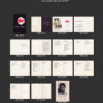
I had initially planned to have my network analysis praxis build on the work I had started in my mapping praxis, which involved visualizing the avant-garde poets and presses represented in Craig Dworkin’s Eclipse, the free on-line archive focusing on digital facsimiles of the most radical small-press writing from the last quarter century. Having already mapped the location of presses that had published work in Eclipse’s “Black Radical Tradition” list, I thought that I might try to expand my dataset to include the names and addresses for those presses that had published works captured in other lists in the archive (e.g., periodicals, L=A=N=G=U=A=G=E poets). My working suspicion was that I would find through these mapping and networking visualizations unexpected connections among the disparate poets in Eclipse and (possibly, later) those featured in other similar archives like UbuWeb or PennSound, which could potential yield new comparative and historical readings of these limited-run works by important poets.

The dataset I wanted and needed didn’t already exist, though, and the manual labor involved in my creating it–I would have to open the facsimile for each of multiple dozens of titles and read through its front and back matter hunting for press names and affiliated addresses–was more than I was able to offer this week. So I’ve tabled the Eclipse work only momentarily in favor of experimenting with a more or less already-ready dataset whose network analysis I could actually see through from beginning (collection) to end (interpretation).

Unapologetically twee, I built a quick dataset of all the credited actors and voice actors in each of Wes Anderson’s first nine feature-length films: Bottle Rocket (1996), Rushmore (1998), The Royal Tenenbaums (2001), The Life Aquatic with Steve Zissou (2004), The Darjeeling Limited (2007), Fantastic Mr. Fox (2009), Moonrise Kingdom (2012), The Grand Budapest Hotel (2014), and Isle of Dogs (2018). As anyone who has seen any of Anderson’s films knows, his aesthetic is markedly distinct and immediately recognizable by its right angles, symmetrical frames, unified color palettes, and object-work/tableaux. He also relies on the flat affective delivery of lines from a core stable of actors, many of whom return again and again to the worlds that Anderson creates. Because of the way these actors both confirm and surprise expectations–of course Adrian Brody would be an Anderson guy, but Bruce Willis?–I wanted to use this network analysis praxis to visualize the stable in relation to itself and to start to pick at interpreting the various patterns or anomalies therein.

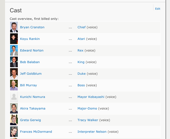
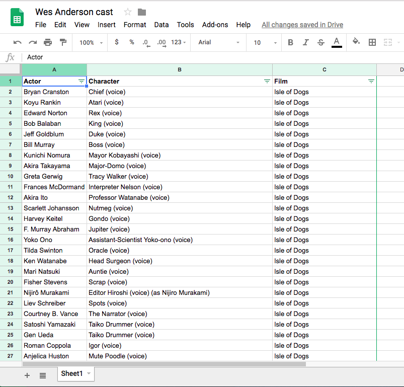
Fortunately IMDB automated a significant portion of the necessary prep work by providing the full cast list for each film and formatting each cast member’s first and last name in a long column–a useful tip I picked up while digging around Miriam Posner’s page of DH101 network analysis resources–so I was able to easily copy and paste all of my actor data into a Google Sheet and manually add the individual film data after. (I couldn’t copy and paste actor names from IMDB without grabbing character names as well, so I kept them, not knowing if they would end up being useful. For this brief experiment, they weren’t.)

I used Google’s Fusion Tables and its accompanying instructions to build a Network Graph of the Anderson stable, the final result of which you can access here. As far as other tools went, Palladio timed out on my initial upload, buffering forever, and Gephi had an intimidating interface for what I intended to be a light-hearted jaunt. Fusion Tables was familiar enough and seemed to have sufficient default options for analyzing my relatively small dataset (500-ish rows in three columns), so I took the path of least resistance, for now.

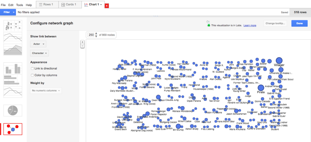
A quick upload of my Sheet and a + Add Chart later, my first (default) visualization looked taxonomical and useless, showing links between actor and character that, as you might expect, mapped pretty much one-to-one except in those instances where multiple actors played generic background roles with identical character names (e.g., Pirate, Villager).

A poorly organized periodic table of characters

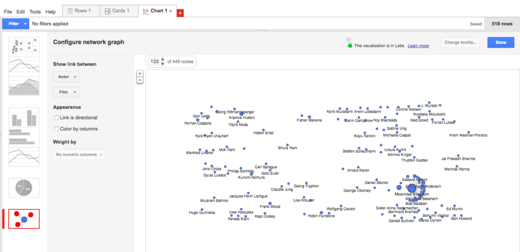
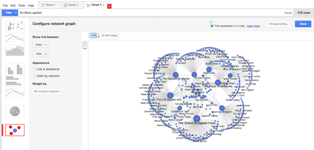
I changed the visualization to instead show a link between actor and film, and was surprised to find that this still didn’t show me anything expected (only one film?) or intriguing. Then I noticed that only 113 of the 449 nodes were showing, so I upped the number to show all 449 nodes. Suddenly, the visualization became not only more robust and legible, but also quite beautiful! Something like a flower bloom, or simultaneous and overlapping fireworks.

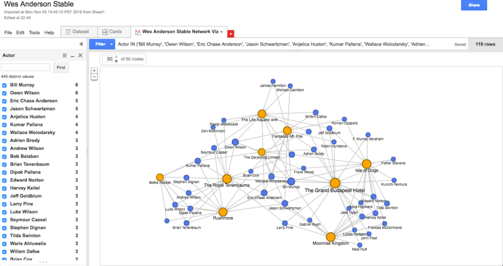
Beautiful as the fireworks were, I felt like the visualization was still telling me too much information, with each of the semi-circles consisting primarily of actors who had one-off relationships to these films. Because I wanted to know more about the stable of actors and not the one-offs, I filtered my actor column to include only those who had appeared in more than one of Anderson’s films (i.e., names that showed up on the list two or more times). I also clicked a helpful button that automatically color-coded columns so that the films appeared in orange and the actors in blue. This resulted in a visualization just complex enough to be worth my interrogating and/or playing with, yet fixed or structured enough to keep my queries contained.

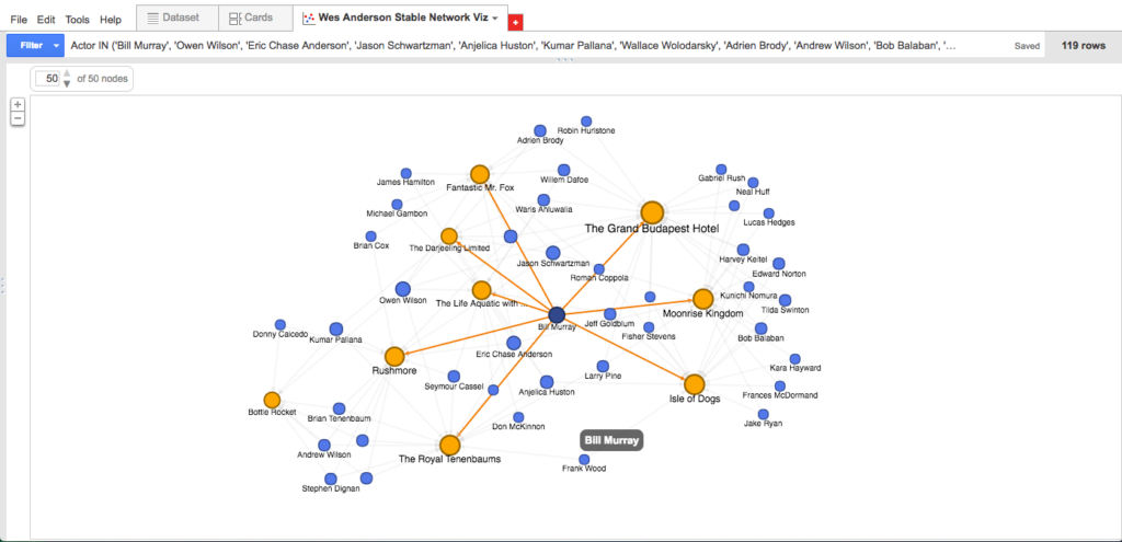
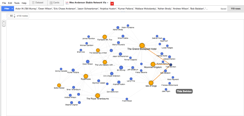
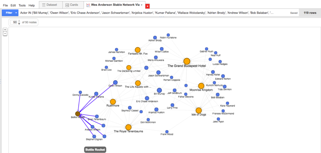
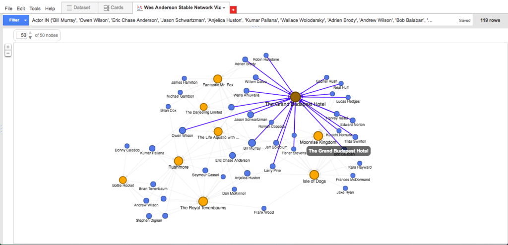
As far as reading these visualizations go, it’s something like this: Anderson’s first three films fall bottom-left; his next three films fall top-center; and his three most recent films fall bottom-right. Thus, the blue dots bottom-left are actors featured among the first three films only; blue dots bottom-center are actors who appear consistently throughout Anderson’s work; and blue dots bottom-right are actors included among his most recent films. As you can see by hovering over an individual actor node: the data suggests (e.g.) that Bill Murray is the most central (or at least, most frequently recurring) actor in the Anderson oeuvre, appearing in eight of the nine feature-length films; meanwhile, Tilda Swinton, along with fellow heavyweights Ed Norton and Harvey Keitel, appears to be a more recent Anderson favorite, surfacing in each of his last three films.

Also of interest: the name Eric Chase Anderson sits right next to Murray at the center of the network; Eric is the brother of Wes, the illustrator of much of what we associate with Wes Anderson’s aesthetic, and apparently also an actor in the vast majority of his brother’s films. (I’m not sure this find would have surfaced as quickly without the visualization.)

Elsewhere, the data suggests that Anderson’s first film Bottle Rocket was more of a boutique operation that consisted of a relatively small number of repeat actors (8), only two of which–Kumar Pallana and Owen Wilson–appeared in films beyond the first three. Anderson’s seventh film The Grand Budapest Hotel, released nearly twenty years later, expanded to include a considerable number of repeat actors (22: the highest total on the list), nine of whom were first “introduced” to the Anderson universe here and subsequently appeared in the next film or two.

I wonder what we would see if we visualized nodes according to some sort of sliding scale from “lead actor” to “ensemble actor” in each of these films, perhaps by implementing darker/more vibrant edges depending on screen time or number of lines? Would Bill Murray be more or less central than he is now? Would Eric Chase Anderson materialize at all?

And I wonder what opportunities there are to further visualize nodes based on actor prestige (say, award nominations and wins get you a bigger circle) or to create “famous actor” heat maps (maybe actors within X number of years of a major award nomination or win get hot reds and others cool blues) that might show us how Anderson’s casting choices change over time to include more big names. Conversely, what could these theoretical large but cool-temperature circles tell us about Anderson’s use of repeat “no-name” character actors to flesh out his wolds?

Further, I wonder if there are ways of using machine learning to analyze these networks and to predict the likelihood of certain actors’ being cast in Anderson’s next film based on previous appearances (i.e., the “once you’re in, you’re in” phenomenon) or recent success. Could we compare the Anderson stable versus, say, the Sofia Coppola or Martin Scorsese stables, to learn about casting preferences or actor “types”?

Ten Things: Mapping the Eclipse Archive’s “Black Radical Tradition”

1 // Most of my reading and writing centers on poetic experiments. Usually the adjectives involved include at least one from a short list that is: computational, constraint-based, conceptual. Other common adjectives are avant-garde and radical, the latter of which appears twice in the source material for my mapping praxis.

2 // Constraint-based, conceptual poet Craig Dworkin manages Eclipse, the free on-line archive focusing on digital facsimiles of the most radical small-press writing from the last quarter century. I return to the Eclipse archive regularly to look at works from poets like Clark Coolidge, Lyn Hejinian, Bernadette Meyer, and Michael Palmer. These are the poets with whom I most familiar. There are many poets in this particular archive with whom I am not familiar at all. In fact, I would say most. These are the poets with whom I want to get familiar. My sense is that I would say most of the poets with whom I am not familiar at all, given their proximity in this particular archive to those poets with whom I am familiar, deserve to have I would say most of their work looked at regularly alongside the others’.

3 // “Given their proximity in this particular archive…”: I am jumping ahead and have one eye on our third dataset/network praxis assignment, wondering to what extent spatial, temporal, racial, gendered, and influential proximity manifests in this particular network of poetic experiments. Conceptual poetry is notoriously white and male, but where isn’t it that way? Where are the radical and avant-garde titles that aren’t being looked at? Where are they? With one eye on our third praxis assignment, I start building a dataset to use for the second. I start with the Black Radical Tradition.

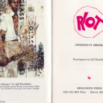
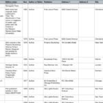
4 // As a rule, for each title in the archive, Eclipse offers: a graf on the title’s publication and material history, a facsimile view of each page, and a PDF download. With lousy Amtrak wifi, I let the facsimiles of each of the 39 titles in the Black Radical Tradition slowly drip down my screen. I don’t yet know what I’ll want for my dataset down the line, but to get started I try to snag from Dworkin’s notes and the first three/last three pages the most obvious data points: author, title, publisher, publication date. Because Eclipse features both authored titles and edited volumes, I learn to add a column to distinguish between the two. I soon add another column to capture notes on the edition, usually to reflect whether the title is part of a series or is significantly different in a subsequent printing. Because I aim to map these spatially–I’m guessing these will cluster on the coasts, but I don’t know this for sure–I snag addresses (street, city, state, zip, country) for each of the publishers. Except for Russell Atkins’s Juxtapositions, which Dworkin notes is self-published and for which I can find no address.

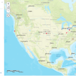
5 // I start my map with ArcGIS’s simplest template, noting two other available templates–the Story Map Shortlist, which allows you to curate sets of places like Great Places in America‘s three “neighborhoods,” “public spaces,” and “streets” maps, and the Story Map Swipe, which allows you to swipe between two contiguous maps like in the Hurricane Florence Damage Viewer–that I might return to in the future if I want to, say, provide curated maps by individual poet, or else compare “publisher maps” of the Black Radical Tradition and the L=A=N=G=U=A=G=E poets (another set of titles in the Eclipse archive).

6 // Even with the basic template, I experience four early issues with ArcGIS:

First, the map doesn’t recognize, and therefore can’t map, the addresses for each of my three United Kingdom-based publishers. This seems to be a limit of the free version of ArcGIS or possibly the specific template I am working with. This is problematic because it keeps me from making an international analysis or comparison, if I want to.

As I click ahead without a lot of customization, the default visualization presented to me assigns each author a different colored circle (fine). The problem with this is that it, for some reason, lumps four of the poets into a single grey color as “Other,” making it impossible to distinguish Bob Kaufman in San Francisco from Joseph Jarman in Chicago.  Those in the grey “Other” category each have one title to their name, but, confusingly, so do several “named” authors, including Fred Moten in green and Gwendolyn Brooks in purple.

Third, beyond placing a dot on each location (fine), the map suggests and kind of defaults to confusing aesthetic labels/styles, such as making the size of the dot correspond to its publication year. In my first map, the big dots signal the most recently published title, which, worse than telling me nothing, appears to tell me something it doesn’t, like how many titles were published out of a single city or zip code. The correlation between year and dot size seems irrelevant, and ArcGIS is unable to read my data in such a way as to offer me any other categories to filter on (e.g., number of titles by a single author in the dataset, so that more prolific authors look bigger, or smaller, I’m not sure).

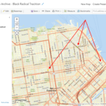
Once I make all the dots equally sized, a fourth problem appears: from a fully scoped-out view, multiple authors published in the same city (e.g. San Francisco) vanish under whichever colored circle (here: grey) sits “on top.” This masks the fact that San Francisco houses three publishers, not just one. You don’t know it until you drill down nearly all the way (and, even then, you can barely see it: I had to draw arrows for you).

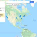
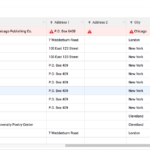
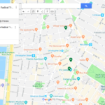
7 // I test out the same dataset in Google Maps, just to compare. I find the upload both faster and more intuitive. Google Maps is also able to handle all three of my UK addresses, better than the ArcGICS zero. Unlike in ArcGIS, though, Google Maps isunable to map one of my P.O. boxes in Chicago, despite having a working zip code; this is almost certainly a problem with my formatting of the data set, but Google Maps does virtually nothing to let me know what the actual problem is or how I can fix it. Nevertheless, Google Maps proves to be more responsive and easier to see (big pins rather than small circles), so I continue my mapping exploration there.

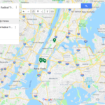
8 // A sample case study: my dataset tells me that New York in 1970 saw the publication of Lloyd Addison’s Beau-Cocoa Volume 3 Numbers 1 and 2 in Harlem; Tom Weatherly’s Mau Mau American Cantos from Corinth Press in the West Village; and N. H. Pritchard’s The Matrix from Doubleday in Garden City, Long Island. When I look on the map, the triangulation of these 1970 titles “uptown,” “downtown,” and “out of town” roughly corresponds to the distribution of other titles in the following decade. Is there any correlation between the spatial placement of publishers and the qualities of the individual literary titles? Do downtown titles resemble each other in some ways, out of town titles in other ways? Is the location of the publisher as important as, say, the location of the author–and even then, would I want the hometown, the known residence(s) at the time of writing, the city or the neighborhood?

9 // And what about this “around the corner” phenomenon I see in New York, where clusters of titles are published on the same block as one another. My dataset is small–a larger one would tell me more–but, as a gathering hypothesis, perhaps there’s something to having a single author’s titles “walk up the street,” moving through both space and time. What, or who, motivates this walk? There’s a narrative to it. What might the narrative be in, say, Harlem, where after publishing the first two instances (Volume 1 and Volume 2 Number 1) of the periodical Beau-Cocoa from (his home?) 100 East 123 Street, editor/poet/publisher Lloyd Addison moves (in the middle of 1969) Beau Cocoa, Inc. to a P.O. box at the post office around the corner. Did an increased national or international demand for this periodical require more firepower than Addison’s personal mailbox?

And what might the narrative be in the West Village, where Tom Weatherly publishes his 1970 Mau Mau American Cantos and his 1971 Thumbprint with two publishers in a four block radius? A larger dataset might show me a network of poets publishing within this neighborhood. Could it lead me to finding information about poetry readings, salons, collaborative projects? (I’m making a leap without evidence here to evoke a possible trajectory.)

10 // Future steps could have me expand this dataset to include data from the rest of the titles in the Eclipse archive (see #5 // above). It could also go the other direction and have me double down on collecting bibliographic data for these authors in the Black Radical Tradition: the material details and individual printings of their titles (some of which Dworkin provides in an unstructured way, but I skipped over during my first pass through my emerging dataset), perhaps performances of individual poems from these titles that have been documented in poetry/sound archives like PennSound, maybe related titles (by these authors, by others) in other “little databases” like UbuWeb. Stay tuned.


Text-Mining Praxis: Poetry Portfolios Over Time

For this praxis assignment I assembled a corpus of three documents, each produced over a comparable three-year period:

  1. The poetry I wrote before my first poetry workshop (2004-07);
  2. The final portfolios for each of my undergraduate poetry workshops (2007-10); and
  3. My MFA thesis (2010-13).

A few prelimary takeaways:

I used to be more prolific, though much less discriminate. Before I took my first college poetry workshop, I had already written over 20,500 words, equivalent to a 180-page PDF. During undergrad, that number halved, dropping to about 10,300 words, or an 80-page PDF. My MFA thesis topped out at 6,700 words in a 68-page PDF. I have no way of quantifying “hours spent writing” during these three intervals, but anecdotally that time at least doubled at each new stage. This double movement toward more writing (time) and away from more writing (stuff) suggests a growing commitment to revision as well as a more discriminate eye for what “makes it into” the final manuscript in the end.

Undergrad taught me to compress; grad school to expand. In terms of words-per-sentence (wps), my pre-workshop poetry was coming in at about 26wps. My poetry instructor in college herself wrote densely-packed lyric verse, so it’s not surprising to see my own undergraduate poems tightening up to 20wps as images came to the forefront and exposition fell to the wayside. We were also writing in and out of a number of poetic forms–sonnet, villanelle, pantoum, terza rima–which likely further compresses the sentences making up these poems. When I brought to my first graduate workshop one these sonnet-ish things that went halfway down the page and halfway across it, I was immediately told the next poem needed to fill the page, with lines twice as long and twice as many of them. In my second year, I took a semester-long hybrid seminar/workshop on the long poem, which positioned poetry as a time art and held up more poetic modes of thinking such as digression, association, and meandering as models for reading and producing this kind of poem. I obviously internalized this advice, as, by the time I submitted my MFA thesis, my sentences were nearly twice as as long as they’d ever been before, sprawling out to a feverish and ecstatic 47wps.

Things suddenly stopped “being like” other things. Across the full corpus, “like” turns out to be my most commonly-used word, appearing 223 different times. Curiously, only 13 of these are in my MFA thesis, 4 of which appear together in a single stanza of one poem. Which isn’t to say the figurative language stopped, but that it became more coded: things just started “being” (rather than “being like”) other things. For example:

Tiny errors in the Latin Vulgate
have grown horns from the head of Moses.

It is radiant. The deer has seen the face of God

spent a summer living in his house sleeping on his floor.

This one I like. But earlier figurative language was, at best, the worst, always either heavy-handed or confused–and often both. In my pre-MFA days, these were things that were allowed to be “like” other things:

  • loose leaves sprinkled like finely chopped snow” (chopped snow?)
  • “lips that pull back like wrapping paper around her teeth” (what? no.)
  • lights of a distant airplane flickering like fireflies on a heavy playhouse curtain” (ugh.)
  • tossing my wrapper along the road like fast silver ash out a casual window” (double ugh.)

Other stray observations. I was still writing love poems in college, but individual names no longer appeared (Voyant shows that most of the “distinctive words” in the pre-workshop documents were names or initials of ex-girlfriends). “Love” appears only twice in the later poems.

Black, white, and red are among the top-15 terms used across the corpus, and their usage was remarkably similar from document to document (black is omenous; white is ecstatic or otherworldly; red is to call attention to something out of place). The “Left-Term-Right” feature in Voyant is really tremendous in this regard.

And night-time conjures different figures over time: in the pre-workshop poems, people walk around alone at night (“I stand exposednaked as my handbeneath the night’s skylight moon”); in the college workshop poems, people come together at night for a party or rendezvous (“laughs around each bend bouncing like vectors across the night”); and, in the MFA thesis, night is the time for prophetic animals to arrive (“That night a deer chirped not itself by the thing so small I could not see it that was on top of it near it or inside of it & and how long had it been there?”).

Takeaways: NEH + Mellon “Humanities Open Book” Project Directors Meeting

If you’ve reached the “Preservation” chapter in Planned Obsolescence, you might recall Kathleen Fitzpatrick’s observation that, unlike in print, where simply using a book can interfere with its ability to be preserved, in digital “the very point of… preservation is ensuring future usability” (144). You also might have noticed that she returns on a few occasions to work The Andrew W. Mellon Foundation has done to advance thinking and to fund projects and tools at the intersection of digital preservation and access.

As has come out in some of my introductions of myself to the class, I happen to work at Mellon in the very program (Scholarly Communications) housing the projects Fitzpatrick hones in on. Though our grants to LOCKSS and Portico predate my time here, there’s a range of other projects on both our preservation and conservation and access and library services fronts that could be worth a Google or two.

I thought I’d use this space now, though, to offer a brief peek behind the curtain at another project we’re funding–jointly, with the NEH–that has digital preservation and access components to it (despite its existing in the publishing area of our portfolio). It’s called Humanities Open Book, and it’s designed to help university presses and libraries make the best out-of-print humanities titles in their back lists open-access and freely available to scholars and to the public. We convened a small group of HOB project directors just last Thursday to discuss the opportunities and challenges native to these sorts of digitization and publishing efforts, and I thought I’d share here just a bit of what I heard, and what I’m still thinking about, in a kind of generalized pseudo-workshop debrief:

It’s not as easy as you’d think. There seems to be something unarguably good about sharing created knowledge, perhaps especially when it stops circulating and becomes stagnant or invisible. Common obstacles to even getting going with this sort of work, though, include obtaining authors’ permissions (some are dead, some are hard to reach, some distrust or philosophically object to OA publishing) and securing appropriate copyright clearance (even with fair-use policies, each image, big or small, photograph or artwork, illustration or map, will have its own side path to journey down). For this reason, text-heavy titles that are only recently out of print are exponentially easier to publish than are architecture, art history, or design titles on the outside fringe of “public domain” territory; a year of work on each might result in 600 publications of the former, while only 18 of the latter. Commission some new forwards/introduction essays or fresh cover designs and your timeline can extend well past what you had originally projected.

If it’s not accessible, it’s not actually OA. Digitizing out-of-print titles as EPUBs might make them “open,” but it’s often not enough on it’s own to confirm true “access.” Extra work needs to go into remediating these titles and making them ADA-compliant, work which might require annotating and converting texts and, as importantly, images into machine-readable formats. Factor in the fact that some titles might be written in non-English languages featuring diacritics that aren’t easily picked up by OCR-like technologies, and you really have to go beyond the simple scanned PDF or EPUB to demonstrate a true commitment to OA.

Even when you’ve done it, it’s hard to know how you did. In one project director’s words, HOB allows titles to be “reborn,” with books disseminating into the hands of readers in up to 150 different countries, in one case. Routing these titles through a range of aggregators and distributors like JSTOR, Project Muse, HathiTrust, Google Books, (etc.)  might aid this kind of increased visibility and exposure, but may also result in duplication or redundancy of content across platforms. Does this ultimately help or hinder discovery? Moreover, without the ability to consolidate OA usage metrics across these platforms, there seems to be no efficient or consistent (or standard, in Fitzpatrick’s terminology) way of reporting on if or how these recovered texts are being used. (For what it’s worth: there’s a recent Mellon grant out to the University of Michigan to support cracking this nut.) Since getting organizational buy-in beyond the “soft money” of grant-funded support might very well rely on such analytics, this seems to be a critical area of focus in the larger conversation about preservation and use.

What are we doing this for? Is the goal of projects like HOB to churn out the largest number of out-of-print texts as possible? If so, perhaps presses and libraries start to lean to simpler, text-exclusive projects in literary criticism, history, and philosophy. Or is the goal to figure out how to overcome the obstacles of more difficult projects involving significant out-of-print titles that might otherwise be lost to time? If so, perhaps organizations begin to prioritize image- or design-heavy titles, or ones that invite new contextualizations in our political climate (e.g., in Indigenous or Black studies), with a focus on establishing model, replicable, and sustainable workflows. Related to this: one project director noted how the lack of an online source for buying and selling ebooks (i.e., no Amazon) in Latin America had resulted in an increased market demand/ potential for preservation/publishing projects like HOB, while another project director showed off his organization’s use of a Python script tracking WorldCat holdings across the globe to see whether popular titles in one area of the world are noticeably absent from others. Could a geographically-focused strategy for selecting out-of-print texts parallel or even complement the mission-driven approach of the area-focused strategies above?