Tag Archives: network analysis

Network Praxis: Shock Incarceration in New York State 2008-18

I had a sneaky feeling that my dataset wasn’t going to work for network analysis, but I had found such a good dataset that I decided to try. This is an Excel spreadsheet compiled by the New York State Department of Corrections listing 602,665 people incarcerated in New York State over the last ten years, with information about admission type, county, gender, age, race/ethnicity, crime and facility. I knew six hundred thousand records were too many, but I figured I’d select just a few, and analyze the networks I would find in these.

The “few” records I selected were those of 771 men and women sentenced in 2018 to shock incarceration, a military-style boot camp initiative that was supposed to reform incarcerated people by subjecting them to strenuous physical and mental trials. According to the U.S. Department of Justice, shock incarceration involves “strict, military-style discipline, unquestioning obedience to orders, and highly structured days filled with drill and hard work.” The data I looked at shows that most people in these facilities were incarcerated for drug-related offenses such as criminal sale of a controlled substance (CSCS) or criminal possession of a controlled substance (CPCS). When marihuana is legalized the population in these facilities – and others – should, I hope, drastically decrease.

I fed the 771 records into Cytoscape and it was a total mess. I tried analyzing only the 106 women sentenced to shock incarceration in 2018 and that was still a mess. The main problem, I realized, was that I could see no clear relationships between the men and women listed in my data other than the relationship they have with the facility in which they are confined. I don’t know who hangs out with whom. I don’t know if people sentenced for different crimes are placed on different floors. It would be too much work to find out who transports the food to the facility and how many guards there are and so on. Frustrated with my project, I saw that trying to get data to bend to software is a lousy way to go about things. I started to think instead about what software would help me explore the data in a meaningful way and decided to see what I could do with Tableau. This was such a good choice that I’m having a hard time stopping myself from building more and more visualizations with what became a wealth of information when I stopped looking for networks that weren’t there.

I couldn’t embed Tableau Public in WordPress so I paste pictures here, but you can’t click and scroll and interact with my visualizations here, and some of the pictures are cut off so please visit my visualization on Tableau. By the way, I was happy to remember that students can get Tableau Desktop for free for a year. Here’s the link: https://www.tableau.com/academic/students

First, here is the mess I made with Cytoscape (I didn’t even try to figure out how to embed):

Isn’t that horrible?! Here’s a close-up:

And here are pictures of what I did with Tableau:

Phew, that’s all for now. See it on Tableau, there’s no comparison.

Network Analysis of Wes Anderson’s Stable of Actors

I had initially planned to have my network analysis praxis build on the work I had started in my mapping praxis, which involved visualizing the avant-garde poets and presses represented in Craig Dworkin’s Eclipse, the free on-line archive focusing on digital facsimiles of the most radical small-press writing from the last quarter century. Having already mapped the location of presses that had published work in Eclipse’s “Black Radical Tradition” list, I thought that I might try to expand my dataset to include the names and addresses for those presses that had published works captured in other lists in the archive (e.g., periodicals, L=A=N=G=U=A=G=E poets). My working suspicion was that I would find through these mapping and networking visualizations unexpected connections among the disparate poets in Eclipse and (possibly, later) those featured in other similar archives like UbuWeb or PennSound, which could potential yield new comparative and historical readings of these limited-run works by important poets.

The dataset I wanted and needed didn’t already exist, though, and the manual labor involved in my creating it–I would have to open the facsimile for each of multiple dozens of titles and read through its front and back matter hunting for press names and affiliated addresses–was more than I was able to offer this week. So I’ve tabled the Eclipse work only momentarily in favor of experimenting with a more or less already-ready dataset whose network analysis I could actually see through from beginning (collection) to end (interpretation).

Unapologetically twee, I built a quick dataset of all the credited actors and voice actors in each of Wes Anderson’s first nine feature-length films: Bottle Rocket (1996), Rushmore (1998), The Royal Tenenbaums (2001), The Life Aquatic with Steve Zissou (2004), The Darjeeling Limited (2007), Fantastic Mr. Fox (2009), Moonrise Kingdom (2012), The Grand Budapest Hotel (2014), and Isle of Dogs (2018). As anyone who has seen any of Anderson’s films knows, his aesthetic is markedly distinct and immediately recognizable by its right angles, symmetrical frames, unified color palettes, and object-work/tableaux. He also relies on the flat affective delivery of lines from a core stable of actors, many of whom return again and again to the worlds that Anderson creates. Because of the way these actors both confirm and surprise expectations–of course Adrian Brody would be an Anderson guy, but Bruce Willis?–I wanted to use this network analysis praxis to visualize the stable in relation to itself and to start to pick at interpreting the various patterns or anomalies therein.

Fortunately IMDB automated a significant portion of the necessary prep work by providing the full cast list for each film and formatting each cast member’s first and last name in a long column–a useful tip I picked up while digging around Miriam Posner’s page of DH101 network analysis resources–so I was able to easily copy and paste all of my actor data into a Google Sheet and manually add the individual film data after. (I couldn’t copy and paste actor names from IMDB without grabbing character names as well, so I kept them, not knowing if they would end up being useful. For this brief experiment, they weren’t.)

I used Google’s Fusion Tables and its accompanying instructions to build a Network Graph of the Anderson stable, the final result of which you can access here. As far as other tools went, Palladio timed out on my initial upload, buffering forever, and Gephi had an intimidating interface for what I intended to be a light-hearted jaunt. Fusion Tables was familiar enough and seemed to have sufficient default options for analyzing my relatively small dataset (500-ish rows in three columns), so I took the path of least resistance, for now.

A quick upload of my Sheet and a + Add Chart later, my first (default) visualization looked taxonomical and useless, showing links between actor and character that, as you might expect, mapped pretty much one-to-one except in those instances where multiple actors played generic background roles with identical character names (e.g., Pirate, Villager).

A poorly organized periodic table of characters

I changed the visualization to instead show a link between actor and film, and was surprised to find that this still didn’t show me anything expected (only one film?) or intriguing. Then I noticed that only 113 of the 449 nodes were showing, so I upped the number to show all 449 nodes. Suddenly, the visualization became not only more robust and legible, but also quite beautiful! Something like a flower bloom, or simultaneous and overlapping fireworks.

Beautiful as the fireworks were, I felt like the visualization was still telling me too much information, with each of the semi-circles consisting primarily of actors who had one-off relationships to these films. Because I wanted to know more about the stable of actors and not the one-offs, I filtered my actor column to include only those who had appeared in more than one of Anderson’s films (i.e., names that showed up on the list two or more times). I also clicked a helpful button that automatically color-coded columns so that the films appeared in orange and the actors in blue. This resulted in a visualization just complex enough to be worth my interrogating and/or playing with, yet fixed or structured enough to keep my queries contained.

As far as reading these visualizations go, it’s something like this: Anderson’s first three films fall bottom-left; his next three films fall top-center; and his three most recent films fall bottom-right. Thus, the blue dots bottom-left are actors featured among the first three films only; blue dots bottom-center are actors who appear consistently throughout Anderson’s work; and blue dots bottom-right are actors included among his most recent films. As you can see by hovering over an individual actor node: the data suggests (e.g.) that Bill Murray is the most central (or at least, most frequently recurring) actor in the Anderson oeuvre, appearing in eight of the nine feature-length films; meanwhile, Tilda Swinton, along with fellow heavyweights Ed Norton and Harvey Keitel, appears to be a more recent Anderson favorite, surfacing in each of his last three films.

Also of interest: the name Eric Chase Anderson sits right next to Murray at the center of the network; Eric is the brother of Wes, the illustrator of much of what we associate with Wes Anderson’s aesthetic, and apparently also an actor in the vast majority of his brother’s films. (I’m not sure this find would have surfaced as quickly without the visualization.)

Elsewhere, the data suggests that Anderson’s first film Bottle Rocket was more of a boutique operation that consisted of a relatively small number of repeat actors (8), only two of which–Kumar Pallana and Owen Wilson–appeared in films beyond the first three. Anderson’s seventh film The Grand Budapest Hotel, released nearly twenty years later, expanded to include a considerable number of repeat actors (22: the highest total on the list), nine of whom were first “introduced” to the Anderson universe here and subsequently appeared in the next film or two.

I wonder what we would see if we visualized nodes according to some sort of sliding scale from “lead actor” to “ensemble actor” in each of these films, perhaps by implementing darker/more vibrant edges depending on screen time or number of lines? Would Bill Murray be more or less central than he is now? Would Eric Chase Anderson materialize at all?

And I wonder what opportunities there are to further visualize nodes based on actor prestige (say, award nominations and wins get you a bigger circle) or to create “famous actor” heat maps (maybe actors within X number of years of a major award nomination or win get hot reds and others cool blues) that might show us how Anderson’s casting choices change over time to include more big names. Conversely, what could these theoretical large but cool-temperature circles tell us about Anderson’s use of repeat “no-name” character actors to flesh out his wolds?

Further, I wonder if there are ways of using machine learning to analyze these networks and to predict the likelihood of certain actors’ being cast in Anderson’s next film based on previous appearances (i.e., the “once you’re in, you’re in” phenomenon) or recent success. Could we compare the Anderson stable versus, say, the Sofia Coppola or Martin Scorsese stables, to learn about casting preferences or actor “types”?

A Network Analysis of our Initial Class Readings

Introduction
This praxis project visualizes a network analysis of the bibliographies from the September 4th required readings in our class syllabus plus the recommended “Digital Humanities” piece by Professor Gold. My selection of topic was inspired by a feeling of being swamped by PDFs and links that were accumulating in my “readings” folder with little easy-to-reference surrounding context or differentiation. Some readings seemed to be in conversation with each other, but it was hard to keep track. I wanted a visualization to help clarify points of connection between the readings. This is inherently reductionist and (unless I’m misquoting here, in which case sorry!) it makes Professor Gold “shudder”, but charting things out need not replace the things themselves. To me, it’s about creating helpful new perspectives from which to consider material and ways to help it find purchase in my brain.

Data Prep
I copy/pasted author names from the bibliographies of each reading into a spreadsheet. Data cleaning (and a potential point for the introduction of error) consisted of manually editing names as needed to make all follow the same format (last name, first initial). For items with summarized “et al” authorship, I looked up and included all author names.

I performed the network analysis in Cytoscape, aided by Miram Posner’s clear and helpful tutorial. Visualizing helped me identify and fix errors in the data, such as an extra space causing two otherwise identical names to display separately.

The default Circular Layout option in the “default black” style rendered an attractive graph with the nodes arranged around two perfect circles, but unfortunately the labels overlapped and many were illegible. To fix the overlapping I individually adjusted the placement of the nodes, dragging alternating nodes either toward or away from the center to create room for each label to appear and be readable in its own space. I also changed the label color from gray to white for improved contrast and added yellow directional indicators, as discussed below. I think the result is beautiful.

Network Analysis Graph
Click the placeholder image below and a high-res version will open in a new tab. You can zoom in and read all labels on the high-res file.

An interactive version of my graph is available on CyNetShare, though unfortunately that platform is stripping out my styling. The un-styled, harder-to-read, but interactive version can be seen here.

Discussion
Author nodes in this graph are white circles and connecting edges are green lines. This network analysis graph is directional. The class readings are depicted with in-bound connections from the works cited terminating in yellow diamond shapes. From the clustering of yellow diamonds around certain nodes, one can identify that our readings were authored by Kirschenbaum, Fitzpatrick, Gold, Klein, Spiro, Hockey, Alvarado, Ramsey, and (off in the lower left) Burke. Some of these authors cited each other, as can be seen by the green edges between yellow-diamond-cluster nodes. Loops at a node indicate the author citing themselves. Multiple lines connecting the same two nodes indicate citations of multiple pieces by the same author.

It is easy to see in this graph that all of the readings were connected in some way, with the exception of an isolated two-node constellation in the lower left of my graph. That constellation represents “The Humane Digital” by Burke, which had only one item (which was by J. Scott) in its bibliography. Neither Burke nor Scott authored nor were cited in any of the other readings, therefore they have no connections to the larger graph.

The vast majority of the nodes fall into two concentric circle forms. The outer circle contains the names of those who were cited in only one of the class readings. The inner circle contains those who were cited in more than one reading, including citations by readings-authors of other readings-authors. These inner circle authors have greater out-degree connectedness and therefore more influence in this graphed network than do the outer circle authors. The authors with the highest degree of total connections among the inner circle are Gold, Klein, Kirschenbaum, and Spiro. The inner circle is a hub of interconnected digital humanities activity.

We can see that Spiro and Hockey had comparitively extensive bibliographies, but that Spiro’s work has many more connections to the inner circle digital humanities hub. This is likely at least partly due to the fact that Hockey’s piece is from 2004, while the rest of the readings are from 2012 or 2016 (plus one which will be published next year in 2019). One possible factor, some of the other authors may not have been yet publishing related work when Hockey was writing her piece in the early 2000’s. Six of our readings were from 2012, the year of Spiro’s piece. Perhaps a much richer and more interconnected conversation about the digital humanities developed at some point between 2004 and 2012.

This network analysis and visualization is useful for me as a mnemonic aide for keeping the readings straight. It can also serve to refer a student of the digital humanities to authors they may find it useful to read more of or follow on Twitter.

A Learning about Names
I have no indication that this is or isn’t occurring in my network analysis, but in the process of working on this I realized any name changes, such as due to a change in marital status, would make an author appear as two different people. This predominantly affects women and, without a corrective in place, could make them appear less central in graphed networks.

There are instances where people may have published with different sets of initials. In the bibliography to Hockey’s ‘The History of Humanities Computing,’ an article by ‘Wisbey, R.’ is listed just above a collection edited by ‘Wisbey, R. A.’ These may be the same person but it cannot be determined with certainty from the bibliography data alone. Likewise, ‘Robinson, P.’ and ‘Robinson, P. M. W.’ are separately listed authors for works about Chaucer. These are likely the same person, but without further research I cannot be 100% certain. I chose to not manually intervene and so these entries remain separate. It is useful to be aware that changing how one lists oneself in authorship may affect how algorithms understand the networks to which you belong.

Potential Problems
I would like to learn to what extent the following are problematic and what remedies may exist. My network analysis graph:

  • Doesn’t distinguish between authors and editors
  • I had to split apart collaborative works into individual authors
  • Doesn’t include works that had no author or editor listed

Postscript: Loose Ties to a Current Reading
In “How Not to Teach Digital Humanities,” Ryan Cordell suggests that introductory classes should not lead with “meta-discussions about the field” or “interminable discussions of what counts or does not count [as digital humanities]”. In his experience, undergraduate and graduate students alike find this unmooring and dispiriting.

He recommends that instructors “scaffold everything [emphasis in the original]” to foster student engagement. There is no one-size-fits-all in pedagogy. Even within the same student learning may happen quicker or information may be stickier if it is presented in context or in more than one way. Providing multiple ways into the information that a course covers can lead to good student learning outcomes. It can also be useful to provide scaffolding for next steps or going beyond the basics for students who want to learn more. My network analysis graph is not perfect, but having something as a visual reference is useful to me and likely other students as well.

Cordell also endorses teaching how the digital humanities are practiced locally and clearly communicating how courses will build on each other. This can help anchor students in where their institution and education fit in with the larger discussions about what the field is and isn’t. Having gone through the handful of assigned “what is DH” pieces, I look forward to learning more about the local CUNY GC flavor in my time as a student here. This is an exciting field!


Update 11/6/18:

As I mentioned in the comments, it was bothering me that certain authors who appeared in the inner circle rightly belonged in the outer circle. This set of authors were ones who were cited once in the Introductions to the Debates in Digital Humanities M. K. Gold and L. Klein. Due to a challenge depicting co-authorship, M. K. Gold and L. Klein appear separately in the network article, so authors were appearing to be cited twice (once each by Gold and Klein), rather than the once time they were cited in the pieces co-authored by Gold and Klein.

I have attempted to clarify the status of those authors in the new version of my visualization below by moving them into the outer ring. It’s not a perfect solution, as each author still shows two edges instead of one, but it does make the visualization somewhat less misleading and clarifies who are the inner circle authors.


Bibliographies, Networks, and CUNY Academic Works

I was really excited about doing a network analysis, even though I seem to have come all the way over here to DH just to do that most librarianly of research projects, a citation analysis.

I work heavily with our institutional repository, CUNY Academic Works, so I wanted to do a project having to do with that.  Institutional repositories are one of the many ways that scholarly works can be made openly available.  Ultimately, I’m interested in seeing whether the works that are made available through CAW are, themselves, using open access research, but for this project, I thought I’d start a little smaller.

CAW allows users to browse by discipline using this “Sunburst” image.

Each general subject is divided into smaller sub-disciplines.  Since I was hoping to find a network, I wanted to choose a sub-discipline that was narrow but fairly active. I navigated to “Arts and Humanities,” from there to “English Language and Literature,” and finally to “Literature in English, North America, Ethnic and Cultural Minority.” From there, I was able to look at works in chronological order. Like most of the repository, this subject area is dominated by dissertations and capstone papers; this is really great for my purposes because I am very happy to know which authors students are citing and from where.

The data cleaning process was laborious, and I think I got a little carried away with it. After I’d finished, I tweeted about it, and Hannah recommended pypdf as a tool I could have used to do this work much more quickly.  Since I’d really love to do similar work on a larger scale, this is a really helpful recommendation, and I’m planning on playing with it some more in the future (thanks, Hannah!)

I ended up looking at ten bibliographies in this subject, all of which were theses and dissertations from 2016 or later.  Specifically:

 Jarzemsky, John. “Exorcizing Power.”

Green, Ian F. P. “Providential Capitalism: Heavenly Intervention and the Atlantic’s Divine Economist”

La Furno, Anjelica. “’Without Stopping to Write a Long Apology’: Spectacle, Anecdote, and Curated Identity in Running a Thousand Miles for Freedom”

Danraj, Andrea A. “The Representation of Fatherhood as a Declaration of Humanity in Nineteenth-Century Slave Narratives”

Kaval, Lizzy Tricano. “‘Open, and Always, Opening’: Trans- Poetics as a Methodology for (Re)Articulating Gender, the Body, and the Self ‘Beyond Language ’”

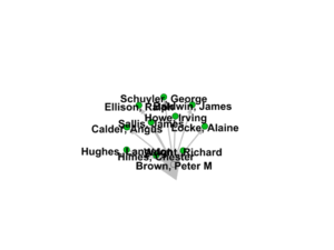
Brown, Peter M. “Richard Wright’ s and Chester Himes’s Treatment of the Concept of Emerging Black Masculinity in the 20th Century”

Brickley, Briana Grace. “’Follow the Bodies”: (Re)Materializing Difference in the Era of Neoliberal Multiculturalism”

Eng, Christopher Allen. “Dislocating Camps: On State Power, Queer Aesthetics & Asian/Americanist Critique”

Skafidas, Michael P. “A Passage from Brooklyn to Ithaca: The Sea, the City and the Body in the Poetics of Walt Whitman and C. P. Cavafy”

Cranstoun, Annie M. “Ceasing to Run Underground: 20th-Century Women Writers and Hydro-Logical Thought”

Many other theses and dissertations are listed in Academic Works, but are still under embargo. For those members of the class who will one day include your own work in CAW, I’d like to ask on behalf of all researchers that you consider your embargo period carefully! You have a right to make a long embargo for your work if you wish, but the sooner it’s available, the more it will help people who are interested in your subject area.

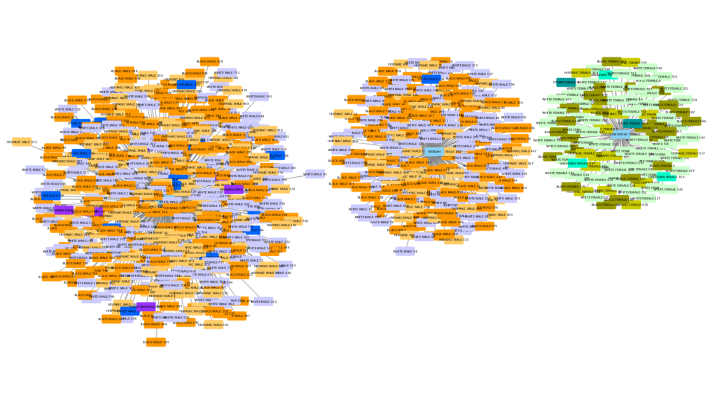
In any case, I extracted the authors’ names from these ten bibliographies and put them into Gephi to make a graph.  I thought about using the titles of journals, which I think will be my next project, but when I saw that all the nodes on the graph have such a similar appearance graphically, I was reluctant to mix such different data points as authors and journals.

As I expected, each bibliography had its own little cluster of citations, but there were a few authors that connected them, and some networks were closer than others.

Because I was especially interested in the authors that connected these different bibliographies, I used Betweenness Centrality to map these out, to produce a general shape like this:

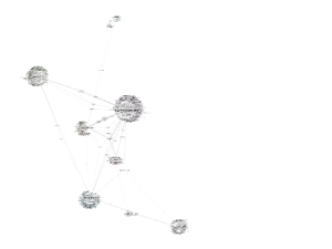
This particular configuration of the data uses the Force Atlas layout.  There were several available layouts and I don’t how they’re made, but this one did a really nice job of rendering my data in a way that looked 3D and brought out some relationships among the ten bibliographies.

Some Limitations to My Data

Hannah discussed this in her post, and I’d run into a lot of the same issues and had forgotten to include it in my blog post!  Authors are not always easy entities to grasp. Sometimes a cited work may have several authors, and in some cases, dissertation authors cited edited volumes by editor, rather than the specific pieces by their authors. Some of the authors were groups rather than individuals (for instance, the US Supreme Court), and some pieces were cited anonymously.

In most cases, I just worked with what I had. If it was clear that an author was being cited in more than one way, I tried to collapse them, because there were so few points of contact that I wanted to be sure to bring them all out. There were a few misspellings of Michel Foucault’s name, but it was really important to me to know how relevant he was in this network.

Like Hannah, I pretended that editors were authors, for the sake of simplicity.  Unlike her, I didn’t break out the authors in collaborative ventures, although I would have in a more formal version of this work.  It simply added too much more data cleaning on top of what I’d already done.  So I counted all the co-authored works as the work of the first author — flawed, but it caught some connections that I would have missed otherwise.

Analyzing the Network

Even from this distance, we can get a sense of the network. For instance, there is only one “island bibliography,” unconnected to the rest.

Note, however, that another isolated node is somewhat obscured by its positioning: Jarzemsky, whose only connection to the other authors is through Judith Butler.

So, the two clearest conclusions were these:

  • There is no source common to all ten bibliographies, but nine of them share at least one source with at least one other bibliography!
  • However, no “essential” sources really stand out on the chart, either. A few sources were cited by three or four authors, but none of them were common to all or even a majority of bibliographies.

My general impression, then, is that there are a few sources that are important enough to be cited very commonly, but perhaps no group of authors that are so important that nearly everyone needs to cite them. This makes sense, since “Ethnic and Cultural Minority” lumps together many different groups, whose networks may be more visible with a more focused corpus.

There’s also a disparity among the bibliographies; some included many more sources than others (perhaps because some are PhD dissertations and others are master’s theses, so there’s a difference in length and scope). Eng built the biggest bibliography, so it’s not too surprising that his bibliography is near the center of the grid and has the most connections to other bibliographies; I suspect this is an inherent bias with this sort of study.

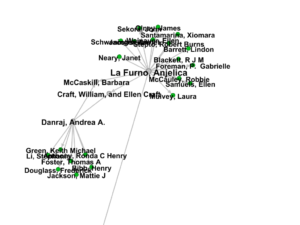
The triangle of Eng, Brickley and Kaval had some of the densest connections in the network.  I try to catch a little of it in this screenshot:

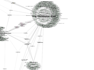
In the middle of this triangle, several authors are cited by each of these authors, including Judith Butler, Homi Babhi, Sara Ahmed, and Gayle Salamon.  The connections between Brickley and Eng include some authors who speak to their shared interest in Asian-American writers, such as Karen Tei Yamashita, but also authors like Stuart Hall, who theorizes multiculturalism.  On the other side, Kaval and Eng both cite queer theorists like Jack Halberstam and Barbara Voss, but there are no connections between Brickley and Kaval that aren’t shared by Eng. There’s a similar triangle among Eng, Skafidas, and Green, but Skafidas has fewer connections to the four authors I’ve mentioned than they have to each other. This is interesting given the size of Skafidas’s bibliography; he cites many others that aren’t referred to in the other bibliographies.

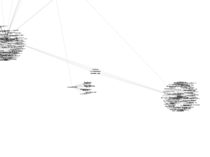
(Don’t mind Jarzmesky; he ended up here but doesn’t share any citations with either Skafidas or Cranstoun.)

On the other hand, there is a stronger connection between Skafidas and Cranstoun. Skafidas writes on Cavafy and Cranstoun on Woolf, so they both cite modernist critics. However, because they are not engaging with multiculturalism as many of the other authors are, they have fewer connections to the others. In fact, Cranstoun’s only connection to an author besides Skafidas is to Eng, via Eve Kosofsky Sedgwick (which makes sense, as Cranstoun is interested in gender and Eng in queerness).  Similarly, La Furno and Danraj, who both write about slave narratives, are much more closely connected to each other than to any of the other authors – but not as closely as I’d have expected, with only two shared connections between them. The only thing linking them to the rest of the network is La Furno’s citation of Hortense Spillers, shared by Brickley.

My Thoughts

I’d love to do this work at a larger scale. Perhaps if I could get a larger sample of papers from this section of CAW, I’d start seeing the different areas that fall into this broad category of “Literature in English, North America, Ethnic and Cultural Minority.” I’m seeing some themes already – modernism, Asian-American literature, gender, and slave narratives seem to form their own clusters.  The most isolated author on my network wrote about twentieth-century African American literature and would surely have been more connected if I’d found more works dealing with the same subject matter. As important as intersectionality is, there are still networks based around specific literatures related to specific identity categories, with only a few  prominent authors that speak to overlapping identities. We may notice that Eng, who is interested in the overlap between ethnicity and queerness, is connected to Brickley on one side (because she is also interested in Asian-American literature) and Kaval on the other (because she is also interested in queerness and gender).

Of course, there are some flaws with doing this the way that I have; since I’m looking at recent works, they are unlikely to cite each other, so the citations are going in only one direction and not making what I think of as a “real” network. However, I do think it’s valuable to see what people at CUNY are doing!

But I guess I’m still wondering about that – are these unidirectional networks useful, or is there a better way of looking at those relationships? I suppose a more accurate depiction of the network would involve several layers of citations, but I worry about the complexity that would produce.

In any case, I still want to look at places of publication. It’s a slightly more complex approach, but I’d love to see which authors are publishing in which journals and then compare the open access policies of those journals. Which ones make published work available without a subscription? Which ones allow authors to post to repositories like this one?

Also: I wish I could post a link to the whole file! It makes a lot more sense when you can pan around it instead of just looking at screenshots.

Expanding the Definition of Humanities Scholarship (Panel Summary)

Today I attended the first day of “Community Colleges and the Future of the Humanities,” which you probably remember that Raven recommended near the beginning of class.  It’s been a great conference so far, but my favorite panel today was “Expanding the Definition of Humanities Scholarship,” moderated by Elizabeth Alsop from the CUNY School of Professional Studies.

The panelists were:

  • Leah Anderst, Queensborough Community College
  • Ria Banerjee, Guttman Community College
  • Kevin Ferguson, Queens College
  • Lisa Rhody, The Graduate Center

Alsop opened the panel by explaining its genesis. She’d found that public scholarship felt like a natural outgrowth of her work, but as she came close to the end of the tenure clock, people started asking her how she would frame this work to make it “count.” So, she put together a panel to talk about some of these questions.

Leah Anderst spoke first, about how finding a full-time position had felt like a small miracle to her, but several members of the older generation of PhDs with whom she was acquainted seemed worried about it, because she was in a pedagogically-focused position.  She spoke about the versatility of faculty members who think and write about pedagogy, and how this work ended up influencing her research. She developed an accelerated program and studied and wrote about it, and although it was not closely connected to the research concerns that she’d come in with, she learned a lot about working with information, especially qualitative information, that she was later able to use in her film studies research.

Ria Banerjee discussed all the conflicting advice she’d received as a graduate student — to publish a lot or not at all, to devote herself to teaching or to treat it as something that happens alongside the “real” work of writing and getting published. She has had a lot of opportunities to speak and write publicly, for audiences she never expected to reach. She’s written some op-eds and blogs, and she’s spoken in events presented by Humanities New York.  This work doesn’t “count” as scholarship, but it does count as service.  Because service isn’t considered as important as scholarship in tenure reviews, this work doesn’t have the same weight that speaking at scholarly conferences and publishing in peer-reviewed journals does, but Guttman does make room for some work like this. They allow a certain number of “substantive” blog posts; there are ongoing conversations about exactly what that means.

Kevin Ferguson works in the English department, but his real focus is film studies. He recently was granted tenure, and made sure to do all the traditional things alongside his more innovative work. He really wanted to help students apply digital humanities principles to film and moving image texts, and to move beyond the mode of film studies scholarship that consists of a written text with some black-and-white still photos. He pointed to his work on MediaCommons. MediaCommons is in collaboration with the Journal of Cinema and Media Studies (formerly Cinema Journal), which is the journal of the Society of Cinema and Media Studies and thus a top film studies journal. This collaborative effort, called [in]Transition, is interesting to him because it takes seriously the idea of writing using the materials of study — in this case, moving images. [in]Transition refers to this as “video essays,” but he prefers “videographic criticism” because it emphasizes the idea that these works can stand on their own, without a written explanation.   The peer review process is also interesting: the reviews are published alongside the videos, which makes for a kind of transparency very unusual in scholarly publications (and perhaps interesting to members of this class?).

Lisa Rhody framed her perspective around storytelling, which is a very powerful tool for connecting with people and changing minds, but can also be used for erasure, colonialism, and exclusionary canon formation. She calls this “the hubris of the humanities.” Her work is on ekphrasis, the literary representation of visual art. There is a certain scholarly narrative about gender and ekphrasis that she wanted to push back on, so she used discourse mapping software to  study it beyond those narratives.  There were a few more technical details than the ones that made it into my notes, but she showed that some of the poets that were usually held up as examples were actually isolated from the poets’ social networks, and that other kinds of languages were used to talk about ekphrasis than the ones on which the current narrative was built. (I want to read a lot more about her work; this is very very interesting to me.) In any case, she did this work as part of her dissertation. It was three times the work of other dissertations, and she also had to work very hard to convince her dissertation advisor that this was a worthwhile project. After all that, it didn’t lead to a full-time, tenure-track position for her, either. But she is working to bring this kind of work to the mainstream, and believes that it’s important. Ultimately, she wants to use messy humanities data to challenge algorithmically designed reading systems.

Rhody also argued that you have to advocate for your own work and take calculated risks. This can be scary, especially since institutions tend to make conservative choices in times of austerity.

There was a question from the argument about talking with peers about this work: Kevin Ferguson made the point that being able to show that the journal was peer-reviewed and prize-winning makes a huge difference, even if people don’t quite understand the work itself.  Being able to show that this work is part of a larger, national conversation with its own vocabulary was also important.

Anderst pointed out that it’s always hard to assess other people’s works because there are so many disciplinary silos, but faculty at her institution are encouraged to publish open access and have a more public voice.

There are several aspects of this discussion I thought people would find interesting, so, enjoy! I’m really looking forward to Day 2 of this conference tomorrow.

Where Not to Screw Around

In “The Hermeneutics of Screwing Around,” Ramsay is very interested in the concept of serendipity – the ways that readers unexpectedly come across just the right information at just the right time.  Of course, one of the things you learn in library school is that serendipity is an illusion created by the infrastructure of the library, as Ramsay acknowledges. Serendipity comes from the fact that someone has put all this information in order so that readers can find it.

Ramsay distinguishes between two ways of encountering information; purposeful searching through the use of indexes and the like, and browsing, which he characterizes rather delightfully as “wander[ing] around in a state of insouciant boredom.” He argues that because the internet is not organized in a human-readable way, search engines are very good at searching, but poor at browsing, which means that it’s more difficult to find that thing you didn’t know you wanted.

I’m with Ramsay up to this point.  One major problem with electronic resources is that they don’t support browsing well. There have, at least among libraries, been some attempts to replicate some of the tools that make browsing work offline, but they don’t work as well. OneSearch has a feature that lets you look at books nearby on the shelf, and I’d love to know whether anyone in this class has ever used this, because I suspect not! Part of the problem is that the process still has to begin with a specific search; part of the problem is that, unlike when you are browsing the physical shelves, you don’t have access to the full text of the book.

What really brought me up short when I was reading this, though, was the very casual way he tosses out the notion that algorithms can fix this problem.

A few weeks ago, Data & Society published a report, “Alternative Influence: Broadcasting the Reactionary Right on YouTube.” It’s definitely worth your time to read the whole thing if you can, 
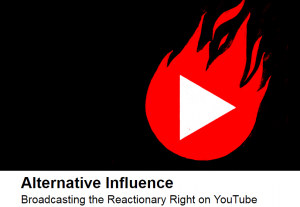
but it examines the network of white supremacist/white nationalist/alt-right microcelebrities on YouTube. Because many of these individuals have strong relationships with their audiences and are able to “sell” them on their ideologies, they are considered “influencers.” The report maps out the relationships among them based on their appearances on each other’s shows. It reveals connections between the extremists and those who are or describe themselves as more moderate libertarians or conservatives.

The process by which these YouTubers’ audience members become radicalized is a browsing process; the description of how an audience member moves from one video channel to another isn’t, mechanically, that different from Ramsay’s description of moving from Zappa to Varèse, as different as it obviously is in subject matter.  He happens to come across one who then points him to another.

For example, influencers often encourage audience members to reject the mainstream media in favor of their content, thus priming their audiences for a destabilized worldview and a rejection of popular narratives around current events. Then, when libertarian and conservative influencers invite white nationalists onto their channels, they expose their audiences to alternative frameworks for understanding the world. Thus, audiences may quickly move from following influencers who criticize feminism to those promoting white nationalism. (35)

Algorithms facilitate this process by recommending similar videos, but the report points out that this is really a social problem; even if the recommendations didn’t exist, these YouTubers would still be promoting each other and radicalizing their viewers. Certainly we could argue that the larger problem is not the mechanism of discovery but just the fact that there’s so much of this kind of content out there. After all, older kinds of browsing can turn up similar content, and let’s not pretend that the Library of Congress headings don’t have a ton of baked-in bias.

All the same, there are clearly some problems with the rather blithe suggestion that the problems of browsing online can be solved by algorithms when this kind of content is so common on the internet, and especially when these algorithms are largely written by companies that are making money on this kind of content. I’m guessing we’ll talk about this further when we get to Algorithms of Oppression…