Tag Archives: ArcGIS

Workshop: ESRI Story Maps

As you may remember, I created an ArcGIS Story map for my 5-minute project presentation last week. Although I created it in a rush and it was longer than I had time for, I think story maps can be a good alternative to power point slides depending on what you’re doing and are also a fun way of keeping a journal, so I want to share what I learned in the ESRI Story Map workshop I took with Olivia Ildefonso and Javier Otero Penya.

Olivia told us that ESRI is the leading story mapper right now. They’ve really taken over the market, she said. The cool thing with ESRI is you don’t even need a map to create a story map. You just need pictures. Olivia doesn’t use it for mapping. She uses it for pictures and text.

ESRI is a for-profit company. They offer the story-mapping tool for free. Why use ESRI? Because it’s free and open-sourced. Therefore, if you’re a developer and want to customize it even more you can download it and customize it. You can get code from Github. Furthermore, It’s easy. You don’t have to know how to code or map. You can embed maps if you want but they have to be ESRI maps. You can’t use Carto.com. Now here’s the rub: if you want to create a map with ESRI you have to pay. But there’s a way around this: GCDI has a one-year ESRI interactive map for students. Go chat with GCDI if you want to access that map.

ESRI story maps are like some of the articles we see in the NY Times (this article on Yemen, for example, was built with ESRI or a very similar program).

To build a story map with ESRI, go to https://storymaps.arcgis.com and create an account. Choose the kind of story map you’re going to create. Olivia suggested starting with Cascade. Create a story board before starting creating the story map! Olivia recommends doing it in PPT. Include photos and notes. Videos have to be shared from youtube. This is the story map I built in the workshop.

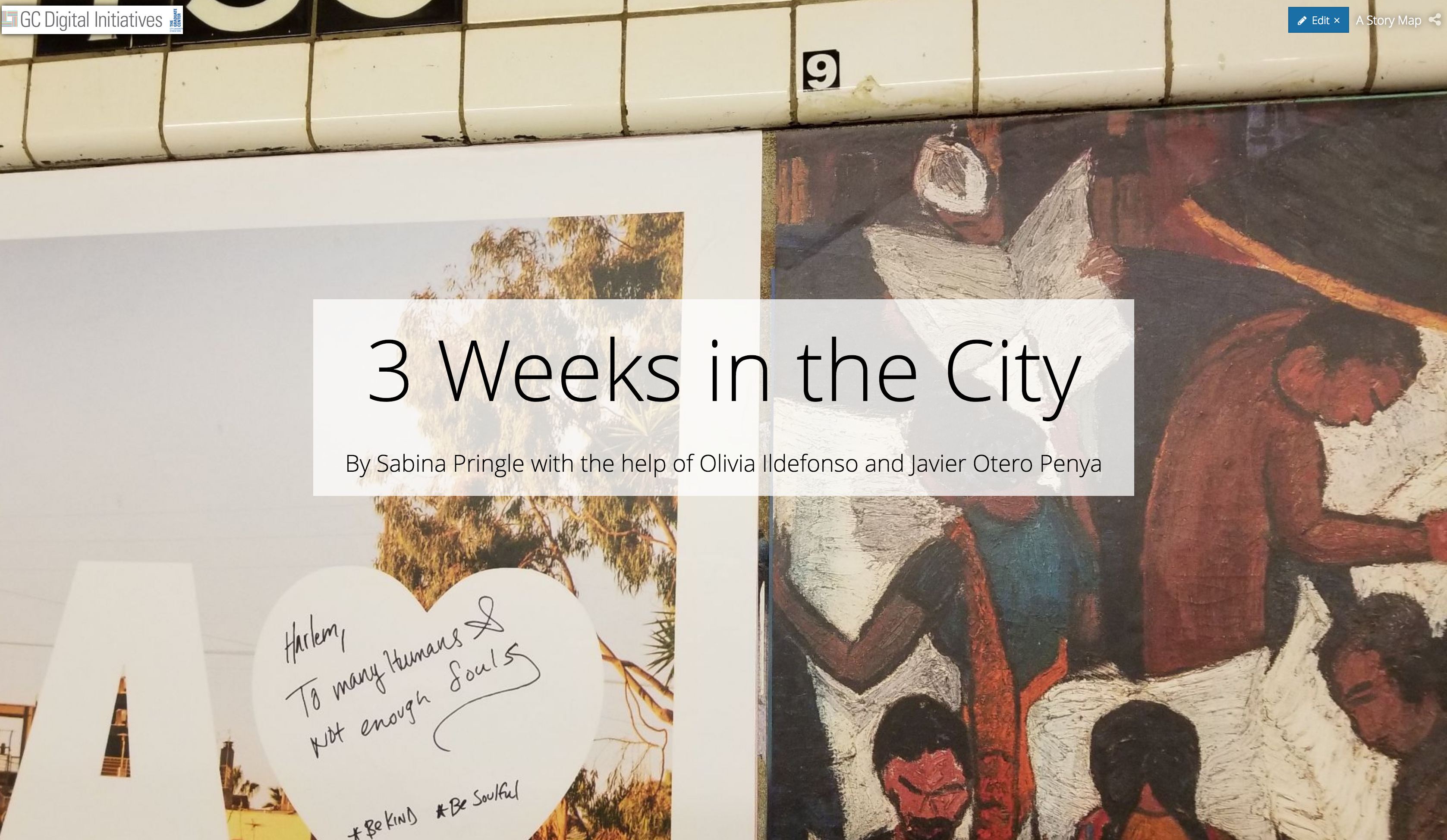
In it you’ll find notes I took of some of Olivia’s and Javier’s suggestions interspersed with a lot of nonsense I wrote as I feverishly followed Olivia’s directions, and an odd assortment of photos I pulled at random from my files. I like how the little dog becomes the big dog; that was a lucky accident. You’ll figure out how to use ESRI easily if you just dive in and play around.

A Successful Story Mapping Workshop

This past week, I attended a workshop titled “Create A Rich Multimedia Narrative with ESRI Story Map.” The workshop was hosted by two of the GC Digital Initiatives’ digital fellows, primarily being conducted by Olivia Ildefonso, with assistance from Javier Otero Peña. The goal of the workshop was to teach us how to effectively use ArcGIS‘s “Story Maps” feature. I was a bit hesitant to work with ArcGIS because I used it once before for a different class and it was a bit difficult to navigate. However, I was pleasantly surprised at how user-friendly it is and overall how naturally the skills needed to create an efficient story map came to me.

Olivia and Javier prepped a Google Slides show as a guide for the participants, but they prefaced the actual story map developing with making sure we went and downloaded a previously created folder on Google Drive. The folder contained all of the materials needed to create a replica of Olivia’s story map, “3 Weeks in Argentina.” I was actually worried about how efficient this workshop would be, thinking we may be creating random story maps. That would open up the possibility of ten different problems arising all at once. The method of having us replicate a demo story map was actually significantly helpful and definitely prevented any potential chaos from erupting.

I was planning on sharing some screenshots to show some of the work we had done, but I realized that defeats the purpose of the story map (I did, however, embed a link to Olivia’s demo in the title above). The difference between a story map and a simple PowerPoint presentation is that the story map brings a presentation to life. You can make your slides immersive, meaning that they can naturally phase between slides (and you can change the phasing effect), present media  (such as live videos playing behind your text boxes, or a stagnant video clip waiting for the viewer to press play), present data via different methods, and much more.

What I should be clear about is the fact that we used the “Cascade” style story map, which is only one of seven different style options. The cascade option fits that of more narrative-based presentations (which is why we worked with information/media from Olivia’s trip to Argentina). With my background being in Education & English, I immediately thought of this as a great tool for narrative-based projects in English classes. Even something as simple as book reports could be an assignment that opens up students to the world of digital humanities. Similar to what Ryan Cordell wrote in his essay “How Not to Teach Digital Humanities” within the Debates in the Digital Humanities 2016 edition (a recent reading of ours), we need to start small with our students and help them climb the scaffolding we lay out in order to help them reach the top. Even simple mapping tools such as ArcGIS’s story mapping is a gateway tool to bigger DH projects, which is something we need to take into consideration when developing curriculum. I’m currently thinking of projects I have done as well as projects I have given students in the past and am thinking of how I could incorporate something like story mapping.

Overall, this workshop went incredibly smoothly and is probably tied for first for my favorite workshop thus far (the other contender is my HTML & CSS workshop with Patrick Smyth). Story maps is a great tool for making presentations much more fun and engaging for students/your audience. It is an incredibly flexible digital tool and surely one that I will be utilizing in the near future. I highly encourage those of you who couldn’t attend the workshop to go to the website (link embedded in “Story Maps” above) and play around with it! Hopefully, you will find it just as easy to use as I did!

Ten Things: Mapping the Eclipse Archive’s “Black Radical Tradition”

1 // Most of my reading and writing centers on poetic experiments. Usually the adjectives involved include at least one from a short list that is: computational, constraint-based, conceptual. Other common adjectives are avant-garde and radical, the latter of which appears twice in the source material for my mapping praxis.

2 // Constraint-based, conceptual poet Craig Dworkin manages Eclipse, the free on-line archive focusing on digital facsimiles of the most radical small-press writing from the last quarter century. I return to the Eclipse archive regularly to look at works from poets like Clark Coolidge, Lyn Hejinian, Bernadette Meyer, and Michael Palmer. These are the poets with whom I most familiar. There are many poets in this particular archive with whom I am not familiar at all. In fact, I would say most. These are the poets with whom I want to get familiar. My sense is that I would say most of the poets with whom I am not familiar at all, given their proximity in this particular archive to those poets with whom I am familiar, deserve to have I would say most of their work looked at regularly alongside the others’.

3 // “Given their proximity in this particular archive…”: I am jumping ahead and have one eye on our third dataset/network praxis assignment, wondering to what extent spatial, temporal, racial, gendered, and influential proximity manifests in this particular network of poetic experiments. Conceptual poetry is notoriously white and male, but where isn’t it that way? Where are the radical and avant-garde titles that aren’t being looked at? Where are they? With one eye on our third praxis assignment, I start building a dataset to use for the second. I start with the Black Radical Tradition.

4 // As a rule, for each title in the archive, Eclipse offers: a graf on the title’s publication and material history, a facsimile view of each page, and a PDF download. With lousy Amtrak wifi, I let the facsimiles of each of the 39 titles in the Black Radical Tradition slowly drip down my screen. I don’t yet know what I’ll want for my dataset down the line, but to get started I try to snag from Dworkin’s notes and the first three/last three pages the most obvious data points: author, title, publisher, publication date. Because Eclipse features both authored titles and edited volumes, I learn to add a column to distinguish between the two. I soon add another column to capture notes on the edition, usually to reflect whether the title is part of a series or is significantly different in a subsequent printing. Because I aim to map these spatially–I’m guessing these will cluster on the coasts, but I don’t know this for sure–I snag addresses (street, city, state, zip, country) for each of the publishers. Except for Russell Atkins’s Juxtapositions, which Dworkin notes is self-published and for which I can find no address.

5 // I start my map with ArcGIS’s simplest template, noting two other available templates–the Story Map Shortlist, which allows you to curate sets of places like Great Places in America‘s three “neighborhoods,” “public spaces,” and “streets” maps, and the Story Map Swipe, which allows you to swipe between two contiguous maps like in the Hurricane Florence Damage Viewer–that I might return to in the future if I want to, say, provide curated maps by individual poet, or else compare “publisher maps” of the Black Radical Tradition and the L=A=N=G=U=A=G=E poets (another set of titles in the Eclipse archive).

6 // Even with the basic template, I experience four early issues with ArcGIS:

First, the map doesn’t recognize, and therefore can’t map, the addresses for each of my three United Kingdom-based publishers. This seems to be a limit of the free version of ArcGIS or possibly the specific template I am working with. This is problematic because it keeps me from making an international analysis or comparison, if I want to.

As I click ahead without a lot of customization, the default visualization presented to me assigns each author a different colored circle (fine). The problem with this is that it, for some reason, lumps four of the poets into a single grey color as “Other,” making it impossible to distinguish Bob Kaufman in San Francisco from Joseph Jarman in Chicago.  Those in the grey “Other” category each have one title to their name, but, confusingly, so do several “named” authors, including Fred Moten in green and Gwendolyn Brooks in purple.

Third, beyond placing a dot on each location (fine), the map suggests and kind of defaults to confusing aesthetic labels/styles, such as making the size of the dot correspond to its publication year. In my first map, the big dots signal the most recently published title, which, worse than telling me nothing, appears to tell me something it doesn’t, like how many titles were published out of a single city or zip code. The correlation between year and dot size seems irrelevant, and ArcGIS is unable to read my data in such a way as to offer me any other categories to filter on (e.g., number of titles by a single author in the dataset, so that more prolific authors look bigger, or smaller, I’m not sure).

Once I make all the dots equally sized, a fourth problem appears: from a fully scoped-out view, multiple authors published in the same city (e.g. San Francisco) vanish under whichever colored circle (here: grey) sits “on top.” This masks the fact that San Francisco houses three publishers, not just one. You don’t know it until you drill down nearly all the way (and, even then, you can barely see it: I had to draw arrows for you).

7 // I test out the same dataset in Google Maps, just to compare. I find the upload both faster and more intuitive. Google Maps is also able to handle all three of my UK addresses, better than the ArcGICS zero. Unlike in ArcGIS, though, Google Maps isunable to map one of my P.O. boxes in Chicago, despite having a working zip code; this is almost certainly a problem with my formatting of the data set, but Google Maps does virtually nothing to let me know what the actual problem is or how I can fix it. Nevertheless, Google Maps proves to be more responsive and easier to see (big pins rather than small circles), so I continue my mapping exploration there.

8 // A sample case study: my dataset tells me that New York in 1970 saw the publication of Lloyd Addison’s Beau-Cocoa Volume 3 Numbers 1 and 2 in Harlem; Tom Weatherly’s Mau Mau American Cantos from Corinth Press in the West Village; and N. H. Pritchard’s The Matrix from Doubleday in Garden City, Long Island. When I look on the map, the triangulation of these 1970 titles “uptown,” “downtown,” and “out of town” roughly corresponds to the distribution of other titles in the following decade. Is there any correlation between the spatial placement of publishers and the qualities of the individual literary titles? Do downtown titles resemble each other in some ways, out of town titles in other ways? Is the location of the publisher as important as, say, the location of the author–and even then, would I want the hometown, the known residence(s) at the time of writing, the city or the neighborhood?

9 // And what about this “around the corner” phenomenon I see in New York, where clusters of titles are published on the same block as one another. My dataset is small–a larger one would tell me more–but, as a gathering hypothesis, perhaps there’s something to having a single author’s titles “walk up the street,” moving through both space and time. What, or who, motivates this walk? There’s a narrative to it. What might the narrative be in, say, Harlem, where after publishing the first two instances (Volume 1 and Volume 2 Number 1) of the periodical Beau-Cocoa from (his home?) 100 East 123 Street, editor/poet/publisher Lloyd Addison moves (in the middle of 1969) Beau Cocoa, Inc. to a P.O. box at the post office around the corner. Did an increased national or international demand for this periodical require more firepower than Addison’s personal mailbox?

And what might the narrative be in the West Village, where Tom Weatherly publishes his 1970 Mau Mau American Cantos and his 1971 Thumbprint with two publishers in a four block radius? A larger dataset might show me a network of poets publishing within this neighborhood. Could it lead me to finding information about poetry readings, salons, collaborative projects? (I’m making a leap without evidence here to evoke a possible trajectory.)

10 // Future steps could have me expand this dataset to include data from the rest of the titles in the Eclipse archive (see #5 // above). It could also go the other direction and have me double down on collecting bibliographic data for these authors in the Black Radical Tradition: the material details and individual printings of their titles (some of which Dworkin provides in an unstructured way, but I skipped over during my first pass through my emerging dataset), perhaps performances of individual poems from these titles that have been documented in poetry/sound archives like PennSound, maybe related titles (by these authors, by others) in other “little databases” like UbuWeb. Stay tuned.