Category Archives: Uncategorized

A Network Analysis of Hashtags in Tweets Containing ‘Ted Cruz’

For the network analysis praxis assignment, I looked at what hashtags appear in tweets that contain “Ted Cruz” or “#tedcruz” during an 18-minute time frame. I used the Twitter Streaming Importer plugin in Gephi (video tutorial), which collects tweets according to set criteria and presents a network visualization of the results. Seeing as the Texas Senate race is one of the most visible in the midterm elections – and because the senator draws polarizing opinions – I was curious to see whether there would be a disparity in the kind of hashtags associated with Cruz tweets. I went with the short period of time so that the visualization would not get too crowded, and because the incoming data was becoming a bit much for my computer.

A few questions going into the assignment:

  1. Easiest one: Which hashtags appear the most?
  2. Will one side of the political spectrum tend to use certain hashtags (that don’t clearly indicate preference) over the other side?
  3. Will there be more hashtags from presumed Democrats or Republicans? That is, based on hashtags that clearly show political preference.
  4. Are any [hashtagged] figures frequently mentioned in “Ted Cruz tweets,” such as Trump or opponent Beto O’Rourke?

Hashtags resulting from an 18-minute search of tweets containing “Ted Cruz” or “#tedcruz.” The darker-colored nodes contain the hashtags that appeared the most frequently, and are connected to the nodes with hashtags that also appeared in the same tweets.

It took a very long time to figure out how to establish this kind of visual hierarchy through color and size but I was amazed at how Gephi could map out what looked like a mishmash of hashtags, collected through the plugin, into something observable.

I highlighted in blue and red (not through Gephi) what appeared to be hashtags coming from Democrats and Republicans, with the rest possibly going either way.


Some casual observations:

  • The most prominent hashtag “on the right” is #maga, which is tweeted alongside references to Trump (#trump, #trumprally), nationalism (#trueamerican, #cruzcaresaboutamerica) and the caravan (#stopthecaravan, #stoptheinvasion).
  • Meanwhile, uses of “vote” (#voteblue, #votedemocrat, #voteforamerica) dominate “on the left” side with numerous mentions of O’Rourke.
  • Trump hashtags appear less than I thought they would on the left side.
  • While Texas is certainly mentioned numerous times, the country as a whole is well represented on both sides, perhaps more so than usual given the current political atmosphere.
  • It seems there are a bit more Democratic-leaning hashtags in this pool, though it is certainly not an indication of how many tweets the two candidates in this particular race are generating – only of tweets that include Cruz’s full name.

Limitations, questions and possibilities
In addition to the brief period of time from which the tweets were drawn, the sample of “Ted Cruz” tweets is also limited in terms of the sample of Twitter users – specifically, those who use hashtags, and of course those who mentioned Cruz. And there’s always the question of who or what is generating the tweets, and how this can determine the usefulness of the data.

I applied the timeline feature, which Micki showed in her presentation, to see the growth of the number of nodes (though it was slightly more satisfying to actually see the feature itself working). With more tweets and a longer time frame, it would be interesting to see if there are any patterns based on time of day, clumps of hashtags appearing at once (i.e. ample use in a single tweet), the increased variety of hashtags, etc.

The plugin also has the option of pulling only usernames or emojis which for this “experiement” seemed more difficult to discern patterns, or pulling everything (hashtags, handles, tweets) which when laid out on the visualization was a bit of a mess and seemed to require beyond-beginner skills to clean up. For my attempt at using Gephi, going the hashtag route seemed the easiest to manage while still producing something that could be examined.

From what I could see, using the hashtag option only returned hashtags and timestamps. Through the latter you can tell which hashtags likely appeared in the same tweet and I believe it’s visualized through the ones that appear to be grouped together. The other options in the plugin for pulling information produced more data – that helped in tracing back to the original tweets – so would provide other kinds of opportunities for analysis, as would the statistical algorithms included in Gephi.

Hate Crimes by County and Bias Type: Network Analysis Praxis

So for my praxis assignment (after spending an extensive evening trying to understand and figure out Gephi) I decided to go with Palladio, the engine developed by Stanford University. After playing with the provided sample dataset provided n Palladio, I encountered the frustrating issue of finding a dataset that I wanted to work with and worked in Palladio. The initial set I wanted to use was not available in the form of a comma separated value file (.csv), so I had to keep looking. This is when I found www.data.gov,  which provided over 18,000 datasets from our area alone. Now that I was in a dataset wonderland, I had found more than several interesting data topics I wanted to work with from disability to car accident statistics. However, this is when I ran into the final pothole in the road to success with this praxis assignment. The sheer size of the dataset played heavily in my ability to use. Plugging in a dataset with well over 4,000 brackets of data tended to cause Palladio to crash entirely. Given Palladio is an open-source digital tool, I’m sure its power to remold datasets only goes so far. Finally, I found a dataset that came in the proper format and was a reasonable size to plug into Palladio.

I decided to work with a dataset titled Hate Crimes by County and Bias Type: Beginning 2010, based on New York State counties. Being someone who fits into several different marginalized communities, this was something I was especially interested in. I was born and raised about a couple hours north of the city in Ulster & Dutchess counties. However, growing up I also spent a lot of my time with family down here in the city, so knowing about these two different cultures and lifestyles I was curious to know the difference in terms of violence against these people labeled as “other.”

I mainly utilized the graphing feature on Palladio. This feature divides the source subject into nodes, and then they connect them to the target nodes in order to represent connections in the dataset. Before diving into specific the counties, I started by showing the correlation between hate crimes against properties versus hate crimes against individual people/groups of people:

Crimes Against People Vs. Property Crimes

This was where I first learned something thanks to the visualization of the data. Notice how the connection between the nodes create a bowtie-like image, it shows that there is a great amount of overlap between these property crimes and crimes against people themselves. This is not something I imagine many people would take the time to scour through the dataset and mark down these similarities, so having this software where you can plug the data in and have it spit out a visualization like this is incredibly useful.

So another common issue I decided to look into before tackling individual counties was crimes against religious practice. We live in a post-9/11 society, and as a result, there is an unfortunately extreme level of prejudice against those within Muslim communities. So first I went ahead and searched the total incidents of hate crimes against religious practice as a whole, followed by specifying hate incidents towards Muslim practice:

Total Incidents of Anti-Religious Crimes

Total Incidents of Anti-Muslim Crimes

In comparing the numbers as well as the intensity of the nodes, we can see that there are many general hate crimes against religious practice as a whole, but if you look at the following graph that focuses primarily on anti-Muslim hate crimes you will see that a truly astounding percent of the religious hate crimes are against Muslim religious practice. This obviously reflects off of what I previously mentioned about the existing prejudice, and it validates that statement.

Alright, now for the New York State counties. For starters, I decided to look into the total number of hate crime offenders versus the number of hate crime victims:

Total Number of Offenders by County

Total Number of Victims by County

Interestingly enough, you can see by the large cluster of engorged nodes in the offenders graph that there are a significantly higher number of offenders than victims. This is because a hate crime does not always mean physically damaging a person or group. So we can see that this significant gap between offenders and victims signifies that hate crime offenders are practicing in much more subtle ways such as only serving/hiring people within a specific demographic, intentionally excluding others.

One issue I did run into while going through this process, was a strange inconsistency in the statistical graphs for anti-gay hate crimes that took place. Below I provided the total number of incidents involving hate crimes against the gay community, and the counties where these hate crimes took place:

Total Number of Anti-Gay Hate Crimes

Counties Where Anti-Gay Hate Crimes Took Place

According to the first graph, there were a staggering number of incidents in terms of anti-gay hate crimes between 2010 and early 2018. However, in looking at the specific counties, it is showing it only took place in a few different NYS counties. There could be a misconnection with the data somewhere, but I am incredibly novice at this so I am not sure where. That or a disturbing amount of hate crimes took place in only several counties.

The last example I’ll provide shows anti-black hate crimes across New York, and I think it gives up some perspective on historical events:

The Number of Anti-Black Hate Crimes

Thanks to this visual, we can see that a lot of the anti-black hate crimes take place on the southern end of New York State. Historically, there are tensions between inner-city communities and those of suburban communities such as Westchester County and Yonkers. Upon ideas such as public housing entering these suburban communities, their development was met with a lot of backlash provided by Italian and Irish citizens. This was primarily an issue when the country was still slowly desegregating, but these issues still run rampant today (as you can see by the visualization) and can be seen between New York City burrows and suburbia.

In the end, I thought this was a pretty neat little experiment to get a feel for these visualization tools. One day I will conquer Gephi, but today I am satisfied with my accomplishments regarding my analysis of this dataset using Palladio.

“it’s just awful trying to find a humanities dataset”

What is the value of teaching methodological tools with no inclusion of theoretical support that informs analysis? But what good is the theoretical when students struggle to learn arduous methodology in software like R Studio? Learning to program, from the outset, seems impossible. It is literally learning a new language, one that is mathematical and statistical. Andrew Goldstone articulates some very promising angles to approaching these dilemmas.

When it comes to having the methodological skillset, the big question is “so what?” What can you say about the visualization on your screen? I recently had this problem with my network analysis… okay, I curated data and created networks of characters that conversed with one another in Hamlet. What good is that for scholarship? Well, it is certainly good for my own personal scholarship. We all were told going into these Praxis assignments that the projects were more about getting experience with digital tools than necessarily revealing anything groundbreaking. You need to test the waters before you can commit to a full-on swan-dive. Goldstone understands this, but at the same time was teaching at the Ph.D. level where results mattered. His course sounded intensely painful but very rewarding at the same time.

My experience with R Studio is limited to one class I took. It is really hard software to learn because, beyond software functionality, there is also the problem of interpreting the R language and making it “do stuff” for you. In Goldstone’s fast-paced one-semester textual analysis course, the students sounded highly committed, intelligent and professional but that would be a given going into the design of the course from the outset, I mean they are Ph.D. students. How could he design pedagogy that would inform his students to create intelligent work and mobilize them to ask worthwhile questions of that work? In a very short time frame.

It seems that Goldstone had three major takeaways from his experience with this trial run of his course:


“1. Cultivating technical facility with computer tools—including programming

languages—should receive less attention than methodologies for analyzing

quantitative or aggregative evidence. Despite the widespread DH interest in the

former, it has little scholarly use without the latter.


  1. Studying method requires pedagogically suitable material for study, but good

teaching datasets do not exist. It will require communal effort to create them on

the basis of existing research.


  1. Following the “theory” model, DH has typically been inserted into curricula as a

single-semester course. Yet as a training in method, the analysis of aggregate data

will undoubtedly require more time, and a different rationale, than that offered by

what Gerald Graff calls “the field-coverage principle” in the curriculum.”


When I took Digital Humanities courses at NYU, the layout of the program was much different than ours. In the first semester of their sequence, you are taking an Intro to Python course that proved to be very challenging, especially to people with little programming experience (like me), because like Goldstone’s course, it met once a week. I struggled with homework and went to office hours every Monday morning. I would have benefited from this back-end approach of learning to look at and analyze what is being quantified before being expected to create it on my own. Then, when I would go back to the programming course at a later time, I would know what to expect to come out of the “other end.”

In DH courses, the internet is our oyster, to mark Goldstone’s second point. In other words, it is all of our responsibility to keep an eye out for that perfect database that has everything we all need (does that exist?). Sometimes it does take being a little creative and problem-solvable, I had to make my Hamletdataset by hand, but is that the worse thing for an intro-level course?

There isn’t much to say about the third point other than as we already have drunk the Kool-Aid of this program, we know, one semester just won’t cut it. There are so many concepts, theories, methods, programs, languages, practitioners and articles to read. We are lucky to call our program home because we get the time we need to delve into all that.

While learning to work with data, we must learn not only how to make the data “do stuff” but know how to ask the right questions of it at the right time. Because as Goldstone points out, how can one be sure a “trend is real, and not a random fluctuation?” It’s fun to look at data and believe you are pointing something worthwhile out. It’s less fun to learn what you’re looking at isn’t actually interesting by someone that knows.

It is important to learn to program because another point Goldstone makes is when using GUI interfaces, you are limited to the confines of the system. He uses Voyant for an example. Without having knowledge of coding, you are literally locked out from asking questions other than what Voyant allows you to. Perhaps this is another weakness in the tool that could be addressed in our letter to Voyant (if that hasn’t happened already).

The problem with learning too much methodology at once is what scholarly good is it serving? A balance of the methodological and the theoretical is essential for keeping checks and balances. I know in my course with R Studio, there was a great deal of both. My professor was a proponent of being sure to include theoretical readings along with practical assignments every week. I learned a great deal, and this class is what turned me on to data and DH. It is only through understanding the theoretical that the methodological clicks in such a way that scholars can ask appropriate questions. This is a very important aspect of pedagogy to me and is something that is put into practice in our program.

And of course, Goldstone makes an excellent point in that having guided datasets for beginner students is a great way for one to get their feet wet; “so that instead of being forced to fish for interesting phenomena in an empty ocean, students can follow a trajectory from exploration to valid argument.” It is always helpful to have a guide, especially when learning something so new and complex as programming and any other kind of work with data.

Hamlet SNA

For my network analysis, I explored character interactions in Shakespeare’s Hamlet. I chose this text because I just finished reading it again for my textual analysis class for a project. Since I was refamiliarized with its layout, I figured I would be able to easily spot discrepancies in the output from Gephi, the software that I used. However, everything looks like it came out as best I could have hoped. I also knew there are many characters in Hamlet, so it would make for entertaining social network analysis.

Since I don’t know of any databases with Shakesperian play edge lists, I had to make my data by hand. This was the most time-consuming part. I went through the play and created a pair of edges in Excel for each time a character interacted with another, once per scene. In other words, it was a personal choice to only mark each interaction only one time a scene, as I felt like it would have been too tedious to do so every time character’s spoke to one another, as there are many long interactions. It seemed as though there was much more room for error with this route too. However, I did wonder how different my network analysis would have looked if I did do it this way. Perhaps in the future if I have more time, I’d go back and do it this way, or perhaps there is something built in the software where I could count the number of interactions and plug it in that way as opposed to having a binary pair in Excel in two columns for each interaction.

One of the issues I had that could be seen as a weakness on behalf of the data was deciding who was exactly interacting with who. There are scenes where, say, King Claudius is speaking, so do I mark an edge with everyone who is present in the scene? It was a judgement call, but I didn’t do it that way. I came to my own conclusion who is likely being addressed (there were multiple people in some instances) and I never made an edge out of an entire cast of characters in a scene. But it is possible that I did miss some interactions, due to skipping over characters being addressed that I didn’t realize as I was going through the text. This is where better/stronger textual analysis skills would have come in handy, so I wouldn’t have had to do this manually, but I am a way’s off from writing programs that would be able to pull out this kind of data.

There are five acts of Hamlet, so I had six Excel worksheets. One for each act of five or so scenes, and the final one is a composite of all the scenes to show the relations throughout the duration of the entire play. To be clear, I only made an edge pair per one interaction per scene, which are all on one Excel worksheet per each act, and the final compounded list. That list had 77 edges and 33 nodes. However it did work out that you can see some thicker edges and that signifies that the edge pair interacted more than once per act, so that is a cool thing to have illustrated.

Once my data was imported into Gephi, I spent a good deal of time choosing how I wanted to layout my output. I couldn’t leave the nodes in place as they were because they were too close to one another to be visible or useful, so I had to drag nodes around to different areas of the Gephi workspace. I also had to play around with Gephi a bit before collecting my data to figure out how I wanted to layout my worksheets in Excel. I realized there would be a learning curve to account for how Gephi would read sheets and spreadsheets. As I found out, or at least was able to come up with, one workspace in Gephi = one worksheet in Excel. So, I would be happy to know how to combine workspaces in order to not have to do that manually in my final worksheet like I ended up doing.

I wouldn’t say my analysis really reveals anything to provocative that you wouldn’t have understood just by reading Hamlet. It is pretty apparent who speaks the most and to whom. But it was fun and meaningful taking a literary text and mining it for data and then playing around with that data in Gephi. It has been a while since I’ve used this software last, so it was good to reacquaint myself with it. One thing I never really mastered in Gephi is how to find different types of visualizations such as the work of Micki Kaufman, who mad many. Mine is pretty bare bones, but it goes to show what social network analysis looks like and does in case anyone in our class had questions about it in terms of practicality. And I felt like a real digital humanist!

Act 1


Act 2


Act 3


Act 4


Act 5


All Acts

How to Teach Digital Humanities to Undergraduate Students

I really appreciated Ryan Cordell’s contribution to the Debates in the Digital Humanities 2016 edition, “How Not to Teach Digital Humanities.” I think it’s important that we take his guide into consideration when building future courses for undergraduate students with the goal of piquing their interest in digital humanities. Hearing the phrase “digital humanities” can be an intimidating experience for young students who are still figuring their own paths out. Upon hearing about it and researching much more fleshed out DH projects online, the thought of tackling what is essentially computer science is terrifying.

For myself, I was in a class full of English and English/Education majors when I was first introduced to the digital potential of the humanities. Being a class full of English students, whose bread and butter of work is writing papers, we were obviously a little hesitant to dive into coding literature. That’s where my professor’s pedagogical methods matched that of Cordell’s recommendations. For starters, as Cordell suggests, we started small. The class was titled “Digital Lyric,” which meant that we did not work with large pieces of literature. We worked solely with poetry and musical lyrics. This made it easier to tackle the incoming assignments. We were not so focused on reading large volumes of work, but rather on the concise prose that we eventually had to rework digitally. We start light, with simply engaging with these DH tools as a way to start a conversation amongst the class. For example, we used the digital tool Prism, which my professor worked on at the University of Virginia. As the website states, Prism is a tool for “crowdsourcing interpretation.” So my professor uploaded a poem, Ozymandias by Percy Bysshe Shelley, and we had to highlight the poem according to certain themes (each associated with a different color). In the next class, she was able to take all of our highlights and layer them over one another. It provided us with percents for each theme, and the class unfolded from there.

This was a very small start in terms of the massive tent that is DH, but it was easy and exciting. We were more prepared to slowly step into the world of digital humanities now that we understood some of what it could do for us as humanities scholars and educators. Next, Cordell suggests you integrate when possible. We went on to talk about poetic form, which brought us to the concept of deformance. After reading a brief piece on deformance (with the intention of keeping the reading light, my professor wrote up her own note sheet on it for us), we actually used a tool to create a bot that randomly provided a new apology in the form of the poem “This Is Just To Say” by William Carlos Williams. We, a class full of English students, learned some basic coding and did well! Other English staff thought my professor was wild for trying to teach us code, but it was incredibly successful. Click here if you want to see the bot and generate some funny parody poems! There is also a Twitter bot that occasionally does the same exact thing, also worth a gander! So in studying poetic form, we also learned how to play with it using technology.

Cordell’s third rule expresses how critical scaffolding is. To put it plainly, you must build up one skill on top of another in order to tackle larger projects. This is the point where we started working on our Victorian Queer Archive with students at Dickinson College. We were each assigned a queer author from the Victorian era, then we had to take one of their poems and do some research. We had to get the details on their publication, find original images, and more. Then we took that information and pieced them into this large archive, making this our first digital humanities project that we all worked on. At this point, we had a solid foundation of DH knowledge and being that there were a large number of us, it was not intimidating to participate in this project.

Cordell’s fourth and final suggestion is to think locally. He doesn’t quite mean “support your local businesses” (although we should also be doing that), but more so that we should be more focused on digital humanities projects/work that is in the interest of the students and their university rather than impressing people who aren’t of significance to the students. Think more about how this work can promote their own work in the DH direction, and how that could meet the goals of the college in question. In our particular instance, we used the digital humanities as a tool for echoing the importance of diversity and equity. This was something that was very important to our campus and student organizations, so it was very encouraging to discuss issues of race and queerness through digital literary projects.

All in all, I really liked Ryan Cordell’s points because to me, they’re just solid suggestions. These points were followed by my professor in undergrad, and now I am studying DH with you all here at The Graduate Center. This course paved a path for me, a truly lost humanities student, that I did not know existed. I’m sure there are many of us who have told our friends and family that we are studying digital humanities, only to be met with a “Nice! What is that?” Given that it is still considered an emerging field, that is okay, but we need to seize the opportunity to expose more undergraduates to this potential since I agree that it is the future of humanities departments. We need to spread this fire.

New York Times: Sentiment Analysis and Selling You Stuff

Something related to textual analysis:

The New York Times is researching how to contextualize which ads they show with the feelings an article is likely to inspire. I’m not a fan. They claim having learned that ads perform better on emotional articles won’t influence the newsroom, but we’ll see. At least they’re being transparent about doing this work. They’ve published an article with information on how they developed their sentiment analysis algorithm (link below).

There’s an explanation of the types of models they used and why. The initial steps were linear and tree-based textual analysis models, followed by a deep learning phase intended to “focus on language patterns that signaled emotions, not topics.” This outperformed the linear models some of the time, but not all of the time.

From what I can tell, the training set used a survey showing articles with images to establish a baseline, but the linear predictive models focus purely on text. I may be misunderstanding this or information may be missing. I expect that image selection can enhance or diminish the emotionality of an article. Perhaps sensational or graphic images would prove to drive more (or fewer) ad clicks. Despite the buffer the NYT cites between their newsroom and marketing arms, this feels like morally hazardous territory. So to answer the question in the title of the NYT piece, this article makes me feel disturbed. But I still didn’t click an ad.

It’s a quick read. Check it out.

https://open.nytimes.com/how-does-this-article-make-you-feel-4684e5e9c47

Digital Technologies in the Public University: More Money-Making or Access for All?

Reading the introduction to Promises and Perils of Digital History by Dan Cohen and Roy Rosenzweig last week, I was intrigued by their mention of neo-Luddite Marxist critic David Noble, which led me off on a tangent which ties in with the pieces on pedagogy we’re reading this week.

Because universities have traditionally hierarchized individual authorities as sources of knowledge and because DH aims to break this hierarchy down, I was interested to see that Cohen and Rosenzweig introduce Noble by aligning him with another neo-Luddite, conservative American historian Gertrude Himmelfarb, who, writing in 1996, didn’t like digital technologies because their equalizing power make “no authority […] privileged over any other” [Himmelfarb qtd in Cohen and Rosenzeig 1]. Although the equalizing power that Himmelfarb is afraid of is something DH embraces, Noble doesn’t engage with this but instead warns us against technology’s power to serve as a tool to mass-market higher education. In “Digital Diploma Mills: The Automation of Higher Education” (1998) Nobles warns that

…the trend towards automation of higher education as implemented in North American universities [in 1998] is a battle between students and professors on one side, and university administrations and companies with “educational products” to sell on the other. It is not a progressive trend towards a new era at all, but a regressive trend, towards the rather old era of mass production, standardization and purely commercial interests. [Nobles para 1]

Noble takes issue not with technology itself but with what capitalists use it for. In the 1980s and ‘90s, he writes, universities were the focus of “a change in social perception which has resulted in the systematic conversion of intellectual activity into intellectual capital and, hence, intellectual property” [Noble para 8]. Research, he argues, was being commodified, and knowledge turned into “proprietary products” that can be bought and sold. As these changes took place, universities were implicated “as never before in the economic machinery” [Noble para 9]. Universities began to allocate funds for science and engineering research – because research had become a commodity – at the expense of education. Then instruction too was commercialized and shaped in a corporate model where costs were minimized by replacing human teachers with computer-based instruction. I think back to the wave of MOOCs that attempted to capitalize on the growing global demand for university degrees and certification around 2012 and what a poor substitute these were for seminars. These were Mills indeed. Then came learning management systems, writes Noble, and educational maintenance organizations contracted through outside organizations. Noble expresses concern that faculty lost the rights to their work as they uploaded syllabi and course content to university websites only to see their scholarship outsourced (I trust that Noble’s concern about ownership of intellectual property is concern that scholarship not be freely shared and not concern that faculty lose power over capital they ‘rightfully’ own). It was also unclear, writes Noble, who owned student educational records once students had uploaded their work to digital sites [para 30]. This is an important question and I hope that FERPA protects student privacy in digital media better now than it did in 1998. Having said that, I think of the query we recently began to write to Voyant about what it does with the corpora we upload, and the question appears to be just as pertinent now. Noble saw students as “no better than guinea pigs” in a massive money-making experiment gone totally wrong [para 30].

In 1998 it seemed to Noble that the technological revolution in higher education was all about corporations (including universities that had become de facto corporations) exploiting the capital that universities had come to contain. And “behind this effort are the ubiquitous technozealots who simply view computers as the panacea for everything, because they like to play with them” [Noble para 15]. Ha. A big problem with Noble’s neo-Luddite position is that he marks a division between people who use computers and those who don’t, as if these were two species apart. It’s important to keep in mind that Noble was writing in 1998. I wonder whether his position towards Digital Humanities would have changed by today (Noble died in 2010) in view of the turn towards free open source digital resources and in view of DH’s growing impact on scholarship, publishing, peer review, tenure and promotion, noted by Matthew Kirshenbaum in “What is Digital Humanities and What’s it Doing in English Departments?” (2012) and taken up by Stephen Brier in “Where’s the Pedagogy? The Role of Teaching and Learning in the Digital Humanities” (2012).

To get a sense of how present pedagogy was in digital humanities work in 2012, Brier looked for the key words pedagogy, teaching, learning and classroom in a summary of NEH grants for DH start-up projects from 2007 to 2010, and found hardly any instances of these key terms. This does not mean that no NEH start-up grants were destined to pedagogical DH projects, writes Brier, but does suggest that “these approaches are not yet primary in terms of digital humanists’ own conceptions of their work.” To start a conversation about the implications of digital technologies in higher education, Brier focuses on the City University of New York, the largest public university system in the United States and one which has grown tremendously over the past five decades in large part, writes Brier, thanks to its readiness to undertake radical experiments in pedagogy and open access.

One of these projects, the Writing Across the Curriculum (WAC) project, came into being to continue the mission that CUNY’s Open Admissions policy, dismantled by the CUNY Board of Trustees in 1999, aimed to accomplish, namely, to ensure that all high school graduates be able to enroll in college and get a college degree. WAC aims to do this by having writing fellows teach writing skills to students who need these. WAC brought digital technologies into the classroom in a natural way, writes Brier, because most writing fellows were interested in developing these.

Brier then points us towards The American Social History Project/Center for Media Learning/New Media Lab, which he co-founded in 1981 and which is deeply committed to using digital media for teaching history in high schools and at the undergraduate level. He goes on to discuss the Interactive Technology and Pedagogy Doctoral Cerfificate Program at the GC, the Instructional Technology Fellows Program at the Macaulay Honors College, Matt Gold’s “Looking for Whitman” project, the CUNY Academic Commons and the GC Digital Humanities Initiative. Now we also have the MA in Digital Humanities and many other initiatives that have come into being since 2012. Given the wealth of initiatives for educational reform developed with digital technologies within CUNY, I like to think that Noble would reverse his Marxist critique of digital technologies in the university were he alive today to witness the equalizing power for educational change digital technologies clearly provide.

A Network Analysis of our Initial Class Readings

Introduction
This praxis project visualizes a network analysis of the bibliographies from the September 4th required readings in our class syllabus plus the recommended “Digital Humanities” piece by Professor Gold. My selection of topic was inspired by a feeling of being swamped by PDFs and links that were accumulating in my “readings” folder with little easy-to-reference surrounding context or differentiation. Some readings seemed to be in conversation with each other, but it was hard to keep track. I wanted a visualization to help clarify points of connection between the readings. This is inherently reductionist and (unless I’m misquoting here, in which case sorry!) it makes Professor Gold “shudder”, but charting things out need not replace the things themselves. To me, it’s about creating helpful new perspectives from which to consider material and ways to help it find purchase in my brain.

Data Prep
I copy/pasted author names from the bibliographies of each reading into a spreadsheet. Data cleaning (and a potential point for the introduction of error) consisted of manually editing names as needed to make all follow the same format (last name, first initial). For items with summarized “et al” authorship, I looked up and included all author names.

I performed the network analysis in Cytoscape, aided by Miram Posner’s clear and helpful tutorial. Visualizing helped me identify and fix errors in the data, such as an extra space causing two otherwise identical names to display separately.

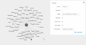
The default Circular Layout option in the “default black” style rendered an attractive graph with the nodes arranged around two perfect circles, but unfortunately the labels overlapped and many were illegible. To fix the overlapping I individually adjusted the placement of the nodes, dragging alternating nodes either toward or away from the center to create room for each label to appear and be readable in its own space. I also changed the label color from gray to white for improved contrast and added yellow directional indicators, as discussed below. I think the result is beautiful.

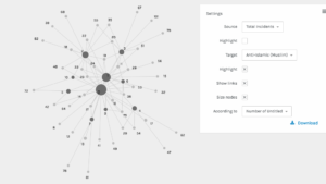
Network Analysis Graph
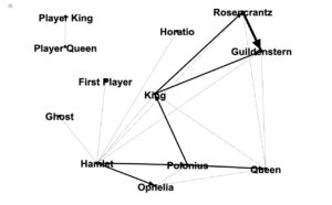
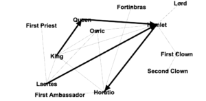
Click the placeholder image below and a high-res version will open in a new tab. You can zoom in and read all labels on the high-res file.

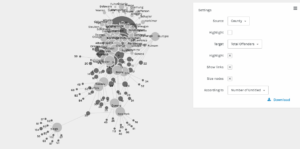
An interactive version of my graph is available on CyNetShare, though unfortunately that platform is stripping out my styling. The un-styled, harder-to-read, but interactive version can be seen here.

Discussion
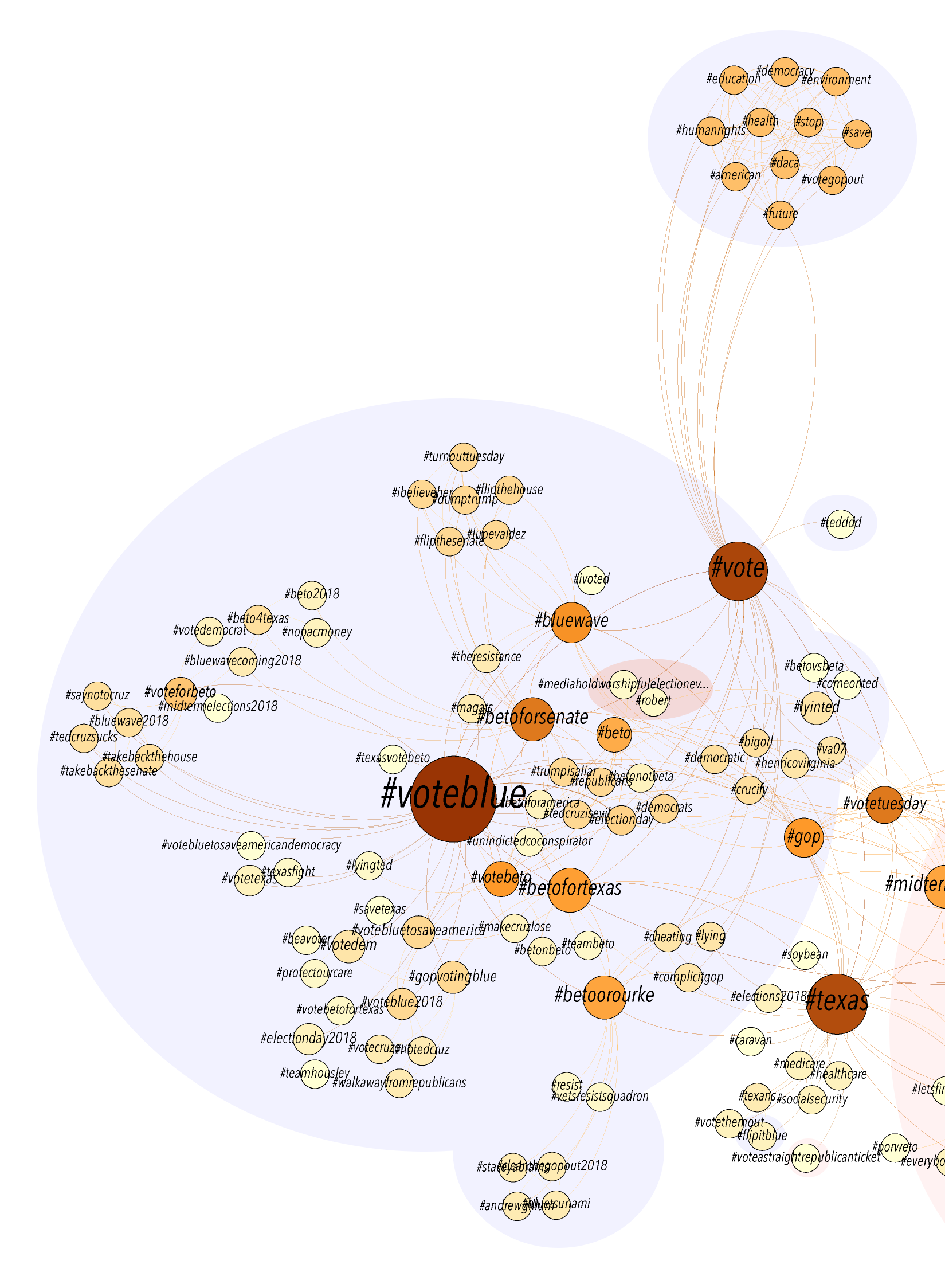
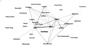
Author nodes in this graph are white circles and connecting edges are green lines. This network analysis graph is directional. The class readings are depicted with in-bound connections from the works cited terminating in yellow diamond shapes. From the clustering of yellow diamonds around certain nodes, one can identify that our readings were authored by Kirschenbaum, Fitzpatrick, Gold, Klein, Spiro, Hockey, Alvarado, Ramsey, and (off in the lower left) Burke. Some of these authors cited each other, as can be seen by the green edges between yellow-diamond-cluster nodes. Loops at a node indicate the author citing themselves. Multiple lines connecting the same two nodes indicate citations of multiple pieces by the same author.

It is easy to see in this graph that all of the readings were connected in some way, with the exception of an isolated two-node constellation in the lower left of my graph. That constellation represents “The Humane Digital” by Burke, which had only one item (which was by J. Scott) in its bibliography. Neither Burke nor Scott authored nor were cited in any of the other readings, therefore they have no connections to the larger graph.

The vast majority of the nodes fall into two concentric circle forms. The outer circle contains the names of those who were cited in only one of the class readings. The inner circle contains those who were cited in more than one reading, including citations by readings-authors of other readings-authors. These inner circle authors have greater out-degree connectedness and therefore more influence in this graphed network than do the outer circle authors. The authors with the highest degree of total connections among the inner circle are Gold, Klein, Kirschenbaum, and Spiro. The inner circle is a hub of interconnected digital humanities activity.

We can see that Spiro and Hockey had comparitively extensive bibliographies, but that Spiro’s work has many more connections to the inner circle digital humanities hub. This is likely at least partly due to the fact that Hockey’s piece is from 2004, while the rest of the readings are from 2012 or 2016 (plus one which will be published next year in 2019). One possible factor, some of the other authors may not have been yet publishing related work when Hockey was writing her piece in the early 2000’s. Six of our readings were from 2012, the year of Spiro’s piece. Perhaps a much richer and more interconnected conversation about the digital humanities developed at some point between 2004 and 2012.

This network analysis and visualization is useful for me as a mnemonic aide for keeping the readings straight. It can also serve to refer a student of the digital humanities to authors they may find it useful to read more of or follow on Twitter.

A Learning about Names
I have no indication that this is or isn’t occurring in my network analysis, but in the process of working on this I realized any name changes, such as due to a change in marital status, would make an author appear as two different people. This predominantly affects women and, without a corrective in place, could make them appear less central in graphed networks.

There are instances where people may have published with different sets of initials. In the bibliography to Hockey’s ‘The History of Humanities Computing,’ an article by ‘Wisbey, R.’ is listed just above a collection edited by ‘Wisbey, R. A.’ These may be the same person but it cannot be determined with certainty from the bibliography data alone. Likewise, ‘Robinson, P.’ and ‘Robinson, P. M. W.’ are separately listed authors for works about Chaucer. These are likely the same person, but without further research I cannot be 100% certain. I chose to not manually intervene and so these entries remain separate. It is useful to be aware that changing how one lists oneself in authorship may affect how algorithms understand the networks to which you belong.

Potential Problems
I would like to learn to what extent the following are problematic and what remedies may exist. My network analysis graph:

  • Doesn’t distinguish between authors and editors
  • I had to split apart collaborative works into individual authors
  • Doesn’t include works that had no author or editor listed

Postscript: Loose Ties to a Current Reading
In “How Not to Teach Digital Humanities,” Ryan Cordell suggests that introductory classes should not lead with “meta-discussions about the field” or “interminable discussions of what counts or does not count [as digital humanities]”. In his experience, undergraduate and graduate students alike find this unmooring and dispiriting.

He recommends that instructors “scaffold everything [emphasis in the original]” to foster student engagement. There is no one-size-fits-all in pedagogy. Even within the same student learning may happen quicker or information may be stickier if it is presented in context or in more than one way. Providing multiple ways into the information that a course covers can lead to good student learning outcomes. It can also be useful to provide scaffolding for next steps or going beyond the basics for students who want to learn more. My network analysis graph is not perfect, but having something as a visual reference is useful to me and likely other students as well.

Cordell also endorses teaching how the digital humanities are practiced locally and clearly communicating how courses will build on each other. This can help anchor students in where their institution and education fit in with the larger discussions about what the field is and isn’t. Having gone through the handful of assigned “what is DH” pieces, I look forward to learning more about the local CUNY GC flavor in my time as a student here. This is an exciting field!
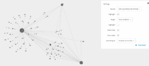
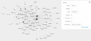
 

Update 11/6/18:

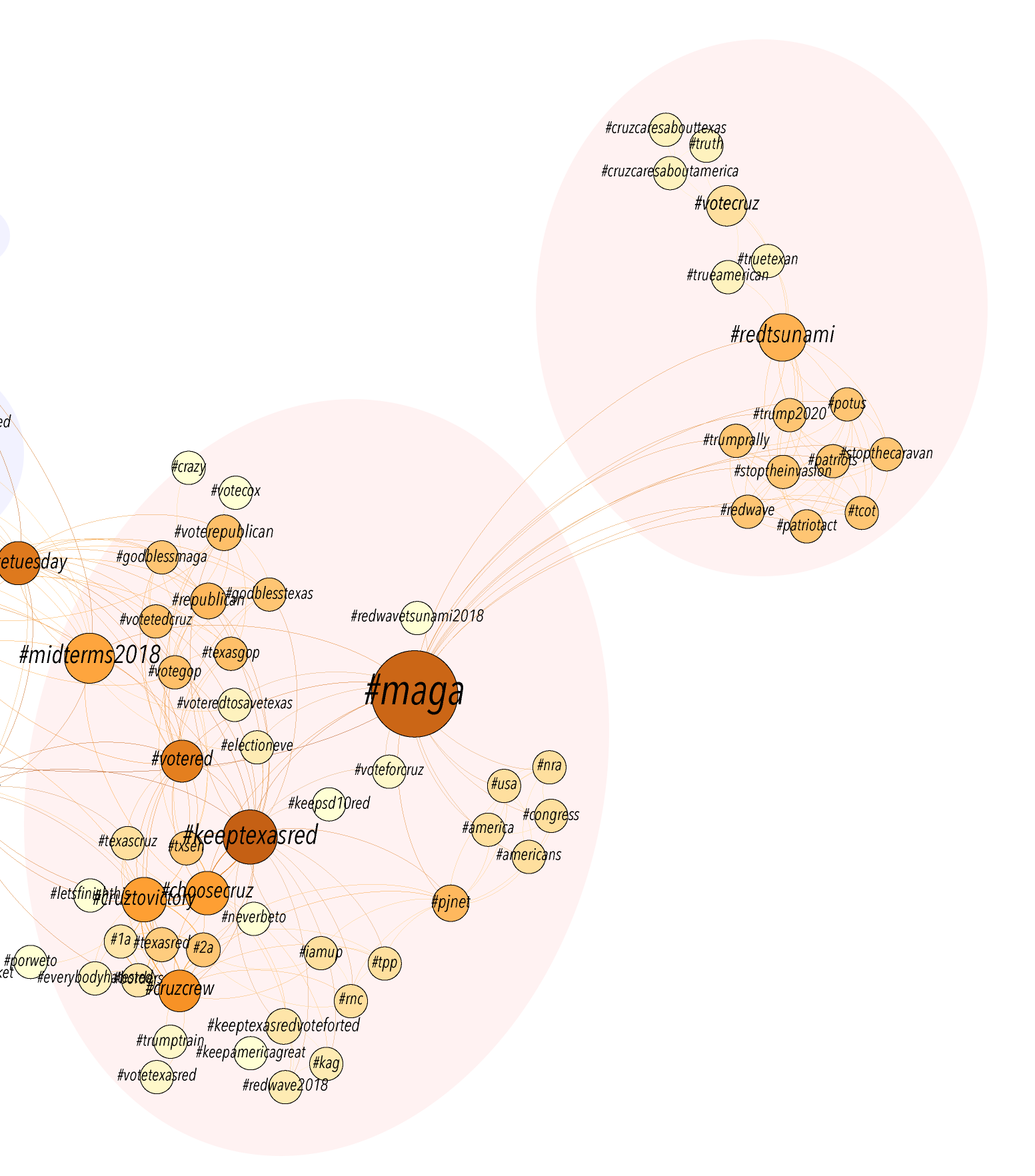
As I mentioned in the comments, it was bothering me that certain authors who appeared in the inner circle rightly belonged in the outer circle. This set of authors were ones who were cited once in the Introductions to the Debates in Digital Humanities M. K. Gold and L. Klein. Due to a challenge depicting co-authorship, M. K. Gold and L. Klein appear separately in the network article, so authors were appearing to be cited twice (once each by Gold and Klein), rather than the once time they were cited in the pieces co-authored by Gold and Klein.

I have attempted to clarify the status of those authors in the new version of my visualization below by moving them into the outer ring. It’s not a perfect solution, as each author still shows two edges instead of one, but it does make the visualization somewhat less misleading and clarifies who are the inner circle authors.


(Moving towards) a network analysis of U.S. Senators

In determining what exactly constitutes a network analysis, Miriam Posner’s website directed me to an older version of Scott Weingart’s website, with his introduction to networks available here. (Weingart received the 2011 Paul Fortier Prize, among other recognitions at the top of our field, and/but/so his website — a WordPress! — is a great resource across the board. Highly recommended.) He writes that, “[i]f you’re studying something with networks, odds are you’re doing so because you think the objects of your study are interdependent rather than independent. Representing information as a network implicitly suggests not only that connections matter, but that they are required to understand whatever’s going on.”

This week, I wanted to focus on connections or relationships with a topic that I believe reflects interdependency, so I took this third praxis assignment as an opportunity to explore the concentration of power that has long defined the upper levels of government in the United States. I was curious about how network analysis might make sense of what I view as a relatively closed circuit of people, predominantly white and predominantly men, whose relationships with each other may go back to college — or earlier, in the case of certain recent high-profile hearings — and serve to further consolidate their influence.

To explore this concept in more detail, I aimed to do a network analysis of the current 100 United States Senators to discover connections in their young adult lives through their time as an undergraduates. Many Senators attended one of a few law schools, but I was curious about finding other similarities even earlier in their higher education, whether a shared undergraduate institution or a similar set of experiences as an undergraduate at different institutions. It came to me that I could possibly use the tools for this week to visualize who — if anyone — would have been at the same school at the same time, for example. I ended up creating a dataset of each Senator’s name, college, graduation date, degree type, field of study, and additional information, including fraternity or sorority affiliation and if they served as student body president, were the first in their family to graduate college, graduated as a member of Phi Beta Kappa, or a few other categories that appeared in academic/professional overviews around the Internet. It’s not that I think being in a fraternity or sorority is an accomplishment (I did have a net positive experience with my own Greek life experience, but I’d hardly call it an achievement), but I wanted to include this element of undergraduate life as a potential link between Senators.

To consolidate all of this information in a Numbers file, I took Wikipedia at its word, and dug for details about several Senators as well. Some biographies described how so-and-so “graduated from [institution] in [year] with a [B.A./B.S./B.B.A.] in [field],” which was optimal for my purpose, but many biographies instead included partial information that left rows blank in my spreadsheet: reading that a Senator “holds a B.A. from [institution” or “graduated summa cum laude from [institution] in [year]” would send me to other sources, including alumni magazine profiles and commencement speaker information. For a few Senators, even this secondary step did not turn up the details I wanted, particularly with comparatively older Senators who graduated from college in the 1960s and 1970s whose fields of study remained hidden deeper than I could dig for this week.

At first, I included a column for “additional information” all together, separated with semicolons, but this catch-all approach had its limits. For one obvious thing, this approach didn’t allow me to sort  the data by any one consideration (if I wanted to see the Senators who graduated cum laude or higher, for example) that would illuminate a potential overlap in experience. To try and fix this, I broke the column up into a few not-catchy additional columns: “PBK?”, “other academic Greek,” “Greek social,” “first-gen,” “leadership,” and “athletics.” The column for “leadership” then became “class president?” and “valedictorian?”, making the table harder to navigate than before when these considerations were in one place. I soon realized another limit of this new approach: that some of this information might not be as accurate as I wanted it to be. Besides deliberately untrue information included in a biography, if a Senator graduated as their college or university’s valedictorian, it might not have made it into their Wikipedia biography (which anyone can edit) because so much else later in life eclipsed that one title or any other reason, or maybe the college or university did not even identify a valedictorian in the first place but the person still graduated at the top of their class.

The final consideration, which is fundamental in hindsight, is that I assumed that shared titles or organizations would lead to shared experiences that would lend themselves to network analysis. To be fair, there might be something about a group of people in the same Greek-letter organization at the same institution at the same time, or even across time, as the fascinating social experience of Homecoming illustrates, that ties them together, but it is hard to generalize from this feeling to a network. Do Doug Jones (who graduated from the University of Alabama, Class of 1976, with his B.S. in Political Science) and Michael Bennet (Wesleyan University, 1987, B.A., History) feel any kinship at all for their shared status as brothers in Beta Theta Pi, for example, and would it be fair to say that this kinship has affected their politics in any way, which is what my initial interest in this entire dataset seems to suggest? Or do John Cornyn (Trinity University, 1973) and Pat Roberts (Kansas State University, 1958) have some unspoken bond thanks to their B.A. in journalism?

I originally began pulling together this information to create a network analysis of what United States Senators might have shared early in their adult lives — institutions, honors, social organizations — but encountered fundamental problems with this very curiosity, not to mention the steep learning curve to putting the data into place. In working to express the data through Palladio and Gephi, I found that the platforms did not respond to my organizational approach or my questions, giving me a string of error messages and forcing me to return to the data over and over again to fill it in and rework its structure. I am going to try a few more rounds of editing my spreadsheet and exporting it to a csv file over the next few days, but also have considered that a different method entirely might give more insight.

Much of this process of compiling and adjusting the dataset was the challenge of figuring out how to organize the data as little as possible while aiming for accuracy and consistency. To paraphrase Micki Kaufman’s answer to questions last week about her method for working with a large quantity of documents processed with optical character recognition, I wanted to remember that we look for patterns where the data is cleanest, so the moment that you begin cleaning data, you begin influencing it, even subconsciously. This lesson only felt more important the more I messed with this data, even on a small, limited scale, and realized how much of my own interests and decisions affected any potential takeaways.

To return to Weingart’s post about network analysis, “Relationships (presumably) exist. Friendships, similarities, web links, authorships, and wires all fall into this category. Network analysis generally deals with one or a small handful of types of relationships, and then a multitude of examples of that type.” He uses the examples of authorship and collaboration as types or ways to describe relationships between types of nodes and introduces the distinction between asymmetric relationships, or directed edges that can be visualized with an arrow flowing one way, and symmetric relationships, or undirected edges that can be visualized with a line between nodes implying that the flow of the relationship is the same in both directions. For my purposes, I was only interested in finding the potential directed edges, the undergraduate-level features that current Senators have in common that could possibly indicate shared experiences and start the process of understanding various intangible “benefits of the doubt” that seem to hold real weight in political situations. Moving forward with trying to explore the concentrations of political power in the federal government, I think it might make sense to incorporate a greater sense of asymmetric relationships (who has clerked for who, for example, rather than who were classmates on the same level or who shared an experience “equally”), or else to work with nodes that offer less room for interpretation on my end.

Workshop: “Writing with Markdown”

The Digital Fellows’ “Format Your Dissertation Like a Pro: Writing with Markdown” workshop taught by Rafael Davis Portela introduced Markdown, a markup language (a way to annotate and present text in a document using tags, with HTML being one example) meant for writing dissertations, web content, notes, or really any form of text, that uses relatively limited formatting options so that the focus remains on the actual writing itself.

Basically, you’re writing your document in a plain text editor with the ability to add minimal formatting to it using syntax. There are benefits such as being able to move paragraphs around without worrying about messing up the formatting, writing lists without being concerned about the specific order, and including notes to yourself that don’t appear in the final version. The file is a plain text file so you don’t have to worry about compatibility issues and you can easily convert it to other formats when you’re finished such as a doc, pdf or html file, or even into presentation slides.

Pre-Markdown

You will need to download some tools to convert the Markdown file when you’re done and if you prefer, you can create the Markdown file itself in Terminal, the info for which is all found on Rafael’s Github page for the class. Just to try using Markdown, you can use Visual Studio Code like we did in the workshop or another text editor, and save the file as a .md file. Or try Markdown in a browser without installing anything at dillinger.io.

Markdown syntax

You’re pretty much just writing your text in the text editor but when you want some basic ways of structuring or styling your text, such as for headlines, lists or links, here’s some of the syntax you can use. (I wasn’t sure of the best way to present the syntax and the result in WordPress so I used screenshots.)

Headings: For the equivalent of headings in Word or Google Docs, you use the pound sign (or hashtag). I’m not sure the best way to present the syntax

Paragraphs and line breaks

  • To start a new paragraph, leave a blank line after the previous paragraph
  • For a line break, add a “\” at the end of the line

Text formatting

Block quotes: Add a “>” in front of the text to make a block quote. (Correction: The result is missing the words “in Markdown.”)

Lists

  • Use *, + or – for unordered lists and add four spaces before the mark for second-level bullets.
  • Write “1.” or “1)” for ordered lists – you can use 1 or any number, and repeatedly, as Markdown will automatically convert it to an ordered list. (Correction: The “A.” in the syntax should be a “1.” or any number. Doesn’t matter as Markdown will order it for you.)

Comments: A comment doesn’t appear in the final version. It can be a reminder or note to yourself. Or it can be text you’re not sure you want to include in the document but in case you change your mind, you simply remove the syntax, which is:

<!– A comment surrounded on both sides by the syntax –>

Links: Use brackets for the text you’re linking and parentheses for the URL with no space in between.

The rest

  • Go to Rafael’s Github page for the workshop for more on inserting images, footnotes and converting Markdown files to pdf/doc/html files, eBooks, presentations, etc. And on automatic citation.
  • Additional syntax info here and here.
  • To get an idea of what Markdown could look like, here’s a screenshot of the post I wrote before putting it in WordPress:
  • Before the workshop, I would use the TextEdit application in plain text format to write since I could produce a clean text that can be formatted in other software. However, I did wish I could, for example, differentiate heading text from paragraphs or make links or tables. Markdown looks like a good solution for keeping the focus on the text without, say, being distracted by multiple fonts and colors or inconsistent line spacing, while still letting you do some basic formatting to distinguish different parts of the text. I still have to become comfortable with converting the Markdown document to other formats – and figure out if there was an efficient way to “convert” it to a WordPress post – but in the meantime it seems like an efficient way to write text without many of the concerns that come with word processing software.