Monthly Archives: October 2018

Make Women’s Health Accessible Again (Mapping “Red” State Abortion Services)

It was difficult to decide on a topic to map for this assignment. With an assignment like this being very broad, it becomes hard to choose what to look at.  Indecision is my worst enemy. I wanted to map content that I was passionate about so eventually I turned to women’s health care access in the United States. Recently, many right-wing politicians have been more aggressively fighting Planned Parenthood and specifically women’s access to abortion services. Inspired by the Safe Place project, I wanted to do an updated mapping of abortion centers in the United States. I was curious to see how many abortion centers were still available to women across the country, specifically one’s sponsored by Planned Parenthood.

I began to collect my data by using the Planned Parenthood Health Center finder feature (by state). Quickly, I realized that the amount of data clean up I would need to do for this project would require me to work beyond the assignment. I decided to narrow my scope a bit. This led me to wonder how many abortion centers were left in states that voted red during the Trump/Clinton election. These “red” states typically tend to advocate against women’s access to abortion resources, so it would be interesting to map these out to get a visual of the distance between centers.

For the sake of the assignment, I was only interested in mapping centers that actually had abortion services within their facilities. Abortion services range from providing the abortion pill to in-clinic abortions, to pre and post-abortion care. There were many centers that offered only abortion referrals, however, were not able to perform abortion procedures within their facility. It’s hard to tell by the website exactly how easy it is to obtain an abortion near you from a local doctor using an abortion referral. The user of the website is prompted to call in for more information from each center.  Thus, I wanted to see the amount of specifically abortion service centers in “red” states.

First, I found all the red states from the 2016 election and combed through all of the Planned Parenthood-sponsored centers to determine the addresses to map. This was the most time-consuming part. One of my big takeaways from this project was the amount of time it took to organize and clean data. I had hoped that there was already an easily accessible list created all in one place, however, this was not the case. I needed to go through each state and then each center in each state individually to determine which centers specifically provided abortion services.

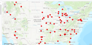
Next, I utilized ArcGIS Mapping software to plot the points across the United States. Here were my results:

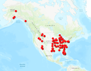
Zoomed out map of the USA

There were several “red” states that had no abortion centers included sponsored via Planned Parenthood (some had abortion referrals but I chose to exclude them from the data). They were as follows:

  • West Virginia
  • North Dakota
  • Kentucky
  • Louisiana
  • Mississippi
  • Wyoming

I was not particularly shocked by the results, though it was quite discouraging to see how limited the options were for many of the “red” states. Most of the centers were only available in larger cities posing barriers of accessibility for those in rural America. One specific example of this is in Ohio, a state with a general population of almost 11.7 million. Within the state of Ohio, there were only three centers with Planned Parenthood-sponsored abortion services housed in the cities of Cincinnati, Cleveland, and Columbus.  Many women have to travel several miles to get to one of these centers, especially those who reside in states with no Planned Parenthood abortion services (both Kentucky and West Virginia share borders with Ohio, however, both states have no Planned Parenthood abortion services). While Planned Parenthood isn’t the only resource for abortions in the United States, it’s arguably the most accessible and known resource. Centers that are not Planned Parenthood are a bit harder to find. I did my own Google searches for some of the states that did not have any options for obtaining abortions but struggled to find easily accessible options.

Since I’m originally from the small town of State College, Pennsylvania I wanted to see how accurate this provided data was by trying to schedule an online appointment for a nearby abortion. While there were a few options provided by Planned Parenthood for abortion services within less than 100 miles of State College on my map, when I went to schedule an actual appointment (specifically for obtaining an abortion) the closest option was actually in Pittsburgh, approximately 2.5 hours or 140 miles away. Thus, I worried that the data provided by Planned Parenthood was not always perfectly up-to-date or that all the centers were not actively or able to take a patient that needed an abortion immediately.

Similar to Quinn’s mapping project, I thought about the “All Models Are Wrong” article we read by Richard Jean So and asked myself what is missing from this data. What can be changed with this model for understanding abortion access in the United States?

Ultimately, the map doesn’t reflect all the myriad barriers that people experience in trying to obtain an abortion. Like my quick search in State College, the map does not always accurately represent centers that are actively accepting patients at the time of the search or still open. Similarly, it does not account for other restrictions placed by states on those who are seeking abortions including forced waiting periods and counseling requirements, and/or take into account how systems of oppression like capitalism or racism add additional barriers to access. At the end of the day, it’s simply a map that contains well-meaning information on abortion centers that tries to make them easy to find and access. While it’s not perfect, it’s at least a start. It’s a model that can and must change. 

Besides adding in the “blue” state abortion services centers (which would be nice to see alongside the red states), it would be helpful to establish some programming that allows these locations to be automatically updated when a center is able to receive patients or goes out of service. Unfortunately, I do not have the necessary programming skills (or know if this is even possible), but this would be an interesting project to consider.

Overall, while there are some limitations with utilizing mapping software like ArcGIS it was still interesting and beneficial to use. I’ve just scratched the surface of its features, but hope to continue with this project to add in the blue states and other tools/programming in the future. 

Ten Things: Mapping the Eclipse Archive’s “Black Radical Tradition”

1 // Most of my reading and writing centers on poetic experiments. Usually the adjectives involved include at least one from a short list that is: computational, constraint-based, conceptual. Other common adjectives are avant-garde and radical, the latter of which appears twice in the source material for my mapping praxis.

2 // Constraint-based, conceptual poet Craig Dworkin manages Eclipse, the free on-line archive focusing on digital facsimiles of the most radical small-press writing from the last quarter century. I return to the Eclipse archive regularly to look at works from poets like Clark Coolidge, Lyn Hejinian, Bernadette Meyer, and Michael Palmer. These are the poets with whom I most familiar. There are many poets in this particular archive with whom I am not familiar at all. In fact, I would say most. These are the poets with whom I want to get familiar. My sense is that I would say most of the poets with whom I am not familiar at all, given their proximity in this particular archive to those poets with whom I am familiar, deserve to have I would say most of their work looked at regularly alongside the others’.

3 // “Given their proximity in this particular archive…”: I am jumping ahead and have one eye on our third dataset/network praxis assignment, wondering to what extent spatial, temporal, racial, gendered, and influential proximity manifests in this particular network of poetic experiments. Conceptual poetry is notoriously white and male, but where isn’t it that way? Where are the radical and avant-garde titles that aren’t being looked at? Where are they? With one eye on our third praxis assignment, I start building a dataset to use for the second. I start with the Black Radical Tradition.

4 // As a rule, for each title in the archive, Eclipse offers: a graf on the title’s publication and material history, a facsimile view of each page, and a PDF download. With lousy Amtrak wifi, I let the facsimiles of each of the 39 titles in the Black Radical Tradition slowly drip down my screen. I don’t yet know what I’ll want for my dataset down the line, but to get started I try to snag from Dworkin’s notes and the first three/last three pages the most obvious data points: author, title, publisher, publication date. Because Eclipse features both authored titles and edited volumes, I learn to add a column to distinguish between the two. I soon add another column to capture notes on the edition, usually to reflect whether the title is part of a series or is significantly different in a subsequent printing. Because I aim to map these spatially–I’m guessing these will cluster on the coasts, but I don’t know this for sure–I snag addresses (street, city, state, zip, country) for each of the publishers. Except for Russell Atkins’s Juxtapositions, which Dworkin notes is self-published and for which I can find no address.

5 // I start my map with ArcGIS’s simplest template, noting two other available templates–the Story Map Shortlist, which allows you to curate sets of places like Great Places in America‘s three “neighborhoods,” “public spaces,” and “streets” maps, and the Story Map Swipe, which allows you to swipe between two contiguous maps like in the Hurricane Florence Damage Viewer–that I might return to in the future if I want to, say, provide curated maps by individual poet, or else compare “publisher maps” of the Black Radical Tradition and the L=A=N=G=U=A=G=E poets (another set of titles in the Eclipse archive).

6 // Even with the basic template, I experience four early issues with ArcGIS:

First, the map doesn’t recognize, and therefore can’t map, the addresses for each of my three United Kingdom-based publishers. This seems to be a limit of the free version of ArcGIS or possibly the specific template I am working with. This is problematic because it keeps me from making an international analysis or comparison, if I want to.

As I click ahead without a lot of customization, the default visualization presented to me assigns each author a different colored circle (fine). The problem with this is that it, for some reason, lumps four of the poets into a single grey color as “Other,” making it impossible to distinguish Bob Kaufman in San Francisco from Joseph Jarman in Chicago.  Those in the grey “Other” category each have one title to their name, but, confusingly, so do several “named” authors, including Fred Moten in green and Gwendolyn Brooks in purple.

Third, beyond placing a dot on each location (fine), the map suggests and kind of defaults to confusing aesthetic labels/styles, such as making the size of the dot correspond to its publication year. In my first map, the big dots signal the most recently published title, which, worse than telling me nothing, appears to tell me something it doesn’t, like how many titles were published out of a single city or zip code. The correlation between year and dot size seems irrelevant, and ArcGIS is unable to read my data in such a way as to offer me any other categories to filter on (e.g., number of titles by a single author in the dataset, so that more prolific authors look bigger, or smaller, I’m not sure).

Once I make all the dots equally sized, a fourth problem appears: from a fully scoped-out view, multiple authors published in the same city (e.g. San Francisco) vanish under whichever colored circle (here: grey) sits “on top.” This masks the fact that San Francisco houses three publishers, not just one. You don’t know it until you drill down nearly all the way (and, even then, you can barely see it: I had to draw arrows for you).

7 // I test out the same dataset in Google Maps, just to compare. I find the upload both faster and more intuitive. Google Maps is also able to handle all three of my UK addresses, better than the ArcGICS zero. Unlike in ArcGIS, though, Google Maps isunable to map one of my P.O. boxes in Chicago, despite having a working zip code; this is almost certainly a problem with my formatting of the data set, but Google Maps does virtually nothing to let me know what the actual problem is or how I can fix it. Nevertheless, Google Maps proves to be more responsive and easier to see (big pins rather than small circles), so I continue my mapping exploration there.

8 // A sample case study: my dataset tells me that New York in 1970 saw the publication of Lloyd Addison’s Beau-Cocoa Volume 3 Numbers 1 and 2 in Harlem; Tom Weatherly’s Mau Mau American Cantos from Corinth Press in the West Village; and N. H. Pritchard’s The Matrix from Doubleday in Garden City, Long Island. When I look on the map, the triangulation of these 1970 titles “uptown,” “downtown,” and “out of town” roughly corresponds to the distribution of other titles in the following decade. Is there any correlation between the spatial placement of publishers and the qualities of the individual literary titles? Do downtown titles resemble each other in some ways, out of town titles in other ways? Is the location of the publisher as important as, say, the location of the author–and even then, would I want the hometown, the known residence(s) at the time of writing, the city or the neighborhood?

9 // And what about this “around the corner” phenomenon I see in New York, where clusters of titles are published on the same block as one another. My dataset is small–a larger one would tell me more–but, as a gathering hypothesis, perhaps there’s something to having a single author’s titles “walk up the street,” moving through both space and time. What, or who, motivates this walk? There’s a narrative to it. What might the narrative be in, say, Harlem, where after publishing the first two instances (Volume 1 and Volume 2 Number 1) of the periodical Beau-Cocoa from (his home?) 100 East 123 Street, editor/poet/publisher Lloyd Addison moves (in the middle of 1969) Beau Cocoa, Inc. to a P.O. box at the post office around the corner. Did an increased national or international demand for this periodical require more firepower than Addison’s personal mailbox?

And what might the narrative be in the West Village, where Tom Weatherly publishes his 1970 Mau Mau American Cantos and his 1971 Thumbprint with two publishers in a four block radius? A larger dataset might show me a network of poets publishing within this neighborhood. Could it lead me to finding information about poetry readings, salons, collaborative projects? (I’m making a leap without evidence here to evoke a possible trajectory.)

10 // Future steps could have me expand this dataset to include data from the rest of the titles in the Eclipse archive (see #5 // above). It could also go the other direction and have me double down on collecting bibliographic data for these authors in the Black Radical Tradition: the material details and individual printings of their titles (some of which Dworkin provides in an unstructured way, but I skipped over during my first pass through my emerging dataset), perhaps performances of individual poems from these titles that have been documented in poetry/sound archives like PennSound, maybe related titles (by these authors, by others) in other “little databases” like UbuWeb. Stay tuned.


Illustration Maps and Stories

Bartleby x Cost-Surface Analysis

I found the ‘GIS and Literary History’ reading by Patricia Murrieta-Flores et al very interesting. The concepts of Cost-Surface Analysis and friction maps were new to me. Below is a friction map illustration of ‘Bartleby, the Scrivener’ by Herman Melville. This depicts the period toward the end of the story where Bartleby ceases to move or comply with requests. The space Bartleby occupies is represented by his answer to all requests, “I would prefer not to.”

An animation over time might show the squares around Bartleby changing hue from a green that indicates positive inducement to movement, to red indicating high friction / low incentive to action. An alternate reading might be that the state of inaction changes from high friction to most desirable, which could be shown by the space Bartleby himself occupies changing from red to green*.

*There are certain deuteranopia- and protanopia-colorblind-friendly combinations of red and green hues, though a different divergent color scheme might be clearer. For black and white reproduction, this could be represented by a heat map showing changes in lightness and/or an increasingly dense pattern.

Image caption: Friction map showing Bartleby at desk
Photos from Unsplash: wood by rawpixel, brick by Joshua Hoehne

—-

Just for fun: The Stranger x Weather Mapping Symbols

I’m sure I’m not the first person to make this illustration of The Stranger by Albert Camus, but it entertains me. As a side note, weather mapping could certainly do with better ways to show uncertainty.

Also just for fun: The Yellow Wallpaper x Floor Plan

I didn’t have a chance to finish this illustration. I’d intended to set the below map showing the bedroom in Charlotte Perkins Gillman’s ‘The Yellow Wallpaper’ into a house floor plan to accentuate the severe confinement the narrator of that story experienced. This illustration depicts the very end of the story, “Now why should that man have fainted? But he did, and right across my path by the wall, so that I had to creep over him every time!”

(Apologies for the repeat posting. I had trouble getting images to render correctly in the post and didn’t realize I wasn’t in draft mode.)

Not a Map, but toward a Map: A Deformance

I didn’t do a mapping project. I started out thinking I wouldn’t do a mapping project, and ended up not doing one, but in between those two states, I spent a lot of time thinking about a mapping project.  Thus, I don’t have a map, but I thought I’d share what I do have in case people are interested — please let me know if this is out of bounds.  (In case this is weird to Matt and Stephen: I’m definitely doing a network analysis later, so this doesn’t need to “count.”)

The assignment suggested a novel, and after thinking about it for a bit, the novel that came to mind was Octavia Butler’s time-travel novel Kindred. It was short enough that I thought I might be able to look through it again and find all the places, and the role of place is really important in the work.  For those who haven’t read it, Kindred is a time-travel novel about American history. In it, an African American woman named Dana is repeatedly drawn back through time to the assistance of her ancestor, Rufus, a white son of a slaveholder, and eventually a slaveholder himself. Because Dana is brought back through time against her will, not to her own benefit but for the sake of a white person, and with no way out except through near-death experiences, her journeys are a metaphorical mirror for slavery — but she is also very literally made a slave at these times.

As you may imagine, place and time are central in the novel, which relies heavily on the difference between “here” (Maryland in the ante bellum South) and “home” (Los Angeles, 1976) — a difference in both space and time.

I needed a way to keep track of all the places mentioned in the novel, so I found myself doing what I eventually recognized as a deformance! I read through the book and made a note of each time that a place was mentioned.

It turns out that this is not quite as easy as it sounds. Ramsay’s point about a computer being able to do a deformance more completely and consistently than a human is well-taken, even for a work of medium length (in this case, a 300-word novel).  I started out wanting to be quite literal about what did and didn’t qualify as a place — hoping to identify only places that could theoretically be identified on a sufficiently detailed map, at least with the aid of the context provided in the novel. This became difficult and ambiguous almost immediately, but I tried throughout to stick to a few rules:

  • I would count physical places, but not experiences or metaphors. I did include Hell and Heaven when they were treated as places
  • Places that are mentioned but not visited count
  • Where someone is in relation to an object (or at any rate a small object) is not a place
  • A person is not a place, even if they seem like one grammatically

As the novel went on, I found that I really needed to include the domestic spaces that make up so much of Dana’s experience, but I tried not to include where people were in relation to furniture. I made an exception for furniture large enough for a person to go into, like a bed or a bathtub. I’m not completely sure this makes sense when I’m excluding desks and fireplaces…

In any case, I thought I’d share one of the more interesting chapters. This is from section 6 of “The Fight.” In this section, Dana asks what happened to her husband Kevin, who she brought back with her to the past and accidentally left there. Additionally, Rufus finds a history book that Dana brought back with her from the future. Dana, after some reflection on the possible ramifications of his having it, takes it away and later burns it. This section includes more references to places outside Dana’s experience, though many of them are close to the plantation on which she finds herself. When the narrative mentions Talbot County, Dorchester County, and Southampton, Virginia, Dana is thinking of Frederick Douglass, Harriet Tubman, and Nat Turner.   So my deformance looked a little like this:

Baltimore
beside his bed
home
Pennsylvania
where Kevin was
that river
at that river
home
home
Philadelphia
At home
New York
Boston
Boston
Maine
north
West
Maine
Maine
the cookhouse
out here
out of the house
Baltimore
there
there
there
New Orleans
New Orleans
down there
Louisiana
in the cane fields
California
In town
Maryland
Louisiana
slave states
here
where he is
North
onto his bed
New York
South
Maryland
Talbot County
Dorchester County
Eastern Shore
Southampton, Virginia
Maryland
Virginia
to town
the plantation
on the place
Boston
home

You can see the rest of it online. (Apologies for the inconsistent capitalization — I worked on two different devices, one of which automatically capitalized the beginning of each cell, and I haven’t had the chance to clean it up.)

In any case, even though it didn’t  result in a map, this showed me a lot about the book.  I noticed the contrast between “here” and “home” and the often slightly euphemistic feeling of the word “here;” it refers to the plantation, the time period, the condition of slavery altogether. I also noticed how, in the plantation chapters, the focus on domestic spaces creates this sense of a closed world in which movement is limited and the same few places come up again and again.  “Town” (Easton, Maryland) seems no nearer than Boston — neither is really available as a travel destination.

Of course, if I were doing this for a more serious purpose, it would be necessary to go back over and look for things I’ve missed or wrongly included. Ultimately, I think this would be a great job for TEI, which does allow places to be encoded as such in metadata — but encoding an entire novel is far beyond my capabilities at this point.

In any case, I definitely chose too big a project for this assignment and didn’t have time to actually work with maps, but I still think this novel is a good one for mapping.  As I worked through the readings for this week, it provided a focal point from which I could think about the relationship between time and place that Presner describes, and the thick relationships between immediate, personal reality and the larger political and economic systems that Ayers insists on, and I’m still thinking about how those could be visually represented.  Layers for time periods? Maybe, but also maybe layers for the slavery laws at the different times that Dana visits, or a layer showing the sites of resistance with the rebellions and escape routes referenced in this chapter. Or maybe layers based on scale– the relationship between tiny domestic spaces and grander concepts of cities and states is really important in this novel, because Dana is aware of other places and often speaks or thinks about them, but cannot access them.  Instead, most of the actual action of the novel takes places on a much smaller scale (and to some extent I realize this is true in every novel, but it’s thematically important in this one). There’s a lot here, and I’m sorry I couldn’t have this map available for everyone because in my mind there’s a lot that could be done with it. (I really struggled with ArcGIS and played around with GoogleMaps some.)

Mapping Assignment – 2016 Presidential Election

When trying to decide what to map I unsurprisingly thought of the 2016 presidential election. I wanted to discuss everything from demographics to voter suppression, through the use of maps. Due to time constraints, I decided on a foundation to base our discussion on and create two maps using Tableau showing the popular votes for Clinton (fig. 1) and Trump. (fig. 2)


One thing that comes to mind when I view these maps is Richard Jean So’s article “All Models Are Wrong”. There seems to never have been a truer statement when faced with these maps.

The first and most obvious piece of missing information is the electoral college vote, which neither of these maps represent and was one of the clear reasons Trump won the 2016 presidential election. If any alien visiting earth for the first time were reading these maps, they might say “Clinton won the popular vote, therefore she won the election.” But this is false and the maps fail to show that. There were many more elements affecting the outcome of the 2016 election that are not shown here; lobbying, number of visits to states by candidates, and Russian interference to name a few, all of which could be their own map.

Using Tableau to create these maps was a bit of a learning curve. I downloaded a database from the Federal Election Commission of the United States of America and cleaned the data myself for the first time. I chose Tableau because it gave me the freedom to choose my own large set of data without manually inputting, and frankly because I cannot seem to get access to Carto since the workshop a few weeks ago.

In conclusion, I’m interested in what these maps do not tell us, and also what they can. If we could create maps and accompanying diagrams to show us the popular vote,  voter suppression, Russian collusion, candidate visits, monetary donations, racism, sexism, and electoral votes, could we predict the next election? Could we find out how to change it?

Zotero Workshop – Free Citation Management Online

On October 19, I attended a Zotero workshop given by Stephen Klein of the Graduate Center library. Zotero is an online service for collecting and managing sources and citations for all your projects.

If you already know Zotero, there’s an advanced workshop on November 1.

Zotero is free and open-source, so your citations will be available even after you graduate. First register an account on zotero.org. Although Zotero is a cloud service accessible from any computer with a browser, you should download both the software and the “browser connector.”

After the browser connector is installed, a Zotero icon should appear at the top of your browser with your other browser extensions. If it’s not there, search in the extensions section of your browser menu. (On Firefox, at least. “Extensions” might have a different name on your browser.) Go into your Zotero account and create a collections folder with the name of your project. You can make as many folders as you want.

Zotero can save PDFs or any other files from websites you visit. If the online information you find is not in a PDF, Zotero will search online for an available PDF. It can also create PDFs of websites. Manual addition of offline sources is also allowed. You can search for information based on ISBN, DOI, and many other IDs. The limit on free storage is 300 MB, but you can get around this by only saving links to files on Google Docs, Dropbox, or other online workspaces.

Zotero can coordinate with Microsoft Word to create bibliographies, footnotes, or endnotes from your citations. It can automatically change the formatting to fit different styles like MLA or Chicago. You can also export your notes to Word, Excel, and other software. Notes can be written in non-Latin characters and symbols. You can share your citations with any other Zotero user.

Citations are created using metadata (notes) connected to the documents or websites. You can edit this metadata if it’s incorrect. Be sure to double-check the original metadata, because it often has mistakes or is non-existent.

If you’re using a strange computer, you can download the browser connector to add a citation to your account. Just be sure to unlink your account after you’re finished.

Uber, Kanye, and the Jamaican Slave Revolt of 1760

I think I need to start with a quick shout out to the Uber driver that inspired this blog post. It all began with a ride to work that quickly went south when my Uber driver went on a rant about blackness in America. The lecture spanned many different topics and ended with her explaining to me that Kanye was indeed correct, slavery was a choice and slaves in The United States chose to remain in bondage long after her ancestors fought for their freedom in Haiti. Now there are many reasons why slavery was different in these two regions that I could have mentioned, but this all occurred before my Friday morning dose of caffeine. I had neither the energy nor the desire to engage. It did, however, lead to an interesting conversation with coworkers on the topic. In that discussion one major reason I cited for success in Haiti was the difference in geography between many Caribbean islands and the American South. Although these maps were not created to argue for or against people’s opinions on slavery, I thought it was an interesting way of telling a story that is often overlooked.

After reading the Monmonier How to Lie with Maps piece I took a look at the Slave Revolt in Jamaica 1760-1761 and the Atlas of Historical Geography of the United States mapping projects. It was interesting to see how the two projects tried to correct the pitfalls that map makers can fall into. The atlas used computers to their advantage to fix map projection issues with their digital georectified maps. Both maps were able to add a lot of background information in the text section that is unavailable when looking at a map on paper.

I found the Jamaican Revolt of 1760 project to be more transparent about their process. This could just be because of content. The atlas is more a digital representation of empirical data, wheres as the revolt map is trying to recount a historical event. This could also just be an example of two different kinds of mapping projects. The atlas digitized and enhanced 700 pre existing maps whereas the Jamaican revolt map was created from other maps and first hand accounts of a historical event. The makers of the revolt map were very aware of uncertainties in their project. For example, the map can only represent space and time from the slaveholders’ point of view and accounts of the skirmishes often varied greatly. They also share reasoning behind the design of the map and why certain elements like the faded dot that moves to chart the possible path of rebel forces were chosen.

All in all this was a great exploration into what forms digital mapping can take, as well as adding to my memory bank for the next time my Uber driver goes on a rant.

Reflecting on spatial humanities beyond literature

As the syllabus starts to expand from focusing primarily on (the) text as data, I was admittedly apprehensive about the readings this week. I remember a few vocabulary terms related to space and mapping from a formative class on modernist and contemporary literature and the Anthropocene (focusing on the figure of the flaneur and psychogeography), but I have never used GIS software or any mapping technology in my own work, have spent very little time talking about space in academic contexts, and have only recently begun to learn about geography as a discipline. This relatively “blank slate” turned out to be helpful for this week’s readings. As we have emphasized throughout the semester, digital humanities as a field can/should incorporate a sense of play into the process of inquiry, and it’s much easier to play with a low sense of expectation and an open mind.

I began this week with The Spatial Humanities: GIS and the Future of Humanities Scholarship, edited by David J. Bodenhamer, John Corrigan, and Trevor M. Harris, and worked through the text from designated beginning to end. The opening chapter of The Spatial Humanities, “Turning toward Place, Space, and Time,” by Edward L. Ayers, was eye-opening in several capacities, starting with its overview of the history of GIS across disciplines and how geography as a field fits into this history. Rather than using the familiar (and, at times, frustratingly flexible) term “interdisciplinary,” Ayers quotes geographer Stanley Brunn’s assertion that geography is “the bridging discipline or an interfacing or fusing discipline” (Ayers 2). I am not sure if more scholars have written on the difference between this bridging/interfacing/fusing cluster and interdisciplinarity, or if there is even a substantial enough difference to discuss, but I liked the new phrasing and imagery here. This sense of bridging means that geography crosses and studies “the relationships between the human and physical phenomena” — in this case, focusing on physical phenomena through space, in the same way that Ayers suggests the historian takes time as their organizing unit (3). (I am still not entirely convinced that “history is, at heart, a humanistic discipline rather than a social science,” but we’ll leave this discussion alone for now.) Geography and history make perfect sense as interfacing fields examining the same landscape, particularly with the help of Bakhtin’s critical vocabulary (Ayers 4), sociological insights like Andrew Abbott’s description of time as “a series of overlapping presents” (quoted in Ayers, 5), and the notion of “landscape” itself (explored in detail in “Representations of Space and Place in the Humanities” by Gary Lock, Chapter 6 of the same collection), all of which help locate humanities scholarship in three and four dimensions.

The editors’ chapter, “Challenges for the Spatial Humanities: Toward a Research Agenda,” goes more into the details of the spatial humanities specifically, rather than the history of GIS or GIScience. In particular, I was drawn to their warnings against relying uncritically on the positivist technology of GIS itself for humanities and humanist scholarship (168) and the related importance of applying sound humanistic judgment to spatial and temporal data that often, as we briefly touched on in our discussion of Miriam Posner’s “What’s Next: The Radical, Unrealized Potential of Digital Humanities” (recommended for September 25), collapses into convenient and inaccurate categories. On this wavelength, the editors mention metaphorical space as well — that of text clouds, for example (172) — but I felt myself glossing over this section and wanting to read more about how to ethically, respectfully explore actual/real/non-metaphorical time and space as a humanist (borrowing from the social scientist’s toolkit), returning to the concept of respecting the complexity of your data.

In addition to a sense of play and the importance of designing research that respects the full range of data, this week saw another recurring theme (in my mind) from the semester so far: the fact that humanities scholarship can extend beyond those very few texts typically designated as “literature.” This isn’t about expanding the canon necessarily (a separate and valuable discussion!), but rather expanding my own idea about what humanities scholarship can and should be. I was convinced that our conversation about mapping in DH would all be related to literature or literary history: mapping the Republic of Letters, for example, or else following the plot of a novel around a plot of land. This week disproved my assumption that mapping — or any spatial/temporal approach to humanities work — has to follow or replicate an existing narrative and instead showed that mapping can, no matter the exact technology used, present multiple overlapping or even competing narratives about a time and/or place.

It was here that the section on “The Humanities in the Digital Humanities” (22) in HyperCities: Thick Mapping in the Digital Humanities spoke to me the most, particularly with the spark of an idea about creating a thick map of something to do with culture, art, and/or information in Europe during the Cold War (a period of history that has been catching my attention more and more recently). I didn’t get the chance to complete a map of my own this week in time to write about it and reflect fully, in part because I was so happy to realize that, amazingly, I didn’t need to limit myself to a literary topic, but I hope to be able to return to these readings soon in the semester with a bit of distance. The concept of deep/thick mapping — mentioned in these readings, with more differences between space and place and other practical details outlined here — is one of the most fascinating concepts we’ve encountered so far this semester because it incorporates so many of the values and practices that have cut across readings and discussions. With this in mind, the idea of building a meaningful, layered, expansive map of a historical site is something that I want to return to for sure, especially now that I don’t feel limited to mapping information drawn from or related to literature.

Expanding the Definition of Humanities Scholarship (Panel Summary)

Today I attended the first day of “Community Colleges and the Future of the Humanities,” which you probably remember that Raven recommended near the beginning of class.  It’s been a great conference so far, but my favorite panel today was “Expanding the Definition of Humanities Scholarship,” moderated by Elizabeth Alsop from the CUNY School of Professional Studies.

The panelists were:

  • Leah Anderst, Queensborough Community College
  • Ria Banerjee, Guttman Community College
  • Kevin Ferguson, Queens College
  • Lisa Rhody, The Graduate Center

Alsop opened the panel by explaining its genesis. She’d found that public scholarship felt like a natural outgrowth of her work, but as she came close to the end of the tenure clock, people started asking her how she would frame this work to make it “count.” So, she put together a panel to talk about some of these questions.

Leah Anderst spoke first, about how finding a full-time position had felt like a small miracle to her, but several members of the older generation of PhDs with whom she was acquainted seemed worried about it, because she was in a pedagogically-focused position.  She spoke about the versatility of faculty members who think and write about pedagogy, and how this work ended up influencing her research. She developed an accelerated program and studied and wrote about it, and although it was not closely connected to the research concerns that she’d come in with, she learned a lot about working with information, especially qualitative information, that she was later able to use in her film studies research.

Ria Banerjee discussed all the conflicting advice she’d received as a graduate student — to publish a lot or not at all, to devote herself to teaching or to treat it as something that happens alongside the “real” work of writing and getting published. She has had a lot of opportunities to speak and write publicly, for audiences she never expected to reach. She’s written some op-eds and blogs, and she’s spoken in events presented by Humanities New York.  This work doesn’t “count” as scholarship, but it does count as service.  Because service isn’t considered as important as scholarship in tenure reviews, this work doesn’t have the same weight that speaking at scholarly conferences and publishing in peer-reviewed journals does, but Guttman does make room for some work like this. They allow a certain number of “substantive” blog posts; there are ongoing conversations about exactly what that means.

Kevin Ferguson works in the English department, but his real focus is film studies. He recently was granted tenure, and made sure to do all the traditional things alongside his more innovative work. He really wanted to help students apply digital humanities principles to film and moving image texts, and to move beyond the mode of film studies scholarship that consists of a written text with some black-and-white still photos. He pointed to his work on MediaCommons. MediaCommons is in collaboration with the Journal of Cinema and Media Studies (formerly Cinema Journal), which is the journal of the Society of Cinema and Media Studies and thus a top film studies journal. This collaborative effort, called [in]Transition, is interesting to him because it takes seriously the idea of writing using the materials of study — in this case, moving images. [in]Transition refers to this as “video essays,” but he prefers “videographic criticism” because it emphasizes the idea that these works can stand on their own, without a written explanation.   The peer review process is also interesting: the reviews are published alongside the videos, which makes for a kind of transparency very unusual in scholarly publications (and perhaps interesting to members of this class?).

Lisa Rhody framed her perspective around storytelling, which is a very powerful tool for connecting with people and changing minds, but can also be used for erasure, colonialism, and exclusionary canon formation. She calls this “the hubris of the humanities.” Her work is on ekphrasis, the literary representation of visual art. There is a certain scholarly narrative about gender and ekphrasis that she wanted to push back on, so she used discourse mapping software to  study it beyond those narratives.  There were a few more technical details than the ones that made it into my notes, but she showed that some of the poets that were usually held up as examples were actually isolated from the poets’ social networks, and that other kinds of languages were used to talk about ekphrasis than the ones on which the current narrative was built. (I want to read a lot more about her work; this is very very interesting to me.) In any case, she did this work as part of her dissertation. It was three times the work of other dissertations, and she also had to work very hard to convince her dissertation advisor that this was a worthwhile project. After all that, it didn’t lead to a full-time, tenure-track position for her, either. But she is working to bring this kind of work to the mainstream, and believes that it’s important. Ultimately, she wants to use messy humanities data to challenge algorithmically designed reading systems.

Rhody also argued that you have to advocate for your own work and take calculated risks. This can be scary, especially since institutions tend to make conservative choices in times of austerity.

There was a question from the argument about talking with peers about this work: Kevin Ferguson made the point that being able to show that the journal was peer-reviewed and prize-winning makes a huge difference, even if people don’t quite understand the work itself.  Being able to show that this work is part of a larger, national conversation with its own vocabulary was also important.

Anderst pointed out that it’s always hard to assess other people’s works because there are so many disciplinary silos, but faculty at her institution are encouraged to publish open access and have a more public voice.

There are several aspects of this discussion I thought people would find interesting, so, enjoy! I’m really looking forward to Day 2 of this conference tomorrow.

Mapping Shawn Mendes’ tour locations

For my mapping assignment, I chose to map Shawn Mendes’ tour locations because I love Shawn Mendes and was curious about what all his tour locations would look like on a world map. There are a few things I want to comment on regarding my experience mapping these locations on ArcGIS. I attached screenshots above, but you can view the interactive map on ArcGIS here.

Breadth of data inputted on ArcGIS

I expected it to be relatively simple to map all of these locations since Mendes has all his tour locations, with each location’s respective venue, on a single webpage. However, as I was doing the assignment, I realized this came with the assumption that ArcGIS would be similar to Google Maps and just be able to match a venue’s name with its respective location on the map.

For the most part, I tried to construct the map using the names of the venues because that was more convenient, given the webpage already had each venue’s name next to the tour dates, so I wouldn’t need to open too many new webpages. I didn’t run into too many problems while doing this for the venues in the United States — aside from the fact that multiple venues across the United States have the same name, which was easily solved by lining up the venue name with the correct city/state. International tour locations were much trickier… I guess ArcGIS might have less data for locations outside of the United States? It was also somewhat confusing for some venues that had multiple addresses on ArcGIS; I believe this was occasionally the case because all of these venues are rather large, and the differences in these addresses may have represented different parts of the roads or intersections that these venues occupy.

Using venue names as opposed to “more precise” addresses

When ArcGIS was unable to recognize a venue name (as I pointed out, this was mainly the case for international locations), I decided to take an extra step to get these locations on the map. This just involved going on the RSVP page of the respective event or using Google to find the specific address of the venue. That made me wonder whether I was actually messing up the preciseness of my map by mostly using the venue names, as opposed to addresses, to pinpoint locations on ArcGIS. Of course, I began regretting not opting for route of using the “more precise” addresses once I ran into the problem of a venue having numerous addresses on ArcGIS.

Are the locations that are attached to these venue names, the same as the venues’ actual addresses? That depends on the inner mechanics of ArcGIS, so I don’t have a concrete answer to that question.

Layers on ArcGIS

I’m not entirely sure why this happened, but my map is composed of two layers, “Map Notes” and “Map Notes 1.” That was not what I intended to happen; I didn’t want any layers at all, and I didn’t try to build the map around layers. I do believe that this somehow happened because I didn’t make the map all at once; I saved the map to save my progress at some point and then continued my progress a little while later. (When I tried to save the map again after resuming and finishing my work, I actually had to rename the map because it couldn’t save my new progress to the map that was made from the initial “save.”) It’s more of an inconvenience if anything, since I don’t want anyone looking at my map to go to the “Contents” tab and think the two different layers actually mean anything.

Moving further with more time and more familiarity with ArcGIS

Though I ran into this “layer” problem, I do see some ways it could be helpful to use layers. For example, I could’ve used different layers to map out Mendes’ tour locations in a specific month (i.e. one layer for April, one for May, and so on).

I also thought it would’ve added an even greater visual element to draw arrows to map out Mendes’ tour from location to location. The map I created is just a bunch of dots on a map with no context, and the context could’ve been improved if there were arrows drawn from location to location and/or layers to separate out tour locations by month.