Monthly Archives: October 2018

Mapping Documentary Shooting Permits in NYC

I like my original mapping illustrations post, but it’s a little lightweight and I’ve belatedly noticed the requirement on the syllabus that we use a mapping platform. So here is take two.

I live in an area with a lot of film and television shooting activity. Our readings have me thinking about what it means for certain parts of the city to be shown often in mass media, while others may never appear at all.

I created a dashboard of maps in Tableau using the Film Permits dataset accessed through the NYC OpenData portal. The colored dots indicate the locations by zip code of shooting permits issued in the three-year period from 8/1/15 – 7/31/18 for commercials, documentaries, films, and television shows. Larger dots represent more activity.
(I can’t get the Tableau Public map to embed here, so please click through via the screenshot below to be able to access the informational rollovers.)

Screenshot of Map Dashboard on Tableau Public

These maps show greater total number and diversity in location for film and television permits. I’m interested in how mapping can be used to show absence, so the map that is most interesting to me on this dashboard is the one showing shooting permits for documentaries. Over the past three years the majority of permitted documentary shooting activity has been in Manhattan and Brooklyn, with only a few projects in the Bronx and Queens, and only one in Staten Island. Less information and data of the documentary type are being created about the Bronx, Queens and Staten Island, which shapes how much presence they have both in current cultural awareness and how much will be available to people who wish to learn about these places in the future.

Some learnings:

  • The raw data included multiple zipcodes for some permits in a single cell. I broke them apart into separate columns in Excel, then wrote a Python script that used Pandas and the melt function (method?) to reshape this into long, skinny data that Tableau could use to map each zip code separately. It would be better if I could have done the entire thing in Python, but I was under a time constraint and doing the first part in Excel was faster for me.
  •  I’d destructively pared the dataset down to cover only three years by deleting the other rows in Excel. I should have left the data intact to leave myself the option of adjusting the timeframe using Tableau filters. Shooting permit data went back to 2012 in the original dataset. I’d like to map all available documentary permitting data to get an expanded view of which parts of the city are the topic of formal archival(?) content creation.

Things I need to learn how to do that would improve this dashboard: (1) include scale reference for each map, as the scale for the dots is not the same between them, and (2) synchronize the area shown in the maps to be identical.

A potential error with this project: I’m not sure whether shooting permits are also issued for shooting on permanent stage sets. I’ve inquired with someone who works in film and television, and I will update this post when I hear back.

Update: per my friend in the industry, these permits are not required for stage shooting unless there is substantial extra parking for trucks required, which happens often with television shoots. In those cases a permit is required, and so my mapped results may also reflect the locations of stage studios. To improve the focus of these maps, I could create a list of such places and add them as an information layer on the map.

This highlights the importance of collaboration. Any analysis one attempts to perform of an area with which they are not familiar will be inherently superficial. A map may tell a story, but it’s not necessarily a true story. It’s useful to solicit input from people who may have critical contextualizing knowledge, be able to identify missing or extraneous information, and can help provide an informed interpretation of results. My industry friend, for example, may draw entirely different conclusions from the same data and visualizations.

Summary takeaway from this exercise: identifying data is only one step. Visualizing a dataset does not automatically confer sufficient understanding of that data to construct a useful analysis.

Mapping — from the context of journalism (and coverage of the pipe bomb packages)

This week’s class discussion really shed light on the different applications mapping can be used for, depending on the discipline. My group (“group four” for those of you who were in class) talked a lot about how maps can be used as a single entity that could represent a much larger amount of information (i.e. the text of a very long research paper). (However, please proceed with caution when considering using a map in this way.) Kriti also passed around a map she’s worked on that shows the stop and frisks of a particular neighborhood in New York City.

It was intriguing to look at maps in this way because as someone with a background in journalism, I’ve always thought of maps as entities that could enhance a story (as opposed to being designed to be looked at alone). I couldn’t think of any recent examples of maps used in journalism until I came across The New York Times‘ coverage of the explosive devices that have been sent to many of Trump’s critics.

Here are the two I’ve seen:

The first map was of course circulated very early into the news story, when suspicious packages were discovered only at George Soros’ home, Hillary Clinton’s home, Barack Obama’s office and CNN’s offices. It’s also clear that map was created on Google Maps, though I can’t point you to evidence in text because the article this map was originally in has since been updated with the second map. Here’s The New York Times’ article I’m referring to.

Before I continue, I also want to bring up the fact that the second map is from a screenshot I had to take because if I try inserting the image of the map from the image URL, it looks like this:

So, it seems like The New York Times overlayed the map itself and the text on the dots in a different way than I originally thought. Upon first glance, one might think the map — a combination of the outlined states, text and dots — was just a single image. When I tried to download the map as an image, I discovered it’ll actually save as a scalable vector graphics file:

Either way, I feel the maps used here were still for the purpose of enhancing the story. The reader gets to visualize where exactly these suspicious packages were found rather than reading “George Soros’ home, Hillary Clinton’s home, CNN’s offices, etc.” Because of the maps, we can easily see the distance between each of the places where these packages were found.

I’m doubtful when thinking that the maps here could represent the entire scope of the news story, however, and that’s quite alright too — that’s just not how I think maps can be used in journalism. I’m curious to hear about maps anyone else has encountered in news coverage though, and if anyone else has a different view of mapping in journalism based on their observations.

Mapping also seems to be a relatively new concept for journalists, so inevitably, news organizations with a lot more resources (such as The New York Times) appear to be part of the few that are actually incorporating maps into their pieces. Or, at least part of the select few that are using maps well. I don’t have any specific examples to point to, but when I was discussing this idea with my group, I brought up how journalists are trying to incorporate more infographics in general, and that often involves adding a chart or graph into an article. Sometimes these infographics are added without an actual purpose though; they’re essentially just there in articles for the sake of being there. I can see the same thing happening for maps.

Thoughts on Drucker and Klein

I began this week’s readings by starting with the Drucker piece entitled Humanities Approaches to Graphical Display. Drucker began by arguing “that even for realist models, those that presume an observer-independent reality available to description, the methods of presenting ambiguity and uncertainty in more nuanced terms would be useful” (Drucker 1). I appreciated this critique. In order to better understand the very complex reality of observer bias and decision-making in research, it is essential to critically consider the ways in which assumptions regarding “traditional data and graphical displays” are established.  Thus, by accounting for and establishing new methods of presenting nuances, we establish a necessary space for these observations that counter positivist “claims of certainty” in research.

Drucker then goes on to say that “data are capta, taken not given, constructed as an interpretation of the phenomenal world, not inherent in it” (Drucker 3). Assumptions regarding data and data collection as the one size fits all approach become problematic and evoke systemic power relations between those who are allowed or able to to “create” knowledge and thus who get to “receive” knowledge.

While I agree with Drucker’s critiques and the necessity for myriad methods of presentation that account for nuances (thus allowing for multiple viewpoints and the reality of observer bias), I couldn’t help leaving Drucker’s work with some questions.I found myself wondering:

  • By using more ambiguity and uncertainty in the visualization of data are we making the data more accessible to a wider audience (a foundation that I believe is essential to the digital humanities field) or in fact, are we complicating it to the point of inaccessibility for those outside of the ivory tower? Can a person outside of academia understand these complicated images of data? Should they be able to?
  • Is there such a thing as too much ambiguity or uncertainty?
  • Further, are ambiguous and uncertain visualizations always the best way to represent data? Or are there sometimes cases when visualizations are unnecessary or more accurately represented in other digital methods?

I do not have any clear answers to these questions (would love to hear others insights on this). While I recognize the importance of ambiguity and uncertainty in data visualization, I wondered if by suggesting that we complicated these visualizations in order to account for nuances, we were also rendering them inaccessible to those who do not have access to the education or resources to understand them. Perhaps there is somehow a middle ground? Or perhaps certain visualizations are better explained in other ways utilizing other types of digital tools in order to create more accessible content? I feel strongly that, at the end of the day, accessibility should be a main focus in all digital humanities work, and thus data visualizations should not be only made for academic audiences or those who can understand their complexities. This does not mean that we should not address nuanced perspectives in our data visualizations, however we should keep in mind our own power and privilege as academics who have access to higher education. We must recognize and address our own positionally in our data visualization constructions. 

Moving on to Klein’s pieces, I really enjoyed her writing and the way she advocates for re-imagining silences in data visualization within The Image of Absence: Archival Silence, Data Visualization, and James Hemings. She states that “Illuminating this movement, through digital means, reframes the archive itself as a site of action rather than a record of fixity or loss.” (665) I liked the concept of a site of action or even–maybe more accurately put–these silences could be referred to as a call to action. The verb “call” designates a more demanding or forceful approach than a “site”.

When reading Klein’s piece I often related back to Choosing the Margin as a Space of Radical Openness by bell hooks. hooks states:

Understanding marginality as position and place of resistance is crucial for oppressed, exploited, colonized people. If we only view the margin as sign marking the despair, a deep nihilism penetrates in a destructive way the very ground of our being. It is there in that space of collective despair that one’s creativity, one’s imagination is at risk, there that one’s mind is fully colonized, there that the freedom one longs for as lost. (hooks, 207)

I want to say that these margins have been both sites of repression and sites of resistance. (208).

Reimagining these spaces that are known solely for their systemic injustices (as Klein has done through addressing silences and her data visualization of The Ghostly Story of James Hemings) offers the potential for us to gain a more accurate and thorough understanding of the past, present and future. These silences are places of repression, but also resistance for data visualization. 

Re: Phototrails

I spent some time this week with Phototrails, a Mellon Foundation-funded collaboration between the University of Pittsburgh’s Department of History of Art and Architecture, California Institute for Telecommunication and Information’s Software Studies Initiative, and The Graduate Center. Photorails maps patterns between 2.3 million Instagram photos from 13 global cities and describes itself as a work of cultural analytics, using computational methods to identify “visual signatures” within this vast amount of data for each city. Our conversation last week about mapping, representing, or else visualizing personal places was on my mind; I was drawn to Phototrails in part because my moves this past summer — to Boston in June and New York in August — have prompted me to think about how to represent my time in these distinctive cities via social media to family and friends in Virginia. Do I share the iconic or expected images (the Manhattan skyline from the Manhattan Bridge, for example, or the arch in Washington Square Park), offer variations on themes (a crowd of people in a museum with Starry Night tucked in a corner), or geotag otherwise nondescript images to signal that, yes, I am in these spaces (a top-down view of my coffee on a table that could be anywhere in the world, only identifiable as my neighborhood coffee shop in New York because of the geotag)? After learning more about what Phototrails aimed to accomplish, I not only wanted to evaluate how my own visual data about and representations of experiences of New York might fit into a dataset or approach to data, but to share a few takeaways about visualizing photographs as qualitative data points and photographic metadata.

First, I wanted to describe the project’s visualization layouts, borrowing language from those sections on the website. The team describes four options for presenting the data: radial visualizations, which organize photos in a circle across their visual attributes (hue, brightness, texture), location, and timing; montage visualizations, which offer a more grid-like organization; PhotoPlot software, available for more investigation here; and points and lines, which use a color-coded system on a gradient to capture the time of day that each photo was taken. The idea with these various layouts is that the data can adjust to show visual characteristics of the data as well as metadata (filters, spatial coordinates, upload date and time). Phototrails describes a “multi-scale reading” capable of “moving between the global-scale cultural and social patterns and the close-ups revealing patterns of individual users,” a middle ground between close and distant reading of behavior, experiences, and representations. With this information in store, however, I began to wonder what other information may have gotten captured. (This is where I loved Drucker’s distinction of data (a “given”) and capta (that which is captured). She elaborates that “capta is not an expression of idiosyncracy, emotion, or individual quirks, but a systematic expression of information understood as constructed, as phenomena perceived according to principles of interpretation” and I am still puzzling over if this notion undercuts the idea that we can find something like a pattern across 2.3 million individual photographs.)

In this sense, Phototrails reminded me of our conversations about text analysis, as when some of us ran became uncertain about if/how Voyant would store our data and ended up pursuing different lines of thought than originally planned. In the case of Phototrails, I was curious about how the team gained access to this data of 2.3 million photographs, then realized that they were publicly posted on Instagram. What are the ethical implications of conducting a large-scale project like this, drawing on social media where those who “participated” in the project might not know that they offered data for this purpose? How do ideas about informed consent — those ideas that shape the concept of the IRB and standards for human-based research, but also notions of privacy more broadly — intersect with this type of scholarship that necessarily casts a wide net and, in many ways, crowdsources from a crowd that often does not recognize itself? It reminds me of when I noticed signs at The Grad Center orientation that said, essentially, “your presence in this space is consent to be photographed and documented on film,” and found myself acting differently — smiling and gesturing more, going into a corner to check a notification on my phone — because I had this heightened awareness of the potential future uses of my image. Because the participants in this project did not have the benefit of such a sign, the Phototrails data is arguably more “real” or “authentic,” but the uneasiness lingers.

At the same time, there are parallels between this challenge of digital data collection and more traditional methods of anaylsis. It makes me uncomfortable to know that any of my own data, visual and otherwise, might very well end up in someone’s research and take on meaning(s) that I did not intend, and that I probably will never even know. In the same way, that farmhand in the nineteenth century might have kept a diary for future insight on labor conditions in their industry, but the diary more likely served a set of purposes in its time and took on new meaning later. Part of conducting responsible research, whether focusing on objects or literature or documents, is recognizing these multiple layers accordingly and not distorting or overstating one aspect to get a desired result.

This is where I found myself disagreeing with Phototrails’s own distinction between big data and thick data. “Zooming into a particular city in specific times, we suggest that social media can also be used for local reading of social and cultural activity,” the Phototrails team wrote. “In other words, we do not necessarily have to aggregate user generated content and digital traces for the purpose of Durkheim-like mapping of society (where individual people and their particular data trajectories and media diaries become invisible). Instead, we can do “thick reading” of the data, practicing “data ethnography” and “data anthropology.”” In my mind, a thick reading of this data would include explanations for why a user shared one location and not another (even to the level of sharing the street address versus a building name, as Sandy mentioned in her discussion of mapping stops on a global tour), information about captions, details about the hashtags, and the consideration of if the photo was taken in New York or just tagged there, all non-visual components that influence a visual signature. Without such context, I think this project is an ambitious and impressive example of visualizing big data, but falls just short of a thick reading that reaches the possible depth of “cultural, social, and political insights about particular (local) places and particular time periods” it aimed for.

Like many of us have mentioned in class and in other conversations, I also find the sense of collapsed boundaries — the idea that we are all constantly, quietly, accidentally providing data, whether it ends up in a peer-reviewed academic journal and helps provide a new perspective on an important social issue or whether someone uses the same data for something far more unsettling — troubling. To illustrate this, I followed the Phototrails website links to its new project, Selfiecity (http://selfiecity.net/). Selfiecity addresses the selfie in artistic, theoretical, and quantitative frameworks, including visualizations of 3200 of selfies around the world and an interactive photoset. Close to the bottom of a page of insights, the website offers headshot and bios of a team of eight and then, at the very bottom, single attribution of sorts: “A DigitalThoughtFacility project, 2014.” The link takes you to http://www.offc.co/web/index.php, which greets you with a description of OFFC, a “a research and design studio based in New York City” that describes its work as follows: “We work with global brands, research institutions and start-ups to explore new product applications for today’s emerging technologies.” This isn’t to say that corporate interests can’t engage with DH scholarship — that’s a huge, ongoing conversation about higher education and business in general — but just to note the curious flow from project to project. This week of readings and projects has provided a good path forward for continuing to explore the interplays between access, democracy, inclusion, and privacy, particularly in the middle ground between close and distant reading.

Mapping Praxis Assignment: Specters of Samuel R. Delany’s Times Square

For this mapping praxis assignment, I made a virtual map (marked over the Open Street current/2018 map) of places (demolished adult /gay porn theaters or micro-cinemas, pubs, clubs, and other subcultural public sites) addressed and illustrated in Samuel R. Delany’s book ‘Times Square Red, Times Square Blue’ (1999). The book is composed of two essays that are written in 1998 when most of the adult theaters (especially, gay porn theaters) and other relevant venues were either already closed (and demolished) or were doomed to vanish under Times Square Development Project that New York City implemented on its cityscape. Samuel R. Delany as a gay writer criticized the disappearance of the gay sexual outlets in Manhattan, which began in the 60s and expanded in the mid & late 90s. He wrote these two essays while remembering his “happier” times as a working-class New Yorker who frequented those venues to “contact” other gay men beyond classes, races, and so forth. While writing, he also photographed the soon-to-vanish-places located in the actual streets.  In the map, I pointed out the names and locations of those places by finding out their past addresses through reading Delany’s book and other digitized archives of Manhattan’s demolished theaters and other past venues. Also, I used the pop-ups that include the descriptions and photographs of those spots by Samuel R. Delany. As for the places Delany didn’t photograph, I added the respective historical photographs after searching them online. This is an on-going project as I further research about Delany’s own writing (quasi-memoir), other old New Yorkers’ writing (often fragmentary) as well as the history of adult cinemas & micro-cinemas in Manhattan.

figure 1

figure 2

figure 3

You can see the published map (in progress) here:

https://www.arcgis.com/home/webmap/viewer.html?webmap=efb4c930dc214fa5a1692231a61d9093

Further remarks

  1. I deliberately marked those venues on the current Open Street Map (from ArcGIS) as I wanted to create the affirmatively haunting (albeit minor) topography and effects of those demolished places inside the current geography of Manhattan. Considering the “adult” quality of those venues, I wanted to mark them as X-X-X but I don’t know much about censorship on ArcGIS so I just used preset symbolized icons (cinemas, pubs, restaurants, etc.).
  2. Since maps like Google map and ArcGIS don’t have records of the addresses of the venues that disappeared in the process of Times Square Development Project, I had to manually find the addresses the old venues based on Delany’s descriptions and other archival information (newspapers and anecdotal notes by New Yorkers). Also, looking at old movies that filmed the Manhattan streets from the 60s to the 90s was helpful to see whether Delany’s writing is based on the actual history.
  3. As I consider this a humanistic and literary project (though it intersects with the scholarship of film history), I used pop-ups to cite Samuel R. Delany’s writing and photographs in the book. Choosing most compelling (culturally, historically, and theoretically) remarks by Delany is painstaking and I’m still working on making this more interesting to the wider range of the audience.
  4. Speaking of usability, the pop-ups do not function smoothly, but it seems like I need to learn professional visualization programming separately.
  5. If I have a premier ArcGIS account, I’d add a layer of information regarding the current property prices of those marked addresses to demonstrate why subcultural businesses no longer can enter those districts.

Praxis assignment: Edward Said’s imaginative geographies

Alright this is a tough assignment—especially when you’re trying to map something related to a geography that has been fought over for a century and remembered and evoked in terms of metaphor.

For this assignment, I chose to map the main stops of Edward Said journey (from Palestine to the US then back to Palestine). And while the map is simple (and simplistic) and straightforward, Said’s conception of place and geography is very far from that. For that reason, I have to say that the map I created doesn’t come near to capturing any claims that Said makes: partly because navigating ArcGIS requires technical training I don’t have, and because of the very assumptions underlying these maps that are rooted in a certain (western/modern) historic and intellectual development that Said largely critiques.

Briefly speaking, Said speaks of “imaginative geography-ies” by which we construct a geography/world (you may also want to check this article discussing the topic). His views on place are part of the project in social theory/post-colonial studies that took it upon itself to reconceptualize space and geography. As his nation is still in fight with an occupier, Said is thus one of the scholars who invited us to reimagine territories in the post-colonial world. He was always keen on pointing to the role of hegemonic culture in imposing delineations of geography and borders. Threads of his writing on this topic are vividly present in his book Reflections on Exile (2000) and his own autobiography Out of Place (1999) from which I seized the data for the map (I also inserted some quotes on the map). Said writes in the preface of his memoir:

“Along with language, it is geography—especially in the displaced form of departures, arrivals, farewells, exile, nostalgia, homesickness, belonging, and travel itself—that is at the core of my memories of those early years. Each of the places I lived in—Jerusalem, Cairo, Lebanon, the United States—has a complicated, dense web of valences that was very much a part of growing up, gaining an identity, forming my consciousness of myself and of others.”

Although the Presner’s discussion of “thick maps” may seem complex enough to engage with Said’s approach to geography especially when he writes:  “thick maps are not simply more data on maps, but interrogations of the very possibility of data, mapping, and cartographic representational practices” (Presner, 19), it still heavily draws on a particular intellectual history in the humanities (this is actually Talal Asad critique of the interpretative Geertzian project that Presner borrows from). On the other hand, another theme we read about this week might have been more convincing to Said; that of white lying of/in maps. And while the author of that piece contends that reality is three dimensional but maps are clusters of two-dimensional graphic scale, I imagine Said jumping in and saying: they are four dimensional—with the fourth dimension being imagination tied to the wit of collective memory and individual remembering. I think, for example, of Said’s trip to Jerusalem in 1992 when he was able to visit his family home for the first time after they were forced to leave in 1948.

Few notes on the map:

I used three layers following Said’s autobiography—childhood, in the US and visits to Palestine and Egypt. I couldn’t however figure out how to make the locations appear in a chronological way…

Jerusalem, where Said was born, can be located in four different ways: Jerusalem, Israel / Jerusalem, the old city, Israel / Jerusalem East, West Bank, Palestinian territories / Jerusalem, West Bank, Palestinian territories. Said was born before the partition of Jerusalem but visited it after the East-West Jerusalem division.


Said visited Northern Palestine/Isreal in 2000 with his son—a region whose cities are named in Hebrew but Said refers to the Arabic names of towns. Ultimately, there are endless ways in which Said’s “imaginative geographies” and the ongoing contestation and fight over territories of his homeland complicate the task of mapping. I’m optimistic though, especially when I find thinking about “maps” is being undertaken in terms of “mapping”– a verb and a process rather than a given static form of geographical representation.

Overall, this exercise makes me ponder the following questions: how has the colonial project shaped the ways in which we experience/think about space and geography? How can we “decolonize” mapping as a practice in the DH? How are material and metaphorical geographies entangled?  what ‘mapping’ practices may be best to express more local/particular understandings of geography and relation to place?

 Where I spend my time

     Where I spend my time

The map you’re looking at might seem like a simple map, but it tells a personal story. It literally pinpoints where I spend my time, which despite being spent on two different continents, is still constricted to a few designated areas. Brooklyn, Manhattan, Oslo, my hometown of Fredrikstad, and the obligatory shopping trip to Sweden. This is what my life has narrowed down to. I visit airports frequently, but I only ever travel between two points and these two points on the map of the world also represents where I live my internal life.

Having lived outside of Norway for the past thirteen years now, I have realized that I live in two different realities at once. Regardless of where I am physically, the two pinpoints and their countries and their people coexist in my mind simultaneously. I am always here and there.

To immigrate is a wonderful, exciting, twisting, heart wrenching experience. You are constantly forced to reevaluate your values and conceptions of the world around you and your identity goes through multiple changes. As in my case you end up neither here nor there. Or rather, as the headline of my map shows, I have landed in myself, somewhere in between, midway through the Atlantic Ocean.

I used the ArcGIS Story Maps which was fairly easy to use. Some of the features were a bit tricky to use so I opted for using the 3D Paint feature on my laptop’s photo software for editing the features I wanted, such as text descriptions.

One issue I had with ArcGIS is the same as I have with most other digital platforms. Put simply: the requirement to give up your privacy in order to utilize the software. It seems to me that pretty much any online program requires you to give access to images in addition to forcing you to publish your work in order for you, the creator, to get access to the final product you yourself has created. This drives me nuts, to the point where I’m mentally tempted to withdraw all my cash from my bank account and rent a cabin upstate with no internet access where I cannot be found. It does indeed seem contradictory then that I have chosen to create a very personal visualization but as all the topics I wanted to map had been done I simply decided to map myself. Having to yet again relinquish my privacy did make me hesitant to use my own life for the project, but I also think it’s a shame not to be able to use personal themes for such an analysis because it can bring clarity and truth to the person exploring their own experience. In the end I decided not to use photos due to the public requirement and come to think of it, once this post is posted to the Commons blog the information can be found outside of our classroom as well! But too late to change the subject now! So, welcome to my life, take a look, snoop around. And be kind.


Mapping the Wrongful Imprisonment of Marion Coakley

For the mapping assignment, I used the first chapter of “Actual Innocence,” which documents the cases of wrongly convicted men exonerated through the work of the Innocence Project. The organization’s co-founders, Barry Scheck and Peter Neufeld, along with journalist Jim Dwyer, authored the book. The chapter tells the story of Marion Coakley, whose exoneration would lead to the founding of the Innocence Project.

Coakley, a resident of the South Bronx, was convicted of robbing a couple and raping the woman at a motel. He spent two years going through seven different state penitentiaries before the efforts of Scheck, Neufeld and two law students led to his exoneration.

I used Carto for the assignment after some much-needed tutorial-skimming and video-watching. Each dot on the map represents a location in Coakley’s story: where he lived, where the crime took place, the prisons he ended up in and the sites relevant to the legal side of the case and the involvement of Scheck and Neufeld.

I started out with a spreadsheet in which each row listed a location, its latitude and longitude (found through Google Maps) and what would go on its tooltip: date, neighborhood/town, incident. I uploaded the csv file to Carto and after clicking the geocode feature, dots miraculously appeared that corresponded to each row.

Once I got past that initial thrill, I had trouble figuring out how to incorporate some kind of sequential aspect so that the chronological order of the events could be discerned. Otherwise, it’s just a bunch of dots to be hovered over at random. I’m not sure if there is in fact some way to achieve this on Carto but in the end I divided up the events into periods of Coakley’s story (the crime he did not commit, imprisonment, and trial-related matters) so that the dots could at least be color-coded and through a legend, have some distinctions.

While the chronological order of the events surrounding his wrongful imprisonment remains unclear on the map, it at least gives a visual layout of the elements in the case and how far from home Coakley was as an innocent man going from prison to prison.

Another issue with mapping the story was that I could only pinpoint the sites that were specifically named in the text. A few critical parts of the story were left off the map such as the unspecified “police station” where the victims of the crime identified Coakley as the suspect through a photo (a photo that had stayed in the files despite that earlier case being dismissed). A NYC Open Data map put the motel where the crime occurred within the boundaries of the 48th police precinct but I didn’t include it on the map as I wasn’t completely sure that was the location of the station where the victims went. Another element that would require further research is whether any sites moved since the 1980s when these events took place. That was the case for the first prison Coakley was sent to, the Bronx House of Detention.

Additional ideas for the map that could be implemented in either Carto or other tools:

  • The dots would have a sequential order so that the viewer would start off on one dot and click a button that would take them to the next dot based on the date in the data.
  • An animated feature that would trace the chronological path in Coakley’s story by going from dot to dot, with a short description for each one.
  • Use different picture icons instead of dots for each location, which would give more of an initial idea of what the spot represents without having to hover over it. (As some of the other mapping assignment posts do using ArcGIS.)
  • Incorporate visuals (photos, legal documents, interview videos, etc.) either via a tooltip or a link that could add more of a human angle to the story.

Digital Praxis #2: Python and Mapping On the Road

This praxis write-up is going to focus on the technical, getting data and rendering it.  I do think there needs to be a purpose behind the mapping that is well spelled out both pre- and post-.  This being an exercise, however, and the technical aspects taking so much time, I am going to treat mostly with the technical and logistical aspects of my efforts in this post.

Fits and Starts:

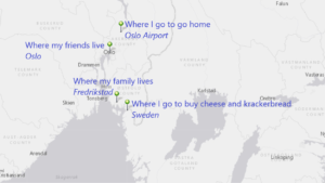
My first hazy idea was to map all the birthplaces of blues musicians and “thicken” them temporally, then add similarly mapped studios that produced their records — to see if there were interesting trends there.  I found getting the data I wanted resistant to quick searches, so I started thinking about other things I might want to do.

Next up was mapping Guevara’s route in The Motorcycle Diaries.  There are already a few resources out there that have done this, so I could check my work.  Further, the book has a trip outline conveniently located before the work’s text. Easy. So, I opened an ArcGIS storymap and went to work, first mapping all the routes from the outline, then deciding to add text from the novel to the main points.  When I started to read the text, however, I encountered much more density of spatial references than in the outline, so I added more points and began, intuitively, to transfer the entire text of the memoir into the map. What I ended up with was the idea of a new version of the book which could be read in the text window while the map frame would move to the location of each entry.  This was labor intensive. For one thing, it required that I read the book again from beginning to end, not for the content so much as the setting of the content. I started to feel that it would take a very long time to do this for even a short book, and that it was not interesting enough to justify such labor without a distinct purpose for doing it. So, I did it for the first few chapters as a proof of concept and then moved on.  

Link to the story map

Praxis #2 — the real effort

Kerouac’s On the Road, might be the most iconic travel narrative in 20th century American Literature.  And, sure enough, many people have mapped the trip routes over the years. So, I knew there would be data out there, both for thickening my maps and comparing my findings to others’.  

Methodology:

Data:

From my first attempts, it was clear that getting data is a problematic for all mapping projects.  The labor involved in acquiring or generating geospatial data can be overwhelming. I can’t remember which reading this week touched on all the invisible work that goes on, mostly in libraries, to create large datasets, (“How to Lie with Maps”, I believe), but, again, it is clear that such work is to be respected and lauded.  It was my intention, then, to look at ways in which data can be extracted from texts automatically — as opposed to the way I was doing it with the Guevara text — thus cutting out a huge portion of the effort required. I was partially successful.

Process:

I’ve been wanting to improve my Python skills, too, so I started there.  (here is my GitHub repository)

  1. I set up a program in Python to load up the text of On the Road.  This first part is simple.  Python has built in libraries for pulling in files and then addressing them as raw text.
  2. Once I had the text in raw form it could be analyzed.  I researched what I needed and imported the geotext package because it has a function to pull locations from a raw text.
  3. Pulling the locations into a geotext class allowed me to look at what geotext saw as the “cities” invoked by Kerouac in the novel.
  4. This list of city names pulled every instance from the text, however, so I ended up with a list that had many duplicates in it.  Fortunately, Python has a built in function (set()) which returns an unordered set of all the unique items in a list. It being unordered, however, meant that I couldn’t iterate over it so I used the list() function to turn the set of unique city names back into a useable list.  The figure ends up looking like this:
    1. list(set(location.cities))
  5. City names are just names (strings), so I needed to somehow grab the latitude and longitude of each referenced city and associate them with the city name.  I went through an extended process of figuring out the best way to do this. Intuitively, it seemed like a master list, where city names and coordinates were joined, was the way to go.  It probably is, but I found it difficult, because of my unfamiliarity with the libraries I was using, to get everything to work together, so:
  6. I imported the geopy package and ran through the unique list mapping each name to its geospatial coordinates (see Error below).  I used the simplekml package to take the name and the coordinates to create a new “point” and then saved the resulting points into a *.kml file.  
  7. I had to add some simple error checking in this loop to make sure I wasn’t getting null data that would stop the process in its tracks, so I added an “if location:” check since geopy was returning null if it couldn’t find coordinates for an entry in the unique list of city names.
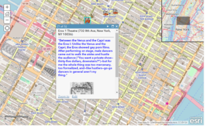
  8. So now I had points with only name and coordinates data.  I wanted descriptions in there, too, so I imported the nltk package to handle finding the city names in the raw text file and pulling in slices of text surrounding them.
  9. The slices look goofy because the basic slicing process in Python uses characters rather than strings.  (Note: I’m sure I could figure this out better.) So I appended ellipses (‘…’) to the beginning and end of the slices and then assigned them as the “description” of each simplekml point. (Note: I wanted to error check the nltk raw text find() function, too, which returns a “-1” for the location if it doesn’t find the entered term–so I did)
  10. I then pulled the kml file into a Google map to see the results.

Error:

First off, it worked.  I was able to generate an intelligible map layer with a set of points that, at first glance, seemed reasonably located.  And the descriptions included the city names, so that did not fail either.

Link to initial map

But there are many issues that need to be addressed (pun intended).  There are multiple “bad” points rendered. I had already imagined avenues for bad data generation before viewing:

  • That a person’s name is also a city or place  — e.g. John Denver, Minnesota Fats
  • That a city pulled by Geotext fails to find a location in geopy — fixed by error checking
  • That a place that is not a city has a city’s name (see below)
  • The beginning of a multi-word city name is the complete name of another place (e.g. Long Island City)
  • That surrounding text (bibliographies, front matter, page notes, end notes, etc.) would have place names in them — addressed by data cleaning
  • That many cities share the same name — requires disambiguation

Examining the points, I found a number of specific issues, including, but not limited to:

  • “Kansas” as a city
  • “Same” is apparently a city in Lithuania
  • “Of” is apparently a town in Turkey
  • “Mary” in Turkmenistan
  • “Along” in Micronesia
  • “Bar” in Sydney’s Taronga Zoo
  • “Sousa” in Brazil
  • “Most” in the Czech Republic
  • Etc….

So, how to deal with all of this?  I ran out of time to address these things in code.  I would have to think more about how to do this, anyway. But here is what I did next on the map.

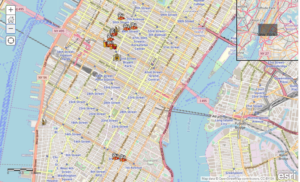
At https://www.dennismansker.com/ontheroad.htm, Dennis Mansker has already put up maps of the 4 “trips” recounted in On the Road.  At first I just thought it would be interesting to add those as layers to my map of city name mentions.  As it turns out, the new layers gave me a clear visual of potentially problematic points.

I included all 4 maps from Mansker’s site and then plotted contemporary driving directions (DD) over them.  Looking at the map with all the layers active reminds me of looking at a 2D statistical plot with the median (multiple medians) drawn in.  It reduced the number of points I needed to address as potential errors. Any point that fell near the DD lines, I could de-prioritize as likely “good” data.  All the points surrounded by space were then easily interrogatable. This way, I discovered that the text file had not been sufficiently cleaned this way — finding a point in Japan, for instance, that corresponded with the Japanese publishing house for this edition.  And I was also able to quickly see what cities Kerouac named that were not part of the “travelogue” — where he was not physically present. This could lead to some interesting inquiries.

Link to final map

More Thoughts:

I really like the idea of automating the process of data generation.  Obviously, there are many ways what I did could be improved, not limited to:

  • A deep dive into reducing error — i.e. the production of “bad” points
  • Adding facilities to take texts as inputs from the person running the program so potentially any text could easily be analyzed and converted
  • Adding facilities for looking at other geospatial data in a text
  • Improving the text slicing mechanics to get more polished and applicable passages from the text into the map.
  • Right now, the algorithm looks up only the first instance of a city name in the text; it would be great if it could pull in all instances (not too hard)

Getting the data and cleaning it for the purposes is a huge issue, one that dominated my efforts.  I’ve left quite a bit of bad points in the map for now to illustrate the issues that I faced.

Google Maps is an easy tool with which to get going, but there are some restrictions that I encountered, namely, limited options for visualizing the points.  I wanted control over the size of the icons, in particular. I would have used ArcGIS, given its power, but my kml files would not load into it. There is a huge learning curve for ArcGIS — as well as a paywall.  In the future, I hope to be able to explore the mapping softwares with a bit more depth and breadth. It really helps, as in most cases, to have a goal/project to use as a vector into these complex softwares in order to begin “learning” them.
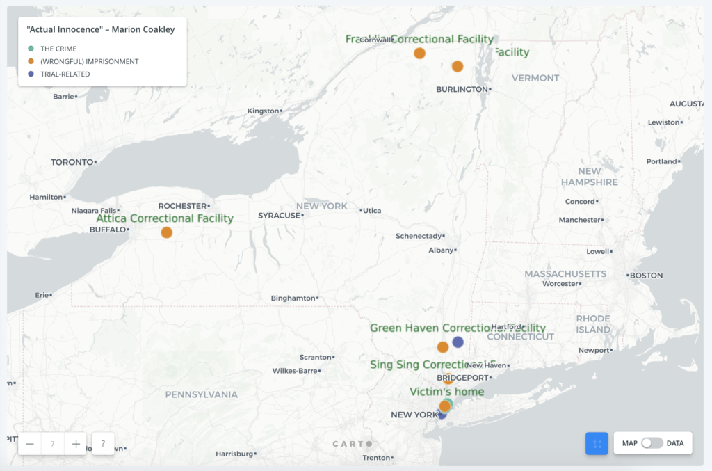
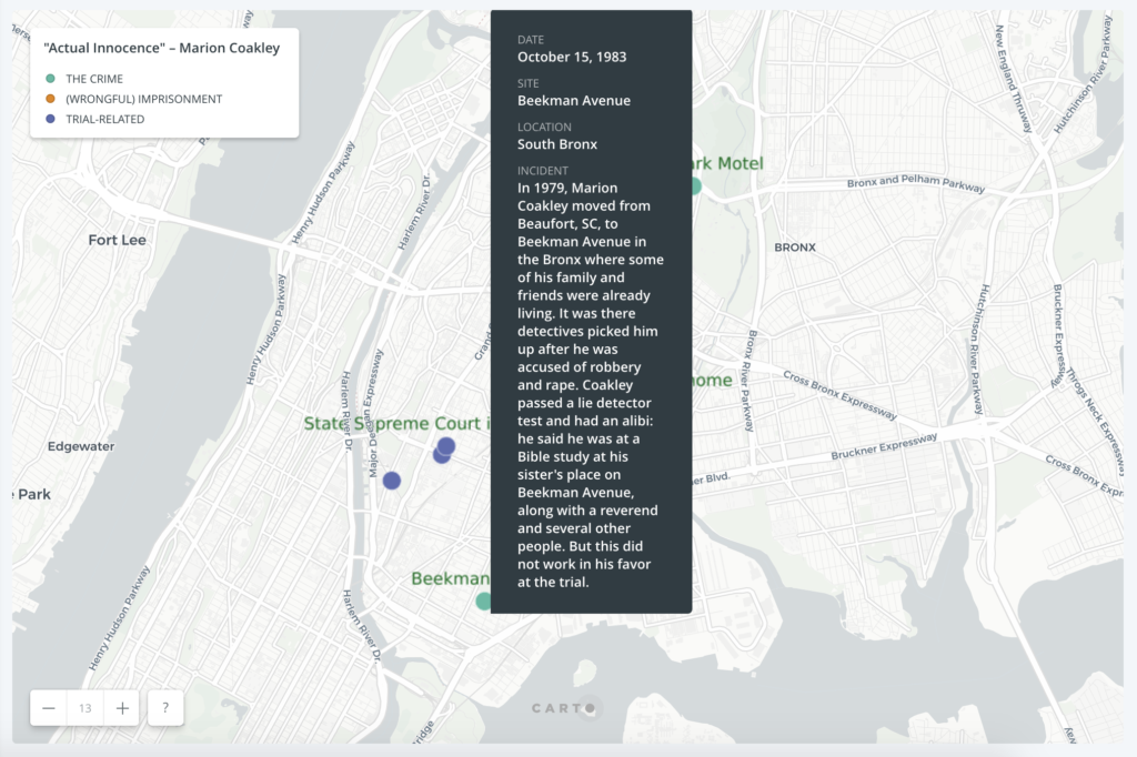
 

Praxis 2: Mapping The Object Library in Time + Space

For Praxis 2, I mapped The Object Library in Time + Space.

I created a site on the commons for this assignment called LOCUS which features a world map of locations related to select objects collected during the Bring-A-Thing-A-Thon, and a timeline of the dates assigned to the objects by the curator/Director of the Center for the Humanities, CUNY.

My process notes are posted there and also here (see below).

To view my project, please visit: LOCUS

[PLEASE NOTE: you must be logged in to the Commons to access the LOCUS site.]

PROCESS NOTES:

I was very inspired by assisting the Center for the Humanities with The Object Library and still mulling the Oct. 9 Ramsay reading’s Search/Browse observations. With these in mind, and with myself still in a browse-rather-than-search mode, I applied the content of TOL to Praxis 2: Mapping.

Also in mind, was a “proof of concept” toward a mapping element for my Humanities References digital tool that I’m building toward the ITP Certificate.

Last semester I took a Data Vis workshop with Micki Kaufman and she introduced us to Gephi, which is a truly interesting platform. I was fascinated by it during the workshop and subsequently really intrigued by it. I even found an error in the code in the first few minutes of the workshop never having seen or worked with Gephi prior to the workshop.

So, if/when I master Gephi, which I hope to throughout the MA in DH, my goal for my Humanities References project would be to map the locations/origins associated with the references/entries in combination with showing them in the the context of time i.e., history, via the JS3 Timeline they reside on located at PointsOfReference / PREFERENCE [n.b. you must be logged on to the Commons to view this site.]

Therefore, I created both of these elements for the mapping assignment using zeemaps.com and Timeline JS3 toward select objects for Mapping The Object Library in Time + Space.

Thanks to a spontaneous and very helpful hallway conversation with Augustin as I “shopped” mapping platforms and expressed my concern about using arcGIS to him because 1) I wasn’t sure if we were required to use it and 2) I’d already invested much time in building a timeline, I chose an “over-the-counter” type mapping tool with a low learning curve. What I discovered is even the “simplest” mapping tools, such as those used by real estate agents, are quite tricky.

This project really gave me a sense of how revolutionary geo-spatial applications toward the humanities can be, as the readings for this week’s class, Oct. 16, claimed and conveyed.

I also became versed in object-based ontology in assisting The Object Library, and this project simultaneously and synergistically enhanced this new knowledge.