Monthly Archives: November 2018

A Case for Turning on the Light in the Supply Chain Process

I really enjoyed Miriam Posner’s piece this week See No Evil because it brought up a common theme we’ve seen within the readings on digital humanities: how and why certain data/content is deliberately concealed or silenced and thus, what it means to utilize a variety of data software tools to draw attention to, address or even how data software tools contribute to the silencing or concealment of data/content. Personally, I am particularly interested in what we can uncover and learn from these concealings and silences to better address injustices and inequalities within society.

Prior to reading this article, my knowledge of the supply chain process was sparse and frankly, in the past, I have spent very little time considering the origins of where my goods came from. As an Amazon Prime member, I have the luxury of receiving my packages within 48 hours of ordering (2-day shipping) and as a person who has used the new Prime Now feature I have even received my goods the same day and within hours of ordering. I just want my items and I want them as soon as possible. Last minute birthday presents? No problem! Groceries delivered to my door? Delivered on the same day. The convenience is unreal.

However, what is at stake with my convenience? Should I know or care about the entire process for the supply chain of my goods? Why don’t I know more about the process? Am I part of the problem? Oh god, I am most definitely part of the problem.

Posner argues that the lack of knowledge of the supply chain process is deliberate, both to the company through the software they use and in turn the consumer; “By the time goods surface as commodities to be handled through the chain, purchasing at scale demands that information about their origin and manufacture be stripped away.” This is done deliberately by companies as a means to create an ignorance of the very specifics of how a product is created and transported, leaving companies turning a blind eye to horrifying work conditions and labor practices. This allows companies to avoid accountability for these work conditions and labor practices and pivot back to the consumer.

The consumers are in the dark, unaware of what their wants and needs for products mean for the working conditions and labor practices that impact those who are ensuring we receive our goods. Would consumers change their minds about a company if they truly knew what’s behind the scenes of receiving goods? I think most certainly.  As consumers should we demand to know the details of a company’s supply chain process? Perhaps we should be more active consumers and demand this knowledge by holding the companies that we purchase from to a higher standard. We, as consumers, could push companies to begin taking accountability for their supply chain process. Let’s do it!

However, we, as a society, rely on this darkness as a means to enable globalization and capitalism even when it means terrible labor practices and the suffering of those in the supply chain. We’ve exchanged scale, globalization, and capitalism for human rights. Globalization and capitalism are only possible through a lack of accountability companies and consumers are able to have regarding the goods they receive. Posner states “We’ve chosen scale, and the conceptual apparatus to manage it, at the expense of finer-grained knowledge that could make a more just and equitable arrangement possible.” Posner’s example of the supply chain process and software was the perfect example to highlight how deeply embedded capitalism and globalization is within society and the ways capitalism and globalization manifest themselves even in software programs.

So my question is where do we go from here?

By the end of the piece, Posner touches on the potential of visibility for supply chain software and programming, but ultimately the problem is more than just software. We must, as a society, agree to see, even if it is traumatic (as she references) for us to know the truth.

I believe that knowledge about things like the supply chain process may disrupt the structures of globalization and capitalism we’ve come to rely on, which may lead to more equitable working conditions and practices for all. We as consumers should do better at demanding to know the supply chain process and accept that it may mean that we see some things we don’t want to see and lose some convenience. Ultimately being in the light may help us be more understanding and empathetic to others lives and create better working conditions for all. Let’s turn on the light and be brave. Let’s do better. 

PS: (Slightly related but kind of a sidebar, Comedian Hasan Minaj just did an episode from his new Netflix show Patriot Act on Amazon discussing some different aspects on their growth and the impacts this has on their supply chain. Here is a link to a YouTube video of the episode.)

Expanding the idea of infrastructure, a reaction to Brian Larkin’s Politics and Poetics of Infrastructure

This piece was a thought provoking look at infrastructure and the many different ways to analyze it. From just the practical side of things, I hadn’t really considered things like funding to actually be a part of infrastructure, although, clearly, it is.

As fascinating as the various discussions of infrastructure here were, I’m not going to focus on them. This article got me to thinking about what is and isn’t defined as infrastructure.

Let’s take Google as an example. Is Google internet infrastructure? I would argue “yes.” Maybe not in the traditional sense, but, still.

Google is more than just a search engine, though its role as the most prominent search engine out there puts it in this category for me. Google also powers so many other things (Chrome, Google docs, for instance, and a variety of other apps). A person’s entire online existence can be curated via Google.

The counterargument might be that Google isn’t necessary. There are alternatives to everything it offers, Bing for searches, Firefox for browsing, etc. So, while you CAN manage your entire online experience through Google, you don’t have to.

While this is true, much of the infrastructure out there is optional. Most of us opt to use it, but it isn’t required. So, I tend to think of Google as online infrastructure.

Let’s talk social media. Is a site like Facebook infrastructure? This isn’t nearly as clear cut (in my opinion).

For one thing, while billions of people use FB, it doesn’t do the things that Google does. FB doesn’t offer a competing search engine or anything like Google docs (at least that I’m aware of).

I’m not saying that FB isn’t important. It is on many levels, from the personal (staying in touch with people far away) to the business world (look at all these people! they have money to spend!) to the academic (data analysis and collect — which also happens in the business world part of FB). I’m just saying it differs significantly from Google. So, while I think that Google should be considered internet infrastructure, I don;t think FB should.

N.B.: The other articles may take up this subject. I haven’t gotten to them yet. I was just reacting to this one.

CUNY DHI Lightning Talks

For those who couldn’t make it to the Lightning Talks on Tuesday, here is the list of the great & cool projects that were presented:

1- Manuscript builder
by Teresa Ober – GC
https://newmedialab.cuny.edu/project/digital-pedagogical-tool-for-teaching-research-methods/

2- The fabric of Cultures: Systems in the Making
By Eugenia Paulicelli – Queen’s College & GC
http://fabricofcultures.qwriting.qc.cuny.edu/

3- DH as OER
by our colleague Nancy Foasberg – Queens college

4- Art history teaching resources (AHTR)
http://arthistoryteachingresources.org/

5- Net-Art
netart.commons.gc.cuny.edu

6- Building and Modeling undergrad DH research
by Dr. Andie Silva – York College

7- Translating Nuova York 
by Julie Van Peteghem – Hunter College

8-  Visualizing epistemology
by David Giuseppe Colasanto & Julian Gonzalez de Leon Heiblum – GC

9- Communities of Platform Development from OPENLAB at CITY TECH
By Kristen Hackett – GC
https://openlab.citytech.cuny.edu/
AND Commons in a Box OpenLab: A Commons for Open Learning
by Matthew Gold
https://openlab.citytech.cuny.edu/openroad/announcing-commons-in-a-box-openlab/
https://commonsinabox.org/

10- QC Voices
by Stefano Morello – GC
http://qcvoices.qwriting.qc.cuny.edu/

11- Expanding Communities of Practice: DH research Institute
By Lisa Rhody & Kalle Westerling – GC
http://dhinstitutes.org/

12-Digital Publishing with Manifold Scholarship with University of Minnesota Press
By Matthew Gold & Jojo Kerlin – GC
https://manifoldapp.org/


A shout out to the Python User Group

I just wanted to give a shout out to the Python User Group which is truly an asset for students  at the GC. The workshop is run by the Digital Fellows and the group meets every three weeks. Meetings are held on the 7th floor in the Digital Scholarship Lab, room 7414 and every meetup has a different theme followed by a wok session where participants can get help with concrete issues that they are working on. They will help you get set up with Anaconda, Jupyter Notebook, Powershell and all other kinds of mysterious sounding things that are new to people who have never written a single line of code. Better yet: they will explain to you what these programs do and how to use them.

For me, who is completely new to coding it has been a great experience to be able to attend these meetings (there’s been two so far this fall) because it’s a group that is open to everyone and all levels. The Digital Fellows are enthusiastic and patient and take their time explaining what ever questions you might have. Possessing great knowledge of coding they are able to help out with a range of issues, including projects you might be working on. They’ve helped me with assignments in addition to helping get started with understanding the concepts of coding. So, for those of you who want to learn how to code you should definitely come along. There is also pizza 🙂

Sophia Smith College, CDHA, and LaGuardia CC Archival Project


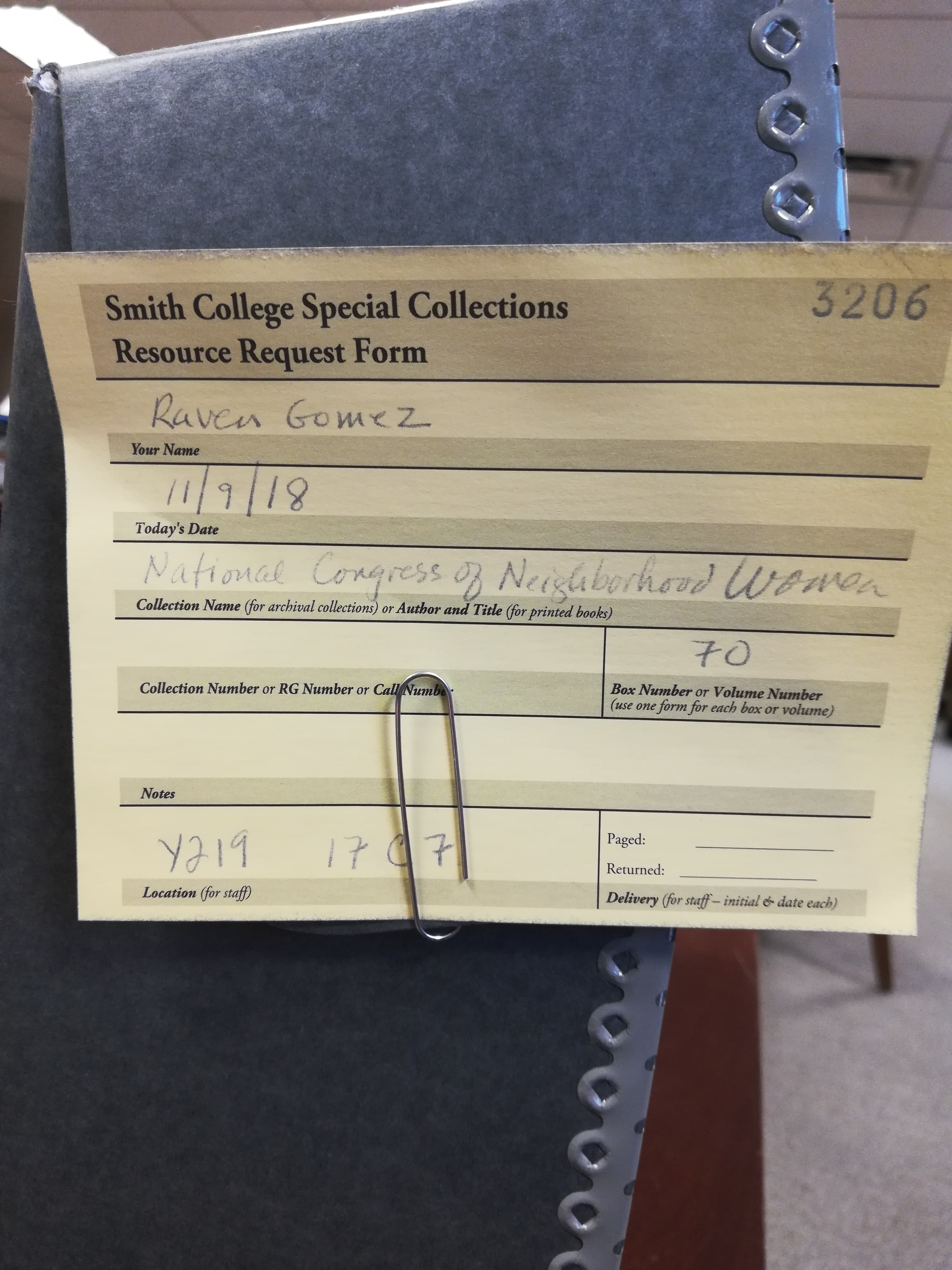
Apologies for the late blog post! I just returned from a weekend at my undergraduate institution, Smith College for an archives project deeply related to this week’s theme of DH and Archive studies.

As mentioned in Stephen Brier’s “Radical Teacher”, the history of the CUNY Digital History Archive, and the significance of “..stor(ies) that can and should be told and must be linked to the broader history of public higher education in the contemporary era..” became the guiding framework as I delved into my current research archival project.

In 2015 during my time as an undergrad, I participated in a 1 credit course in the Sophia Smith Archives, which not only exposed me a skill-set of navigating archives, but exposed me to a serendipitous collection which would spark my interest for the years to come. The collection involves The National Congress of Neighborhood Women (Archive directory in link) in collaboration with the City University of New York (aka CUNY), specifically Hunter & LaGuardia Community College’s involvement with an experimental/nontraditional off-campus curriculum for women of lower-economic neighborhoods from 1971-1979. I’m still perplexed as to why such a large collection of CUNY related materials would be at Smith College, an all women’s liberal arts college in rural MA, and as a current “DH’er” & graduate student, I wanted to return to this collection and see if it would be possible (and what the process would be like) to transition these materials to the CDHA with the support of Stephen Brier and the Wagner Archives at LaGuardia Community College.

The bureaucratic process involved in attempting to digitize this collection for an open-access platform has not been the easiest process, which deeply echoes the tone of Dr. Stephen Roberts article, “The Differences between Digital History and Digital Humanities”. Particularly, I’m interested his exploration of DH as a field of study, and limiting accessibility into considering archival projects as a pedagogical tool to decipher history in the learning process. Considering the usage of digital tools to preserve this archival collection has been met with several restrictions due to the collection’s content including written testimonies from NY state senators and congresswomen, and other confidential materials from the time which can limit accessibility & inclusion in considering students from the CUNY community. Ideally this would be a project that should not only be made public, but could be drawn as a resource for CUNY students at LaGuardia community college that could be incorporated into a course, or project for a broader understanding of the history of community college’s in relation to the student’s direct and individual experience. These broader notions of how history, politics, and education policy intersect deeply inform how we as graduate students, in limited positions of power could engage in the dismantling of accessibility of historical documents in higher education.


Going through these resources, which includes handwritten testimonies from the women of this program was particularly cathartic for me, and my personal experience graduating from LaGuardia Community College in circa 2014. It felt as though a part of my history, which involved the now radical concept of allowing women (mostly women of color from neglected parts of Brooklyn) to remain in their neighborhoods to pursue an associates degrees “off-campus”, engaged in developing an empowered sense of community and pedagogy in practice had been forgotten when I noticed the collection had not previously been accessed since 1991. How can Digital Humanities radicalize the process in which archival material can be accessible to ensure history can be persevered an utilized to communities that need it? And how can we ensure that students of all educational backgrounds have the tools to navigate materials in an archival collection? I wish I could share more of the images I gathered from my trip without breaking any restriction rights, but I’m hoping to send these materials back to CUNY (digitally) soon. 

Public History and the NYPL’s Public Projects

The concept of public history in the digital sphere as described in Cameron Blevins’ “Digital History’s Perpetual Future Tense” and Leslie Madsen-Brooks’ “‘I Nevertheless Am a Historian’” reminded me of the New York Public Library’s public projects. Anyone with internet access can help “interpret” historical materials in the library’s collections by pinpointing locations on maps, transcribing documents and polishing computer-generated results.

There’s the Building Inspector project – with the tagline “Kill time. Make History.” – that involves “training computers to recognize building shapes” on old maps, primarily from the 19th and early 20th centuries, and asking volunteers to verify the results. The intent is not only to document the buildings and neighborhoods of centuries past but also to observe how the city has changed over time and make this information “organized and searchable.” Other projects include:

  • Emigrant City: Transcribing information found on handwritten mortgage and bond ledgers from Emigrant Savings Bank records.
  • What’s on the Menu?: Transcribing old restaurant menus and tagging the geographic location of the restaurants.

This use of collaboration and making old images, maps and documents available for public input reflects the ideals of digital humanities and is a form of “expanding access to the past,” to borrow Blevins’ words in describing the emergence of public history.

He writes: “A commitment to public engagement and accessibility has democratized both the consumption and production of history.”

By getting the public involved, or at least those who can use the internet, the NYPL gives people “early” access – that is, access before the completion of the projects – to their historical collections to build the information that is and will be stored about that material. In turn, these efforts will allow visitors to not just search more easily for and within the texts and images but also analyze, say, the textual data.

(As a sidetone, this effort also demonstrates that when it comes to extracting text and shapes from historical documents and other material, human verification of computer-generated results is necessary – not to mention, human verification of the work of other humans as all the projects make sure to have multiple volunteers checking and double checking the transcriptions.)

At the same time, these tasks are able to be open to anyone who wants to volunteer their time perhaps because the work it is asking participants to do is clear-cut – verify or write out what it says in the documents. In this case “interpretation” is primarily inputting information. Interpretation in the sense of argumentation of the material on the part of the volunteers would be done on their own, separate from the project. This certainly avoids the potential pitfalls of “crowdsourcing history via the “‘wisdom of the crowds’” that Marshall Poe warns against, according to Madsen-Brooks.

Workshop: Understanding and Building on the Web with HTML/CSS

I recently attended a workshop on HTML/CSS that was incredibly fun and informative. Going into this workshop, my knowledge of HTML was limited to what I learned building MySpace pages over 10 years ago. The workshop was well organized to cater the students of various backgrounds that attended. Patrick Sweeney organized and led the workshop, and Stephen Morello kindly assisted those that ran into technical issues.

The objectives of the workshop were as follows:

 “By the end of this workshop, participants will:

– Familiarize themselves with the anatomy of a webpage and how the internet     works.

– Understand the basics of the HTML and CSS markdown languages.

– Use HTML, CSS, and a text editor to build a small website.”


My understanding of the difference between HTML and CSS was cleared up early, when HTML was described as the bones of website building, and CSS the style. Understanding the purpose of HTML/CSS as languages was a key component that I think many other programming classes fail to address. I tried to learn Python over the summer with an online course, for example, and didn’t know that it was commonly used as a glue language until I googled it just now.

The workshop was broken down into HTML basics, and CSS basics. HTML basics included an introduction, and an opening activity where we viewed the code source of the New York Times website. We then created our own rudimentary website using a basic HTML template on a text editor like Sublime.From there, we covered tags and elements, paragraphs and headings, links, images, and conventions. CSS basics covered HTML/CSS integration, rule sets, filtering, classes and IDs, selectors, and troubleshooting. All in all, my poor website looked like this:

By the end of the two-hour workshop, the vibes of the room were overwhelmingly positive. Almost everyone had created their very own website that looked like it came straight out of the year 1998, and we were very proud of ourselves. We concluded the workshop with viewing some examples of websites created with HTML/CSS that looked very sleek, and really saw their potential as languages.

A Successful Story Mapping Workshop

This past week, I attended a workshop titled “Create A Rich Multimedia Narrative with ESRI Story Map.” The workshop was hosted by two of the GC Digital Initiatives’ digital fellows, primarily being conducted by Olivia Ildefonso, with assistance from Javier Otero Peña. The goal of the workshop was to teach us how to effectively use ArcGIS‘s “Story Maps” feature. I was a bit hesitant to work with ArcGIS because I used it once before for a different class and it was a bit difficult to navigate. However, I was pleasantly surprised at how user-friendly it is and overall how naturally the skills needed to create an efficient story map came to me.

Olivia and Javier prepped a Google Slides show as a guide for the participants, but they prefaced the actual story map developing with making sure we went and downloaded a previously created folder on Google Drive. The folder contained all of the materials needed to create a replica of Olivia’s story map, “3 Weeks in Argentina.” I was actually worried about how efficient this workshop would be, thinking we may be creating random story maps. That would open up the possibility of ten different problems arising all at once. The method of having us replicate a demo story map was actually significantly helpful and definitely prevented any potential chaos from erupting.

I was planning on sharing some screenshots to show some of the work we had done, but I realized that defeats the purpose of the story map (I did, however, embed a link to Olivia’s demo in the title above). The difference between a story map and a simple PowerPoint presentation is that the story map brings a presentation to life. You can make your slides immersive, meaning that they can naturally phase between slides (and you can change the phasing effect), present media  (such as live videos playing behind your text boxes, or a stagnant video clip waiting for the viewer to press play), present data via different methods, and much more.

What I should be clear about is the fact that we used the “Cascade” style story map, which is only one of seven different style options. The cascade option fits that of more narrative-based presentations (which is why we worked with information/media from Olivia’s trip to Argentina). With my background being in Education & English, I immediately thought of this as a great tool for narrative-based projects in English classes. Even something as simple as book reports could be an assignment that opens up students to the world of digital humanities. Similar to what Ryan Cordell wrote in his essay “How Not to Teach Digital Humanities” within the Debates in the Digital Humanities 2016 edition (a recent reading of ours), we need to start small with our students and help them climb the scaffolding we lay out in order to help them reach the top. Even simple mapping tools such as ArcGIS’s story mapping is a gateway tool to bigger DH projects, which is something we need to take into consideration when developing curriculum. I’m currently thinking of projects I have done as well as projects I have given students in the past and am thinking of how I could incorporate something like story mapping.

Overall, this workshop went incredibly smoothly and is probably tied for first for my favorite workshop thus far (the other contender is my HTML & CSS workshop with Patrick Smyth). Story maps is a great tool for making presentations much more fun and engaging for students/your audience. It is an incredibly flexible digital tool and surely one that I will be utilizing in the near future. I highly encourage those of you who couldn’t attend the workshop to go to the website (link embedded in “Story Maps” above) and play around with it! Hopefully, you will find it just as easy to use as I did!

PRAXIS 3: UNICEF Dataset

At the eleventh hour, Palladio finally worked for me — hooray!

I’m trying to contain my excitement and relief as I share my Process Notes.

My project began with a plan to “visualize absence” through “The Effect of the AIDS crisis epidemic in NYC on the Performing Arts” because as you can imagine, the performing arts tragically lost hundreds of artists to AIDS, as well as the legacy of training, peaking in the early-90’s. By peaking, I mean  “peaking” through decimation, so I thought it would be powerful to show the individuals disappearing from their individual disciplines (dance, acting, voice, writing, choreography, directing, set design, wardrobe, makeup, lighting, publicity, stage management, etc.) through their deaths. I was particularly moved by a photo gallery I’d seen entitled “Faces of Aids”

It’s an amazing annual tribute EW magazine published, in this case, for the year 1992. It’s profound to see the faces and read the names along with their professions (mostly arts-related). My plan was to do a reverse treatment of the photo gallery in datavis.

I started working with Palladio by experimenting with my own spreadsheet for PREFERENCE, my ITP & DH humanities references digital pedagogical tool project, but could not get Palladio to do anything — except frustrate me. Then it dawned on me that my spreadsheet is not a “dataset” but a “set of data” and I hope I’m accurate in that simple observation. Moral of the story: as I effort to datavis PREFERENCE, the spreadsheet has to be spot on, much like Micki Kaufman described to us in class and also during a datavis workshop I took with her in Spring.

So I had to abandon my “AIDS Visualizing Absence” concept in search of a reliable dataset.

I found many through UNICEF and I was especially intrigued because they have alot of AIDS-related datasets. I considered these but settled on:

UNICEF’s PRIMARY EDUCATION DATA and the specific dataset for Education: Primary net attendance rate – Percentage (by country)

Education: Primary net attendance rate – Percentage
Prepared by the Data and Analytics Section; Division of Data, Research and Policy, UNICEF
Last update: December 2017

I was so psyched when I achieved this map with Palladio which I display here as a screen shot (due to the limitations in Palladio Miriam Posner describes.)

UNICEF First Map

Although quite tiny and diffuse, and literally wandering off the screen, all the countries are in tact.

I was even more thrilled when I got this map to appear:

UNICEF Second Map

Because it appeared globe-like, I was hoping the coutries were in their global positions. But they’re not because what I discovered is this is just the 2D map starting to shape itself in to other views, which I find fascinating.

I had planned not to do PRAXIS 3 but as I saw everyone’s work unfolding, I really got inspired, particularly by Patrick’s work with Shakespeare and his candor in articulating that he didn’t know what the results of his project might lead to.

I feel similarly because I’m still wrapping my head around the potentialities with Voyant in the fields of study I frequent, and have many “wish list” projects for both text analysis and datavis.

More specific to DH, PRAXIS 3 is showing me how damned hard it is going to be to datavis PREFERENCE, which I knew, but now I’m becoming more psychologically prepared to tackle.

The Demise of Daesh

With today being Veteran’s Day, I took inspiration from a Vice News video I saw on Facebook about two hipster Brooklynites who took a year off of work and volunteered to fight Daesh (ISIS) with the Kurdish Army. I thought it was such a cool thing to do, and so my own contribution is a mapping project that illustrates where Daesh held land, where it has control as of most recently, and where it had been eliminated by the US. I realize I am very late with this praxis, however, I had a medical issue when it was due and my other two were on time so this is just for my own benefit.

I used Carto to make my map. I had a hard time figuring out how to make the layers work for me and eventually, it told me I had exceeded my allotted amount and needed to upgrade my account if I wanted more. The reason I had so many layers was that of the purple and orange polygons (which I will explain in a minute the logic of it all) … I was having a hard time adding more than one polygon to one layer, but I eventually got it to work.

Other than that Carto is very intuitive. There is definitely a learning curve that I haven’t quite gotten over entirely, but it was rewarding to play with this tool. The source of my data was a BBC article on the annihilation of Daesh over time (https://www.bbc.com/news/world-middle-east-27838034). I basically just combined two of the different maps they had… one showing Daesh control and another map visualizing where the US destroyed Daesh. I did this very crudely and not all of the towns that were on the BBC map would come up in Carto, even when I searched for al-Qaim it took me to Yemen, which is not the right answer. So I had to guess as best I could. I looked for Daesh related datasets but came up empty-handed. ISIS has a lot of connotations other than the terror organization, so that search too was useless.

So here is the map…


I couldn’t figure out how to embed the image so I just screenshot the entire workstation so anyone not familiar with Carto could see how it is setup. As for a legend of the map, the red dots show US lead coalition strikes against Daesh, there were 13,315 in Iraq and 14,660 in Syria. The purple polygons and one line signify Daesh control of the territory as of Jan 5, 2015 and the orange polygons show their significant loss of control as of Jan 8, 2018.

This was a great way to spend my morning. Seeing the demise of Daesh visualized is very rewarding… and if anyone happens to know those two Brooklynites I referenced earlier please introduce me! The one even talked about reading Hamlet and all of Shakespeare during his deployment. He is a theater designer in real life, just to illustrate his unique personality a bit!