Monthly Archives: November 2018

Network Praxis: Shock Incarceration in New York State 2008-18

I had a sneaky feeling that my dataset wasn’t going to work for network analysis, but I had found such a good dataset that I decided to try. This is an Excel spreadsheet compiled by the New York State Department of Corrections listing 602,665 people incarcerated in New York State over the last ten years, with information about admission type, county, gender, age, race/ethnicity, crime and facility. I knew six hundred thousand records were too many, but I figured I’d select just a few, and analyze the networks I would find in these.

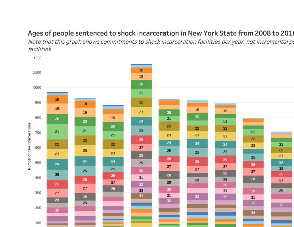
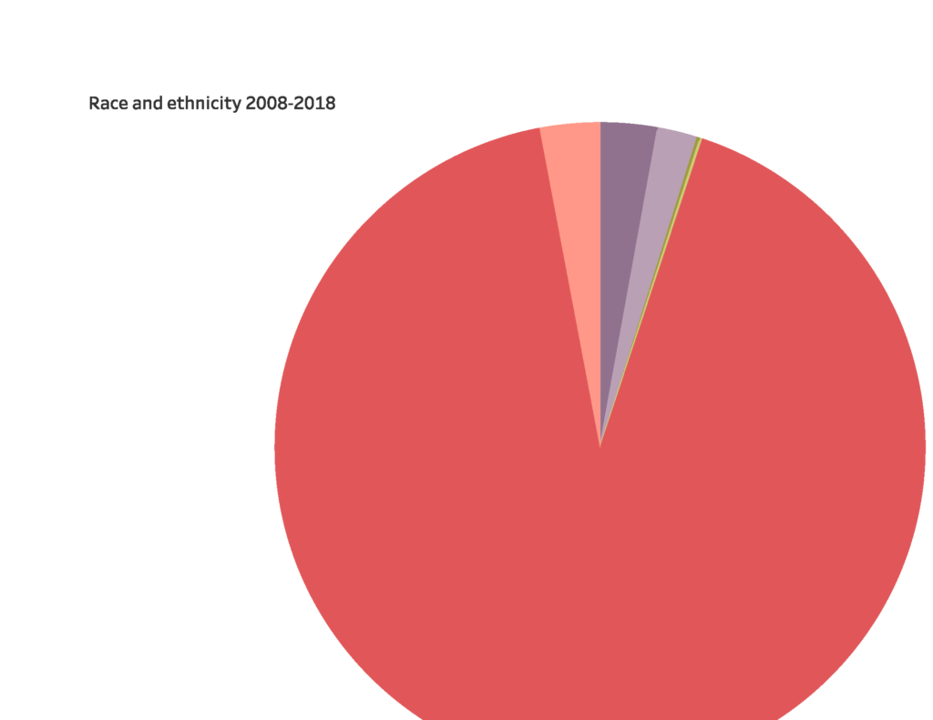
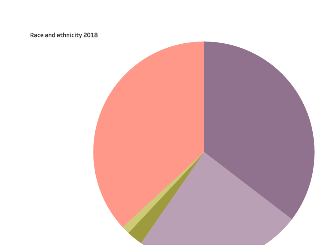
The “few” records I selected were those of 771 men and women sentenced in 2018 to shock incarceration, a military-style boot camp initiative that was supposed to reform incarcerated people by subjecting them to strenuous physical and mental trials. According to the U.S. Department of Justice, shock incarceration involves “strict, military-style discipline, unquestioning obedience to orders, and highly structured days filled with drill and hard work.” The data I looked at shows that most people in these facilities were incarcerated for drug-related offenses such as criminal sale of a controlled substance (CSCS) or criminal possession of a controlled substance (CPCS). When marihuana is legalized the population in these facilities – and others – should, I hope, drastically decrease.

I fed the 771 records into Cytoscape and it was a total mess. I tried analyzing only the 106 women sentenced to shock incarceration in 2018 and that was still a mess. The main problem, I realized, was that I could see no clear relationships between the men and women listed in my data other than the relationship they have with the facility in which they are confined. I don’t know who hangs out with whom. I don’t know if people sentenced for different crimes are placed on different floors. It would be too much work to find out who transports the food to the facility and how many guards there are and so on. Frustrated with my project, I saw that trying to get data to bend to software is a lousy way to go about things. I started to think instead about what software would help me explore the data in a meaningful way and decided to see what I could do with Tableau. This was such a good choice that I’m having a hard time stopping myself from building more and more visualizations with what became a wealth of information when I stopped looking for networks that weren’t there.

I couldn’t embed Tableau Public in WordPress so I paste pictures here, but you can’t click and scroll and interact with my visualizations here, and some of the pictures are cut off so please visit my visualization on Tableau. By the way, I was happy to remember that students can get Tableau Desktop for free for a year. Here’s the link: https://www.tableau.com/academic/students

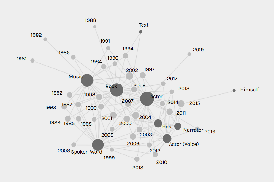
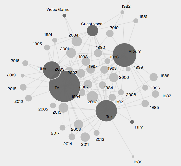
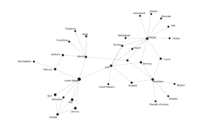
First, here is the mess I made with Cytoscape (I didn’t even try to figure out how to embed):

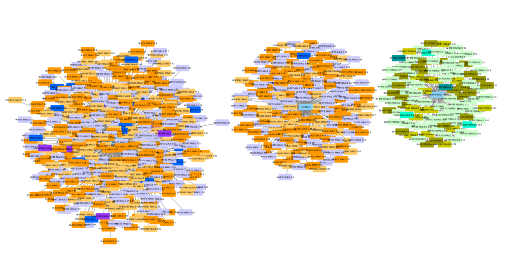
Isn’t that horrible?! Here’s a close-up:

And here are pictures of what I did with Tableau:

Phew, that’s all for now. See it on Tableau, there’s no comparison.

Network Praxis: The Works of Henry Rollins

For my network analysis praxis assignment, I decided to examine the works of a single artist. After considering several individuals [1], I settled on Henry Rollins. I thought he would be particularly good for analysis because he’s had an extremely prolific career spanning a variety of art forms.

First, I needed to decide which of Rollins’s works to analyze. Should I consider the hundreds of articles that he’s written for various magazines and newspapers? I reluctantly decided no, since I doubted that it would even be possible to collect a representative list. Should I consider each installment of his weekly radio show/podcast? Although he spends considerable energy on these, I worried that the sheer mass of them would skew the results toward a single area of his life, overshadowing the larger drift of his career. However, I did decide to include guest vocals on albums by other artists, because each of these seemed so self-contained that it might indicate a change in his overall focus. I readily admit that many people might disagree with these choices. Honestly, I might disagree with them too if I weren’t facing the difficulty of creating a viable dataset.

The actual creation and cleaning of that dataset took a number of hours. I scraped all the works listed in Rollins’s Wikipedia and IMDB webpages and put them in an Excel file. The information was not in any sort of tabular form and contained an enormous amount of duplicates and superfluous entries. It added a little frustration that I know Rollins keeps an obsessive private record of every work, performance, and appearance that he’s ever made in a massive Word file that he simply calls “The List.”

The final csv file of my dataset can be viewed here:
Henry_Rollins_(Some_Significant_Works)

When I finished my dataset and first plugged it into Palladio, I was dismayed, because the network of art forms and years seemed to be just a chaotic jumble:

I immediately thought that a line chart of Rollins’s art forms over the years would be a better demonstration of how his focus has shifted, so I made one in Tableau:

However, after comparing the two, I realized that the Palladio network graph actually demonstrated the flow of his career better than the line chart. It only seemed chaotic at first because I wasn’t used to network graphs. His career flow is even more evident when networking media formats over the years:

As the above network graphs show, Rollins has shifted from being primarily a musician and author in his twenties and thirties, to focusing on spoken word performance and acting in his forties and fifties. I originally thought that these facets of his career were islands floating independently of each other, until I networked art forms with media formats:

The above graph became even more revealing when I realized that “video” should really be combined with “TV” and that “audio” should be combined with “album”:

This network graph shows that all of Rollins’s shifts over the years, despite seeming isolated in their finished forms, actually have connections. For example, his lives as an author and actor are connected through his screenwriting. His lives as a musician and author are connected through the recording studios where he created both albums and audiobooks.

A few issues that I had with Palladio were that it sometimes seemed to create duplicate nodes (see the two “TV” and “Film” nodes in the last two graphs). When saving images of graphs through the Palladio software, the nodes were always black, so differently-sized nodes weren’t possible because the labels (also black) were often completely obscured. Palladio also sometimes created a large central pseudo-node to connect all the nodes from one column of csv data, which might give the mistaken first impression that there’s a single node connecting the other nodes:

Overall, I found Palladio and its network analysis to be an intriguing way to examine data. Although it can seem a bit jarring at first, once a viewer becomes comfortable, there are many useful connections to glean. I’d be interested in trying it out someday on Rollins’s “The List.”

[1] I first considered analyzing a single person’s podcast, since podcasts seem to be having a growing impact on public discourse. I researched various podcast csv files, but eventually moved on because comprehensive podcast data seemed beyond the scope of this praxis assignment. There are also already some very good data analyses about podcasts out there, like this one, and I didn’t want to just do another version of those.

Then I thought about John Oliver’s influential political television show “Last Week Tonight.” However, as with the podcasts, there already seemed to be good data analyses out there. I also examined the datasets available on kraggle.com and data.gov, but I was interested in doing something less overtly political for this praxis assignment after my MTA review in the last one.

Archives: Queens College Civil Rights Archive

I’m sorry to make two posts in a row!  But we were asked to share archives that caught our interest, and in a week in which we’re discussing both archives and CUNY history, I’d be remiss not to share this.

The Queens College Civil Rights Archive

It’s a work in progress, and to be honest, I haven’t fully explored the whole thing! But a lot of excellent work has gone into it over the years. Queens College students were very active in the civil rights movement of the 1960s, and this archive documents that.  There is a special focus on the work of James Chaney, Andrew Goodman, and Michael Schwerner, three civil rights activists who were murdered in 1964.  All three of them were from Queens, and Goodman was a QC student. The tower of our library building is named for them.

In any case, institutional connections aside, this archive is very much worth checking out.

Historical Literacy and Good Faith in Public History

The two pieces from “Writing History in the Digital Age” were really interesting to me.  In “I Nevertheless Am a Historian”: Digital Historical Practice and Malpractice around Black Confederate Soldiers,” Leslie Madsen-Brooks considers “the intersection of ‘the public’ with historical practice” and when and how professional historians might intervene.  In “The Historian’s Craft, Popular Memory, and Wikipedia,” Robert S Wolff looks specifically at the moral economy of Wikipedia as it manifested in the edits of the page “Origins of the American Civil War.” As a (very desultory) Wikipedian, I expected that I’d be really interested in writing about the Wolff piece, but as much as I liked it, I was more drawn to the Madsen-Brooks article.

All the readings this week were interested in how the public interacts with history on the internet, but these in particular were about members of the public as the makers of historical claims.  It’s a little bit challenging, because the inclusiveness of digital humanities is really important to me. Cohen and Rosenzweig discuss speed of access and the acquisition of new audiences while critiquing the potential passivity of computers. Blevins, too, writes about democratizing access to the past and engaging the public. Of course, you really know the public is engaged when they write about something, not just read about it, and in the case of history in particular, I think it’s really important for the public to critically engage with it. Public discussion of history is definitely a good thing! But I’ve also come more and more to realize that when we think about public engagement with information, we also have to ask what happens when irresponsible conspiracy theorists with an axe to grind decide that they want to engage, too.

Madsen-Brooks addresses this question when she writes about the myth of “black Confederates,” who supposedly served in the Confederate Army during the Civil War (this, as Madsen-Brooks hastens to clarify, is not at all the case).  She argues that the myth comes from shallow, decontextualized readings of primary sources made available online; readers of these documents jump to unjustified conclusions in their haste to support their position. This myth has gone so far as to be printed in a Virginia textbook in 2010, so it is doing real harm.  (In contrast, Wolff notes that Wikipedia can successfully exclude claims that are not supported by sources, so in this case, Wikipedia has done a better job than at least one textbook!).

Additionally, the expertise of professional historians might not be valued.  In the case that Madsen-Brooks describes, the status of professional historians might even cost someone credibility. The communities in which the notion of the “black Confederate” circulates hold conspiracy theories about the suppression of this narrative and dismiss credentials as “showing some papers” and institutes of higher education as “centers of indoctrination.” Madsen-Brooks notes that engaging with these communities is likely a waste of time and instead suggests that historians address themselves to more mainstream audiences.

However, what I really like about this piece is that despite her focus on a group that is misusing historical information, Madsen-Brooks still supports the efforts of the public in grappling with sources, looking at history, and even calling themselves historians. Instead of a strike against public history, she sees this as an indicator of the need for historical literacy.

I was excited about this, because I’m seeing some parallels between historical literacy and information literacy. The Association for College and Research Libraries puts out a document they call the Framework for Information Literacy, and I’m tempted to call it the new Framework because it’s a significant shift from their previous rhetoric about information literacy, but it’s not really new anymore. In any case, this document argues that information literacy is about understanding how authors gain authority, how information is produced, circulated, and becomes part of a larger conversation, and how the process of inquiry proceeds. Madsen-Brooks is interested in historiography, which (and actual historians, please correct me on this!) studies the documents from which our understanding of history proceeds. Although she doesn’t define historical literacy in any detail in the piece, I am sure that it involves, at least partly, understanding “information creation as a process,” not to mention how “authority is constructed and contextual” (to quote the Framework).

Now the question is: is she (and am I) being naïve about this? And I’m not sure. Clearly, in the example she cites, there are some people who are not learning about history in good faith. They are looking for evidence to support their enthusiasm for the American Confederacy, and are sure to find it whether it’s there or not.

But I think any plan for educating people about the use of information can break down with bad faith.  Like Madsen-Brooks, I think it’s still important to do this work for the people who can engage with it in good faith.

November 20: A Case for Keeping Infrastructure and Materiality

I want to make a brief case for why we ought to keep the November 20 class focused on infrastructure and materiality, and I want to do it through the video game trope of mirror alignment puzzles. (Apologies in advance if this is a little too “did you know Shakespeare … [turns hat backwards] … was a rapper?!”)

Mirror alignment puzzles start with a source of light that somehow needs to get from here (a crack in the roof) to there (a “sunlight keyhole”). Your job is to position a dozen or so abandoned cave mirrors into a mediating system that takes the light where it wants to go. It’s how you move forward, or access important tools.

The Legend of Zelda: Ocarina of Time

When Jonathan Rauch talks about how the creation of knowledge, he describes it as a “professionalized and structured affair,” a network of “norms and institutions [assembled into] a system of rules for identifying truth.” That there even is a system that checks, balances, reviews, replicates, cites, and confirms its hypotheses is what fundamentally separates the “shared facts” of scholarly knowledge from the irreverent disinformation of “troll epistemology.” (As my other recent post indicates: I’m a bit preoccupied with the blurry boundary between scholarship and conspiracy right now.)

Similarly, when Kathleen Fitzpatrick thinks about “the university of the future” in Planned Obsolescence, she does so by spending a great deal of time reimagining the scholarly author, the monograph, peer review, the university press, and the library not just as discrete mirrors but more importantly as a necessary network for the mission-driven creation and sharing of knowledge. 

And since, as Eli Lehrer reminds us, infrastructure is a public good, using a liberal version of the transitive property, we can easily make the case that if infrastructure helps us constitute knowledge and infrastructure is a public good, then it must be that the constitution of knowledge is a public good. Knowledge is good! This may sound like nothing new–it’s basically something we knew already–but it’s true (here) only if each of the initial premises is true. And if we had to work backward from our conclusion, what could we really say about these initial premises? How convincingly can we argue that infrastructure is (or can be) a public good, or that infrastructure helps us constitute knowledge? Could we get into the weeds on these issues with those who are skeptical? (After all, one of the largest partisan gaps in institutional confidence involves higher education.) Can we say anything about the infrastructure of and around DH? Can we speak to the material changes needed to solve the “Grand Challenges” of our time with the same dexterity as we can the ideological changes needed? Is the fact that we are open to substituting this material indicative of a potential blind spot? 

Or, to cannibalize a line of thinking from Renaissance scholar and editorial theorist Gary Taylor: how can you love knowledge if you don’t know it? How can you know it if you can’t get near it? How can you get near it without its underlying infrastructure?

Rather than looking in the mirror to analyze a little more carefully the DH knowledge and experiences we bring to it–what we’ve already read; projects we’ve already started working on–I think we ought to spend a little time looking at the mirrors of DH themselves: the way they are currently positioned; their various misalignments; where the light is and wants to go and how an improved infrastructure can facilitate that process.

And it’s not just the hardware or software either, the mirrors that stand apart from us. I think we ought to consider human infrastructure too: how student or adjunct labor fits in to DH; who or what the public (or their data) is; how our physical bodies are exposed or made vulnerable in DH work.

The materiality of digital infrastructure.

The materiality of human infrastructure.

We’ll need to think too about the ecological systems in which our digital infrastructure operates: the permanence or disposability of machines; energy usage for the creation and preservation of projects; the physical space DH centers and server warehouses and shared repositories require; the carbon footprint involved in our conference travel to present on the shiny new thing.

Shine your mirror shield here long enough…

…and you will receive access, but will irremediably destroy the face.

There’s a lot to talk about, and Matt and Steve bring a lot to the table in this regard through their CUNY and other affiliations. It’s worth spending two hours thinking about.

Archives

Since archives are one of next week’s topics, here are two of interest:

The ARTFL project

This online archive has digitized many pieces of French literature and other important documents in French.

I was involved with ARTFL very briefly back in the 90’s, when I was a grad student at the University of Illinois. The U of I has the largest collection of French-language works outside the French speaking world, so the folks running the ARTFL project asked us if they could borrow some for digitization.

The university would not loan out a few items, such as the Dictionary of the French Academy 1740, 1762, and 1798 editions, so I had to photocopy them and then make sure the photocopies were legible.

The Kolb Proust Archive for Research

I was more closely involved with this one. Marcel Proust, one of the 20th century’s great writers, wrote as many as twelve of thirteen letters per day, but he never dated them.

Enter Prof. Philip Kolb. Kolb collected as many of Proust’s letters as he could AND tried to date them. He did this by reading the letters, and then going through the newspapers and magazines of the time, trying to match up things Proust mentioned in his letters with reports in the print media.

Kolb would then take notes on notecards, carefully labeling the date of the event, the source, and a brief description of the event. These were the chronology files. These weren’t the only files: biography files, of the people and families important in Proust’s life, were also there. These were all housed in card catalogs.

Kolb was very successful, publishing over fifteen editions of Proust’s annotated letters, and in the process, created this archive.

The university had just secured a grant to digitize the archive when I arrived, so I got to work there for two years. Most of the time, I worked with the chronology files. It was fascinating. Proust came from a very wealthy family, so he moved in the elite circles in Paris at the time (1870-1921).

As a result, by digitizing the chronology files, I got an intimate glimpse into the lives of those people. Also included in the chronology files were excerpts of letters from other people, so I didn’t just deal with news, I also read an awful lot of gossip. It was educational and fun.

It was also shocking at times. I felt like I got to know these people, and when bad things happened (like, say, suicide), I was taken aback. a few times felt like I was losing a friend. Further, I got a close up look at the horrors of World War I.

Also, I learned HTML in the process — we had to set up templates, so I learned the basic commands , some of which I still use frequently, and some I need to sit down and learn again.

Zotero Workshop

Zotero is the coolest thing I haven’t been using. I am so pumped I went to this workshop. I hate creating citations and bibliographies with a passion. Citation generators are garbage and full of flaws. Zotero remedies all of this and keeps track of everything you find that you want to be saved with both the PDF and the catalog information (you can adjust so it does both or only one or the other).


Zotero is very easy to install. Just be warned to not have Microsoft Word open while you do this because Zotero comes with a handy Word extension that wouldn’t install right if you have this program open. The Word extension is what allows you to add your citations and bibliographies with ease to documents you are working on. You could also change between different styles with no problem, i.e. Chicago, MLA, etc. I didn’t ask, but I doubt it works with Apple Pages. You also need the Zotero extension for your browser, so you can pull the data on the pages you find.


What’s more is that beyond the downloaded client, all of your data is saved on the Zotero.org site. You need to create an account, of course. But all that you have to do in order to exchange updated information between the two is simply hit sync. This is helpful too for updating the website with PDF’s and data you drag into the client from your hard drive or desktop.


It works with academic databases and even newspaper articles like the New York Times. The possibilities are rather endless in how it could make your research easier. And better yet there is a dynamic forum that helps with troubleshooting and has its own community following. There is a massive amount of documentation to help with general troubleshooting though and to help gain mastery. The instructor of the workshop lead me to documentation that will even help me install Zotero on my iPad or other mobile device. He did suggest making an appointment with him to help ensure that download goes smoothly though. He was actually very knowledgeable, he is the Digital Services Librarian named Stephen Klein (sklein@gc.cuny.edu).


Another cool function is being able to add notes and tags, so you can keep yourself organized within your workspace/the downloaded client. For example, I searched for articles on Hamlet critical theory for my other class and tagged it as relating to mental health. The tags display in their own section, so you can browse through each one specifically.


One thing Mr. Klein suggested was double checking the data was pulled correctly in the citation area. He said sometimes things get rough with page numbers and the like, so you just want to make sure everything loaded properly. He demoed pulling in an article, and sure enough, there were all sorts of errors in the citation with characters/quotation marks/markup language, so it is not entirely flawless.


One of the people had trouble installing the browser extension to his Surface Pro, which is a tablet but functions as a computer. He even had Chrome and Firefox, not just Microsoft Edge, the mobile browser. So, if you use this device you may have to get additional help to get things operating.


Another thing to consider is that Zotero does run out of allotted memory, but you can purchase additional (there’s even an unlimited plan) for pretty cheap. But Mr. Klein said it does take a while to fill up the free memory.


Other than that, I guess it’s just important to stress that these citations can follow you for life. If you are using another device that you don’t usually use, just log in and sync later. You can also easily disconnect the downloaded client from an account too so if you are using someone else’s computer you don’t save your workstation on their device. I highly recommend this workshop and this software if you aren’t already using it.

Network analysis praxis: Intimacy of early American avant-garde filmmakers

For my second praxis assignment, I decided to visualize the friendship and intimacy of early American avant-garde filmmakers based on their collaboration & cast information in Film-makers Lecture Bureau Catalogue No. 1 (1969) (see fig 1) and supplementary research (when necessary).  Continuing my interest in mapping demolished old Times Square’s adult theater (and relevant) venues before its disappearance, I wanted to digitize and visualize the ephemeral records of subcultural art/event participants (in this case, early American avant-garde filmmakers and actors) whose relationships (personal and/or creative friendships) are addressed fragmentary ways and not yet explored in terms of the shape and intensity of its networks. I research and write about American avant-garde films from their beginning to the present, and I (and other researchers/scholars/critics) emphasize collaborative & amateur community in illustrating the characteristics of early Avant-garde filmmaking, but I wasn’t sure how much (and how complicatedly) filmmakers/artists were actually connected, so I wanted to take advantage of this assignment for my studies of their friendships based on collaboration records in the catalogue.  Film-makers Lecture bureau happened as a division of The Film-makers’ Cooperative (aka The New American Cinema Group) that was founded in 1961 and served as an artist-run, non-profit collective organization that hosted screenings & lectures as well as distributions of their film prints. It was located in 175 Lexington Avenue New York 10016 at that time (1969, the year of this catalogue printed), but, at some point (I still couldn’t figure when it was yet), it moved to their current address, 475 Park Avenue New York NY 10016.

fig 1

This catalogue has gathered individual artists’ — whose list is alphabetized by their last names — screenings & lectures along with the brief descriptions of their works and talks in the year of 1969. (But there’s no precise information of lecture/screening dates.) At times, the descriptions of the film have the collaboration & cast information, but it’s neither consistent nor patterned in any way. So it was challenging to collect the information of their friendships (either artistic or personal) but I’m interested in dealing with imperfect & ephemeral historical records like this even if that task often requires more work, so it was an enjoyable experience over all. The following images (fig 2, 3, & 4) are the screenshots of the “friendship” graphics that I made by using Gephi 0.9.2. Of course, to import spreadsheets of nodes and edges, I first collected data manually (even by using other catalogues, newspapers, scholarly writings, and online archives to some degree when the cast information is missing). Apparently, as I excavated more, there was too much information about collaborating and even personal relationships (family, romance, and so on) so I couldn’t go further than 12 pages of this initial catalogue. (The entire book is 72 pages long.) So the result I show below is less than 20 percent of their networks that should be digitized and certainly much less than the actual relationships that are not recorded in any way.

I used Libreoffice calc to make spreadsheets (as it was recommended by one of our TAs and DH fellows Patrick Smyth) and imported them in Gephi 0.9.2. There are 51 nodes (51 names of artists) and  82 edges (connections) so far. Most of them preferred collaboration or collective filmmaking (within this community) to individual filmmaking.  But a few artists worked rather individually for minimalistic structural works (that do not need much filming and performers and instead rely on solitary editing process). A few actors were just spouses of artists and they didn’t connect to other artists. However, most of the filmmakers were connected crossing genders and those relationships created the various shapes of quartz-like terminations as much as they were connected around the important members of The New American Cinema Group, such as Jonas Mekas, Shirley Clarke, Gregory Markopoulos, Stan Brakhage,  Storm De Hirsch, and others. Jonas Mekas is a Lithuanian American (refugee and then immigrant) filmmaker, and, as you can see from the screenshots, he was mutually connected to most of the avant-garde filmmakers at that time as much as he also worked as a full film critic (he was a first full-time film critic for The Village Voice). However, it doesn’t mean that he functioned/functions as a patriarchal figure in those connections although his name appears too large (as I wasn’t completely able to figure out how to size node labels gradually upon their popularity ranks although I tried so many times by adjusting the node ranking “degree”) In fact, as you can see other artists (women filmmakers included, such as Shirley Clarke, Storm De Hirsch, Daisy Aldan, and Marie Menken; I haven’t included her here just yet, among many others), without Mekas’ mediations, independently collaborated although it didn’t mean the exclusion of Jonas Mekas either in other projects. So in these images, their connections create multiple diamonds around some of the important figures in their community, and I suspect that it will create more if I add more nodes and edges as I further develop the project.

fig 2

fig 3

fig 4  

Beyond this post as an assignment for this Intro DH class, I’d certainly like to further pursue this as I believe revealing collaborative and intimate (yet independent and democratic) nature of alternative (avant-garde or experimental, and amateur) filmmaking is important to distinguish those communal yet unrestrictive art practices from large studio centered commercial filmmaking. The former was (and is even now in a much less visible way) weaving an artist community and shaped the participants’ work and life at varying, intimate levels.

Network Analysis Praxis: An Attempt at Happiness

I had a bit of a hard time choosing a data set. I started looking at datasets for topics that are related to current events and politics, which just made me sad. Stumbling across this dataset on happiness and alcohol consumption was a nice relief. I started off  thinking of it as people partying and having a good time over the idea that alcohol consumption can also be a symptom of darker circumstances.

I found this website called Kaggle. It is a website that runs many data science competitions. It’s free and includes many datasets that have been put together by its users. Some of the data sets are managed by Kaggle and some are updated periodically by the people who upload them. You can search data sets by topic, popularity, date it was uploaded, and many other criteria. You do have to create an account with them to access the data sets. I just logged in with my Google account, and agree to not cheat in their data science competitions.

While looking through their data sets I found one on happiness and thought it would be a great topic to look at. The dataset included the human development  index, alcohol consumption per capita by type of alcohol, GDP and Happiness Score (from the UN report) of 122 countries. The question I was interested in answering was is there a relationship between alcohol consumption and happiness. I decided to look at this by region because it would be easier to study than to look at a graph with each individual country. It was when I looked at my first graph that I realized big my mistake. Naturally some regions have way more countries than others. This skews the data because regions with more countries will seem happier than smaller ones. It made me think back to our class discussion about quantitative methods. Maybe I might have thought about this sooner had I known how to decide what data I use and how I use it. I can’t say I’d sign up for that class, but an introductory unit could be useful. I decided to try my search by country. This approach resulted in one big circle of data. It did help me understand how the source and target work as well as give a more accurate depiction of the answer to my question.

The images I’ve added to this post show the relationships between type of alcohol consumption per capita and region. Wine drinking has the most connections between regions. That being said the relationships are around how little people drink wine. 

Venezuela has one of the highest beer consumption per capita at 333. It made me wonder about the factors contributing to that number including political turmoil, violence etc.  Also why beer? Is it because of price point? More readily available?

Spirit consumption connections were at higher numbers than beer and wine. I think it’s because certain spirits can be made using local ingredients like rice for example. It would require closer analysis but the idea seems plausible. 

All in all, my network analysis was not the best, but it raised questions which is part of the point of the exercise in the first place.  It shows correlations we expect and those we don’t prompting questions for further exploration. I get very far on my quest for happiness, but I think the journey created much for meaningful questions to explore.


David Bowie’s Reality Tour

For our first praxis assignment, I did a textual analysis of David Bowie’s top hit from each decade that he worked. While looking at his body of work, I became interested in his last tour, The Reality Tour, where he had a heart attack on stage and ended his public performing career. I wanted to look at his tour schedule because I thought there might be a clue as to what stresses he was enduring on stage. At first, I thought I’d do a map of the tour but never got to it.

Then came the network visualization praxis assignment and I was looking for some dataset to represent as a visualization, but in my search for datasets, I didn’t find anything that called to me. The things I wanted to look at such as the post-atomic bomb US and/or Japanese News was such a big undertaking that I decided to return to the Bowie data that I had from earlier.

Now I know there is a whole world of stuff, but I wanted to work with something I already had an intuitive sense of because it was easier to drill down into the dataset as it wasn’t large, but representative of the lifespan of an event. The fields being date, country, month, and arena were fairly simple and easy to corral into something approaching a tame dataset. So, I dug into Bowie’s final tour.

First, I tried to understand how to find in the data and represent what I intuitively thought would show up: that June was the most the stressful month of the tour (because it was connected to so many other dates on the tour) and caused him to have a heart attack on stage. But what were the important factors in the historical elements such as travel, dates, arenas, hours on stage, and days that he performed in each month of the tour? Which parts could I leave out?  And most of all how to show it?

It seemed that I was looking for a schematic of the plot of “Nashville,” Alman’s 1975 hit film, with all the intersecting lines converging in one concert. I thought I might find that kind of visualization in the data that I was using, but I wasn’t certain. Really, I wasn’t certain of what I was doing, at all.

I played with the data trying to understand what went into the weight of each node. First, I tried to weight each node so that it is accurately represented in the visualization all the dates and that looked like spaghetti with peas in a square dish. For the most part, everything I did in Gephi looked like a pasta dish. I finally took it to Palladio which was easier to use because it functioned on an axis with two data points: source and target. I cut and pasted the dataset from my spreadsheet into the data box and then smoothed out a few errors for special characters and loaded the data and choose graph. I choose the dates and the countries, and then I got little starfish all over a circular map, pretty, but not useful.

I needed to aggregate the dataset even more and I added the month to simplify it down to the nine months of the tour leaving out the dates. I then reentered the data and choose month and country. Voila! It showed up. Right in front of my eyes.

June was in the center of the visualization where I believed it belonged with all the stresses of the performances and travel that Bowie had to undertake for this tour. I think what I found most interesting is that the month had a equal connections to Europe and to the US. March also had those connections, but it seemed that June had more dates in the US and landed more squarely in the middle. So June visually represents the place in the middle where the connections to the different shows in the different countries fall on one side or the other.


Visualization of David Bowie Reality Tour, 2003-2004

Palladio has issues with visualizing and one of them is that when you show the correct size of the nodes, you cannot see the labels. I choose text over image in this case because I thought the labels were more important for understanding the overall graph. I’d also like to see this in three dimensions as I believe it would give a fuller picture of the event.

For the future, there should be more data added to the weights of the nodes such as hours on stage, times of the shows, opening acts or none, set lists and how many encores. Hopefully, this configuration will hold up and June will continue to be in the center of it all.